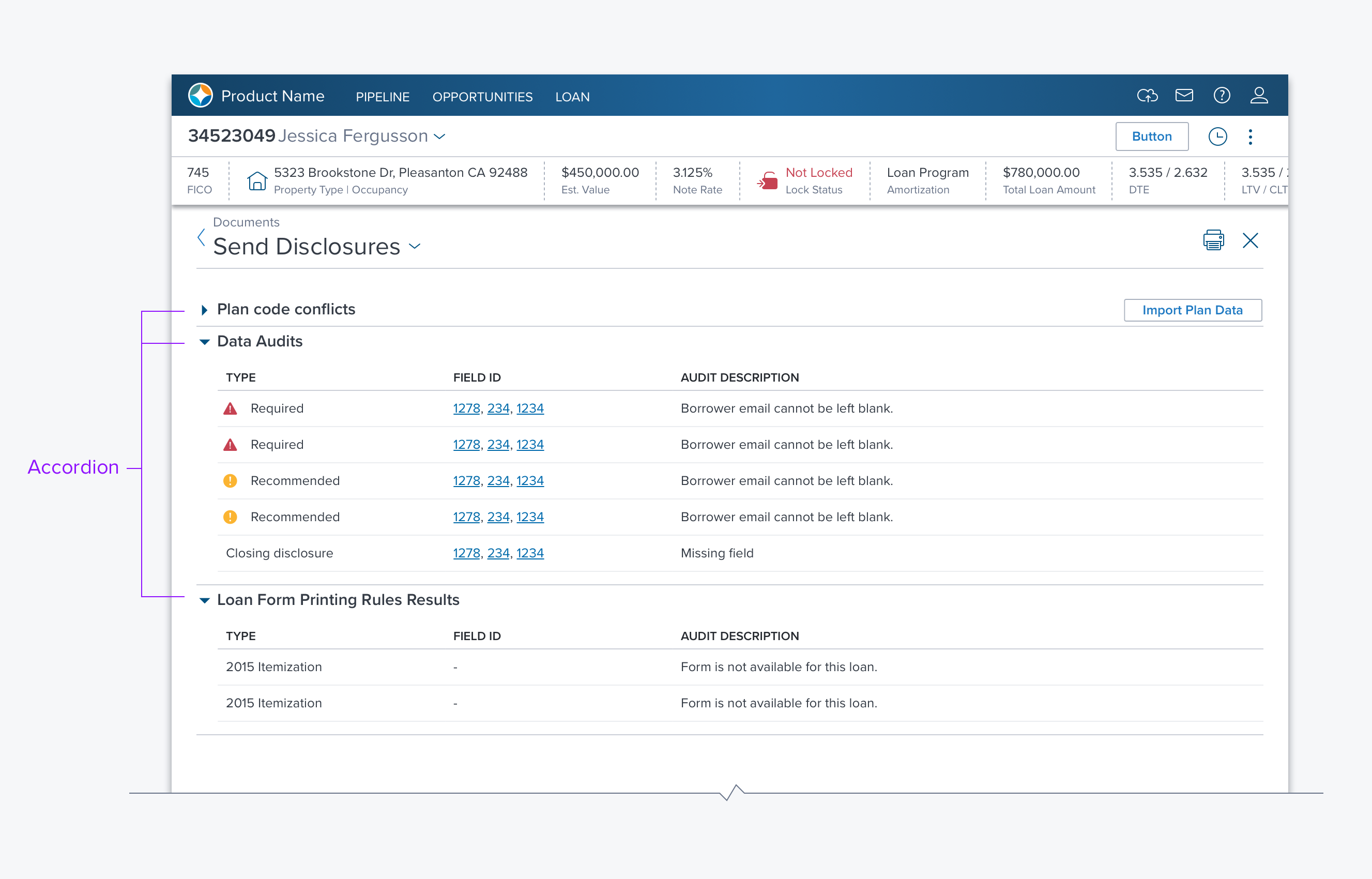
Accordion

Usage
The Accordion is a layout component used to present large amounts of content on a single page by allowing users to hide and show portions of the information, thereby reducing scrolling or navigation to other pages. It affords the user an opportunity to read, compare, and/or act on the content in different sections concurrently. Unlike the expandable DataTable each section can present content unrelated to the other sections.
Alternatives
- Tabs - Use tabs when the content in one or more sections is very long. Use when the sections each stand on their own and non-serial navigation is preferred.
- Left Navigation as vertical navigation - Use when there will be more a large number of sections of information to work through. Also if there is a hierarchal relationship between the bodies of information.
- Card Array – Use Cards when you want to present more information about each object in the collapsed state than the accordion header affords and if the user needs different information about each body of information before choosing.
- Expandable DataTable - This allows you to drill down on an object and see its details. Use this when the drill-down details are closely related.
- Group Box - For smaller sections of content.
Options
Toggle/Multiple
- Toggle - Only one section can be open at a time, alternatively, all sections can be collapsed. If the user opens a section when another is already open the system closes the previously opened section.
- Multiple - Users can open as many sections as they want concurrently.
Simple Header/Complex Header
- Simple header - Only has a title and is used if a toolbar is not needed at the section header level.
- Complex header - Can also display a sub-title and have its own toolbar. It is particularly useful to take actions that are unique to this section. In other words, if there are actions that are specific to a section then having a toolbar is required.
Updated over 3 years ago
