Checkboxes

Usage
Use a Checkbox to switch an individual item's state or the selection of multiple items.
- A checkbox is activated by clicking the indicator (checkbox) or the label.
- The label should make the implied Off state readily apparent.
Alternatively
- Toggle - use when there are two states, both should be explicitly stated, in horizontal spaces, such as toolbars. Do not use to select items.
- Radio Buttons - use when there are multiple states, all should be explicitly stated, in vertical spaces, such as forms. Do not use to select items.
- Drop Menu - use when there are several states or selectable items, only one can be selected, and space is at a premium,
- Combo Boxes - use when there are many states or selectable items, one or more can be selected, and space is at a premium.
- Shuttle - use when there are many selectable items, one or more can be selected, items are in a hierarchy. Is best when many items can be selected and the user wants to keep track of the selection set.
Placement & Layout
Checkboxes and Radio Buttons are often laid out in groups. See the Forms Layout Pattern for ways they can be grouped and laid out relative to other Input Fields.
Types
Single / Basic
Use when a setting or option needs to be turned on or off.
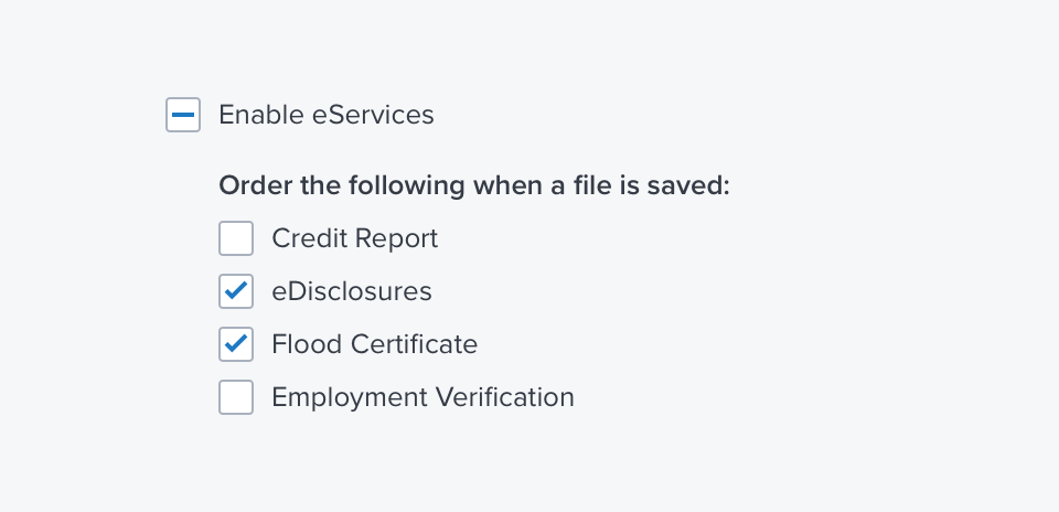
Nested Group
Groups can be nested under a Single Checkbox to allow the set to be turned on or off with a single selection. Nested arrangements also allow for a mixed selection state for parent items.

References
Updated over 3 years ago
