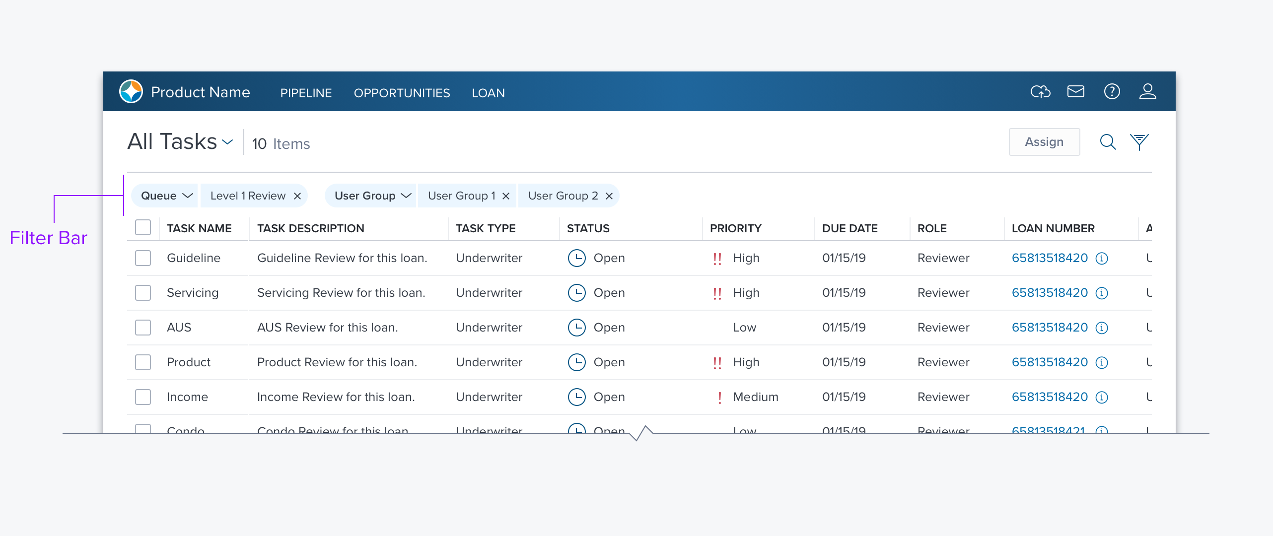
Filter Bar


Usage
The Filter bar is applied anywhere two or more filter criteria are needed. It can be used above a Datagrid, a Card Array, the Left-Nav, or a Dashboard.
The Filter Bar is comprised of one or more pills, each of which represents filter criteria, this provides the capability to filter on multiple attributes.
The order of pills in the filter bar is determined by their type, from Left to right; Fixed Read-only, Fixed Editable, and Remove-able.
Alternatives
Search Box, If only one filter criteria is needed a simple Search Box may suffice.
Pill Types
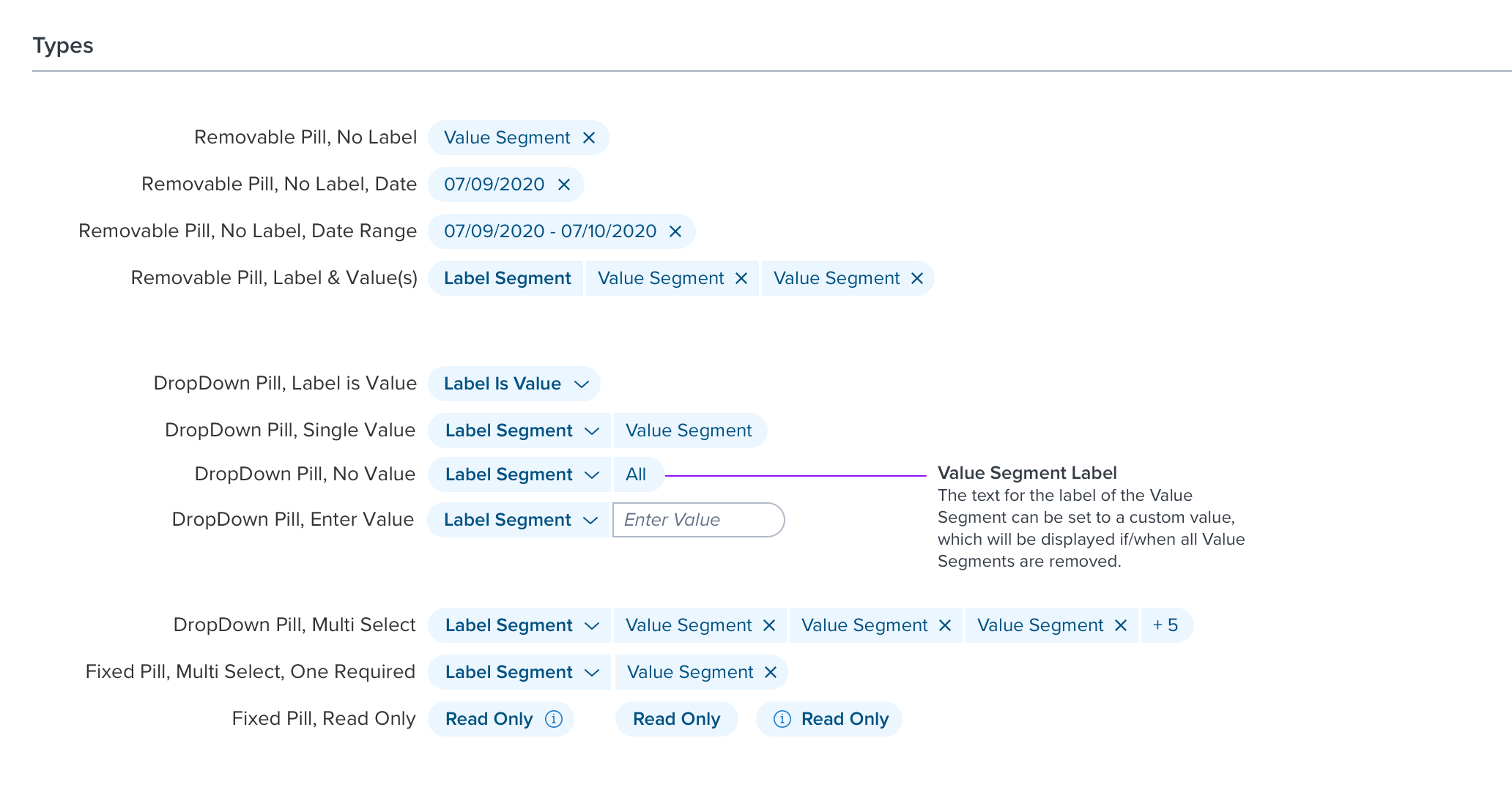
There is only one type of Filter Bar, but there are three pill types: Fixed Read-only, Fixed Editable, and Removable.
- Fixed Read-only - A single pill representing an underlying query, established by the developer or sysadmin, which cannot be edited by the end-user.
- The end-user can hover on a Fixed Read-only pill to see a popover with details. Alternatively, the user can click the pill to open a modal containing the details. If there is a need to copy the details a modal should be used.
- This pill type can have an Icon Left, Icon Right, or No Icon. Typically an information icon is used.
- This pill type is never presented as a group, it is a singular object with just a label.
- It is used to represent queries built in Encompass Smart Client.
- Fixed Editable - Allow the user to edit the pill but not entirely remove it. There are three sub-classes of fixed editable; Label is Value, Label & Value, Label & Enter Value. In each case, the user has the option to open a drop-down and select a different label and/or value.
- Label is Value - The user simply selects a single choice from a list of options.
- Label & Value - The label remains constant but there are a number of options for the value including; single select, multi-select, multi-select with one value required, single or multi-select with no value required (e.g. indicate null). In the case of multi-select, there is also a responsive solution. When there is not enough room to display all the selections an “overflow” pill appears (e.g. “+5”). When the user hovers on this pill a popover displays all the pill values that are selected but not displayed.
- Label & Enter Value - The user can select from a list of labels and then type in (enter) a value. The value segment appears as a pill outline to indicate that the user can enter or edit the value.
- Removable Pills - Removable pills are generated by the user from either a search input field or column filters, or in the case of the Datagrid are created by the end-user when they select a filter option from a header cell in a Data Grid or Filter Bar. There are three subclasses of Removable Pills; Value only, Value Range, and Label & Values.
Options
Filter Bar Menu - Provides a mechanism to clear a search, save as new, restore to previous, and recall saved searches.
Updated almost 3 years ago
