Typography
Overview
Typography creates clear, readable and compliant content. Dim Sum uses the Proxima Nova font family because of its space-efficiency, and support of several sizes and weights. It also performs well on a range of devices due to its high x-height and glyph proportions. Dim Sum includes six primary classes, which include several sub-types to create a usable range of styles.
- Title
- Sub-Title
- Label
- Value
- Hyperlink
- Microtext
Title
Used to clearly establish the location and define the purpose of a content region.
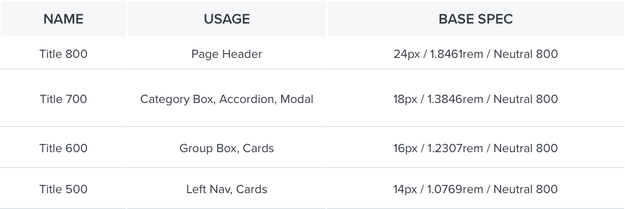
Examples
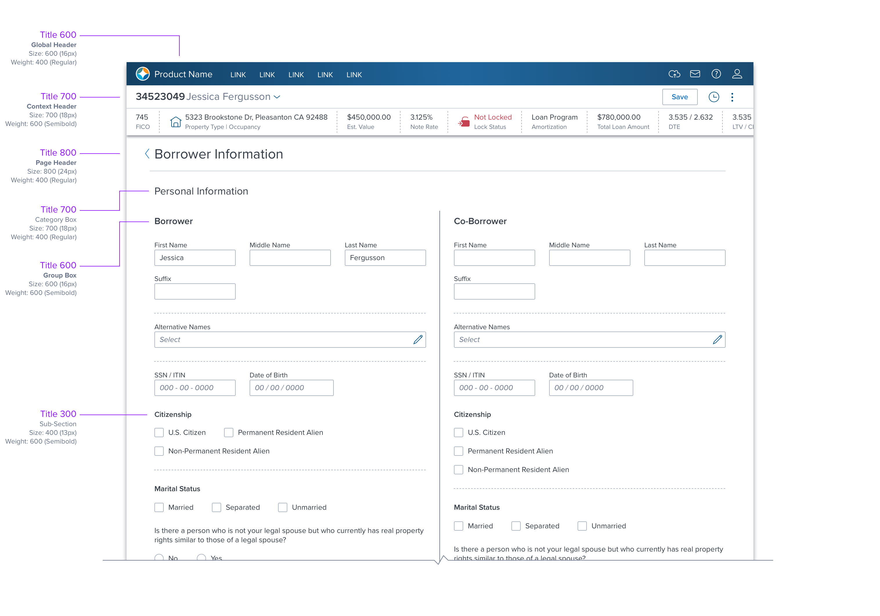
Sub-Title
Used if block(s) of content within a page need to be distinguished from one another. For example, sections within a form, or multiple paragraphs that are related but should also be distinct.

Example: See 'Title' (above)
Label
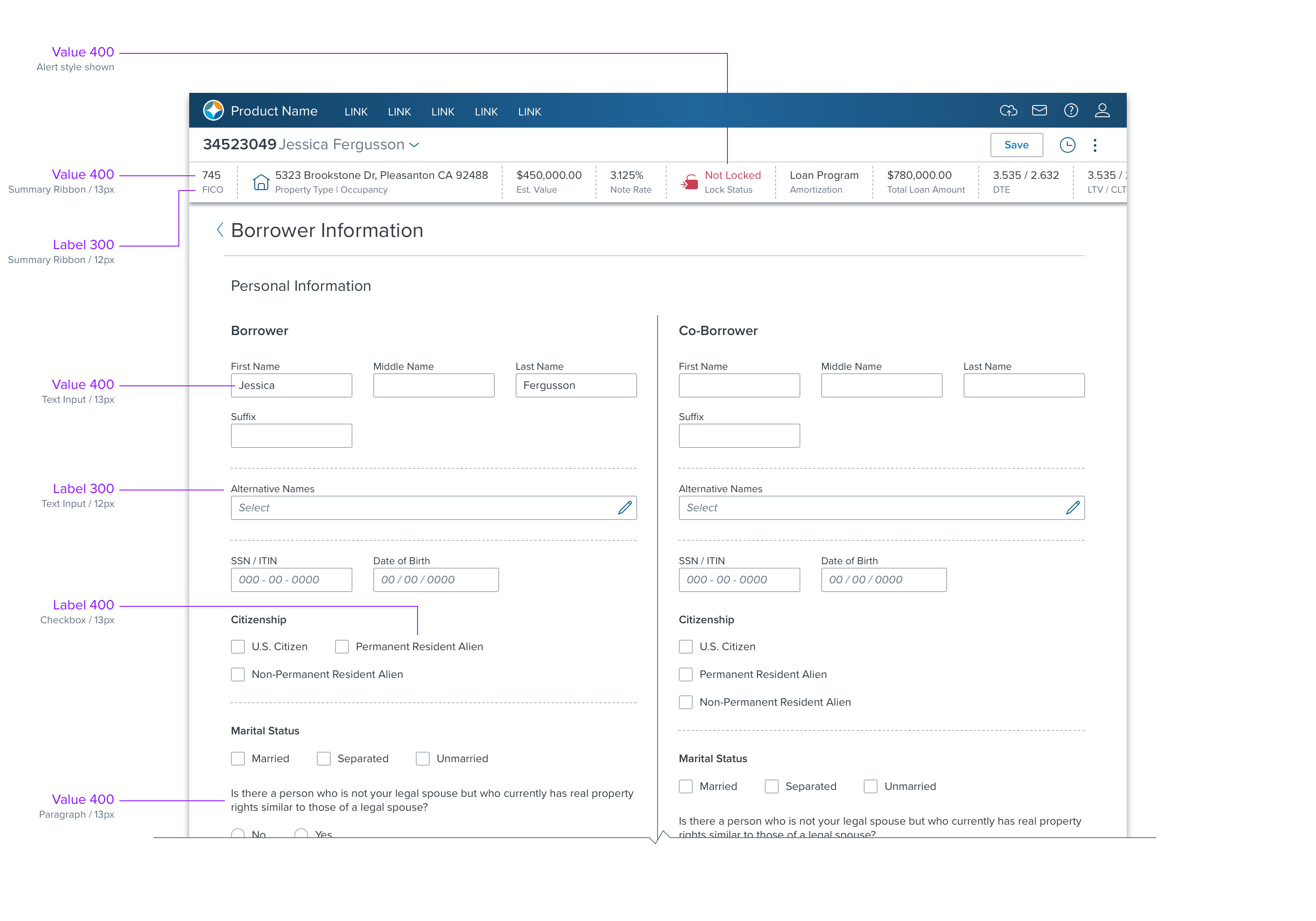
Commonly used to identify controls such as Radio Buttons and Input Fields, but also read-only values, such as label-value pairs in the loan summary ribbon. Label includes three styles with all-capitalized characters used in the Tab component.

Examples
Value
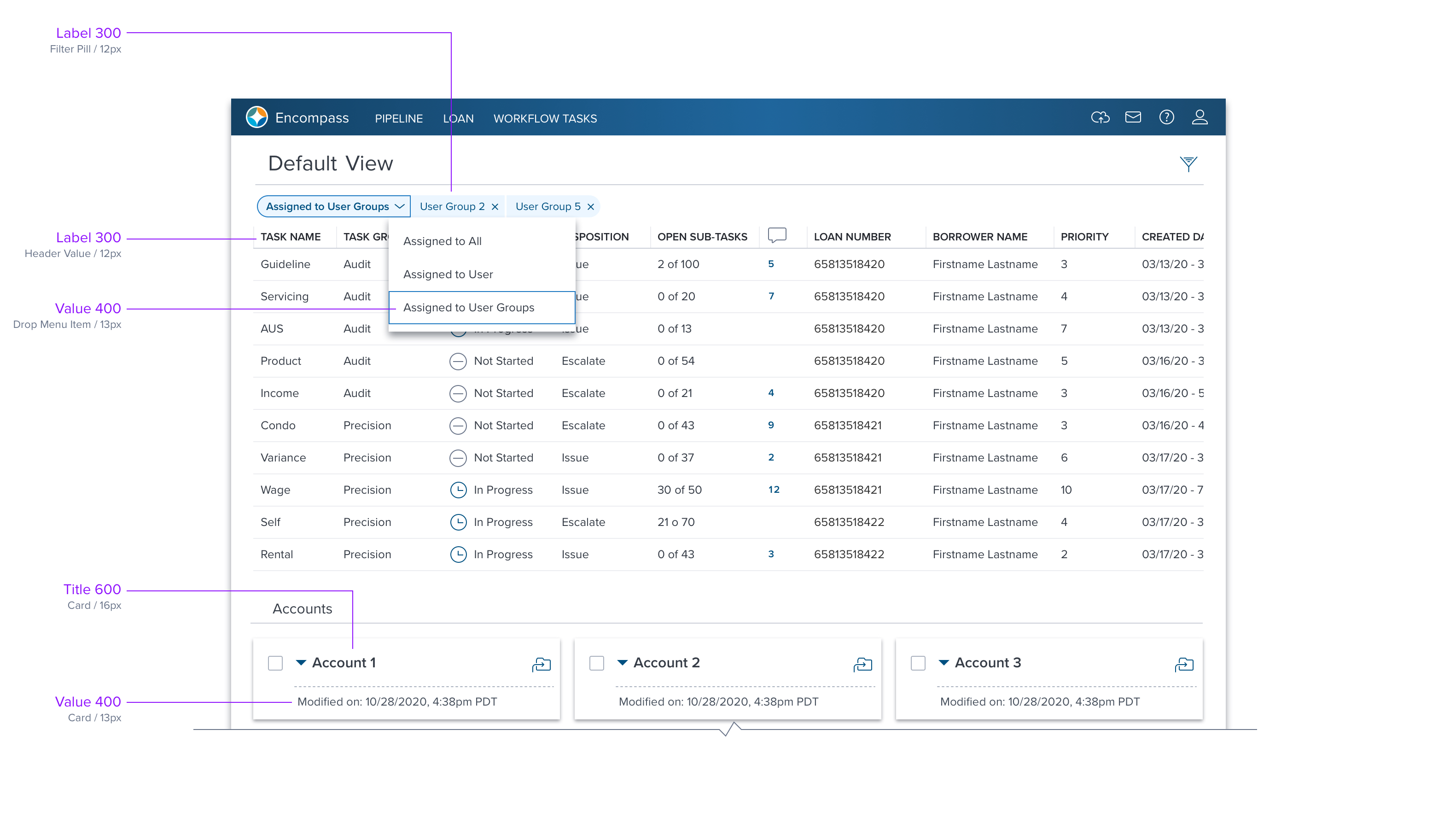
Used for nearly all display of alpha-numeric information such as the value in an input control, navigations, data grid cell values, select lists in menus, paragraph text, etc.

Examples
Hyperlink
Used when a text string includes a hyperlink to another location within the app, or outside the app.

Example (pending)
Microtext
Used for Tool Tips, Help Messages that appear on controls and legal mandatories such as copyright and declarations.

Examples

Weight
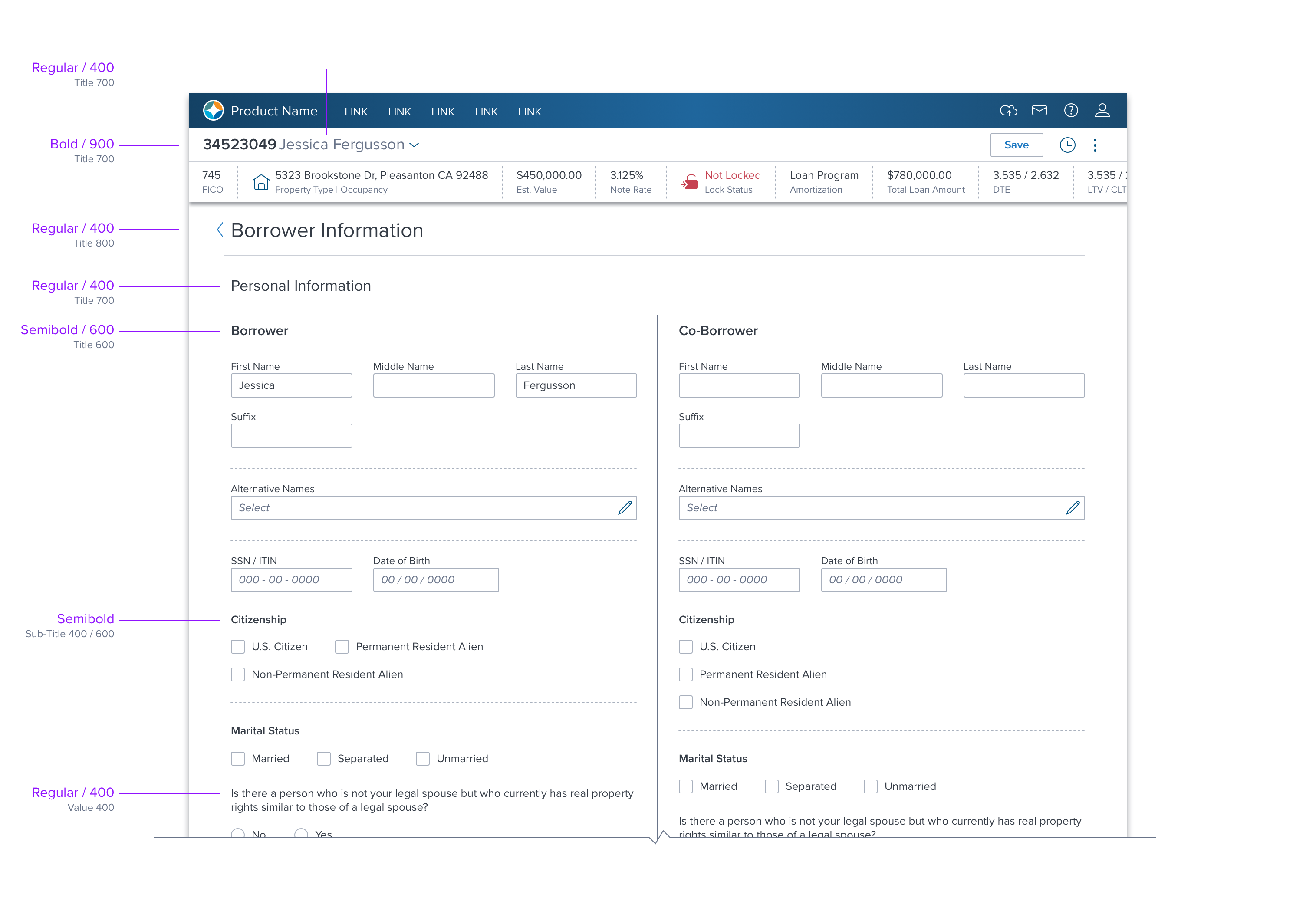
Use to create various levels of emphasis. Dim Sum includes Regular, Semibold and Bold weights.
| Name | Primary Use | Base Spec |
|---|---|---|
| 400 | Label, Title, Sub-Title, Paragraph | Regular |
| 600 | Sub-Title-, Text Button, Tab | Semibold |
| 900 | Bold |
Examples
Color
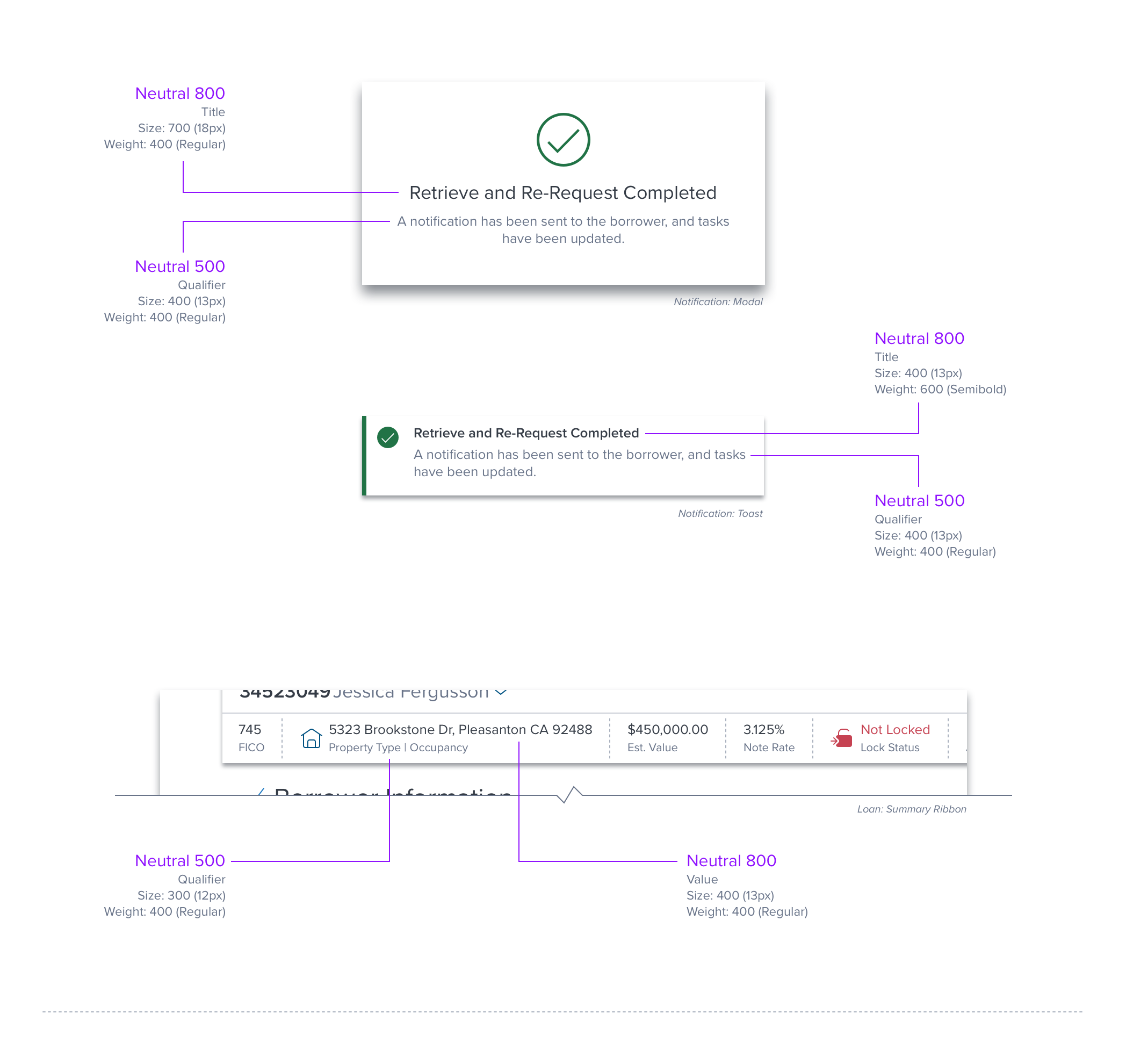
In most cases, typography is set to neutral 800 for maximum readability and accessibility. However, other colors are used to indicate status, state or hierarchy.
- State/Status: Standard color rules apply, such as Success 900 when the system completes an event. Please refer to Color for complete details. (example: toast)
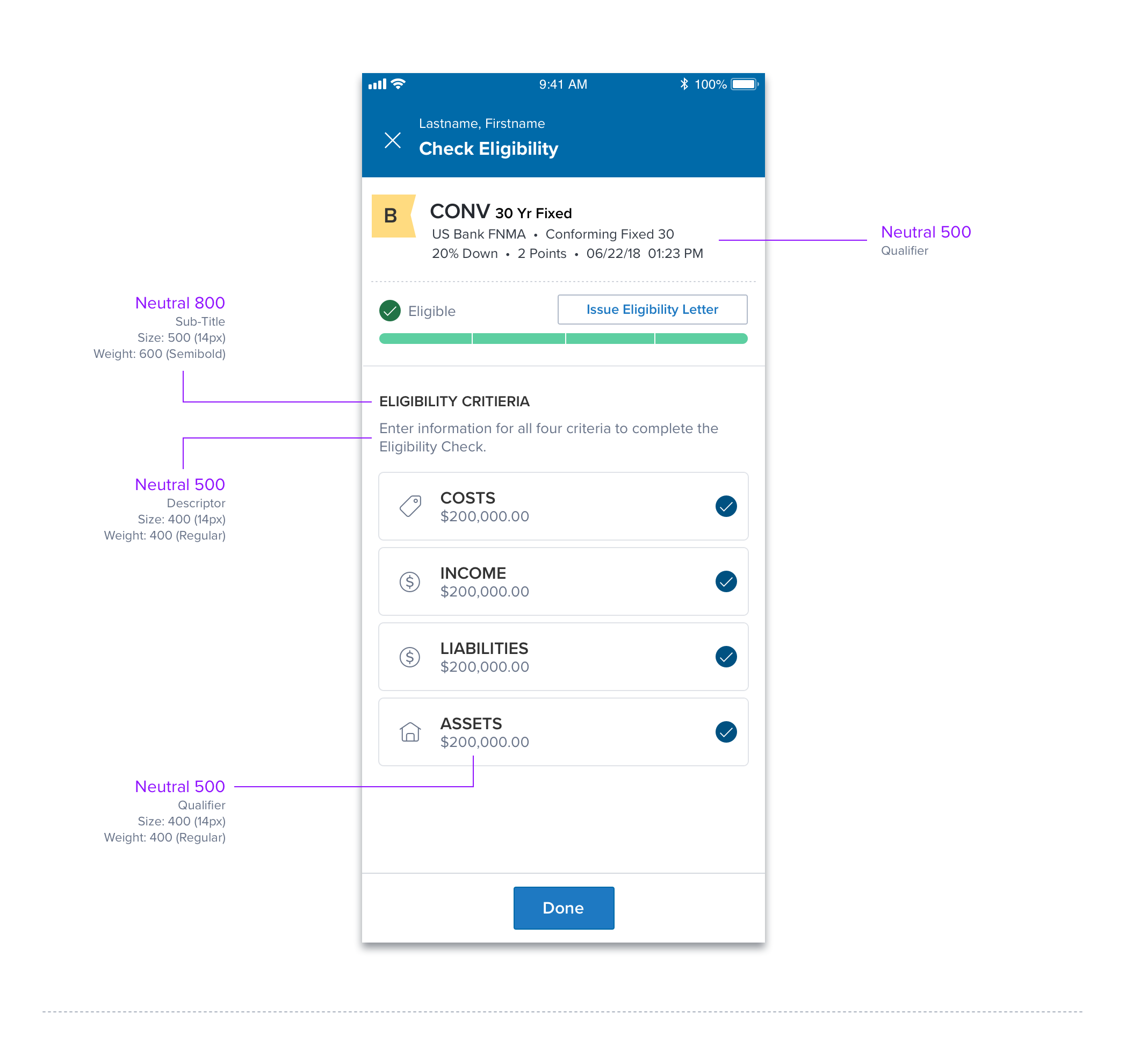
- Hierarchy or Emphasis: Neutral 800 is used for nearly all text, but Neutral 500 can be used for non-critical or supporting text, such as a descriptor or qualifier. (example: toast)
Examples
Line Height
Pending
Text Layout
Wrapping
Longer words with character counts exceeding the width of its container will wrap to the next line within that container. This ensures the text remains within the bounds of the container, avoiding issues like overflow or disrupted layout.
EXAMPLES

References
[UX Spec] (https://dimsum-usage-guidelines.readme.io/reference/typography)
Storybook
Updated over 1 year ago
