Radio Buttons

Usage
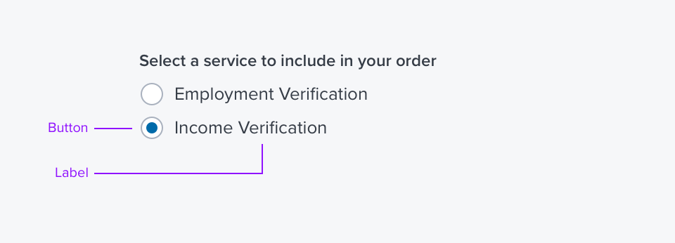
Radio buttons are always used in a group, in sets of two or more to show and select a set of explicit choices.
- Radio Buttons are the preferred display of options when space allows. Their value over a drop menu is that user can see all of the options before having to click an element.
- Radio Buttons are typically aligned in a vertical list. Horizontal lists should be used only when vertical space must be prioritized.
Alternatives
- Toggle - use when there are two states, both should be explicitly stated, in horizontal spaces, such as toolbars. Do not use to select items.
- Drop Menu - use when there are several states or selectable items, only one can be selected, and space is at a premium,
- Checkbox -only to be used if both states can be understood by label.
Placement & Layout
Checkboxes and Radio Buttons are often laid out in groups. See the Forms Layout Pattern for ways they can be grouped and laid out relative to other Input Fields.
- See Forms For using Radio Butons to trigger opening a box/panel for additional information on selection.
Labels
Labels should imply two distinct and opposite states of a function (basically 'on/off'). They should be as succinct as possible to limit character count and screen clutter.
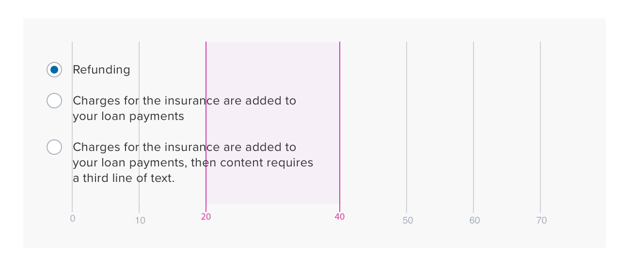
Characters per line should fall between 20 and 40 for optimal readability.

Options
Default Selected/None Selected
- Default Selected - One of the choices is selected when user comes to page, modal, etc.
- If order of options permits it is preferable that the first item be the default.
- None Selected - None of the choices is selected. Used to force a user selection.
References
Updated over 3 years ago
