Tabs

New 6.27.21
Overview
Tabs provide single-click navigation across a set of pages or forms. They provide access to groups of content that are related and are at the same level of hierarchy. Tabs offer efficient use of vertical space and quick navigation between groups of content.
Usage
- Use Tabs when there are two or more groups of loosely related content on a page that don't need to be viewed at the same time for comparison.
- Use tabs when the content in one or more sections is very long.
- Labels should be succinct. Fewer words are better.
- Don’t use Tabs when it is likely that there will be more tabs than space to display them. In such a case an accordion is a better approach.
- Tabs should not wrap, i.e. There should not be multiple rows of tabs. Other solutions should be looked at if tabs will wrap at standard screen resolutions.
Alternatives
- Accordion - Use when groups of content need to be viewed together for comparison.
- Card Array - Use when groups of content need to be viewed together for comparison.
- Wizard - Use to present groups of related content in a fixed order, and provide assistance.
- Expandable D-Grid - Use when you want to encourage the user to see each section or when the sections are very closely related - e.g. a single form.
- Left-nav - Use when the content has long names, maybe hierarchal or is likely to cause the tabs to horizontally scroll.
Types
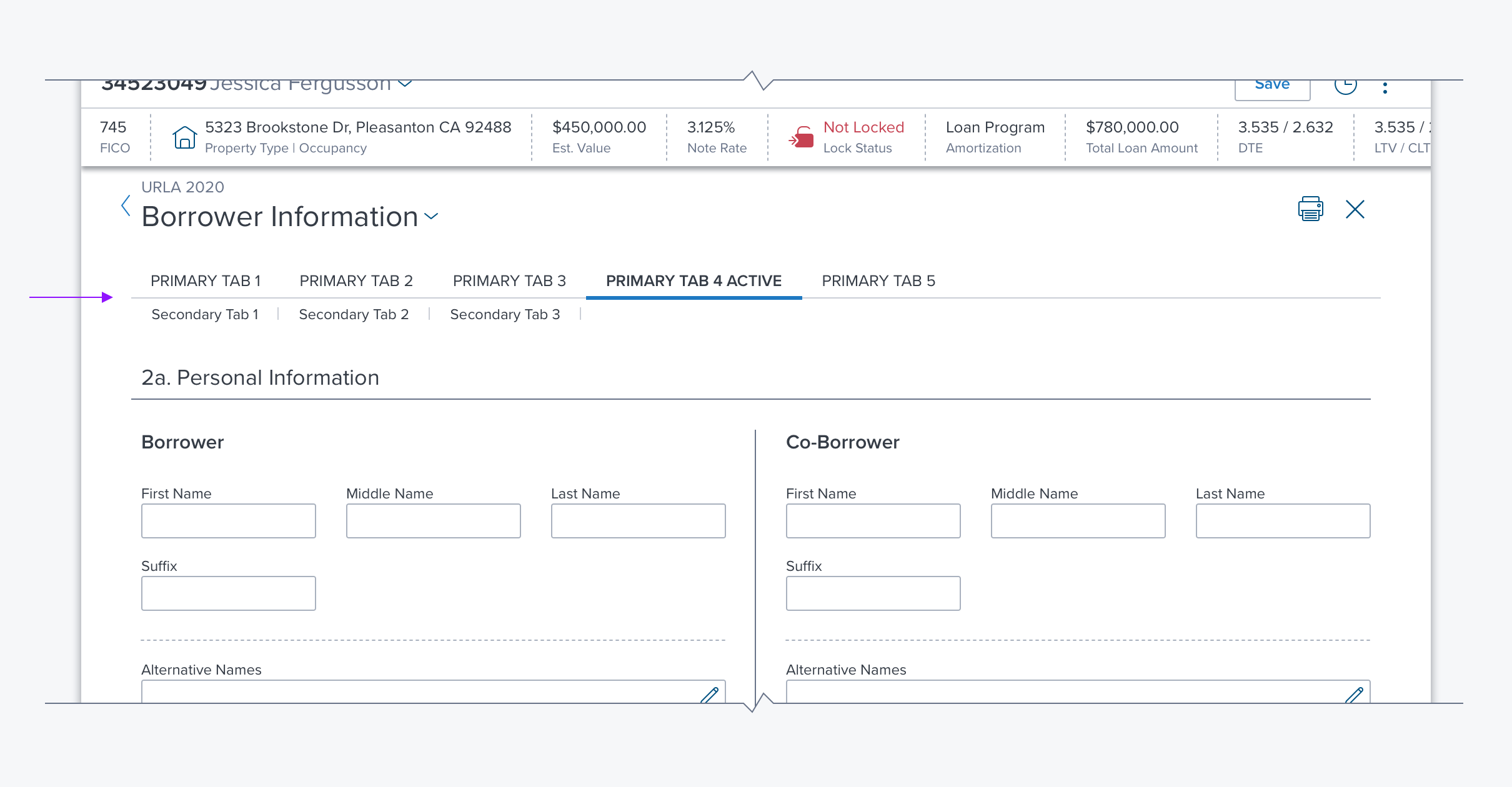
- Primary Tabs are larger and more visually prominent. In most cases, these should be used when Tabs are called for, e.g. after a Page Header.
- Secondary Tabs are intended for situations that call for nested tabs, where the contents of a primary tab can be further subdivided. In some special cases, the secondary tab can be used in isolation when a visually less prominent tab set is called for.
Options
- Carousel - Intended primarily for mobile applications this provides a solution for including more tabs than can be viewed at one time.
- Required Indication - This is a property in the API that can be used to indicate that content on a tab is required.
- Tab Overflow Menu - Should automatically appear when the window is resized to hide any of the tabs.
References
Updated over 3 years ago
