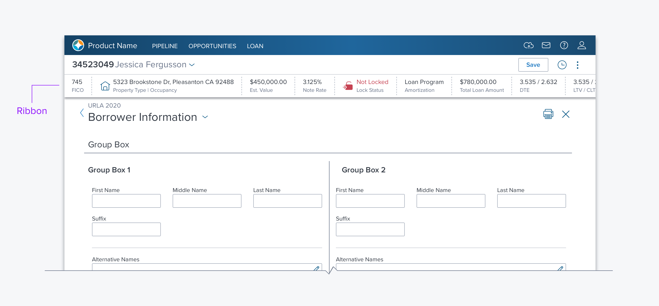
Ribbon

Usage
The Ribbon is a horizontal container used to present an object overview and current status as well as provide access to high-level actions. The Ribbon can be thought of as a mini Dashboard providing data and actions that gives the user contextual information about the content below.
- Typically the data is visually prioritized over the labels, both because it is assumed the user reads a Ribbon often as well as much of the data is often statuses the user is looking for. Thus Data is bolder and first - left or top, and labels are less prominent.
- Example - Overview of a loan under the Global Header on Loan pages in Encompass Web.
Alternatives
- Text > Label-Value - Use when there are only a few items needed.
- Notifications > Banner - Use for transient information and timely data such as warnings, alerts or messages.
- Popover > Tooltip - Use for contextual transient information within content region and when buttons or actions are not needed.
Options
The Ribbon has no options of its own. It is built out of Text Label-Value, Buttons Icons and Separators, etc.
Standard Content
- Label/Value Pairs
- Label/Icon Pairs
- Vertical Separators - Solid/Dashed
- Progress Indicators
Custom Content
Since the ribbon is a special form of Box it can contain other kinds of content including progress indicators, buttons, toggles, and combo boxes as needed to provide information and appropriate actions.
Updated over 3 years ago
