Dropdown Menu v2

Overview
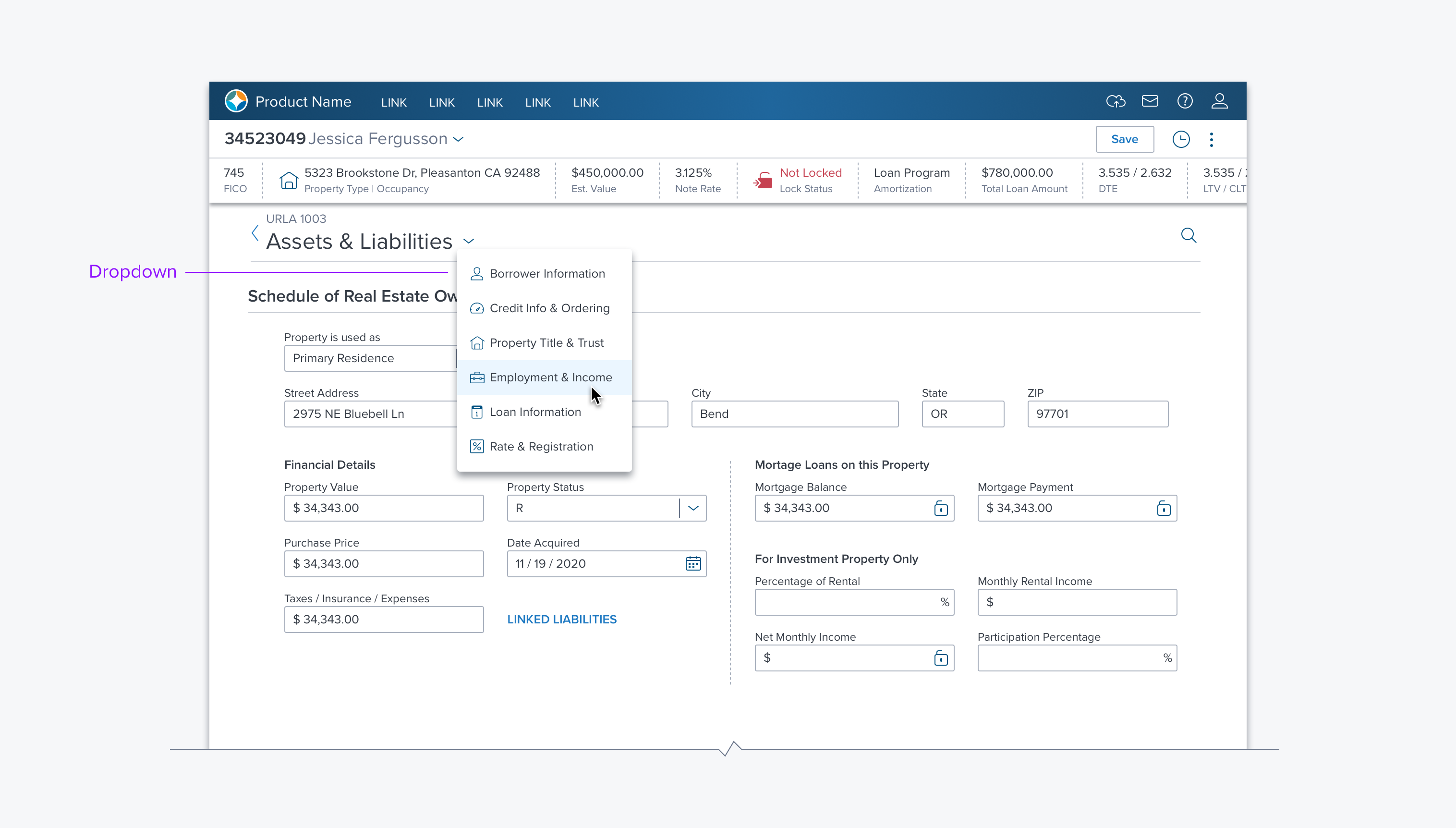
A Dropdown is a component that provides actions and/or selections. It consists of a trigger and a container that is rendered when the user interacts with the trigger.
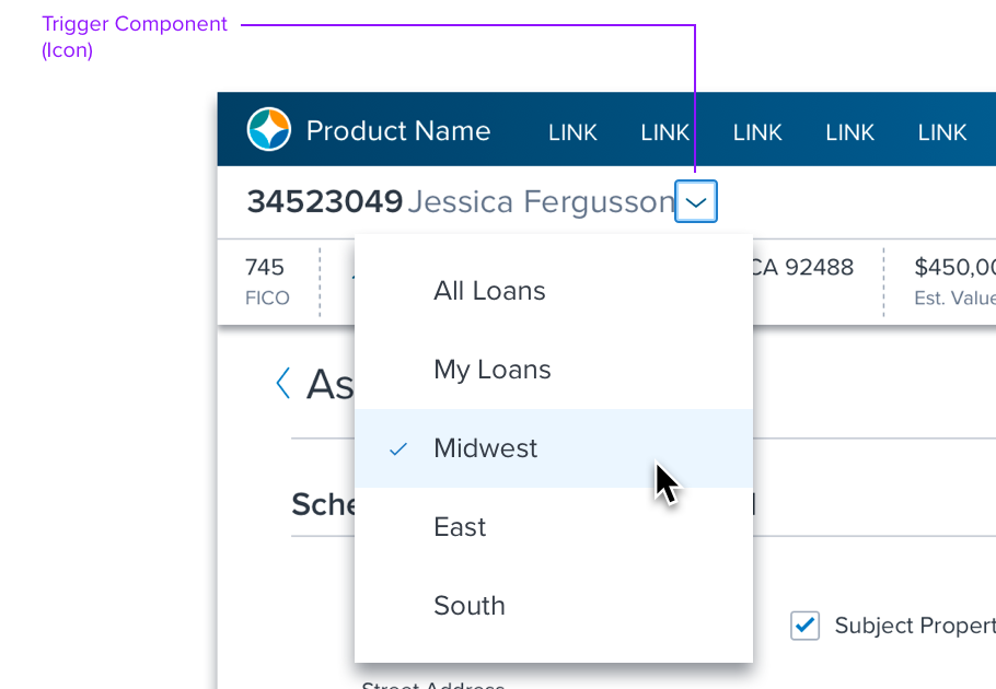
- Triggers may include Icon buttons, Menu Labels, or the icon that is part of another control, (eg. Combo Box icon, etc.).
- The dropdown container can display any kind of content, with Menu content being the default.
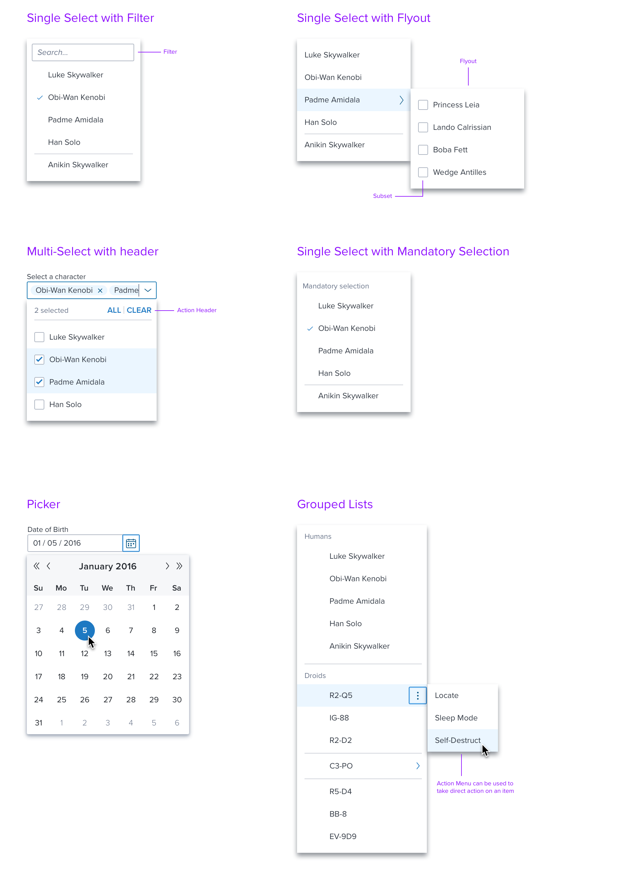
- Controls like the Date Picker have their own proscribed content.
- Dropdowns can also have other content such as a color picker, or something like a light modal with combined actions.
- The container is styled with a drop shadow and always appears in front of other content.
Usage
Use Dropdown to provide:
- Selection with custom triggers or content different than those provided.
- Selection in a smaller space than Shuttles, Lists, and DataGrids.
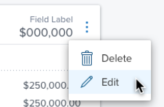
- Additional actions to a page, section of a page, or components like DataGrid, List, Accordion, etc.
Selection Example

Views on DataGrid
Actions Example

Additional actions menu (vertical ellipsis) on a toolbar or row of a DataGrid.
Alternatives
- List - Use a list if there is room on the page to show the content and it is used frequently.
- Shuttle - Use a shuttle if the user selecting items and they are in a hierarchy or are heterogeneous.
- Card Array - Use a card array if space permits and the user needs different information per item to decide what to select.
- DataGrid - Use a dGrid if space permits and the user needs the same pieces of information per item to make choices.
Type & Examples
Although triggers and contents can vary there is only one type of drop menu.
The following types of content can be used in a Dropdown:
- Menu - provides basic single and multiple selection, keyboard shortcuts and, optionally cascading menus.
- List - provides basic single and multiple selection and, optionally Add, Delete, Editing, Reordering and an Action menu per item.
- Card - provides complex layout where each item can have any controls that Menu and List can provide, arranged with additional text, icons, and images.
Examples include the following:

fig. Examples
References
Visual and Interaction spec
Accessibility and Keyboard Access (Pending)
Updated almost 3 years ago
