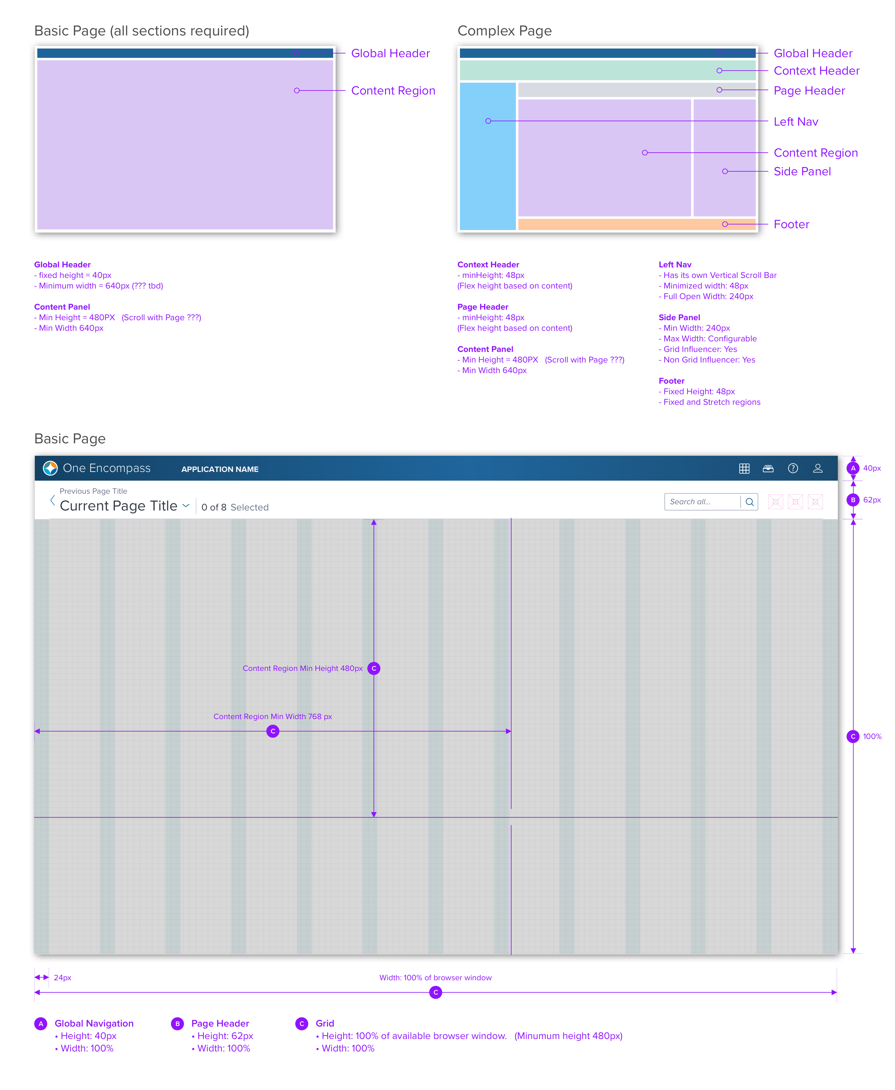
Page Structure - Desktop
Layout patterns provide frameworks for designing pages that ensure consistency across the application and helps increase the velocity of both design and development of applications for our platform.

All pages have at minimum two regions: Global Header and Content Region. The only exception to this is the log in page. By default the global and page headers are sticky and should not scroll out of view, only the content region scrolls.
Page Regions
Headers
Global Header
This is a required region that is made up of three sections: product branding, currently active application, and toolbar. The toolbar includes an application switcher which is used to switch between applications.
Context Header
Left Navigation
Page Contents
Page Header
The page header provides context and a mechanism for navigating within the application. This includes a page title and view selector, summary data, and a toolbar to facilitate page level actions.
There is a small subset of situations where a Page Header is not required: Landing Pages (See Insights): In these cases, the context is already established by the Navigation Region, and therefore a page Title is redundant and unnecessary.
Content Region
In its most basic form this region contains a single grid where content is presented. Use Basic page when the hierarchy of the content is flat or minimal and does not require structure to manage the relationship between content elements.
Footer
Side Panels
Button Considerations
Modal vs Modeless
Responsive Layout
Updated almost 3 years ago
