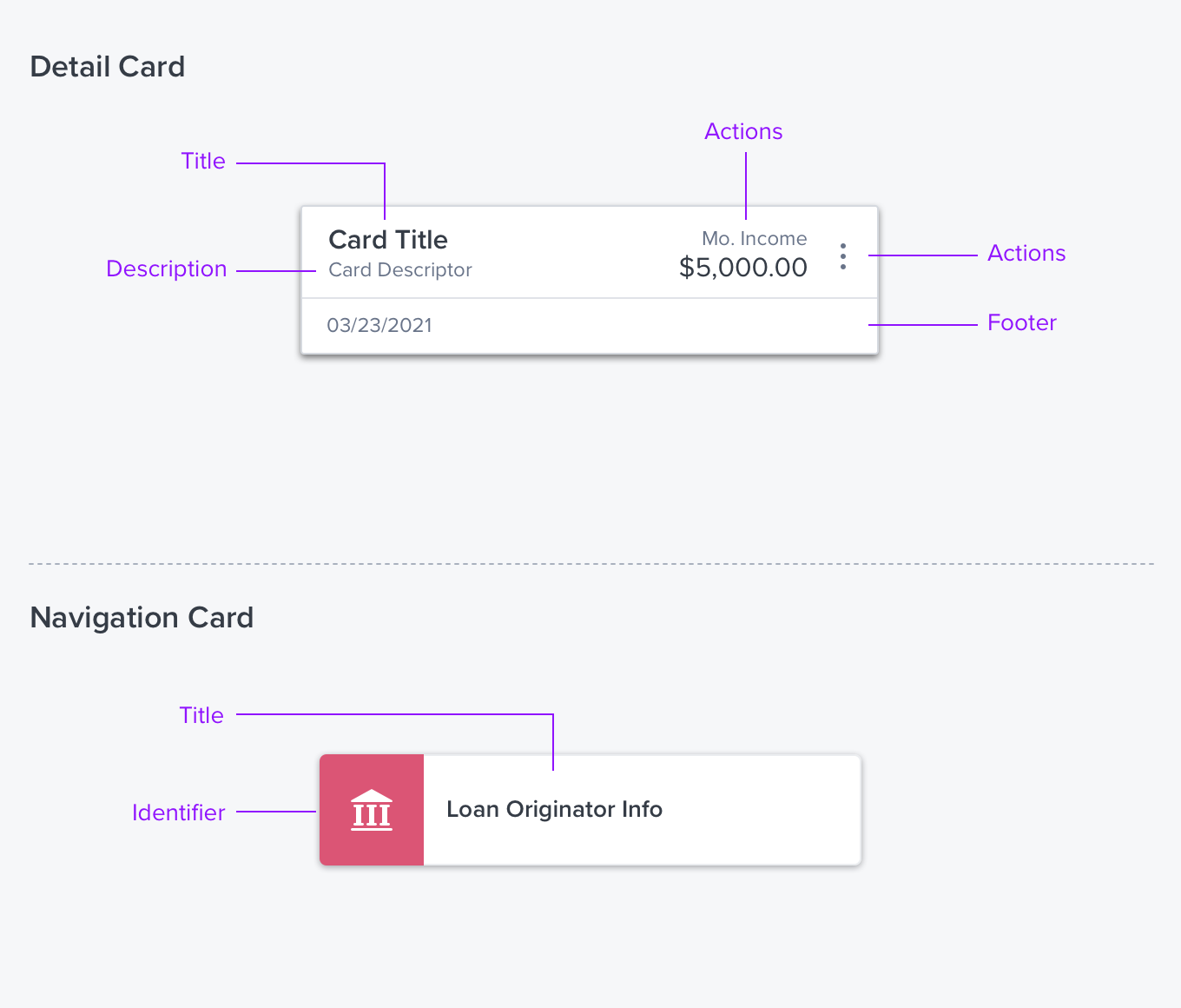
Card

Overview
A Card is a content container that provides for the flexible layout of information and actions. Cards can contain varying fonts and colors, icons, infographics, and images as well as a mix of horizontal and vertical items. A Card is particularly useful when displaying status or other information that can be represented graphically, eg. gauge, chart, graph.
Usage
Use cards to style arrays of objects, menus, and lists to provide additional information that allows for efficient comparison and prioritization.
- Cards can make comparisons easier by providing additional information per item in a visual hierarchy via richly styled layout.
- A Card should not be used stand-alone. They are the main construct in Card Array, and can also be used as Menu items, List items or in DataTable cells.
- Cards support progressive disclosure in three ways: by expanding in place, opening a details panel, or a full page.
- Use when a workflow includes several nested workflows that need to be easily understood and navigated.
Types
Basic
A basic container with a drop shadow.
##Trigger
When this card is clicked an event is triggered.
Alternatives
- Group Box - For Page Layout layout use a Group Box.
Options
- Header with actions
- Expandable
- Select/Deselect
References
D-Card. (layout)
Updated over 3 years ago
