Modal Dialog
A Modal Dialog provides information on a critical issue and requires a user acknowledgment or action to progress with a task. It appears in front of all other windows, blocking all other interaction, until the user chooses from the options provided.
Related Guidelines
Notifications, Modal Panel, Popover
Usage
Modal Dialogs forcibly interrupt the user’s workflow they should only be used for:
- Critical information that requires a specific user task, decision, or acknowledgement
- Errors that block an app’s normal operation
Information Modal Dialog
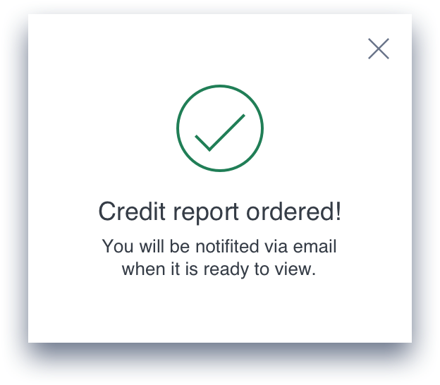
An Information Modal is triggered when the system needs to inform the user a something important has happened, or give feedback on an action or task requested by the user.
Content
- Contains a statement.
- The primary message gives the user the context of the statement
- A secondary message gives additional details on the impact of the statement.
Actions
- The only action available to the user is to dismiss the dialog using the 'X' button.
Decision Modal Dialog
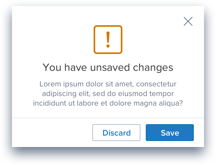
The Decision dialog is triggered when the system requires a choice from a user to move forward with a task.
Content
- Contains a decision a user is required to make.
- The primary message gives the user the context of the decision.
- A secondary message is gives details on the decision, typically a brief summary of the result of each choice.
Actions
- Provides a minimum of two choices, the action or dismiss 'X'. Dismiss will close the dialog and allow the user to go back to their previous state.
- Typically there should be no more than three buttons, a binary choice and dismiss.
- The button label should never repeat the button label that opened this modal
Modal Dialog Styles
Styles
Modal Dialog content can be formatted a number of ways according to type and usage. They can contain:
- A primary Message
- A secondary message
- An icon
- A footer containing one or more action buttons
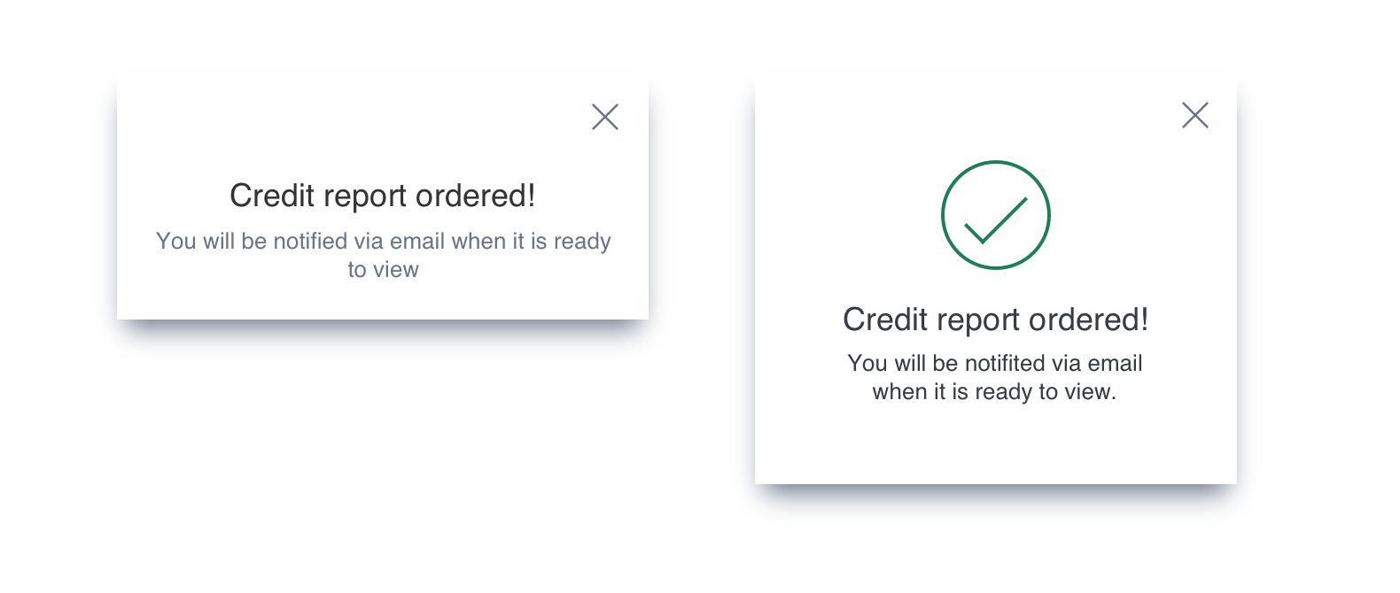
An Information Modal Dialog showing the optional Icon
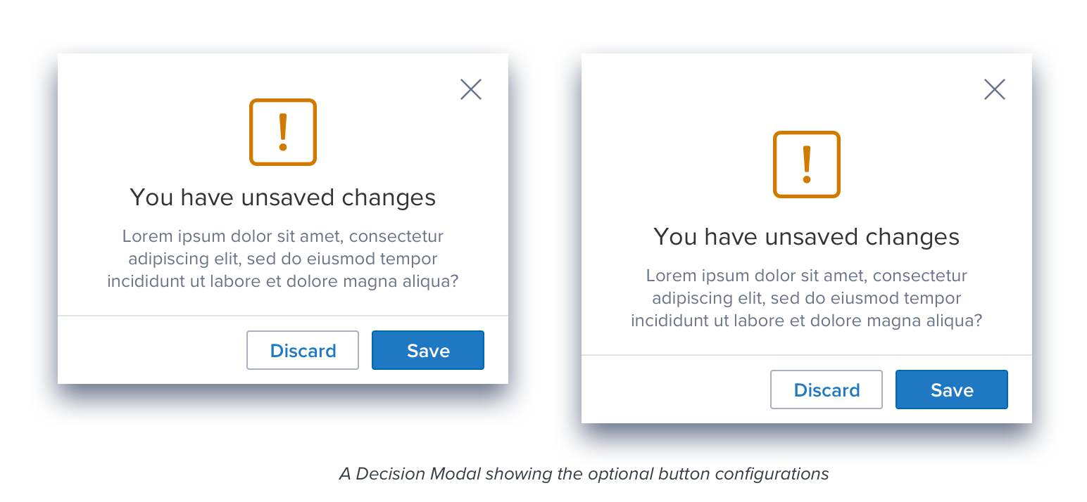
A Decision Modal Dialog showing the optional button configurations
Modal Dialog Content
Content
- If the primary message is sufficient a secondary message is not required.
- A secondary message is used for additional information that would be useful to the user.
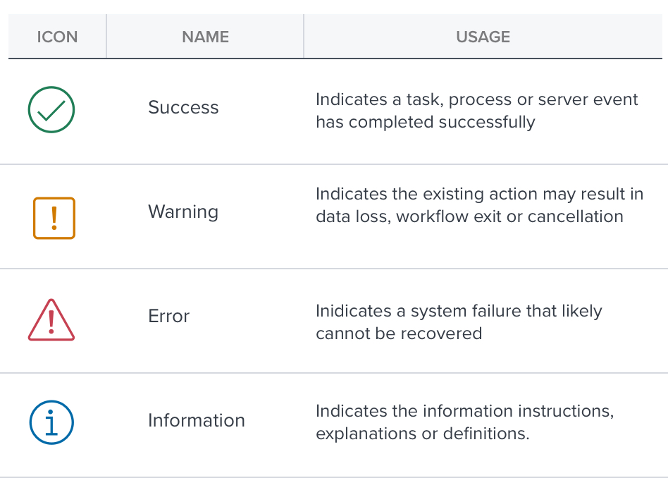
- The graphic is optional, but recommended. Its purpose is to allow the user to quickly understand the nature of the message.
A graphic is used on Information and Decision Dialogs to differentiate between the four sub-categories: Success, Warning, Error, and Information.
Updated 8 months ago
