Combo Boxes
Overview
The combo box is an input control that combines a text box with a drop menu that opens automatically when the control has focus.
Usage
- A Combo Box is typically part of a form, but can also be used in toolbars.
- Although the control supports lists up to 10,000 items, it is best applied when list of of items is less than 30 and can be ordered intuitively. If the list is longer than 30 consider using a multi column selection dialog with better filtering capabilities.
Alternatives
- Radio Buttons - Use radio buttons when space permits and only one item can be selected from a set of fewer than 5 items.
- Checkboxes - Use checkboxes for multi-selection from a set of fewer then 5 items.
- Modal Spec - Use a Modal when the number of items to select from will be large (approx. 10+) and columns of extra information would help selection.
- Shuttle – Use a Shuttle when Items to be selected will be coming from a large list (approx. 50+) or a list that has a hierarchy and user will appreciate seeing the selection set before committing.
Placement & Layout
See the Forms Layout Pattern for ways Combo Boxes can be laid out relative to other Input Fields.
Types
There are two types; Basic and Free Solo. Both allow the user to filter and select one or more items from a list of choices. The free solo type adds the ability to enter a choice not contained in the list.
Basic
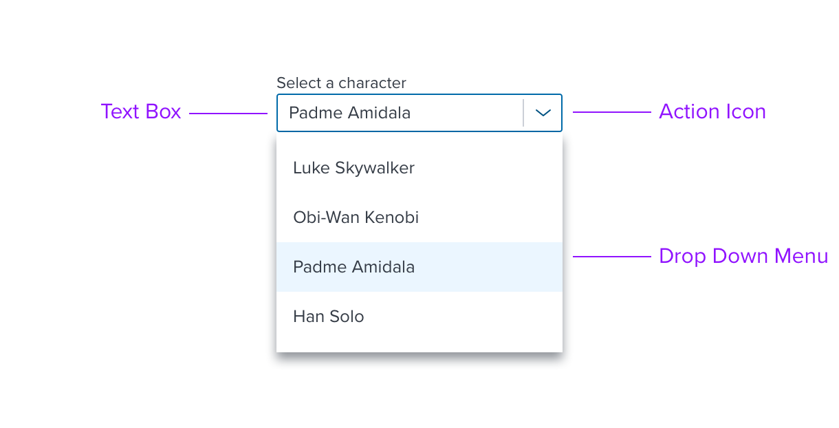
The basic type allows the user to filter and select a single item, displayed as plain text, from a pre determined list of choices.

fig-1. Basic Combo Box, with single select shown
Free Solo
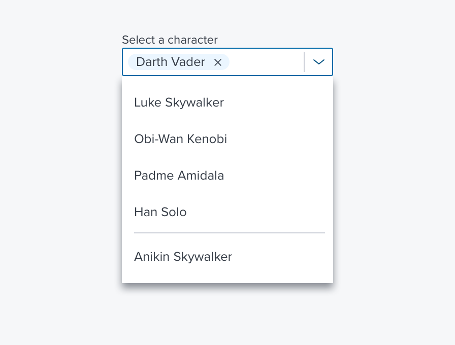
The free solo type adds the ability to enter one or more values not contained in the list of choices. With free solo all choices are represented as pills that can be navigated and individually removed.

fig-2. Free Solo Combo Box, with single select shown
Options
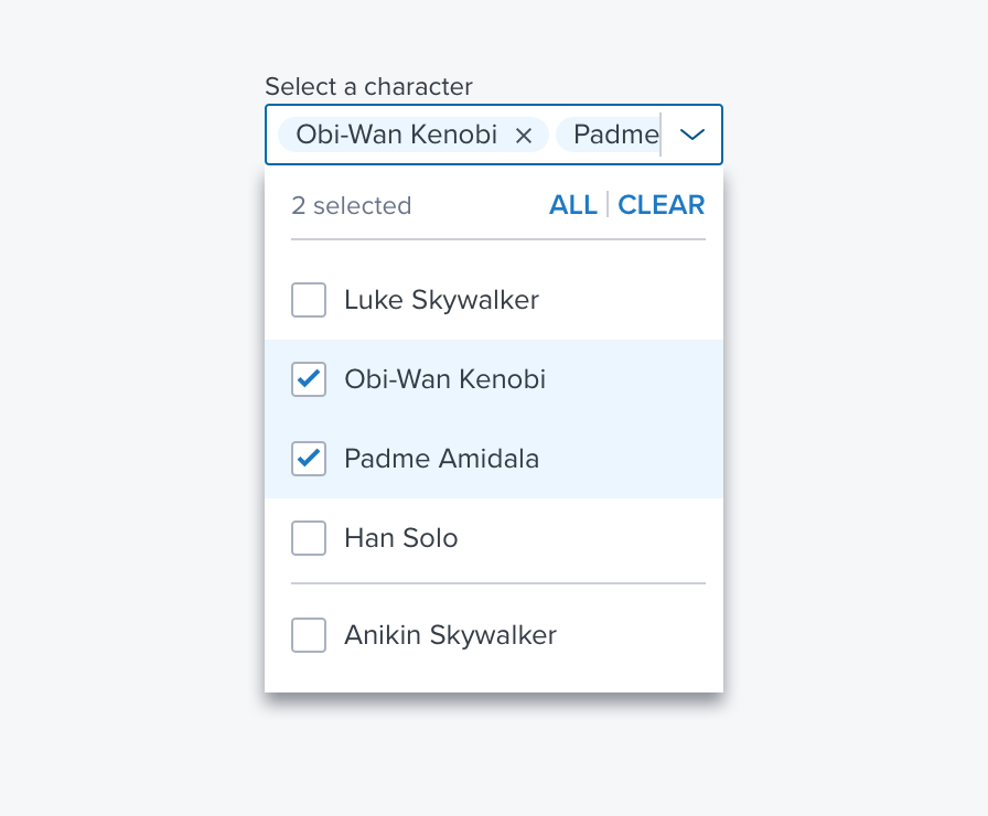
- Header - The header option includes a selection counter on the left.
- Multi-Select - When multi select is enabled the user can select more than single item. The header text buttons allow the user to select all or clear the current selections with a single click. If no items are selected the "Clear" is disabled, If all items are selected the "All" button is disabled.

fig 3. Free Solo with header and multi select shown
References
Updated almost 3 years ago
