Page Header

Usage
The Page Header provides context for the users' understanding of what they are expected to do on a page. It is essential and as such, every page should include one with few exceptions such as the login page.
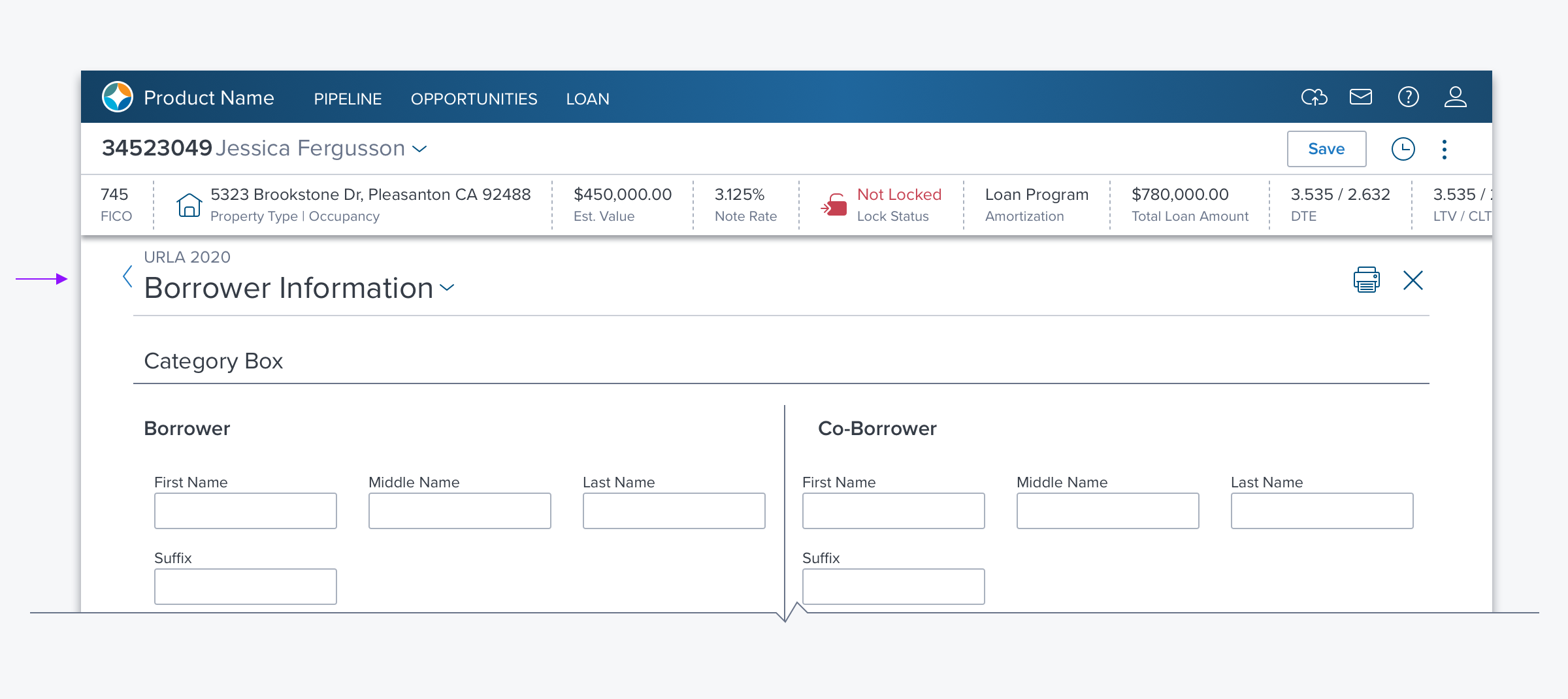
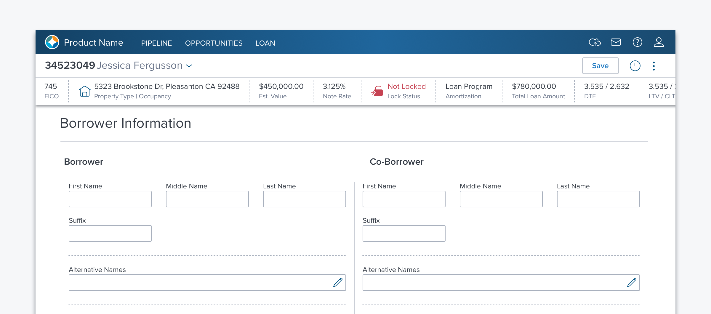
- A title is placed on the left, with optional additional contextual information, while an optional Toolbar on the right allows contextual action to be taken on the page.
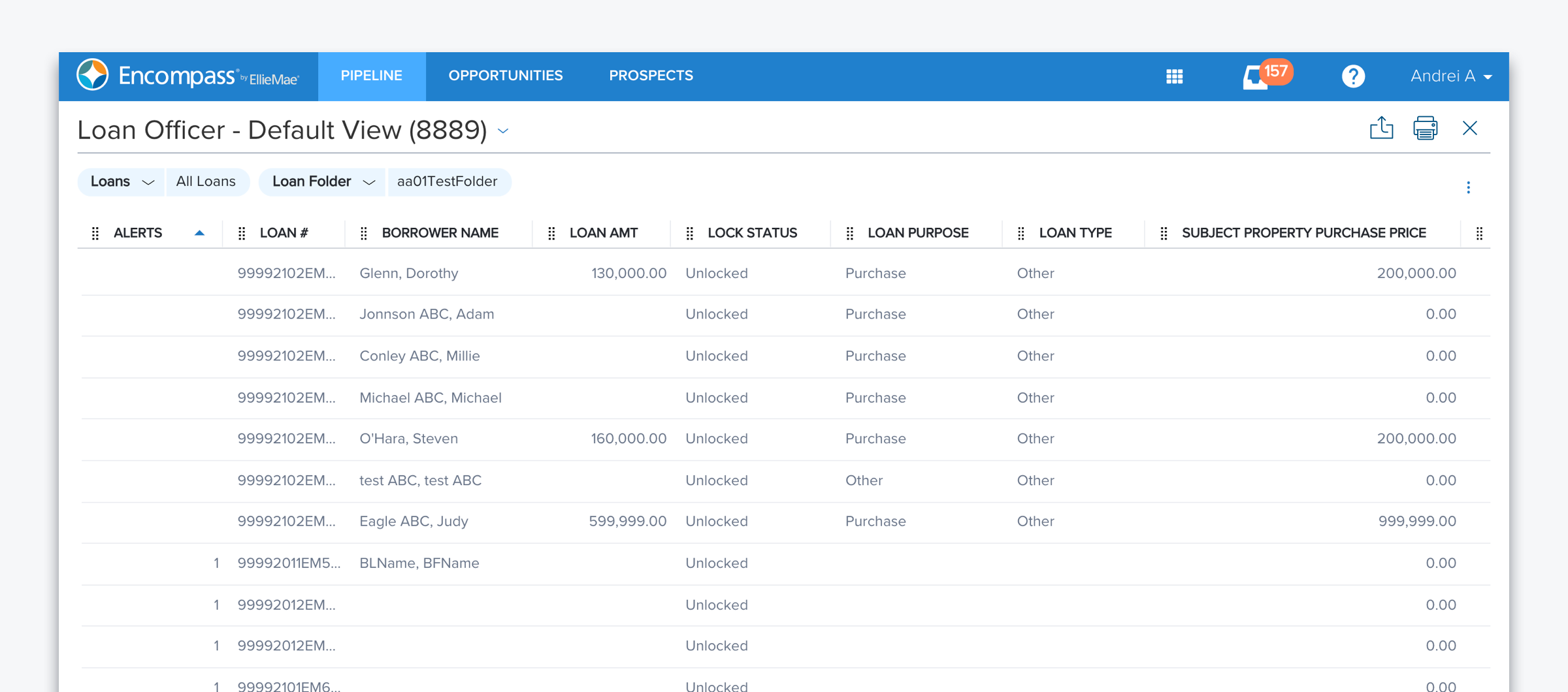
- If there is only one Section/Box on the page - for example, if the page only contains a dGrid, Accordion or Card Array - the Page Header also serves as the Section Header, and no component level Section/Box header is required.
Alternatives
There are no alternates for Page Header
Types
Basic
Use basic when nothing more than page identification is needed.

Complex
Provides a range of functionality it needed, which may include: changing between page views, making selections, taking action on page content or moving between multiple pages of a workflow.

Options
- Breadcrumb: ON/OFF - A hyperlink to the previous page placed directly above the Title.
- View Manager ON/OFF - A dropdown menu with a list of existing views and the ability to create, delete or set a view as default. Additionally, the number of objects in a view is displayed.
- Count: ON/OFF - When the Page Header is also presenting as a Section Header over a dataset
- Toolbar: ON/OFF - A set of controls placed to the right to allow the user to take action within the page, such as adding an item to a list or exporting a report.
- Bottom Border: ON/OFF - The bottom border is used to create visual separation between the page header and the page content.
- An additional border will be displayed if a component directly below the page header also includes a border. This creates too much visual noise so turn off the bottom border of the page header.
References
Updated over 3 years ago
