Global Practices
Focus Order
The default keyboard navigation order must be logical and intuitive. The tab order should follow the page, micro app, or component's visual flow hierarchy: left to right, top to bottom – e.g., header, nav, main (content), aside (if present), and footer. Navigation order and (and reading order for screen readers) is determined by the web page's source code.
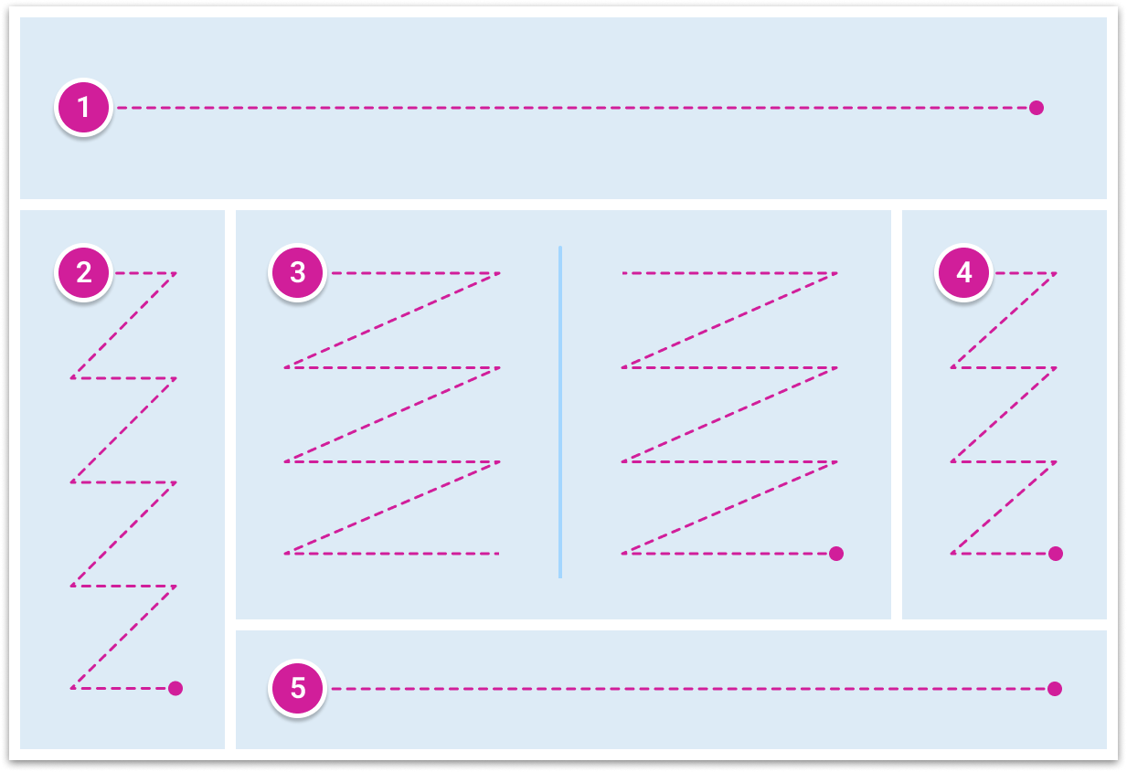
1. header, 2. nav, 3. main, 4. aside, 5. footer.
References:
Keyboard Functions
Keyboard accessibility enables users who rely on or prefer using a keyboard for navigation. All interactive content and elements should include the most common keyboard functions. Consider these:
| Key | Function |
|---|---|
| Tab | navigate to next focusable element |
| Shift+Tab | navigate to previous focusable element |
| Arrows | navigate between related radio buttons, menu items, or widget items |
| Enter | activate a link, button, or submits a form |
| Space | activate a button or toggle |
| Escape | close menu, modal dialog, and other popover variations. Focus should return to the focusable element used to invoke the widget to open. |
| Home | navigate to the beginning in a list |
| End | navigate to the end in the list |
| Printable Characters | when a character is typed, focus moves to the item that starts with the typed character OR if multiple characters are typed, focus moves to the item with a name that has the string of characters matching the typed characters. |
References:
Color Contrast
Different user types with a spectrum of vision impairments may not be able to recognize information that is only conveyed using color. Using multiple methods of communicating information for our users is recommended.
Contrast Ratios
All text, images of text, and icons should provide sufficient contrast, so all users have the best possible experience. Contrast is displayed as a ratio that ranges from 1:1 to 21:1. Consider these W3C contrast ratio guidelines:
- Standard text and images of text that is 14 pt or below must meet a 4.5:1 contrast ratio.
- Large text that is 14 pt and bold or larger than 18 pt must meet a 3:1 contrast ratio.
- Contrast ratios apply to text, non-text content, and images of text.
- Non-text content must meet a 3:1 contrast ratio.
References:
Screen Reader
Screen readers convert digital text into synthesized speech. They empower users to hear content announced while navigating with the keyboard. The order of announcement will vary across different browsers and screen readers. To ensure consistent operability across different screen readers or browsers, assistive technology uses standardized callouts that should be considered that include, but not limited to: role, label, name, state and properties, value, and description to communicate user interface elements.
References:
- Screen Reader Tools
- WCAG Navigable: Understanding Guideline 2.4
- WebAIM Designing for Screen Reader Compatibility
WAI-ARIA and Landmarks
ARIA (Accessible Rich Internet Application) roles convey the intent or meaning of an element to assistive technology. This helps users navigate when they cannot see the layout and provides further context about different functionalities.
Landmark roles identify regions in a page (e.g., header, nav, main, aside, and footer). Screen reader users can mention a list of the landmarks on a page to quickly orient themselves with the essential content. They can jump directly to a landmark without listening to the entire page from top to bottom.
References:
Responsive Layout
Flexible design
Use relative units like ems, rems, percentages, or named font sizes when specifying font sizes and text container dimensions. Avoid setting explicit width and height values in pixels whenever you can, and opt for relative units. When it's not feasible to use relative units, consider using minimum width and height values instead.
Strategic sizing
It's generally recommended to define margins and padding in pixels (px). Scaling margins and padding with font size can decrease available space without significantly enhancing text readability. In most cases, margins and paddings have little direct impact on meeting the criteria's intent.
Resize Text and Reflow Guidelines

Responsive/Adaptive design
Responsive or adaptive design is typically associated with ensuring compatibility across various devices and screen sizes. However, the same principles can effectively address the 1.4.4 and 1.4.10 criteria. Instead of creating breakpoints solely based on screen size, we can also incorporate font size considerations into the equation. This approach may not always be necessary but can be viewed as an initial tool in the UX designer's toolkit, to be used when required.
References:
Updated 5 months ago