Notifications
Notifications allow a user to be appraised of system status.
Different notification mechanisms are available based on the urgency of the message and the level of a user required response. A notification is categorized by message type and form factor.
Message types:
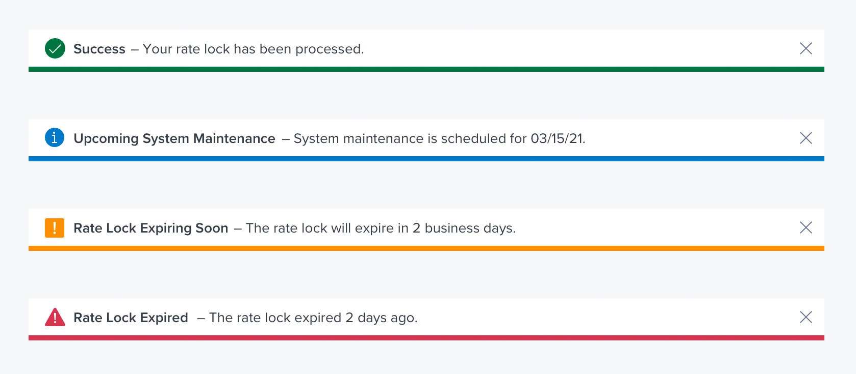
- Info
- Success
- Warning
- Error
Notification form factors:
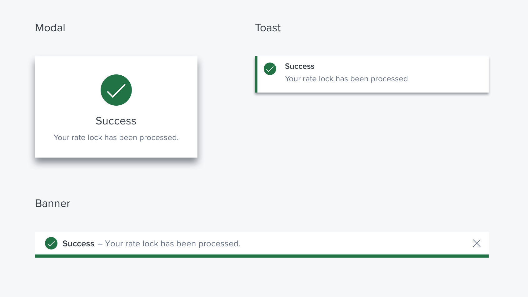
- Toast
- Banner
- Modal

Non Urgent - Toast
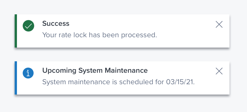
A Toast is used for low-level success or informational messaging. It provides additional information to the user and may not be tied to their current action or task.
Non disruptive - It does not require any user acknowledgment and will self dismiss after 5 seconds
Non actionable - It can only be viewed, and cannot include buttons for decisions or links

It is typically located in the upper-right corner of the viewport (but can be placed in any corner)
Requires Acknowledgment - Banner
Banners can be used for low, or medium, success, information, warning, or error messages.
Minimally disruptive - A banner will stay visible until dismissed by the user. The user is not required to dismiss the a banner to continue with a task, but it will remain pinned to the top until dismissed by the user.
Actionable - They do not provide direct user input, but they can include a link to other locations within the app/system.

Requires Immediate Action - Modal Dialog
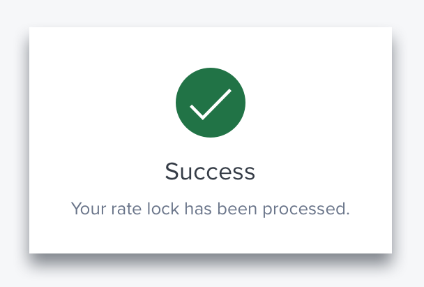
A modal dialog is used for medium and high-level notifications when the system requires a user to acknowledge or make a decision in order to continue.
Highly Disruptive - A Modal Dialog will stay visible until dismissed by the user. The user is required make a choice before they can continue with a task.
Action Required - Modal dialogs utilize a footer bar containing buttons to present actions and choices to the user.

Updated over 1 year ago
