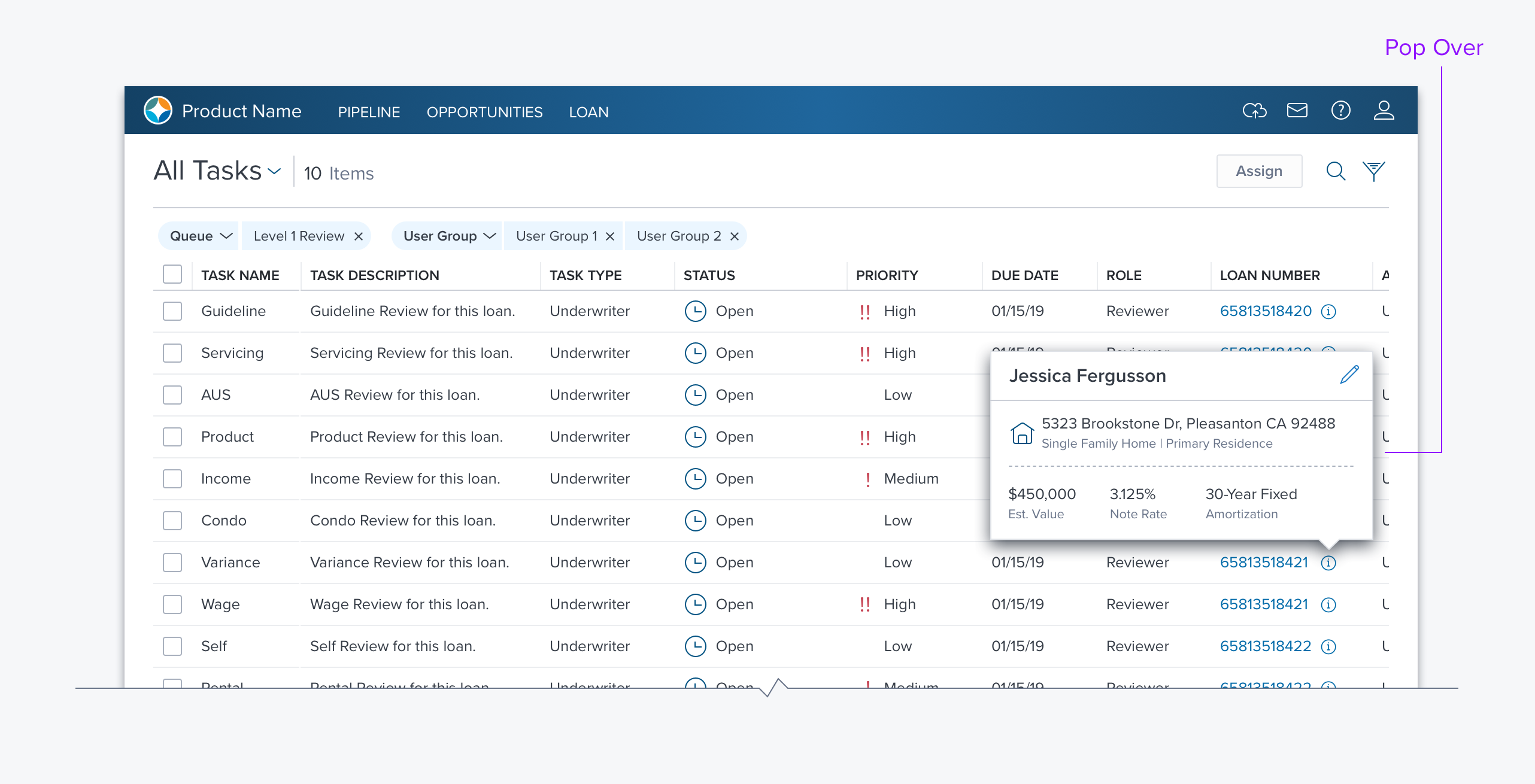
Popover

Usage
A Popover provides additional information or minor action for a page element.
- Defaults to opening down but will automatically open towards the interior of page/modal.
- Do not open popovers from a popover.
Alternatives
- Tooltip - Use to just provide information on a page element
- Drop Menu - Use if action will be taken.
- Icon or button leading to a modal or another page - Use if the content will be more than a field. While the Popover keeps the user on the page there may be accessibility or save model issues.
Types
Tooltip
A Popover that appears on hover, by default, whose content is just text or an icon on the left and simple text that.
Signpost
A Popover that appears on click, by default, whose content can be a list of items or more complex container that can include any of: a Group Boxe, content including menus and editable fields, a footer with buttons - Save/Cancel most likely.
Options
- onHover/onClick - By default Popovers use onClick and Tooltips use onHover.
- External Reference - Used when a popover is presented over one object but triggered from another object.
- Text, Text with Icon, Small Form (resizable, sub-menu, button)
Updated over 3 years ago
