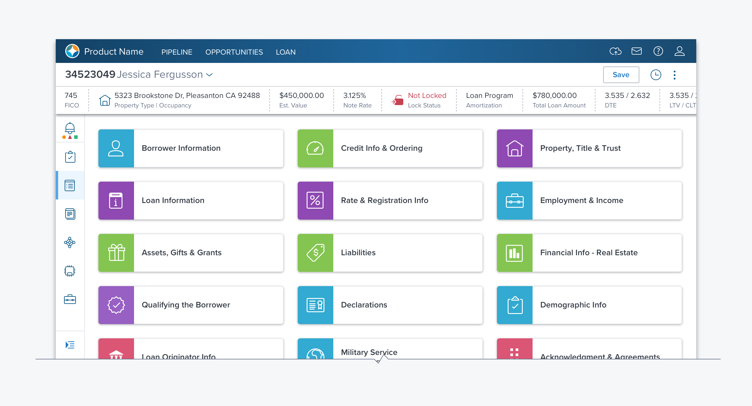
Card Array

Usage
The Card Array provides a grid view of Cards (see Card). A Card Array can be used to create an application launch pad, a Dashboard, or to present a set of options for comparison. It is particularly useful when there are a small enough number of objects (cards) to browse.
- The Card Array can stand on its own as a full page layout or be nested in an accordion, a side panel, or a dialog.
- Each card should provide an overview, that when clicked leads to details, usually on a side panel, another page, or expanding in place.
- Each card can provide different information and actions based on the object or information that it represents.
Alternatives
- Accordion - Use for a fixed number of items where user may not need to see details of each item at the same time, so collapsing them to reduce scrolling is preferable.
- DataTable – Use for larger data sets where efficient space utilization is needed. s where the user needs to decide to act on objects using the same information (columns).
- Tabs - Use for a fixed number of sections with large bodies of information that can be chosen just by name.
- Left Navigation - Use for a large number of items that may be hierarchal.
Options
While Card Arrays do not come with the following as part of the component, they are appropriate controls that can be added to make the Card Array efficient and useful.
- Sort Dropmenu - Sort cards by various criteria including Status, Created Date, Modified Date, Title, etc.
- Search Box - Find a card with specific criteria.
- Filter Bar - Display cards matching filter criteria.
References
D-CardNavigation. (layout or nav)
D-CardArray. (layout)
Updated over 3 years ago
