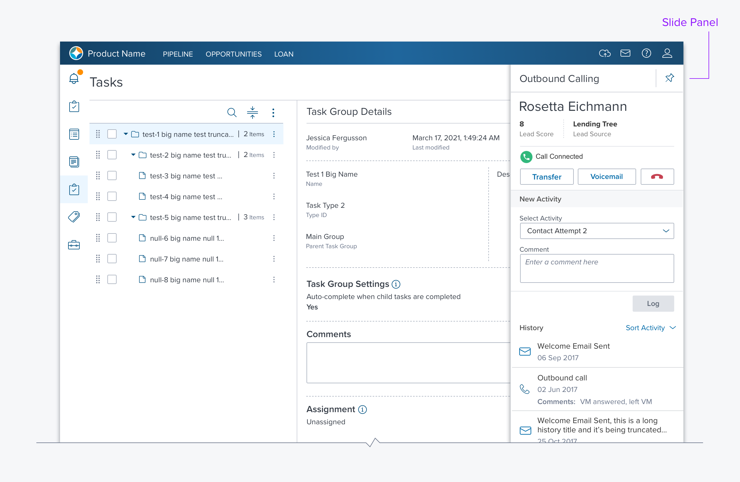
Side Panel

Usage
The side panel is essentially an empty container, positioned along the right side, that opens with a smooth animation. It can be used to present details, actions, or tools without leaving the page. It is typically a child of the current selection in the main content region. It provides a consistent location, in context, for modal and/or related interactions.
Alternatives
- Expandable DataGrid - An alternative that maximizes horizontal real estate but requires more clicks to open and close each line item.
- Modal Dialogs - An alternative that forces the user to focus and act on its content. It maintains context minimally. It should only be used when the content can adhere to the modal dialog guidelines.
- Separate details page - For large amounts of information, especially when another dGrid needs to be viewed, clicking on data element takes user to another page. The page title should include a breadcrumb that provides context for the new page.
Options
-
Modal / Non-Modal A Modal side panel acts like a pinned dialog box. All page content that is not on the side panel should be masked. The user must take an action (e.g. OK, Cancel) to excuse the side panel and regain access to the page contents.
-
Width The side panel width is fixed but configurable by the application developer. When used within a modal dialog the side panel can be full width which provides for secondary operations (aka. "modal in modal”)
-
Header The header is optional and contains a title and toolbar
-
Footer The footer is used when the side panel contains a modal dialog or non modal content that requires buttons (e.g. “Save” “Cancel”).
Updated over 1 year ago
