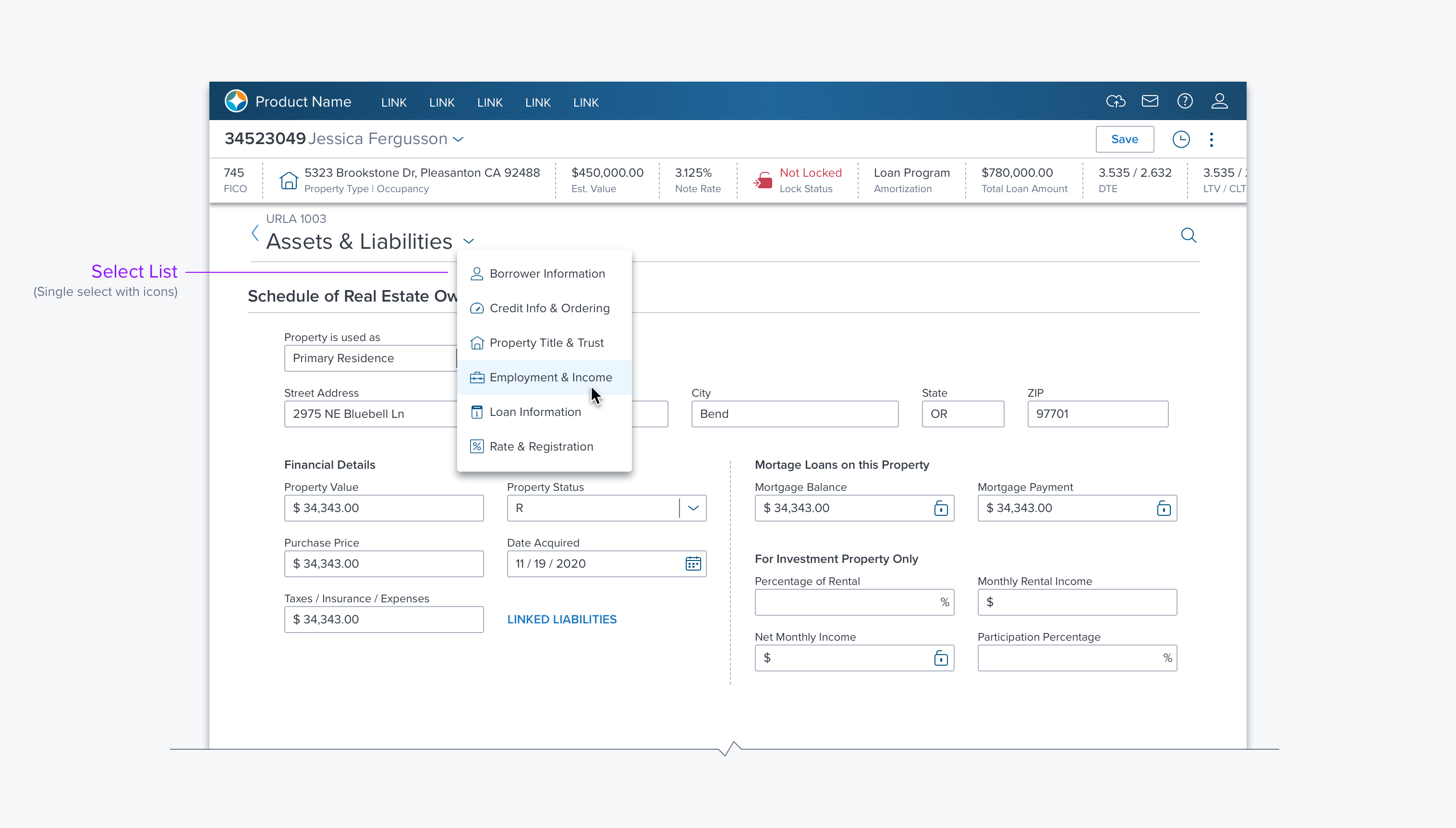
List

Usage
A List provides the user with a way to select sets of simple to grouped items on a page and in various containers.
- The items in a List can be Text, Icons, Cards, Radio Buttons, Check Boxes.
- A List can be placed in a page, dialog, side panel, group box or drop menu.
- Complex lists can be made by combining different types into a single list.
Alternatives
- DataGrid - use when multiple columns of information are needed for the user to select or act.
Types
Single Select
Multi-Select
Grouping
Ordered/Unordered/Set (States, Countries)
Types (BW)
Both List and Menu include a range of Types and Options. Please see Dropdown (Types & Examples) for a complete reference.
Options
- Grouping - Separates sets of items in the menu with a separator bar.
- With/Without labels - Adds a label above the set under any other groups separator bar.
- Icons - An icon to the right of the label to help differentiate them from each other.
- Search - A Search Box at the top of the list. For finding items in long lists or when user will know the item they are looking for: ie searching states or countries.
- Reorder - Gripper icon on the far left that allows user to reorder each item relative to its peers.
- Management - Icons in and around the list to Add/Rename/Duplicate/Delete
- Actions - Menu for additional actions user can take against each item.
Updated over 3 years ago
