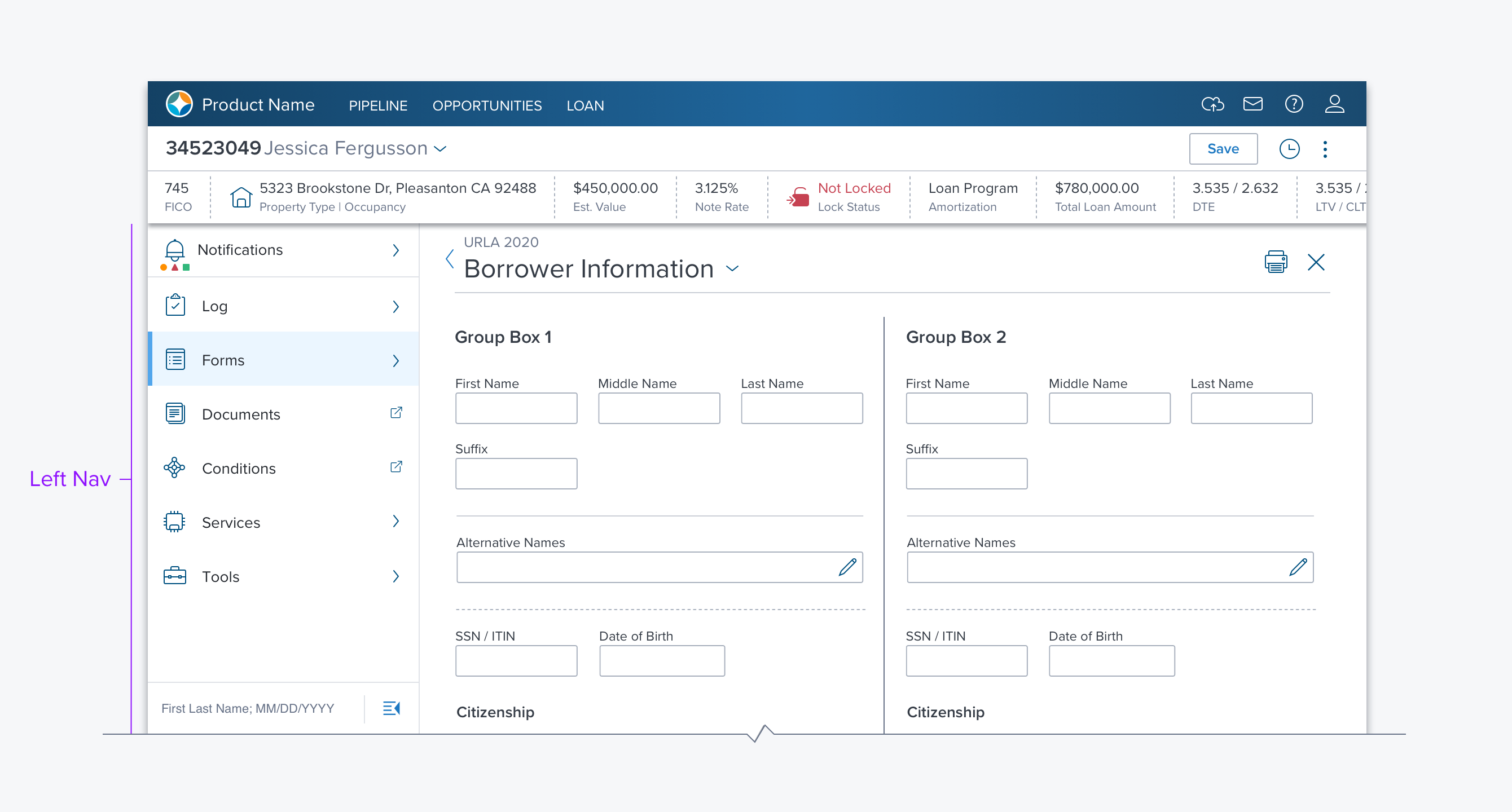
Left Navigation

Overview
The Left Nav is a side panel that provides navigation via either a flat list or a hierarchy. It can be minimized to a narrow vertical list of icons (side rail) and supports always open (sticky) and only open on access (transient) behavior. It is always located to the left of the main content region.
Usage
Use as the primary application navigation, especially when there are five or more areas being navigated between.
- Use when there is a hierarchical relationship in the structure.
- Use for object navigation when there are 7 or more areas being navigated between. (e.g. Encompass Web uses the Left Nav within a loan to navigate between loan parts, notifications, and tools.)
Alternatives
- Tabs in the Global Header - When there are 5-7 or fewer areas to provide access to and they are not hierarchal.
- Treeview - Use in Group Boxes, or Dialogs, for navigating and accessing hierarchal data.
Options
-
Collapsable: Open/Close Toggle - When enabled, this option provides a control at the bottom to collapse the Left Nav into a Side Rail. The user can then open it by clicking the button again or by hovering on the side rail to open it like a menu. In the latter case, the left nav will close when the user moves the cursor off the left nav.
-
There are three panel types (differentiated by how they behave):
- Expand in place - This expands a container while maintaining context, children are displayed under the parent clicked on. (e.g. Encompass Web uses this for Forms, Services, and Tools).
- Open in place - This opens the parent into the left nav taking over the entire left nav region. The user navigates "back" to return to the top-level navigation. (e.g. Encompass Web uses this to display all Notifications)
- Open into the content region - This highlights the parent container but all its content is displayed in the main content region of the page. (Encompass Web uses this for Documents and Conditions)
Updated over 3 years ago
