Color
Intro
Color helps our product experiences be intuitive, delightful and on-brand. As a design element, color is used to in 3 primary ways: Hierarchy, Feedback and Accessibility.
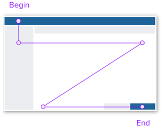
Hierarchy
A visual path to begin and complete a workflow.

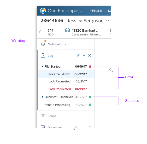
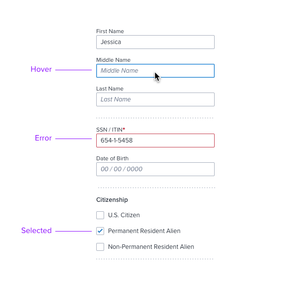
Feedback
Visual treatments that indicate system status, interaction states, and input validation.


Accessibility
All Dim Sum components meet or exceed AA requirements readability and contrast. Be sure to measure contrast ratios throughout your design and implementation process (Read more on our accessibility standards).
Palette
The palette extends the ICE corporate standards to align with the direction and styling in the SaaS market space. Colors are bold and vibrant, and offer a wide range of quality, character and tone. The palette includes three classes: Brand, Neutral, and Feedback.
Brand
The blue swatch reinforces brand while indicating functionality and interaction. Primary uses include clickable states, layout hierarchy, and corporate identity.
| Swatch | Color | Hex # | Usage |
|---|---|---|---|
| 100 | f6fbff | Background Elements: NA; | |
| 200 | ebf6ff | Multiple Component (Hover; Background); Inline Highlight Variant paired with Brand-800 (Inline Highlight Variant Text); | |
| 300 | a3d6ff | Foreground Elements: Input Controls (Hover/Active: Border); | |
| 400 | 52a6ec | Background Elements: NA; | |
| 500 | 1394e5 | Foreground Elements: Dropdown Menu V2 (Active, Focus: Border); Card V3 (Accented Variant); Text (Large-Bold 18.66-24 px) | |
| 600 | 1e79c2 | Foreground Elements: Secondary Button (Default; Label Text); Input Control (Help message); Text (Regular Default; Hyperlinks); | |
| 700 | 006aa9 | Primary Button (Hover; Background); | |
| 800 | 005181 | Input Control (Active: Border); Global Header (Background); Iconography; Text; Inline Highlight Variant Text paired with brand-200; |
Neutral
Gray tones help define page layout, mid-level hierarchy. and some feedback states. These are the also commonly used in most typography such as Page Titles, Control Labels and Paragraph text.
| Swatch | Color | Hex # | Usage |
|---|---|---|---|
| 000 | ffffff | Primary Button (Default; Text); | |
| 050 | f6f7f9 | Input Text, Card v3 (Disabled; Background); | |
| 080 | ebedf0 | Checkbox, Radio Button (Disabled; Background); Inline Highlight Variant Fill paired with Neutral-600 (Inline Highlight Variant Text); | |
| 100 | e0e3e8 | Primary Button (Disabled; Background); | |
| 200 | cbcfd7 | Misc. (Disabled; Background); | |
| 300 | b0b9c8 | Misc. (Disabled; Background); | |
| 400 | 8c93a6 | Foreground Elements: Input and Selection Controls (Default; Border); Graphical Objects (empty state iconography), Text (Large-Bold 18.66-24 px), Separator; | |
| 500 | 697489 | Foreground Elements: Input Hint, Helper, and Selection Text (Disabled/Label); | |
| 600 | 464f5c | Foreground Elements: Input and Selection Controls (Default/Label, and Subtitle Text); Inline Highlight Variant Text paired with Neutral-080; | |
| 700 | 353c46 | Foreground Elements: Header Title Text; Paragraph Text; Iconography; | |
| 800 | 25295f | Foreground Elements: Input and Selection Controls (Default/Label); Header Title Text; Iconography; |
Feedback
Used to provide feedback from system operations.
Success
| Swatch | Color | Hex # | Usage |
|---|---|---|---|
| 400 | e1f4ed | Input and Selection Controls (Default; Border); Inline Highlight Variant Fill paired with Success-950 (Inline Highlight Variant Text); | |
| 600 | 289f6b | Input and Selection Controls (Default; Border); Iconography; Text (Large-Bold 18.66-24 px); | |
| 900 | 207e56 | Input and Selection Controls (Default; Border); Text; Iconography; | |
| 950 | 185d44 | Input and Selection Controls (Default; Border); Inline Highlight Variant Text paired with Success-400 (Inline Highlight Variant Fill); |
Warning
| Swatch | Color | Hex # | Usage |
|---|---|---|---|
| 400 | ffefd8 | Input and Selection Controls (Default; Border); Inline Highlight Variant Fill paired with Warning-950 (Inline Highlight Variant Text) | |
| 600 | e06c29 | Input and Selection Controls (Default; Border); Iconography; Text (Large-Bold 18.66-24 px); | |
| 900 | b25119 | Input and Selection Controls (Default; Border); Text; Iconography; | |
| 950 | 853c12 | Input and Selection Controls (Default; Border); Inline Highlight Variant Text paired with Warning-400 (Inline Highlight Variant Fill); |
Danger
| Swatch | Color | Hex # | Usage |
|---|---|---|---|
| 400 | fbebed | Input and Selection Controls (Default; Border); Inline Highlight Variant Fill paired with Danger-950 (Inline Highlight Variant Text) | |
| 600 | ed5a64 | Input and Selection Controls (Default; Border); Iconography; Text (Large-Bold 18.66-24 px); | |
| 900 | c64252 | Input and Selection Controls (Default; Border); Text; Iconography; | |
| 950 | a11b2b | Input and Selection Controls (Default; Border); Inline Highlight Variant Text paired with Danger-400 (Inline Highlight Variant Fill); |
Color System
Color follows a predictable scale driven by type and a range. Each heu or color has a Base (500) and from this base, we extract shades and tints of that heu. Each variation of this color is given a three-digit rage number. This provides a predictable color scale of "allowed" colors in the system; the higher a number is, the darker the color.
Usage in Code
We make use of Sass Functions to extract colors from each type in a consistent way.
color($type, $range)
Applies a color from our palette to a CSS property. $type refers to the type of color you would like to use (brand, neutral, feedback). $range refers to the scale or how dark you would like to color to be. If $range is not specified, the color will default to the base color for that type.
.div-container {
background-color: color(brand-primary, 700); // returns a hex value for that type of color and its range
}
Color Contrast Checker
color-contrast($background-color, $dark-color: color(neutral, 900), $light-color: color(neutral, 000))
Applies a color from our palette to a CSS property based on a given background color in accordance with accessibility standards. $background-color refers to the background color in which the foreground color is going to sit. $dark-color (Optional) refers to the dark color you wish to display if there is enough contrast. $light-color (Optional) refers to the light color you wish to display if there is enough contrast. If neither $dark-color or $light-colorare specified, the colors will default tocolor(neutral, 900)andcolor(neutral, 000)` respectively.
**$button-background-color: color(brand-primary, 700);
$button-text-color-dark: color(brand-primary, 800);
$button-text-color-light: color(brand-primary, 200);
.button {
background-color: $button-background-color;
color: color-contrast($button-background-color, $button-text-color-dark, $button-text-color-light); // returns a hex value with enough contrast for its background
}**
Supporting Material
Color in Design System
https://medium.com/eightshapes-llc/color-in-design-systems-a1c80f65fa3
The Color System
https://material.io/design/color/the-color-system.html#color-usage-palettes
Updated 9 months ago
