Buttons
Types

Usage
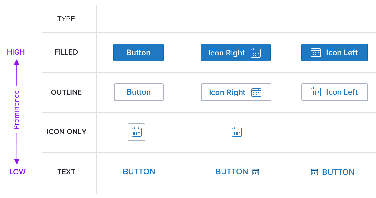
Buttons allow users to take action and make choices with a single click. There are four types: Filled, Outline, Text, and Icon Only. All but ‘Icon Only’ may include left or right icon add-ons.
Each button type has a visual prominence in relation to the others. The visual hierarchy of the styles emphasizes the primary action and deemphasizes the secondary or tertiary actions in a view to which the buttons apply - page, dialog, side panel, toast, etc. Given that, there should be only one primary button in a view. The primary button can be any of the four types, as long as no other button on the page is more prominent.
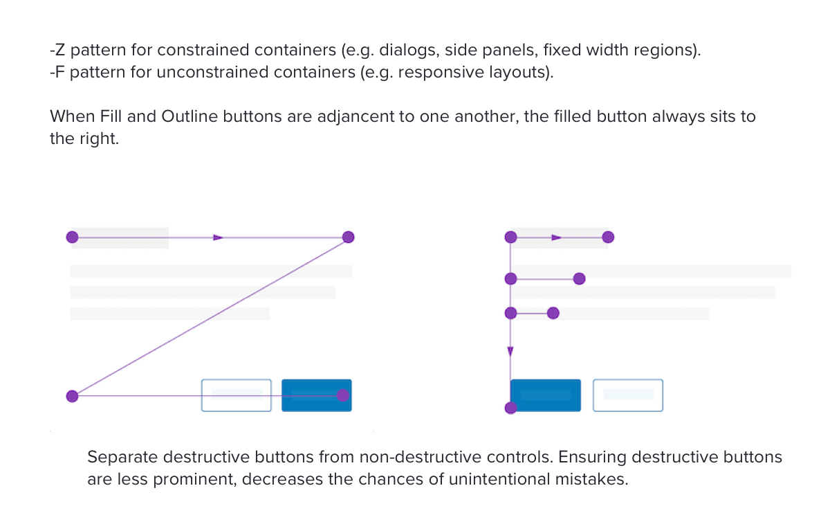
Ensuring destructive buttons (eg. Cancel, Delete, etc.) are less prominent decreases the chance of unintentional action. This can be accomplished by applying a less prominent button type to destructive actions (eg. Using a text button for Cancel and an Outline button for OK).
Alternatives
- Dropdown - Use for choosing between 2 or more options. Use when there is a need to make the different choices explicit.
Labels
- Use title-case for push-button titles. Capitalize every word except articles, coordinating conjunctions and prepositions of four or fewer letters. This includes two or three letter words such as “No”, “Yes”, “On”, “Off”.
- Use verbs in push-button titles. An action-specific title shows that the button is interactive and says what happens when you click it. For example, Save, Close, Print, Delete, and Change Password are all good action-specific titles. Because buttons initiate immediate actions, there’s no need to include a time descriptor like ‘Now.’
- Include a trailing ellipsis in the title when a push-button opens another window, dialog, or app.
- Acronyms, only used if there is a realistic expectation user will know them, should be all uppercase, e.g. “SSO”, “ID”, “LAN”.
- Icon Only buttons can only be used for universally established concepts.
Placement

See Page Layouts v2, Global Header, and Modal guidelines for placement within these layouts.
References
Updated almost 2 years ago
