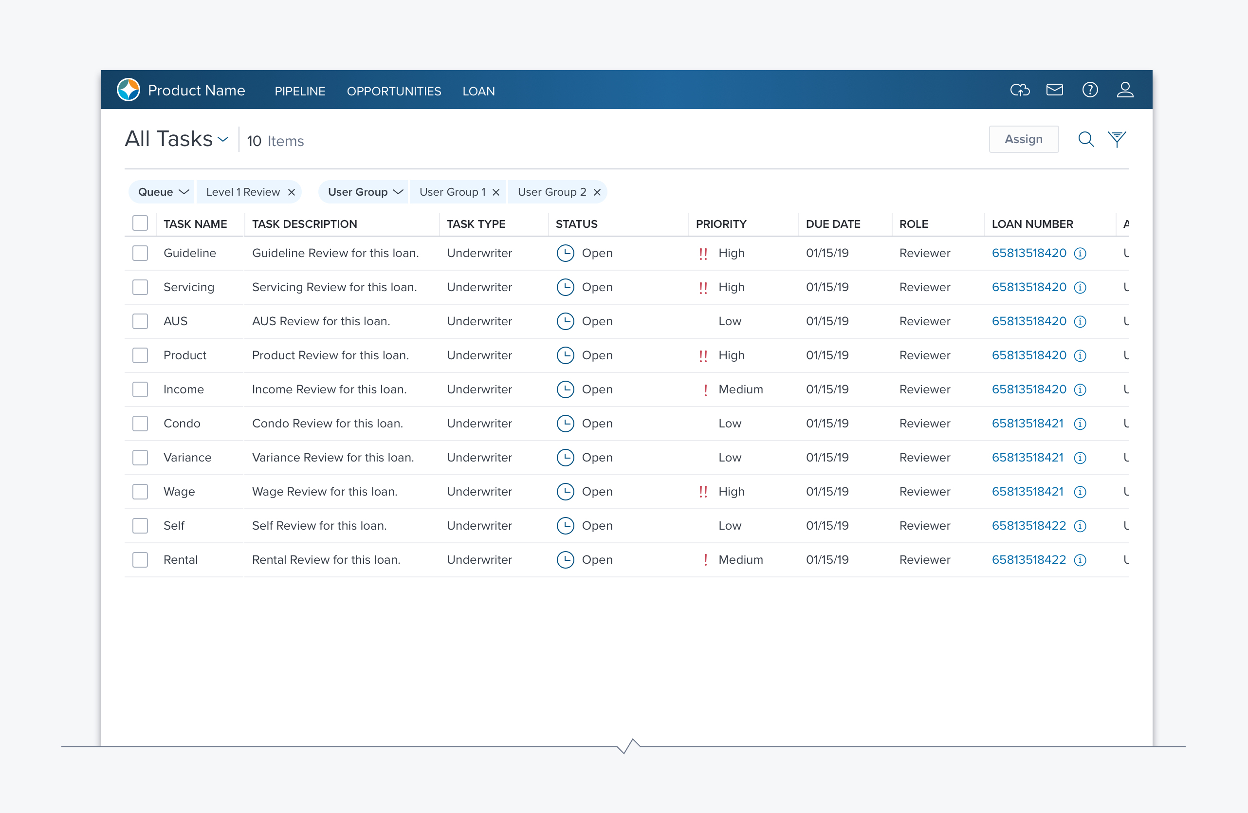
DataTable

Overview
The DataTable provides support for interacting with data in a spreadsheet format using rows and columns. The DataTable is space-efficient and easy to scan, well suited to presenting large amounts of the same data per object.
Usage
Cell Contents
- Non-interactive data: Text, Numbers, Icons, and Progress Indicators.
- Interactive controls: Text Box, Combo Box, Toggle, Button, and Checkbox.
Placement
Typically displayed prominently in the visual hierarchy as it is a primary source for prioritization, decision-making and taking action.
Data Tables should not nested within other Data Tables. Other cases of nesting Data Tables within other components need to be validated for support and performance.
Alternatively
- A-Grid (Layout) - If a table-like layout is needed but not sorting or searching. A-Grid has much less overhead then DataGrid.
- List - User only needs a column of information, possibly with reordering, actions and limited extra info (use Cards in List).
- Card Array (Layout) – User needs different information per object to decide which to act on.
- Shuttle - Used for making selections similar with multi-select and filtering similar to a DataTable. Useful in a more constrained space it only provides for a single column of data. User needs only one column of data and is mostly selecting – not taking a variety of actions on the selection.
Placement
- The DataTable can be placed on a page, a side panel, or in a dialog.
- The DataTable should always have a label.
- There is often a need to associate buttons that act on the entire DataTable, header controls are used to accomplish this for a page, dialog, or groupbox.
- If the DataTable is the only content on a Page or Dialog
- If the DataTable is embedded in a groupbox, with or without borders.
Behavior
- Pagination and Infinite Load are mutually exclusive.
- Column Truncation or Wrapping, are mutually exclusive.
- Multiple or Single Select are mutually exclusive.
Types
There are three types of DataTable: Basic, Row Group and Expandable. They share many characteristics but are unique in some key ways.
Basic (all DataTables share these capabilities)
- Cell Contents
- Non-interactive data: Text, Numbers, Icons, and Progress Indicators
- Interactive controls: Text Box, Combo Box, Toggle, Button, Checkbox
- Row toolbar
- Row Reordering
- Row Heights
- Multi-Select
Row Group Header (unique characteristics)
- Row Grouping
- Row groups can be collapsed/expanded.
- Sorting with Row groups is constrained, contents are sorted within a group, but groups are not reordered.
Expandable (unique characteristics)
- There are two types of expandable content:
- Rows that share all, or a subset, of the parent columns.
- Containers that can contain almost anything (e.g. Form Input Controls, Card Array, Embedded table, Shuttle, etc.)
- Does not support Row Grouping
- Does not support Column Sorting
- Does not support nested Data Tables
Options
Drag and Drop - v.2.0 is limited to repositioning rows within a container (v.2.1 will support dragging between containers and dragging / nesting containers).
Updated over 1 year ago
