Overview
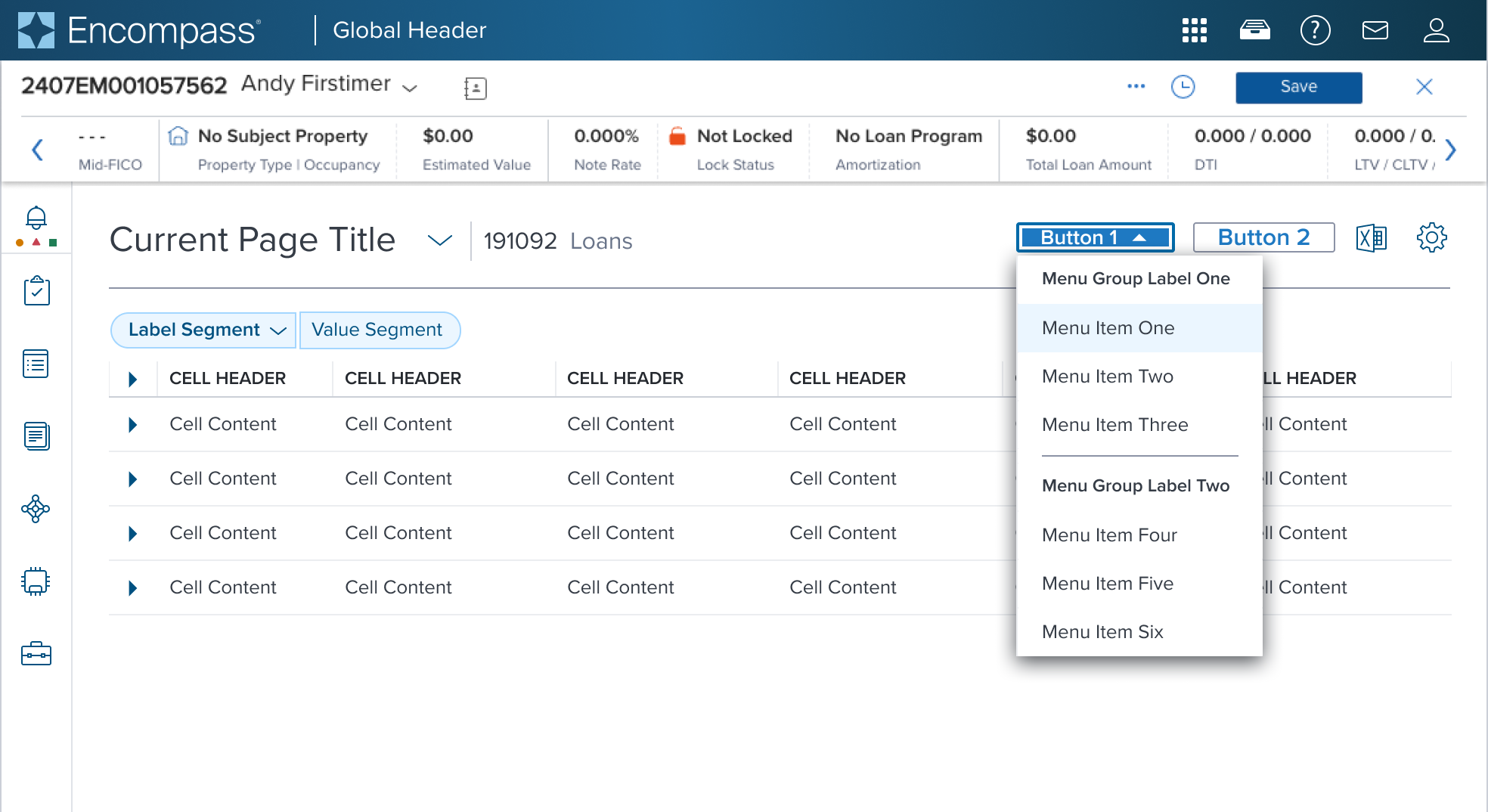
Group Label is for presentational purpose only and has no action. It is to be placed at the top of a menu group to distinguish section content.
1 - this should be used sparingly, the best kind of design for this component would be showing a hierarchy of actions that is self-explanatory and doesn't require additional ad-hoc header.
2 - if designers find themself needing many headers within the same menu, they should consider using a composable "submenu" and add a level to the hierarchy to make the most of the component "progressive disclosure" embedded semantics, if not possible it probably means "comparison of items" is a fundamental piece of what the designer is building, which violates the meant/implied semantic usage of the menu-button component.
3 - while there is no A11y/ADA problem technically speaking to nesting groups within groups within a given menu, this would result in a croweded and overcharged non semantic way of using the menu-button (use a submenu instead?) as such the menu button only allows 1 level depth groups within any given menu/submenu
Design
Box Model
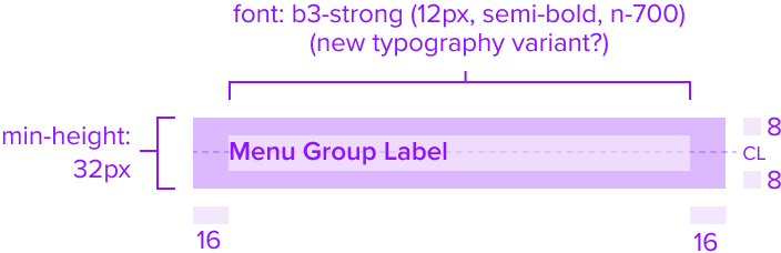
Resize/Reflow
[images]
Validity Criteria:
- Covers spacing and dimensions: Identifying spacing and dimensions to ensure pieces are A11Y compliant. Use min-width/min-height instead of height/width/max-height/max-width. Define padding/margins in PX, and min-width/min-height in relative measures.
- Covers responsive/adaptive layout: Given the box models, clearly identify how the layout adapts to breakpoints and responsiveness.
[Images]
States
| State | Default Graphic | Default Styling |
|---|---|---|
| Idle | 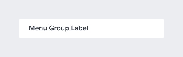 | background: neutral-000 (#FFFFFF) font-typography-variant: b3-strong (12px semibold, neutral-700) - New Variant |
| Focus | N/A (no required cases) | N/A (no required cases) |
| Disabled | N/A (no required cases) | N/A (no required cases) |
| Read-only | N/A (no required cases) | N/A (no required cases) |
| Hover | N/A (no required cases) | N/A (no required cases) |
| Error | N/A (no required cases) | N/A (no required cases) |
Configurations
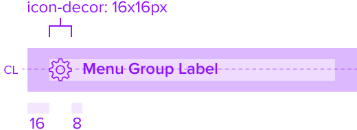
Configured with a left decoration icon for better understanding of various actions to be taken.
States
| State | Default Graphic | Default Styling |
|---|---|---|
| Idle |  | background: neutral-000 (#FFFFFF) font-typography-variant: b3-strong (12px semibold, neutral-700) - New Variant icon-color: brand-800 (#005181) |
| Focus | N/A (no required cases) | N/A (no required cases) |
| Disabled | N/A (no required cases) | N/A (no required cases) |
| Read-only | N/A (no required cases) | N/A (no required cases) |
| Hover | N/A (no required cases) | N/A (no required cases) |
| Error | N/A (no required cases) | N/A (no required cases) |
Use Cases
[UX to fill this with KNOW OF product scenarios that motivates this specific component]
| Original Scenario | Dimsum's version |
|---|---|
 |  |
Examples
| hypothetical scenario graphic | hypothetical scenario solution | hypothetical scenario description |
|---|---|---|
| [UX to add image of hypothetical use-case valuable proposed solution] | [UX to add an text based description/guidance of the scenario |
Digital Accessibility
Objective: Outline the component's compliance with WCAG 2.1 AA accessibility standards.
Variants
Objective: Provide an exhaustive list of the expected and available graphical variations that the component can take out-of-the-box, officially supported by the Dimsum team. Each variant's will then be created as a sub document but the this document should provide the quick-resume of each variants main points.
- Variant Name 1 (Provide link)
- Variant Name 2 (Provide link)
- Variant Name 3 (Provide link)
Usage Warnings
Objective: Address common errors or misunderstandings related to the component's use or implementation.
A component may have obvious potential to be used incorrectly by UX or product. It is possible there are common implementation pitfalls for app devs as well. List these below with complete references and rationale.
Pitfalls & Misconceptions
Implementation of interactive components within the card should enhance user experience without compromising the card’s core function as a structured and clear content container. Use interactive buttons, icons, toggles and images only when necessary in order to maintain a intuitive and easy-to-use experience.
Reference
Objective:List external references, guidelines, or documentation that provide further context or information about the component.