v.1.3.4
Overview
Use a Checkbox to switch an individual item's state or the selection of multiple items.
A checkbox is activated by clicking the indicator (checkbox) or the label.
The label should make the implied Off state readily apparent.
Design
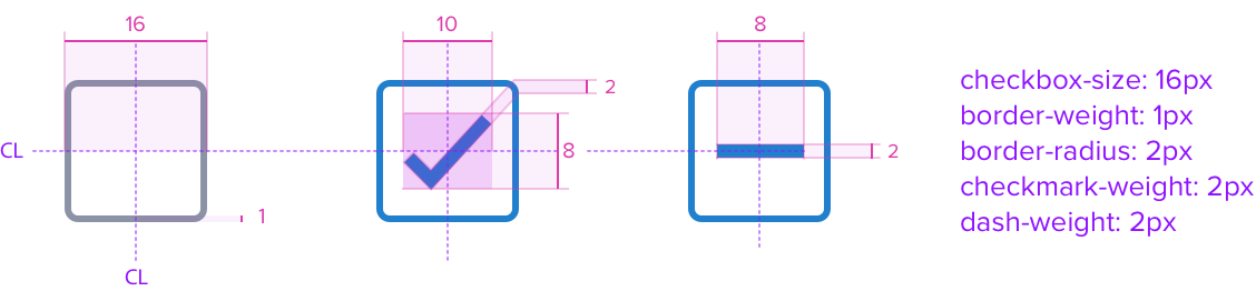
Checkbox & Checkbox Group
Dimensions, Types
Responsive
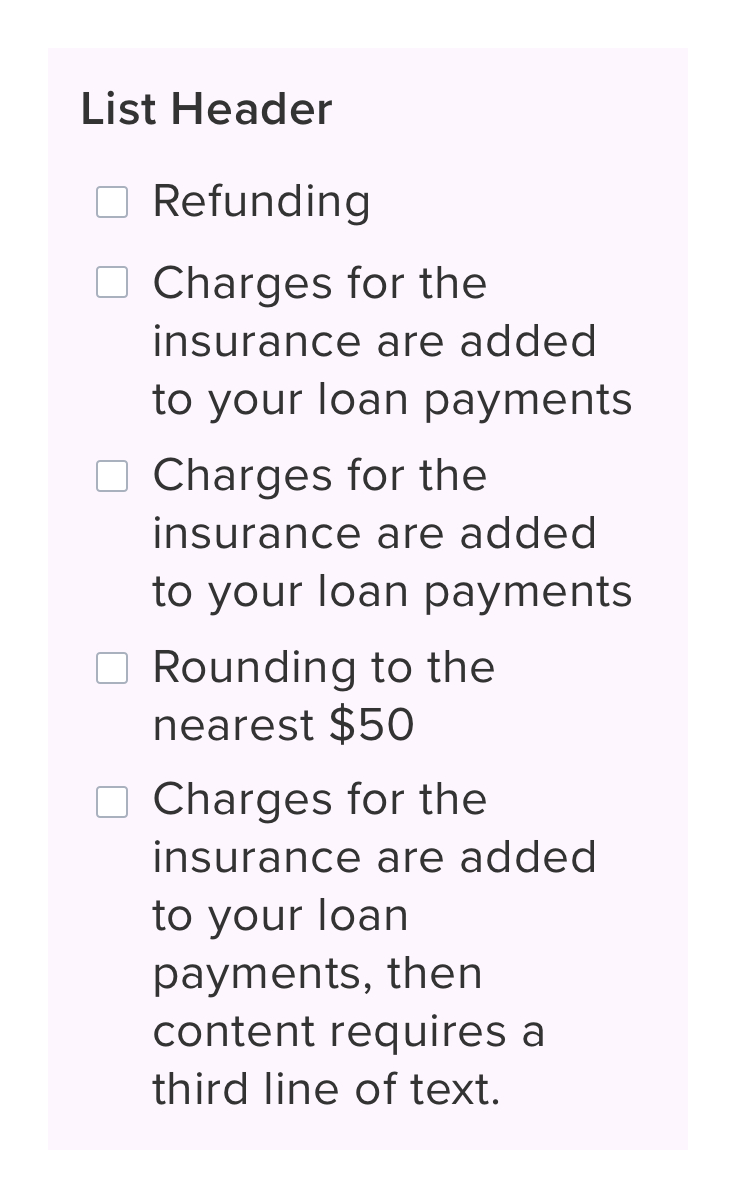
By design, Checkbox supports responsive resize and reflow characteristics by defining a minimum width in relative units that aligns with guidance from WCAG SC [link here]. Relative measurements ensure that Checkbox maintains its structural integrity and visual design across different screen sizes and orientations to ensure usability.
If a Checkbox or Checkbox Group and label cannot fit within the remaining space because of font scaling or browser zoom, it will wrap to as many lines as needed to display the entire content. This behavior applies to both vertical and horizontal layouts.
| Scenario | Text Resize and Reflow (200%) | Styling |
|---|---|---|
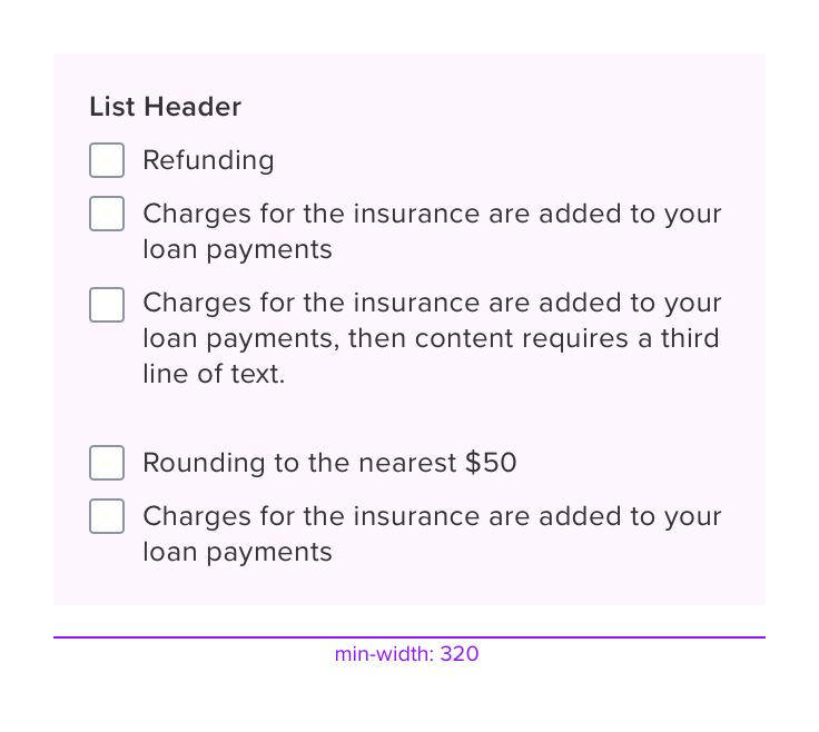 |  | min-width: 320 RT |
 |  |
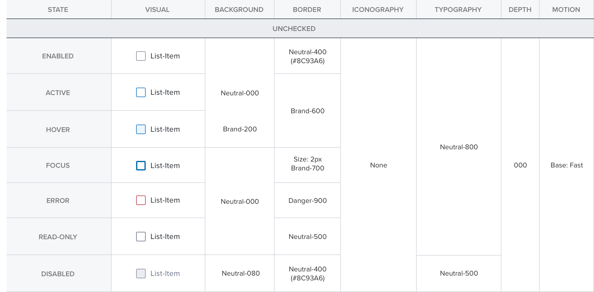
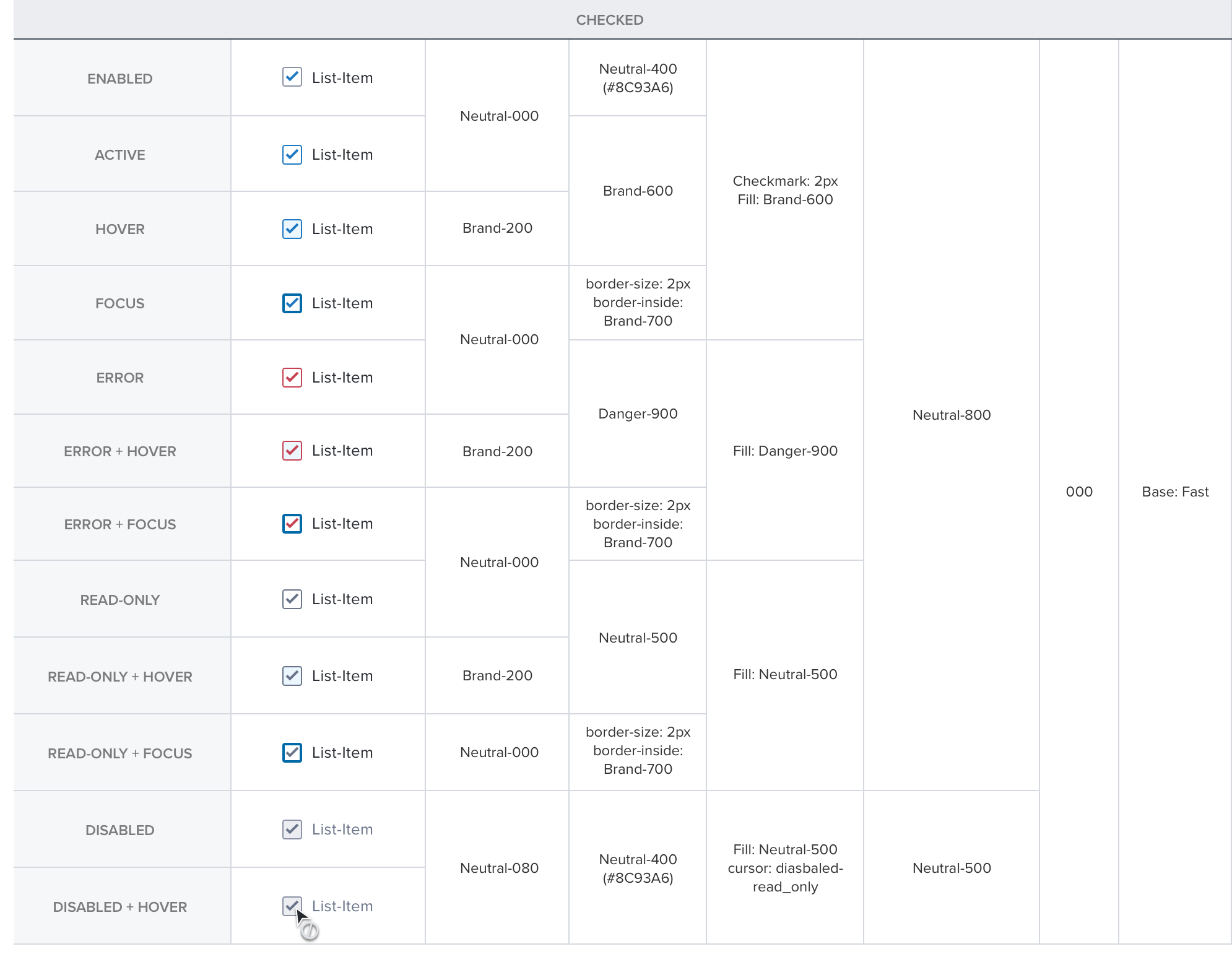
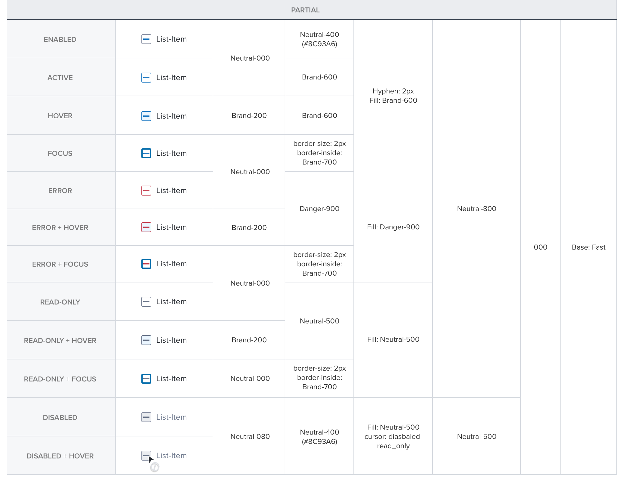
States
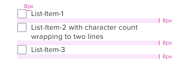
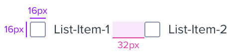
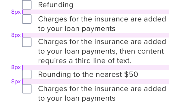
Spacing
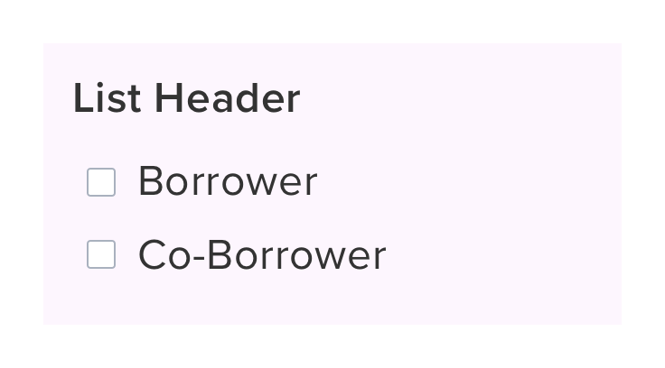
Vertical List
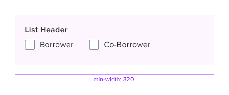
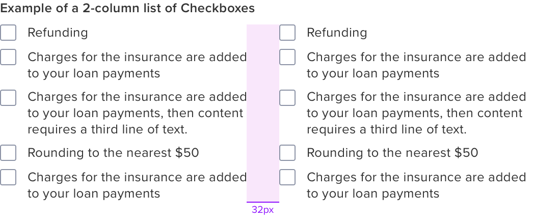
Horizontal List
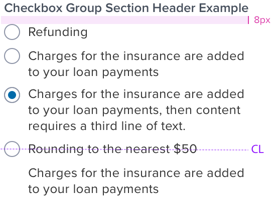
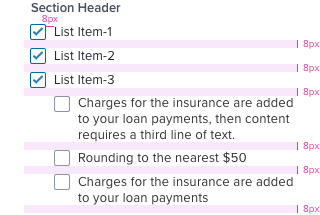
Radio Group Section Header
font-family
font-family: ProximaNova-Semibold;
font-size: 13px;
color: #464F5C;
letter-spacing: 0;
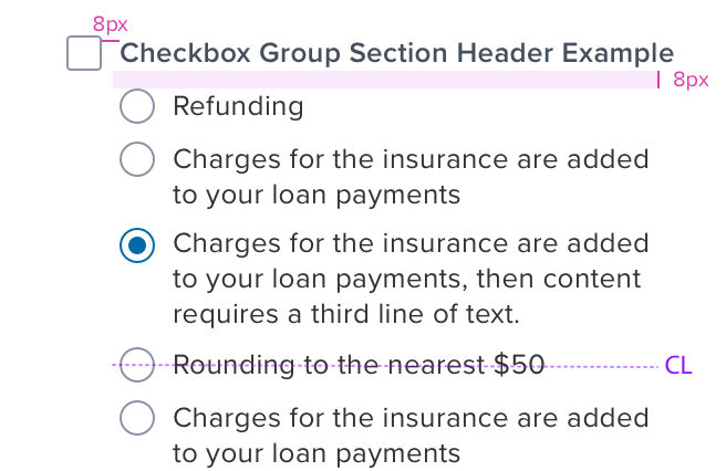
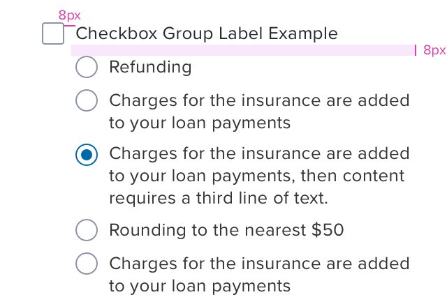
Radio Group Section Header w/ Checkbox
font-family: ProximaNova-Semibold;
font-size: 13px;
color: #464F5C;
letter-spacing: 0.2px;
Checkbox Group Section Header w/ Radio
font-family: ProximaNova-Semibold;
font-size: 13px;
color: #464F5C;
letter-spacing: 0.2px;
Checkbox Group Section Header-Horizontal
font-family: ProximaNova-Semibold;
font-size: 13px;
color: #464F5C;
letter-spacing: 0;

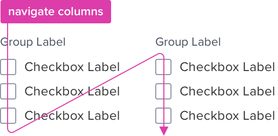
Multiple Columns
Radio Group Label
font-family: ProximaNova-Regular;
font-size: 12px;
color: #464F5C;
letter-spacing: 0;
Radio Group Label w/ checkbox
font-family: ProximaNova-Regular;
font-size: 13px;
color: #25292F;
letter-spacing: 0.2px;

Checkbox Group Label w/ checkbox
font-family: ProximaNova-Semibold;
font-size: 13px;
color: #464F5C;
letter-spacing: 0.2px;
####Text overflow and graphic alignment
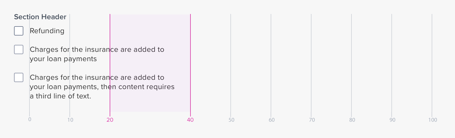
Width & Line Length
Character Count
The width is governed by limiting character count between 20 and 40 per line.
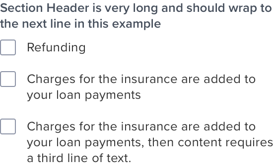
Section Header / Label - Wrap / No Wrap Behaviour
Wrap
This attribute is an available on/off setting.
Applicable to the section header and label.
Digital Accessibility
Keyboard Interaction
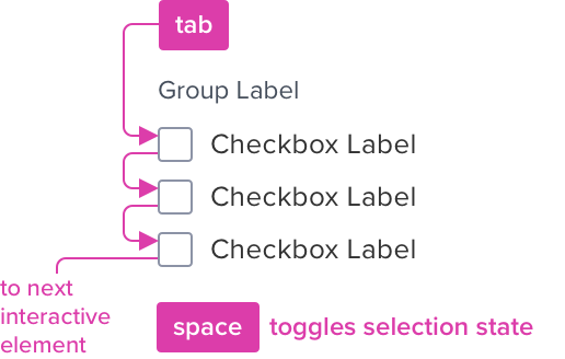
Each checkbox can be reached by Tab and selected with Space independently.
Meaningful Order
Checkboxes can appear in multiple columns. Tab order is by column.
| KEYBOARD & FOCUS (K&F) *Global standard keyboard interactions apply, and in order of operations from left to right, top to bottom. |
|---|
| TWO / DUAL-STATE |
| KEY | FUNCTION | |
|---|---|---|
| TAB SHIFT+TAB | Moves focus indication to the next and previous interactive elements in the tab order (when checkbox receives focus). | |
| SPC | Toggles checkbox between checked and unchecked states. |
| TRI / MIXED-STATE |
|---|
| KEY | FUNCTION |
|---|---|
| TAB SHIFT+TAB | Same as above |
| SPC | • Cycles the tri-state checkbox among unchecked, mixed, and checked states. • When the tri-state checkbox is unchecked, all the controlled checkboxes are unchecked. • When the tri-state checkbox is mixed, the controlled checkboxes return to the last combination of states they had when the tri-state checkbox was last mixed or to the default combination of states they had when the page loaded. • When the tri-state checkbox is checked, all the controlled checkboxes are checked. |
| SCREEN READER (SR) *Steps from object to object or by jumping between components. Converts interactive elements into speech. |
|---|
| Semantic HTML Role | Announced Content (defined by app-side) | ARIA Attributes |
|---|---|---|
| Checkbox | label, state | NA |
| ARIA Considerations |
|---|
| ARIA supports two types of checkbox widgets: - Dual-state: The most common type of checkbox, it allows the user to toggle between two choices -- checked and not checked. - Tri-state: This type of checkbox supports an additional third state known as partially checked. One common use of a tri-state checkbox can be found in software installers where a single tri-state checkbox is used to represent and control the state of an entire group of install options. And, each option in the group can be individually turned on or off with a dual state checkbox. - If all options in the group are checked, the overall state is represented by the tri-state checkbox displaying as checked. - If some of the options in the group are checked, the overall state is represented with the tri-state checkbox displaying as partially checked. - If none of the options in the group are checked, the overall state of the group is represented with the tri-state checkbox displaying as not checked. - The user can use the tri-state checkbox to change all options in the group with a single action: - Checking the overall checkbox checks all options in the group. - Unchecking the overall checkbox will uncheck all options in the group. - In some implementations, the system may remember which options were checked the last time the overall status was partially checked. If this feature is provided, activating the overall checkbox a third time recreates that partially checked state where only some options in the group are checked. |