v.1.0.6
Overview
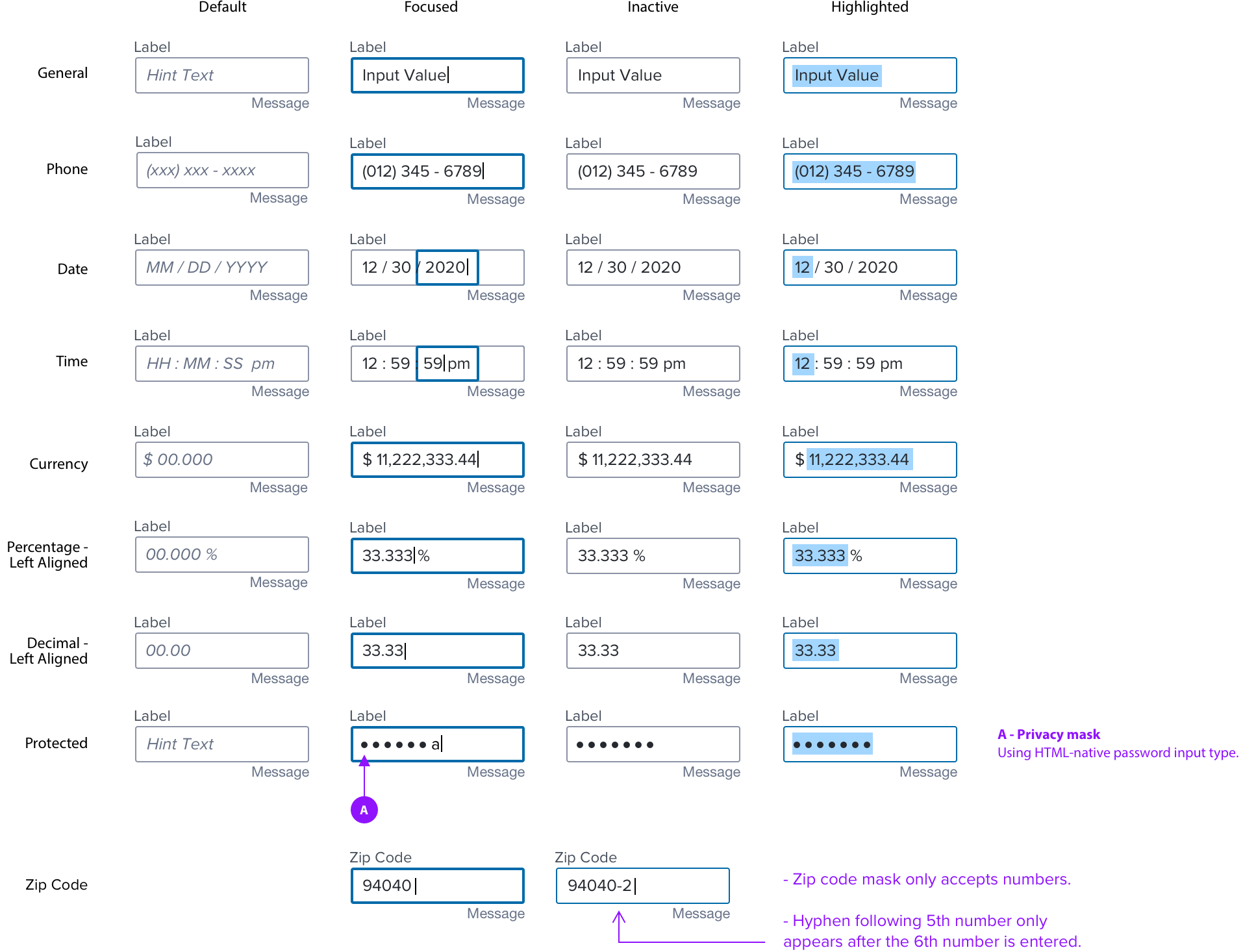
A set of masks that apply standard formatting to alpha-numeric characters, such as decimal placements, unit indicators, ZIP code, phone number, etc.
Anatomy
Types
See Input Field spec for general interaction rules
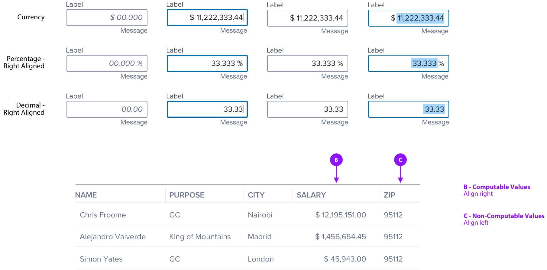
In editable forms, computable numerical values will align left.
In non-editable, or within comparison components/screens, computable numerical values will align right
Alignment
Computable values align right in data tables and other types of components where comparison is important.
Date Input Behavior
The Date Mask behavior is based on the standard HTML element; (https://developer.mozilla.org/en-US/docs/Web/HTML/Element/input/date)
Continuous String:
The mask allows the user to enter month day and year as a continuous string.
Auto-Advance:
- The mask auto advances once you have entered two valid numbers (eg. “02” or “12”), or a single number that can only be valid as a single digit. (eg. 4, 5, etc. in the case of day) (2, 3, etc in the case of month)
- Month only requires two digits if the number starts with 1 or 2. if anything between 3 and 9 are entered it auto completes and advances.
- Day only requires two digits if the number starts with 1 or 2 or 3. if anything between 4 and 9 are entered it auto completes and advances.
Auto-Correct:
- Type 3 into month, result is 03 and auto advance to day
- Type 4 into day, result is 04 and auto advance to year
- If the user enters a month or day that is beyond the valid range of numbers the closest valid number is inserted automatically. For example type 33 into day, result is 31 and auto advance to year.
Validation
- The Day is validated after the control loses focus (user clicks on another object or tabs out of the control. If the day should be 30, 29, or 28 based on the year and month this is validated after the control loses focus. The Error condition is indicated per text box error state (red surround and error message)
Editing:
- The user can click into any of the three numbers (month, day, year) to edit that number.
- All the same rules apply to both entering and editing a number.
For example if the user types 34 for day then 31 is automatically entered and the cursor automatically advances.
Usage Warnings
Protected Input Mask
In conformance with the ICE MT privacy policy and WCAG 2.2 AA accessibility requirements, the visual display and audible announcement of Non-Public Personal Information (NPI), Personally Identifiable Information (PII) or any other such values deemed confidential must be protected.
Currently, the input type="password" attribute seems to be the only reliable way to ensure screen readers and assistive technologies will visually mask and not announce it audibly. In these use cases, designers and developers must properly use the 'type=password', which will hide and not announce the value by default.
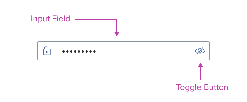
If required or desired, the component can be composed—usually with a button placed on the right—to allow the user to toggle the protected and unprotected states. The behavior and functionality must be designed and built to clearly express the security risk, namely that protected values will become visible to visual users and announced by assistive technologies.
Digital Accessibility
Keyboard Navigation
Use standard order of operations, Left to Right, Top to Bottom.
Navigation details for embedded components can be found in their respective specs.
| KEY | FUNCTION |
|---|---|
| Tab | Takes user to the next interactive element in the tab order |
| Shift+Tab | Takes user to the previous interactive element in the tab order |
| Enter | Submits value |
| Arrow Left/Right | Highlighted Values: Moves cursor to beginning/end of selected values |
| Arrow Up/Down | - Date/Time Inputs: Reels through field values - Highlighted Values: Moves cursor to beginning/end of selected values |