v 1.1
Overview & Anatomy
Input Groups are used to enhance text boxes by prepending and/or appending icons (buttons) to the textbox itself.
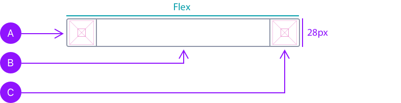
Basic Framework
All input groups share a common combination of pieces.
These three pieces are:
A - Left Add-On
B - Text Box
C - Right Add-On
When placed within a column framework, Left/Right add-ons retain their height and widths of 28px, respectively. The text box will resize respectively. Labels and error/message text align with Left/Right add-ons.
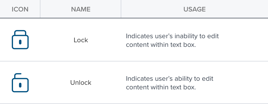
Left Add-Ons
Left Add-Ons (ie Lock and Unlock) can be prepended to text boxes. Left add-ons typically show state. Other icons may be used per use case.
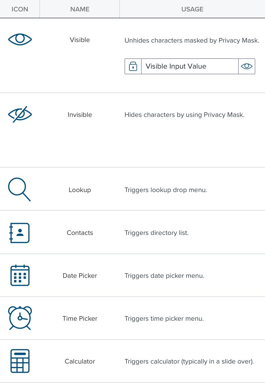
Right Add-Ons
Right Add-Ons can be appended to text boxes. Right add-ons typically trigger lookups (ie Date/Time pickers) or slide overs (eg Calculator).
Digital Accessibility
Input Group follows all global patterns for keyboard, screen reader and mouse usage.