v.1.5
Overview
Toast is a type of notification. It lets the user know the status of a system event, and provides relevant detail to help the user understand may be done next, such as resolving an error or confirming the completion of a task.
Anatomy
Visual Style
Basic Toast
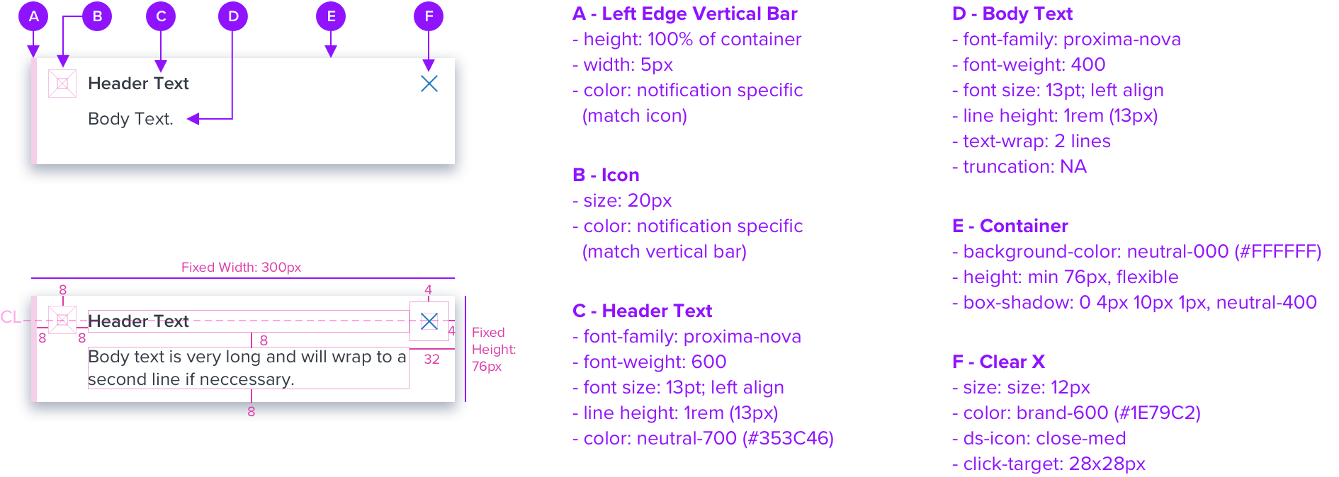
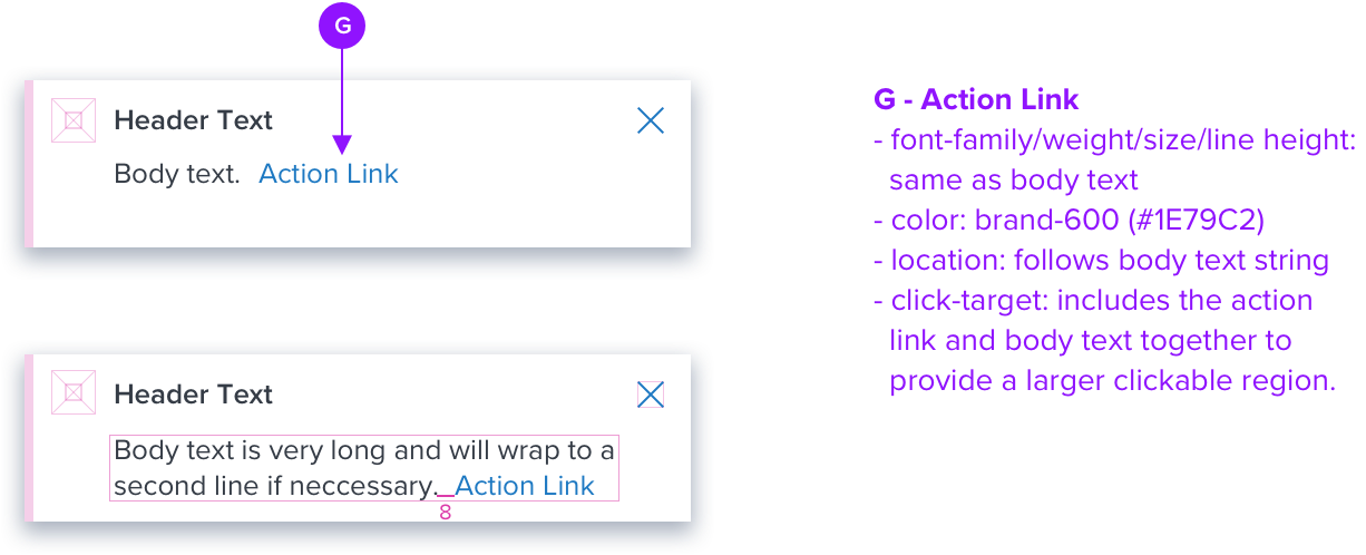
With Link
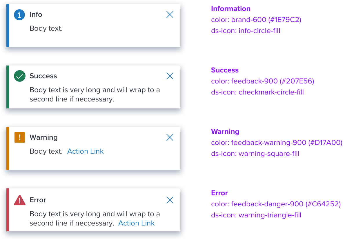
Notification Types
Placement and Animation
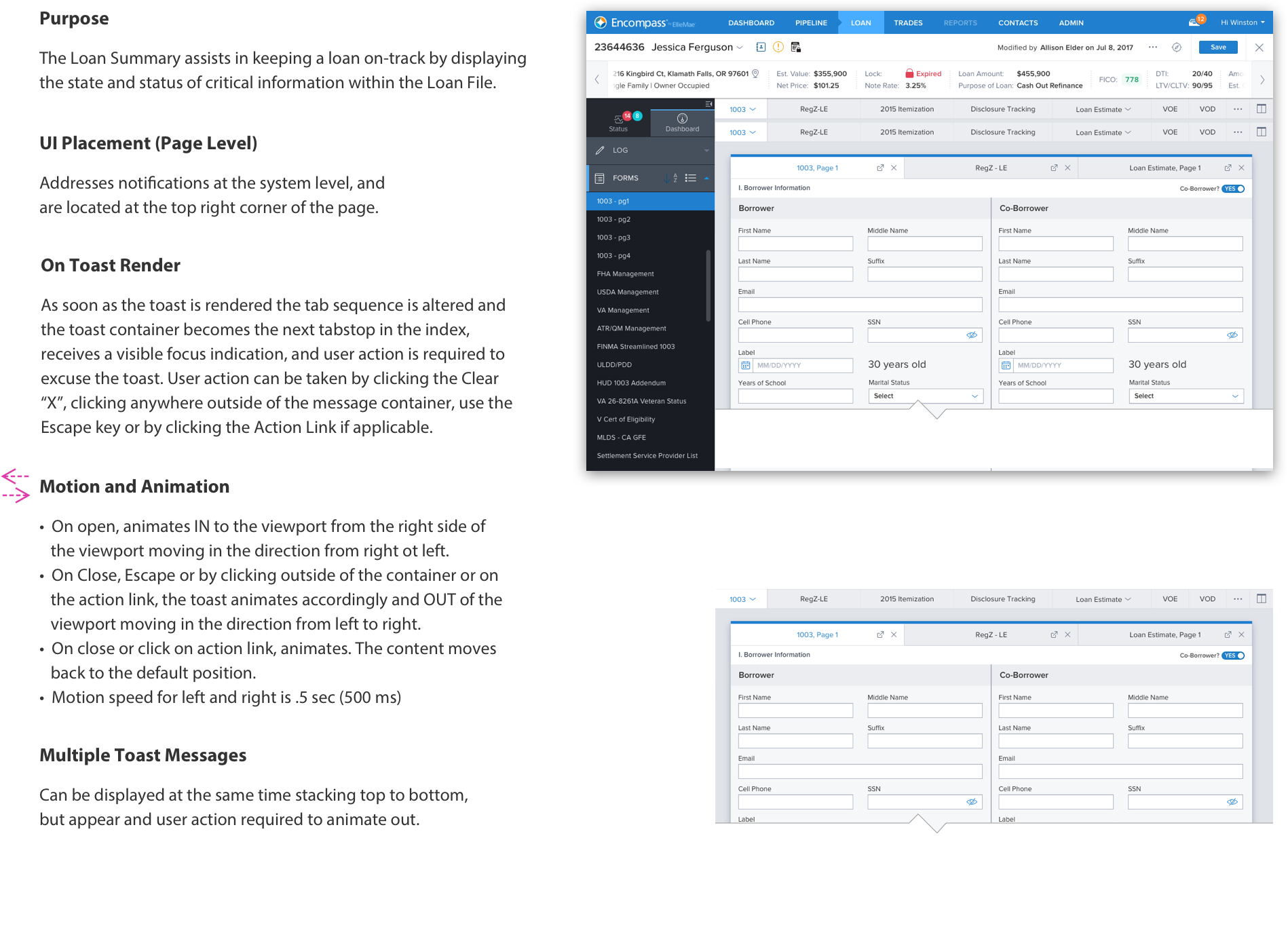
Toast Messages - are notifications that slide in and out, typically in the top right of the page. They are more disruptive than inline notifications and are best used with system-generated messages that do not correspond to a specific section of the UI. User action is required to dismiss all toast messages.
Use the “Basic” Toast for low-level notifications with minimal content for success and informational messaging. Use the Toast “With Link” for high-level critical errors or warnings that require immediate attention and user action. Utilize the Modal Dialog if more functionality and more space for content is needed.
Digital Accessibility
Keyboard Interaction
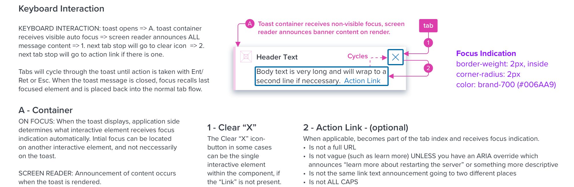
| KEYBOARD & FOCUS (K&F) | *Global standard keyboard interactions apply, and in order of operations from left to right, top to bottom. |
|---|---|
| Key | Function |
| TAB, SHIFT+TAB | Moves focus indication to the next and previous interactive elements in the tab order (e.g. clear icon-button, action link). |
| SPC, ENT/RET | Activates and confirms action when an interactive element receives focus indication (e.g. clear icon-button, action link). |
| ESC | Closes the toast, focus should retain the user’s point of regard, and return to the element that invoked the toast open. |
| Screen Reader (SR) | *Steps from object to object or by jumping between components. Converts interactive elements into speech. | |
|---|---|---|
| HTML/Semantic Role | Announced Content (defined by app-side) | ARIA Attribute |
| ALERT | Title and type | <div role="alertdialog”, aria-labelledby="dialog1Title”, aria-describedby="dialog1Desc"> |
| LINK | Label | tag, tabindex=”0” |
| BUTTON | Label | NA |