v 2.2
Overview
The Global Header is used to brand the application, and optionally provide high-level navigation, profile notification and actions. Used on all Dim Sum pages, except Login.
- Global Header Regions in order of priority (left to right)
- Image/Icon or Text Logo Region: Branding specific
- Navigation Region (Custom Nav): Allows app team to place navigation content such as tabs, links, and buttons within the defined space. Items such as action icons, toolbars, badges, etc. are not appropriate for this location.
- Flex Region: Available for added navigation and/or menu elements
- Menu Region: Allows app team to place menu content such as action icon-buttons and drop lists within the defined space. Navigation content is not appropriate for this location.

Anatomy
Global Header includes a set of regions to manage specific content: Brand, Navigation, Flex and Menu. The navigation for each region can be set as either Tab or Custom (but not mixed).
Visual Style

Region Usage

Interactions

Global Header Integration


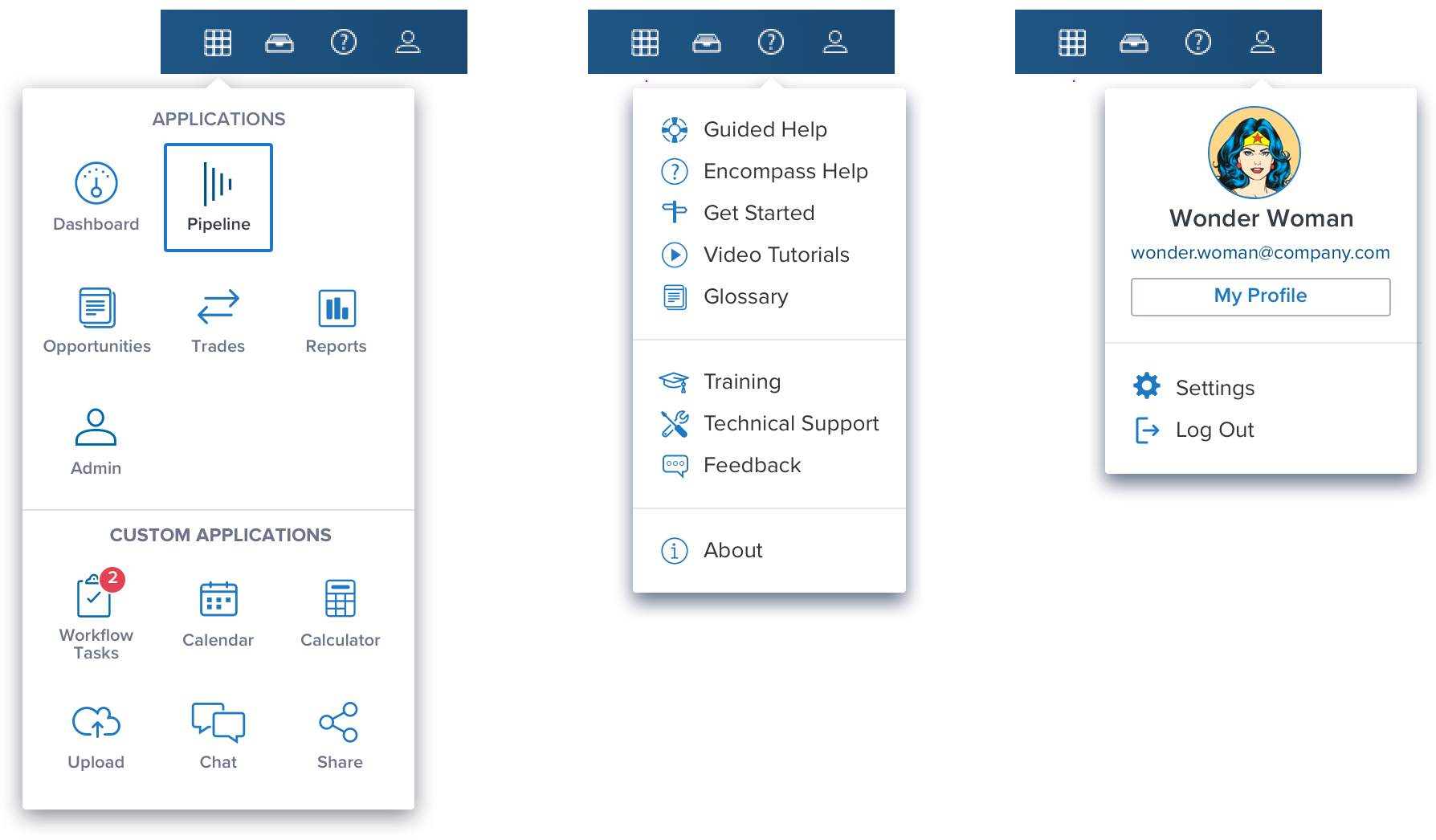
App Picker

Behavior
- From the Parent a child can be opened, and a child can spawn a grandchild (3 levels of hierarchy).
- The user can move fluidly between the three levels of hierarchy.
- Making a new choice at any level excuses lower levels.
- If there is only a parent there is no Underline. The Underline indicator is only visible when there are two or more items (eg parent w/ child).
- There is a default application on open. (App logic may allow admin or user to set the default).

Digital Accessibility
Keyboard Navigation

KEYBOARD & FOCUS
*Global standard keyboard interactions apply, and in order of operations from left to right, top to bottom.
| Key | Function |
|---|---|
| TAB SHIFT+TAB | Moves focus to the next and previous interactive elements in the tab order (e.g. breadcrumb, tab, button, link, etc.). |
| SPC ENT/RET | Activates and confirms action when an interactive element receives focus indication (e.g. breadcrumb, tab, button, link, etc.). |
| ▲/▼ | Moves up and down vertically within options (e.g. app picker scroll, search box, dropdown menu). |
| ◀︎/▶︎ | Moves left and right, and cycles the icon-buttons within the right-side menu region. Moves left and right horizontally within options when applicable (e.g. search box, between value characters). |
| ESC | Closes the app picker, focus should retain the user’s point of regard (app picker icon-button), and return to the element that invoked the menu open. |
SCREEN READER
*Steps from object to object or by jumping between components. Converts interactive elements into speech.
| HTML/Semantic Role | Announced Content (defined by app-side) | ARIA Attributes |
|---|---|---|
| HEADER | label, nav, link, button | NA |
| LINK | label, state, menu, list | NA |
| BUTTON | label, state, menu, list | NA |
| ARIA Consideration |
|---|
| NA |
DOCUMENTATION
| Rationale |
|---|
| Skip to main content: Starting focus in the global navigation allows users to navigate to other areas in the UI, but could block them from the main content if there is a large number of navigation items to tab through first. Providing a “Skip to main” link at the start of the navigation’s focusable controls provides the ability to bypass these blocks. This lets users easily skip the navigation region and begin interacting with the page’s main content area. The "Skip to main” link is the first focusable element in the global header read by the screen reader, has a tab stop and receives visible focus indication. Located on top-left position. |
References
UX Usage Guidelines
Basic Keyboard Functions
WCAG Success Criterion for Bypass Blocks "Skip to main" link
View Code on Storybook
