v.2.1
Overview
Chip is a type of button with style and proportions that are optimized for displaying an array of options that can be quickly understood and selected.
Anatomy
Visual Style
Placed in a dropdown and arranged in an array. A horizontal separator is used to create groupings or sections if desired.
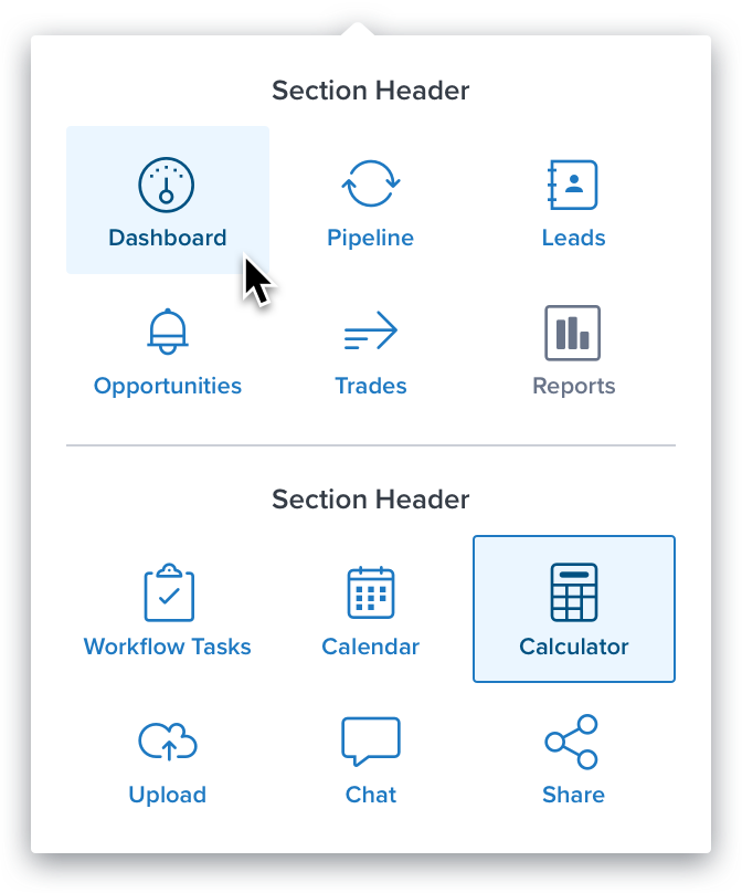
An inline group styled with a circular shape for a prominent and tap-able look on touch devices. The shape option should only be used for priority or ‘most used’ actions:
Configurations
See “App Picker” spec for chip spacing details.
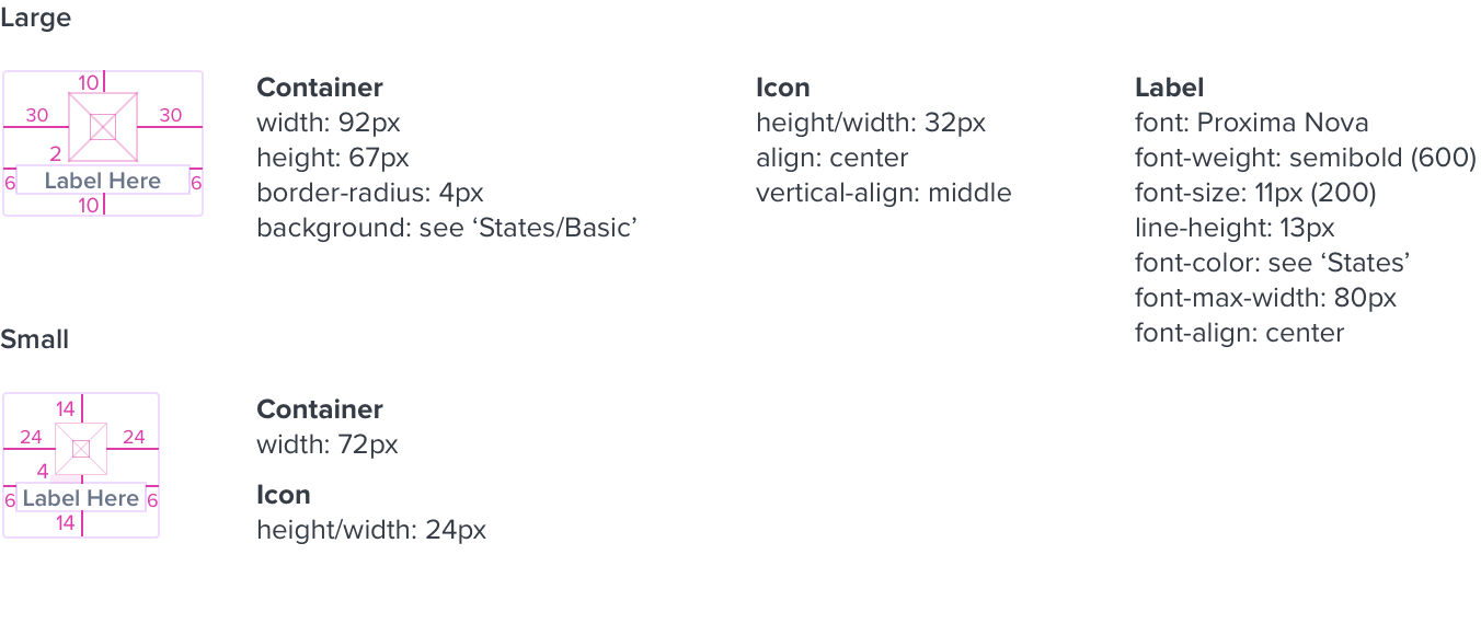
Basic
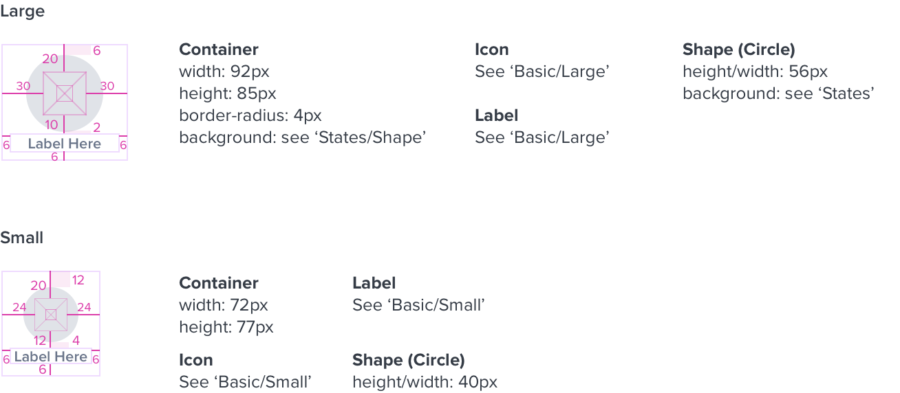
Shape
Interactions
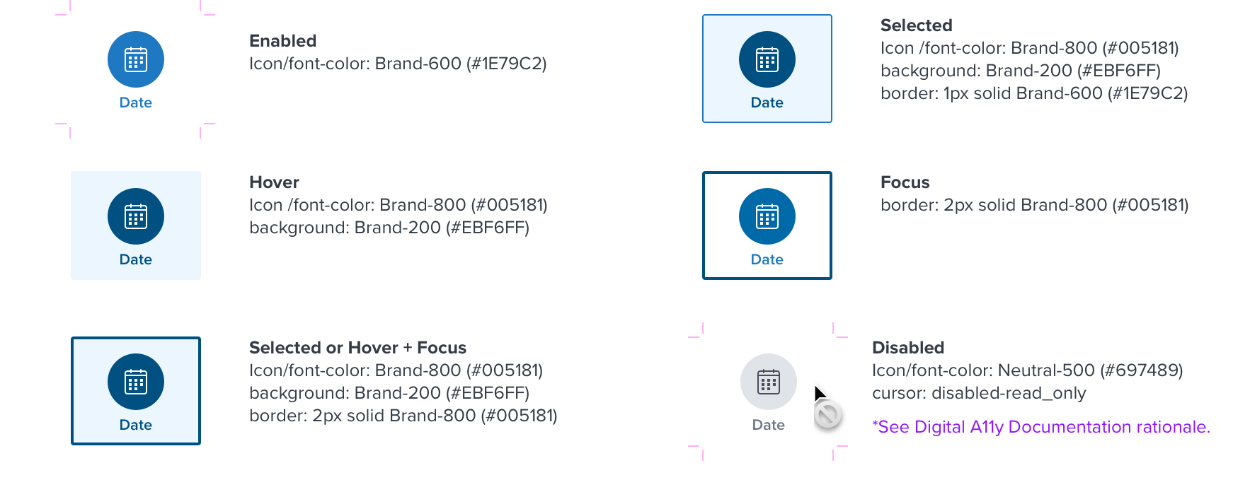
Basic
Shape
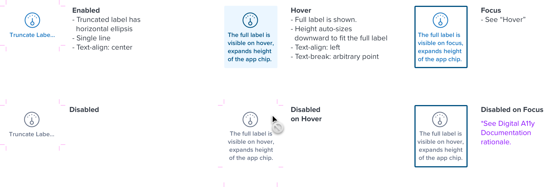
Truncation
Digital Accessibility
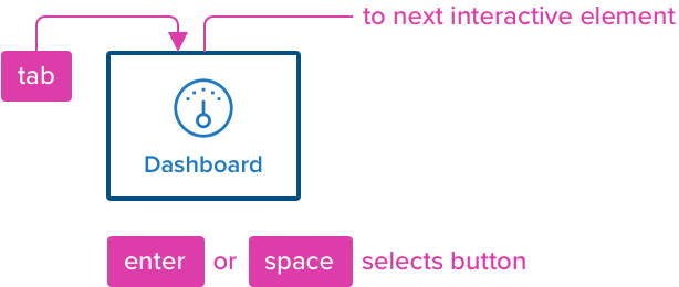
Buttons can be reached by Tab and selected with Space or Enter.
Mouse Interaction - when opening the app picker container:
- The container receives non-visible focus indication.
- When an app chip has selection, that chip has visible selection even if not the first interactive element in the list.
Keyboard Interaction - when opening the app picker container:
- The first interactive app chip recieves visible focus indication.
- When an app chip has selection, that selected chip receives visible focus indication, even if not the first interactive element.
| KEYBOARD & FOCUS (K&F) | |
|---|---|
| Key | Function |
| Tab / Shift + Tab | - Moves focus indication to the next and previous interactive elements in the tab order when inside of the menu, cycling through the list. |
| SPC ENT / RET | Activates and confirms action when an interactive element receives focus indication: - When focus is placed on the app picker icon, opens the app picker menu and the first interactive element receives focus indication. - When focus is placed on the app chip in the menu, launches that application and closes the drop menu. |
| SCREEN READER (SR) | ||
|---|---|---|
| Semantic HTML Role | Announced Content (defined by app-side) | ARIA Attributes |
| BUTTON (CHIP) | label, header, order, button | NA |
| Considerations |
|---|
| NA |
| DOCUMENTATION |
|---|
| Rationale |
| As a Keyboard Only/Assistive Technology (AT) user, they must be able to navigate to app picker buttons even if it is disabled, so user can choose which app to access. The button must: • Be focusable with a keyboard • Inform the AT user that the button is Disabled’ with the help of aria-disabled instead of ‘disabled=“” attribute. • Indicate when it has keyboard focus. • Expand the truncated content on focus. • (Optional) Inform the user which number the currently selected match is (1 of 3 for example) • (Optional) Inform the user about button group heading. |