Overview
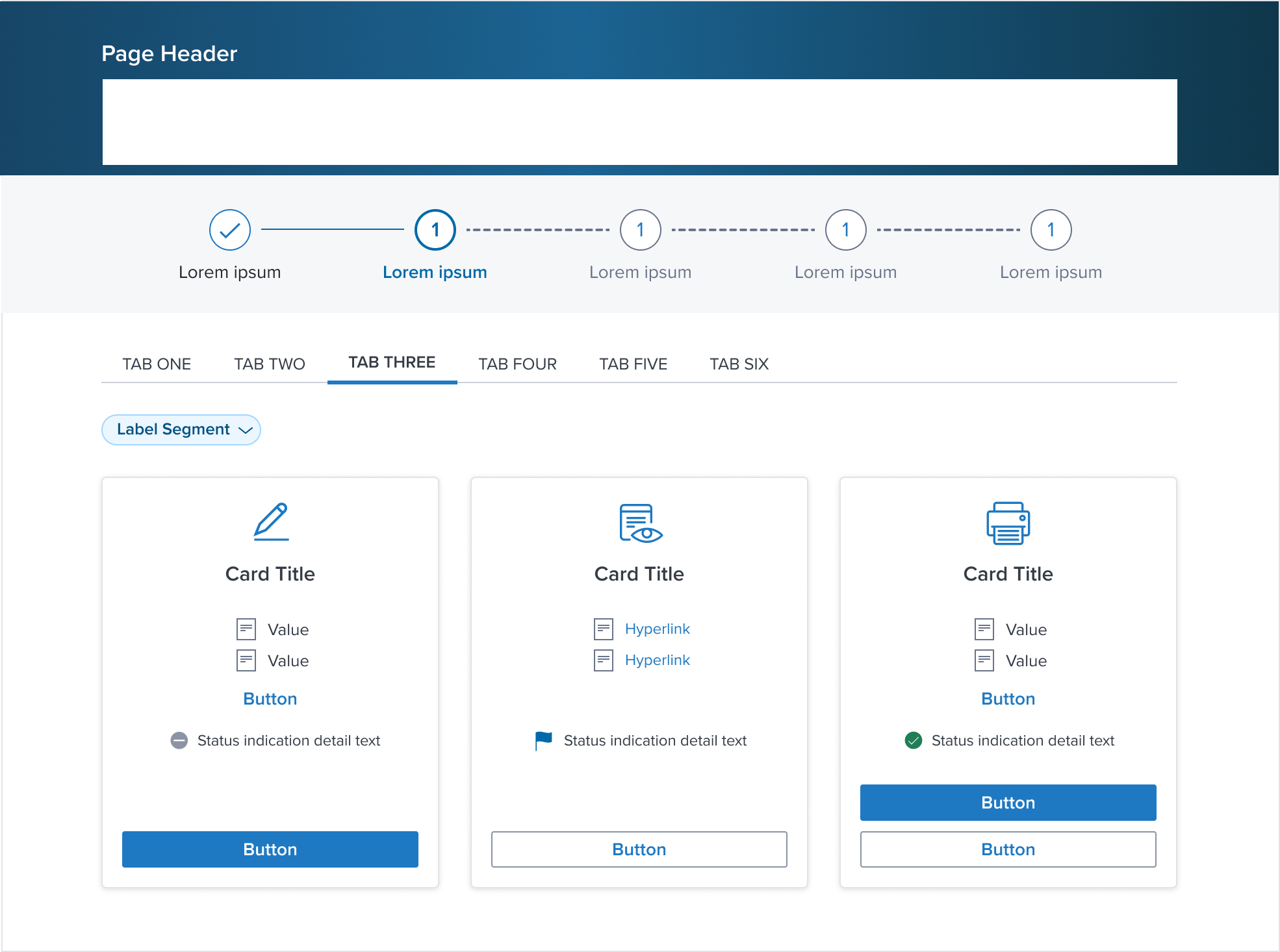
At the heart of the Dim Sum Design System's Card component lies the CardBody, a versatile container designed for the bulk of the content.
Its purpose is to support a wide range of content types, from text and images to interactive elements, providing a flexible yet cohesive canvas.
The CardBody is engineered to adapt content gracefully, ensuring readability and engagement across all devices.
This central component underscores the Card's role in delivering information in a structured, accessible manner, emphasizing the system's commitment to usability and design coherence.
Design
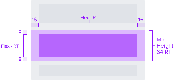
Box Model
The design choices for the CardBody Component are carefully selected to enable it to serve as an adaptable, visually appealing, and consistent content container within the card structure.
-
Padding-y 8px & Padding-x 16px
The CardBody introduces a uniform padding around its content, promoting clear delineation from other card components without causing overlap.This consistent spacing is key to achieving a cohesive visual and functional experience across different implementations.
-
Min-height 64 RT
A defined minimum height ensures that the CardBody retains visual consistency and functionality across various devices and screen sizes.This design choice supports the CardBody's role in maintaining the aesthetic appeal and readability of the content it houses, without necessitating a minimum width.
This approach allows for greater content flexibility and adaptability to specific content needs.
The CardBody's box model is precisely engineered to facilitate its purpose as a flexible and visually cohesive container for the main content within a card.
By carefully selecting each aspect of the box model, the design contributes to a stable and consistent content experience across various projects.
This deliberate design strategy underscores the importance of adaptability, while ensuring a unified and appealing presentation of the card's body content.
Responsive
The CardBody Component is constructed with a responsive box model in mind, allowing it to adjust fluidly across a variety of screen sizes and user environments.
This flexibility ensures a consistent and accessible user experience, upholding the design's integrity and usability in diverse viewing situations.
By design, CardBody supports responsive resize and reflow characteristics by defining minimum height in relative units and no limitation for the widths.
Relative measurements ensure that the CardBody maintains its structural integrity and visual appeal across different screen sizes and orientations, adapting gracefully as needed.
Dictating content-specific reflow behaviors goes beyond its scope and is managed by the individual content elements within the card-body, which are designed to be responsive in their own right within the overarching design system.
This approach allows the card-body to serve a wide array of content types and interaction contexts without imposing rigid layout constraints that could hinder the adaptability of the content it hosts.
States
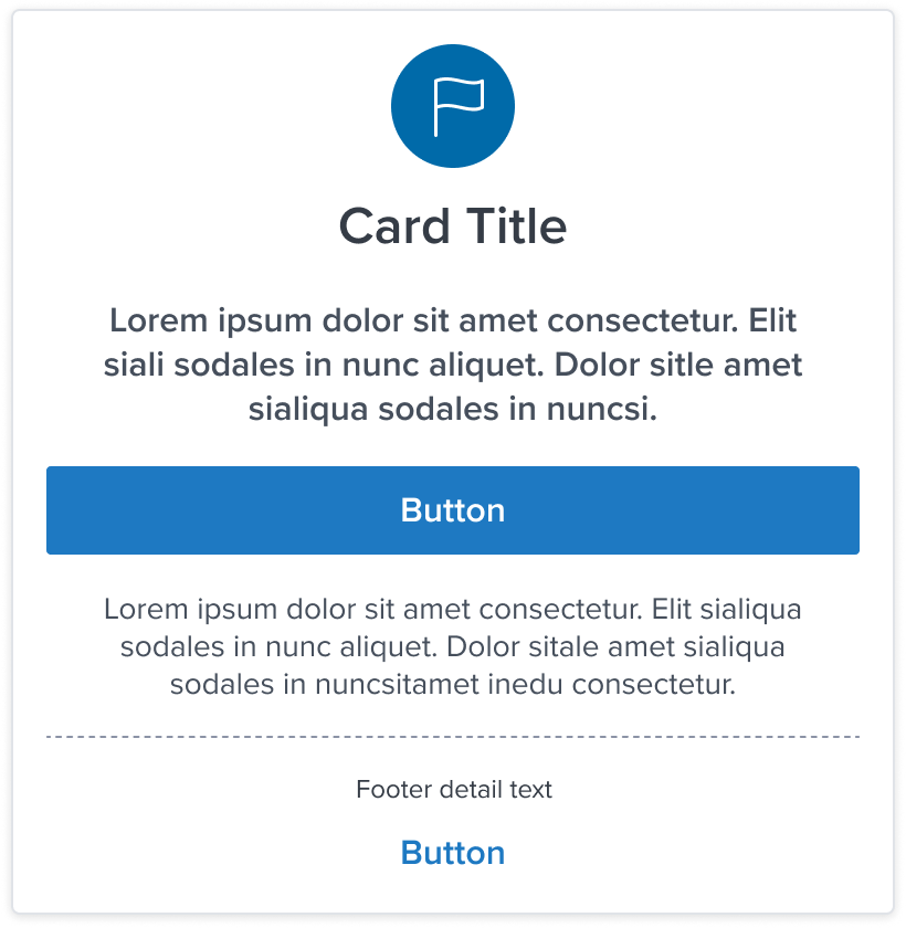
| State | Graphic | Default Styling |
|---|---|---|
| Idle |  | Padding-y: 8px Padding-x: 16px Min-height: 64 RT |
| Focus | N/A (content needed to apply) | N/A |
| Disabled | N/A (content needed to apply) | N/A |
| Read-only | N/A (content needed to apply) | N/A |
| Hover | N/A (content needed to apply) | N/A |
| Error | N/A (content needed to apply) | N/A |
Use Cases
| Original Scenario | Dim Sum Version |
|---|---|
  |  |
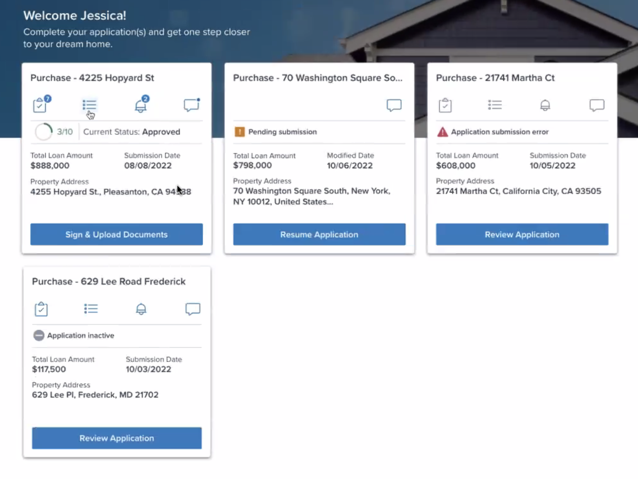 |  |
 |  |
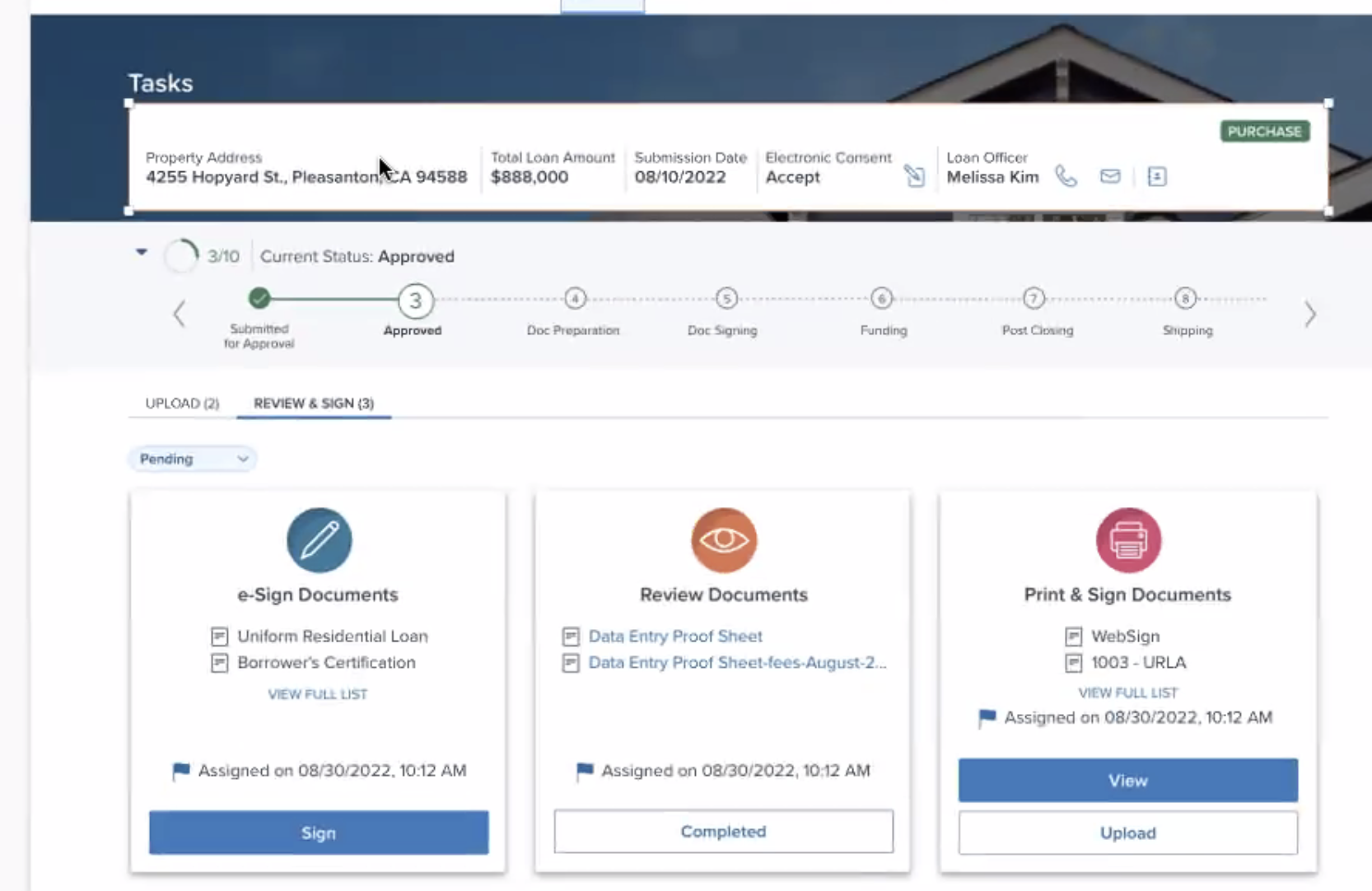 |  |
 |  |
Additional Examples (Optional)
| Hypothetical Scenario Graphic | Hypothetical Scenario Solution | Hypothetical Scenario Description |
|---|---|---|
| NA | NA | NA |
Digital Accessibility
While the CardBody Component itself primarily serves as a visual layout tool and does not introduce specific accessibility concerns, it is crucial to ensure that all content placed within the card-body is accessible. The responsibility for accessibility lies with the content and interactive elements integrated within the card-body.
Designers must adhere to accessibility guidelines for text, images, interactive controls, and other content types to ensure the overall accessibility of the card-body's content.
Given the card-body is meant to serve as an optional region of the card it should not require any special treatment apart from standard concerns but ad-hoc considerations needs to be done on the app side.
Usage Warnings
No known-of issues
References
- link to storybook stories when they exist
- Resize and Reflow Guidance