v.1.6.3.0
Overview
The Accordion is a layout component used to present large amounts of content on a single page by allowing users to hide and show portions of the information, thereby reducing scrolling or navigation to other pages. It affords the user an opportunity to read, compare, and/or act on the content in different sections concurrently. Unlike the expandable DataTable each section can present content unrelated to the other sections.
Anatomy

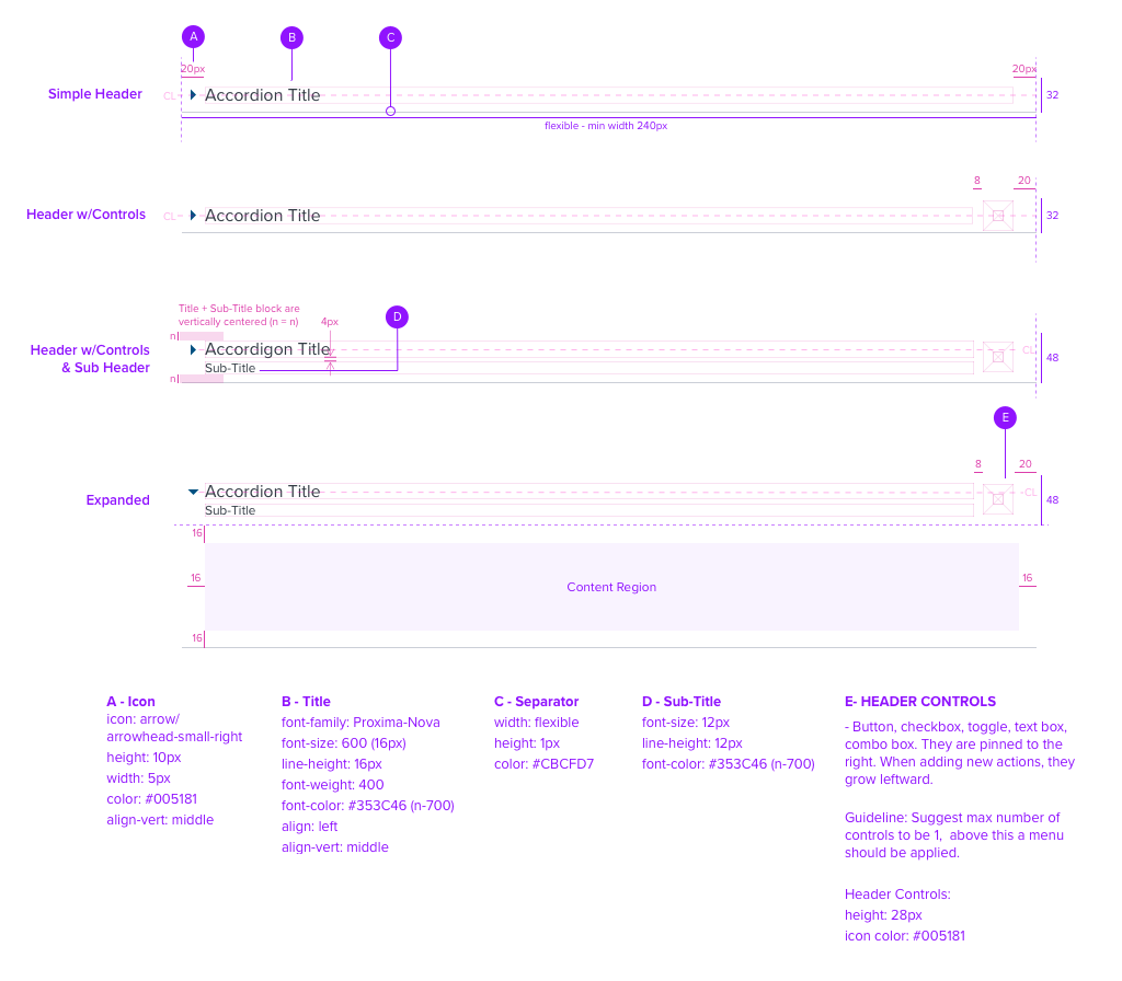
Alignment

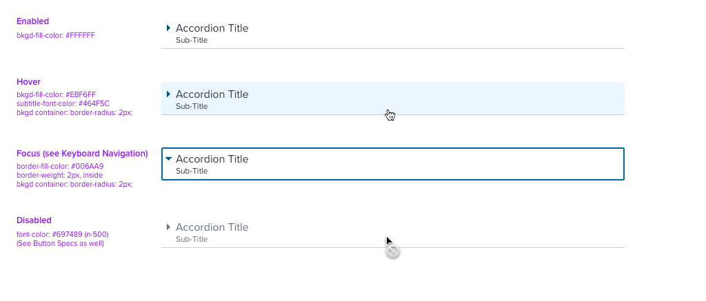
States

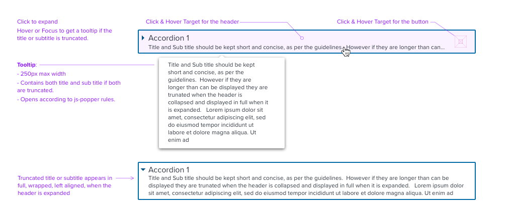
Overflow

Digital Accessibility
Keyboard Navigation and Screen Reader

| Key | Function | Semantic HTML Role | Announced Content | ARIA Attributes |
|---|---|---|---|---|
| 1 - Tab / Shift + Tab | For Global Keyboard Functions please see the 'References' link located below this spec. | Button (row) | header label, secondary label, state, button, group | na |
| 2 - Ent or Spc | For Global Keyboard Functions please see the 'References' link located below this spec. | Button (Icon Only) | label, button | na |
| 3 - Up / Down Arrow | For Global Keyboard Functions please see the 'References' link located below this spec. | na | na | na |
| ARIA Considerations |
|---|
| - Tab stop, label and value when nec., eg. "Header Lorem Ipsum", "Button Easy Order". |
| - Aria tags are used to describe up/down arrows can be used to navigate between rows. This is unique to the first row, is not repeated as a user navigates up/down between rows. |
| Rationale |
|---|
| NA |
