v.1.0.1
Overview
The Filter bar is applied anywhere two or more filter criteria are needed. It can be used above a Datagrid, a Card Array, the Left-Nav, or a Dashboard.
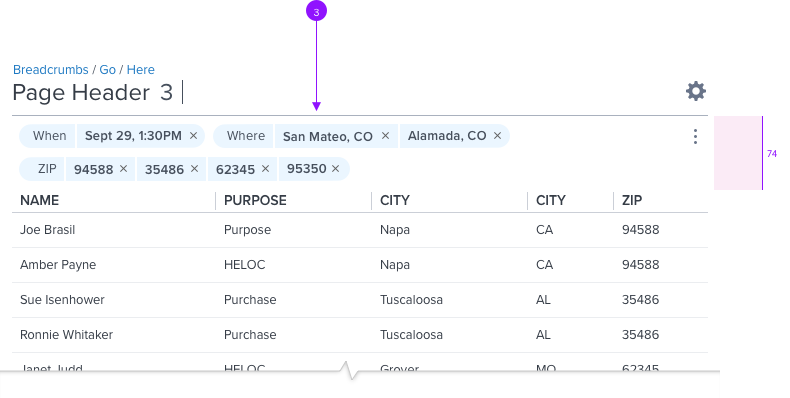
The Filter Bar is comprised of one or more pills, each of which represents filter criteria, this provides the capability to filter on multiple attributes.
The order of pills in the filter bar is determined by their type, from Left to right; Fixed Read-only, Fixed Editable, and Remove-able.
Anatomy
Visual Style
Definitions & Behavior
Default (Collapsed)

Default (Collapsed)
The Filter Bar collapsed, with a height of 4px
- Hover
The Filter icon will appear within the header column cell on hover, long press, or tab key.
(Please refer to the Grid spec for details.)
Active (Expanded)

Active (Expanded)
On click or tap, the height of the Filter Bar increase and Filter Pills will populated the within the container.
Collapsing Behavior
The Filter Bar will automatically close and return to default height if the user removes all Filter Pills.
Wrapping Rules

Wrapping, Stacking
Content will be placed from left-to-right
Height of the Filter Bar will automatically increase if Filter Pills extend beyond the width of the parent container
Filter Pills will wrap to a second row.
(Please refer to the Filter Pill spec for details.)
Actions
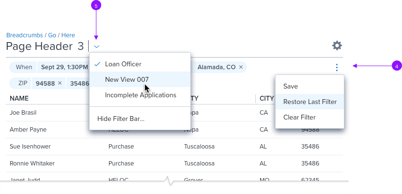
 Save The filter settings are saved as a 'View'. 'Views' are accessed via a dropdown menu to the right of the Page Title.
Restore Last Filter Need Info
Clear Filter Removes all Filter Pills. A Filter Pill will remain in the Filter Bar if it is a 'Fixed' type.

- Manually Expand/Collapse
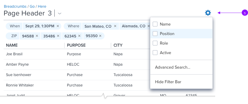
Filter Bar can be expanded or collapsed from the 'Page View' and 'Settings' drop menus.
The option in the drop menu is binary, and dependent on the current state
• If Filter Bar is expanded, menu option will be 'Hide Filter Bar'
• If Filter Bar is collapsed, menu option will be 'Show Filter Bar'
Visual Spec

Styling
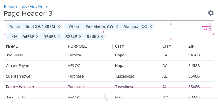
padding: 8, 0, 8, 0
background: neutral-000 (#FFF)
min-height: 4px
max-height: 74px
Motion
Filter animation set to 'duration-slow' when expanding and collapsing.
Digital Accessibility
Pending resource
