v.1.0.2
Overview

Anatomy

Types

Dimensions

Truncation

Example

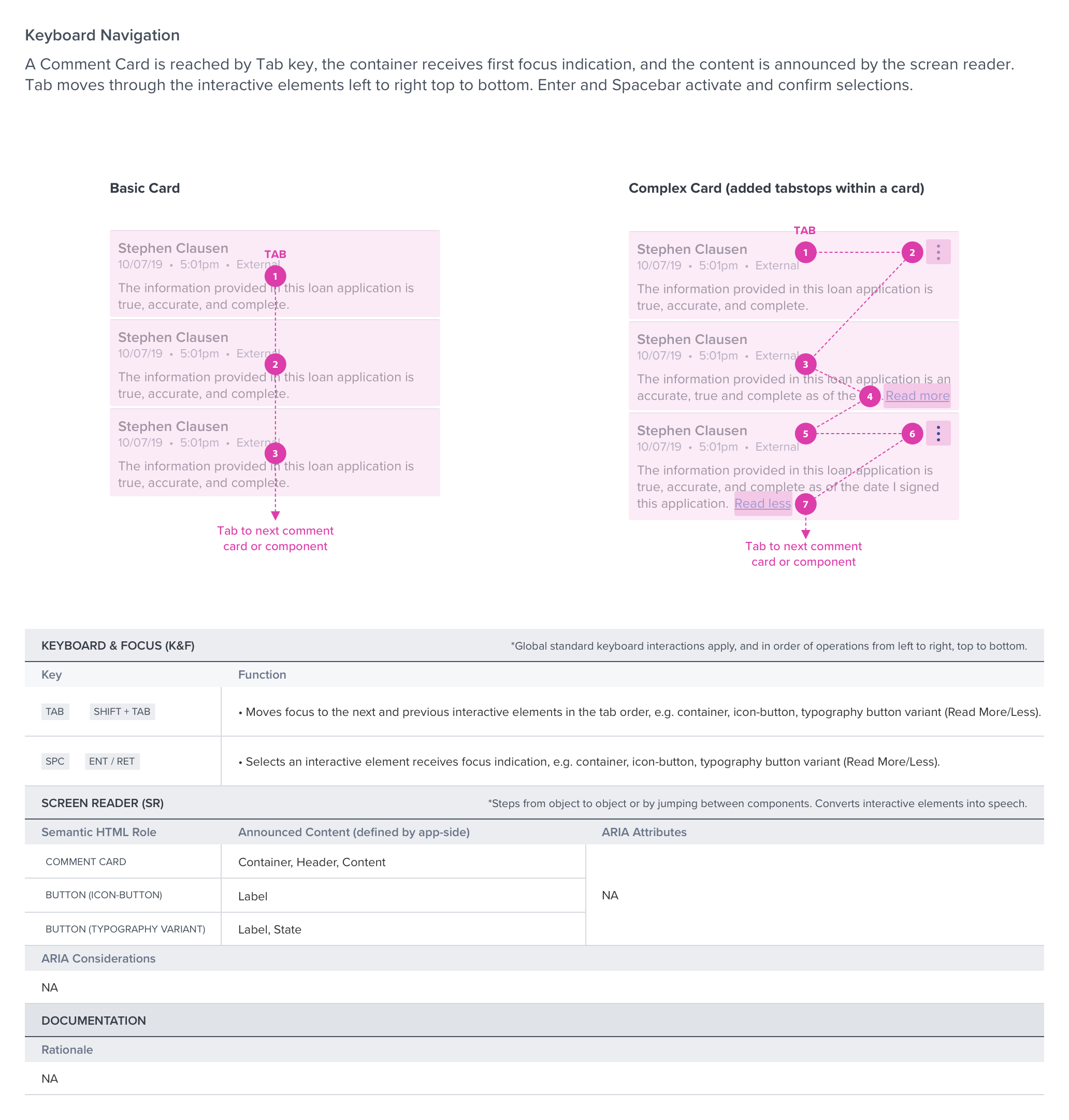
Digital Accessibility
References
UX Guideline
UX Spec: Read more / less
Basic Keyboard Functions