Overview
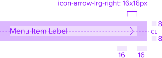
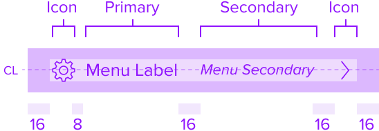
Activation with Submenu provides a right facing chevron serves the purpose of providing visual feedback about the presence of a (sub)menu spawning from the given "submenu" menu item.
The (sub)menu content can contain any of the documented composable menu-items but because they now live under a "sub" menu, a semantic hierarchical relationship between menu items is from this point forward established between different depth levels and both design and functionality MUST ensure and enforce meaningful hierarchical treatment.
Design
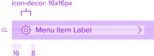
Box Model
Resize/Reflow
[images]
Validity Criteria:
- Covers spacing and dimensions: Identifying spacing and dimensions to ensure pieces are A11Y compliant. Use min-width/min-height instead of height/width/max-height/max-width. Define padding/margins in PX, and min-width/min-height in relative measures.
- Covers responsive/adaptive layout: Given the box models, clearly identify how the layout adapts to breakpoints and responsiveness.
[Images]
States
| State | Default Graphic | Default Styling |
|---|---|---|
| Idle | 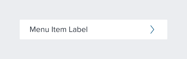 | background: neutral-000 (#FFFFFF) font: b2 (typography-variant) font-color: neutral-700 (#353C46) right-chevron-icon-color: brand-800 (#005181) |
| Focus | 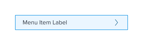 | [vs standard idle] background: brand-200 (#EBF6FF) border: 1px solid brand-500 (#1394E5) |
| Disabled | 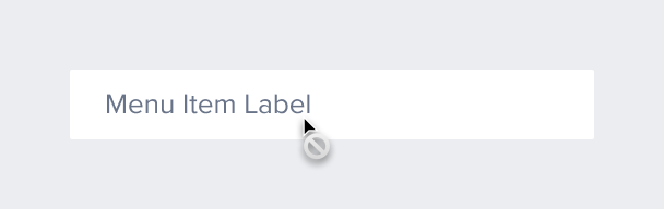 | [vs standard idle] font-color: neutral-500 (#697489) cursor: disabled right facing chevron disappears |
| Read-only | N/A (no required cases) | N/A |
| Hover | 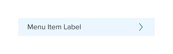 | [vs standard idle] background: brand-200 (#EBF6FF) |
| Error | N/A (no required cases) | N/A |
Configurations
Left Decoration Icon
Configured with a left decoration icon for better understanding of various actions to be taken within the submenu.
States
| State | Default Graphic | Default Styling |
|---|---|---|
| Idle |  | background: neutral-000 (#FFFFFF) font: b2 (typography-variant) font-color: neutral-700 (#353C46) left-icon-color: brand-800 (#005181) right-chevron-icon-color: brand-800 (#005181) |
| (for IEs) Focus | 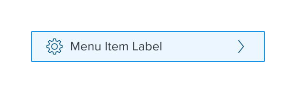 | [vs standard idle] background: brand-200 (#EBF6FF) border: 1px solid brand-500 (#1394E5) |
| (for IEs) Disabled |  | [vs standard idle] font-color: neutral-500 (#697489) left-icon-color: neutral-400 (#8C93A6) cursor: disabled right facing chevron disappears |
| Read-only | N/A (no required cases) | N/A |
| Hover |  | [vs standard idle] background: brand-200 (#EBF6FF) |
| Error | N/A (no required cases) | N/ |
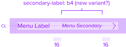
Secondary Text Label
Configured with a secondary text label.
States
| State | Default Graphic | Default Styling |
|---|---|---|
| Idle | 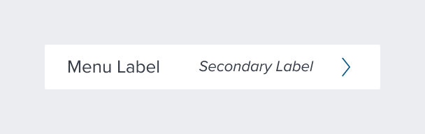 | background: neutral-000 (#FFFFFF) font: b2 (typography-variant) secondary-label-font: b2 (typography-variant) font-color: neutral-700 (#353C46) font-style: italic right-chevron-icon-color: brand-800 (#005181) |
| Focus | 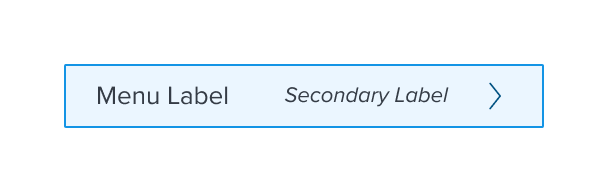 | [vs standard idle] background: brand-200 (#EBF6FF) border: 1px solid brand-500 (#1394E5) |
| Disabled | 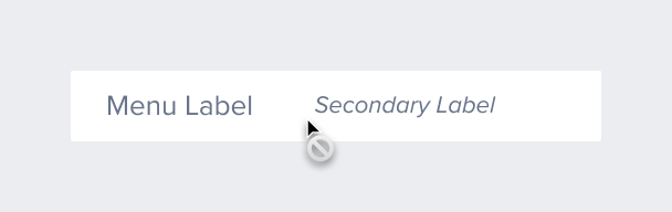 | [vs standard idle] font-colors: neutral-500 (#697489) cursor: disabled right facing chevron disappears |
| Read-only | N/A (no required cases) | N/A |
| Hover | 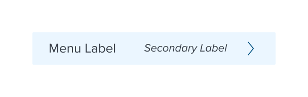 | [vs standard idle] background: brand-200 (#EBF6FF) |
| Error | N/A (no required cases) | N/A |
Left Decoration + Secondary Text Label
Configured with left decoration icon and secondary text label.
States
| State | Default Graphic | Default Styling |
|---|---|---|
| Idle |  | background: neutral-000 (#FFFFFF) font: b2 (typography-variant) secondary-label-font: b2 (typography-variant) font-color: neutral-700 (#353C46) font-style: italic left-icon-color: brand-800 (#005181) right-chevron-icon-color: brand-800 (#005181) |
| Focus | 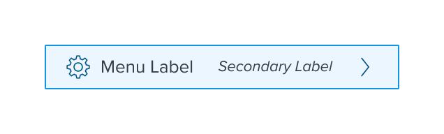 | [vs standard idle] background: brand-200 (#EBF6FF) border: 1px solid brand-500 (#1394E5) |
| Disabled |  | [vs standard idle] font-colors: neutral-500 (#697489) left-icon-color: neutral-400 (#8C93A6) right facing chevron disappears |
| Read-only | N/A (no required cases) | N/A |
| Hover | 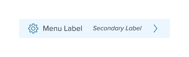 | [vs standard idle] background: brand-200 (#EBF6FF) |
| Error | N/A (no required cases) | N/A |
Use Cases
[UX to fill this with KNOW OF product scenarios that motivates this specific component]
| Original Scenario | Dimsum's version |
|---|---|
| [UX to add image of product use-case] | [UX to add image of use-case proposed solution with dimsum components] |
| ... | ... |
Additional Examples
| hypothetical scenario graphic | hypothetical scenario solution | hypothetical scenario description |
|---|---|---|
| [UX to add image of hypothetical use-case that could benefit from this component/variant] | [UX to add image of hypothetical use-case valuable proposed solution] | [UX to add an text based description/guidance of the scenario] |
| ... | ... | ... |
Digital Accessibility
Objective: Outline the component's compliance with WCAG 2.1 AA accessibility standards.
Variants
Objective: Provide an exhaustive list of the expected and available graphical variations that the component can take out-of-the-box, officially supported by the Dimsum team. Each variant's will then be created as a sub document but the this document should provide the quick-resume of each variants main points.
- Variant Name 1 (Provide link)
- Variant Name 2 (Provide link)
- Variant Name 3 (Provide link)
Usage Warnings
Objective: Address common errors or misunderstandings related to the component's use or implementation.
A component may have obvious potential to be used incorrectly by UX or product. It is possible there are common implementation pitfalls for app devs as well. List these below with complete references and rationale.
Pitfalls & Misconceptions
Implementation of interactive components within the card should enhance user experience without compromising the card’s core function as a structured and clear content container. Use interactive buttons, icons, toggles and images only when necessary in order to maintain a intuitive and easy-to-use experience.
Reference
Objective:List external references, guidelines, or documentation that provide further context or information about the component.