v.1.7
Overview
Toolbar creates a way for the user to take actions against content within a region or subregion of the page. It houses Action components such as buttons (types: primary, secondary, text, icon), inputs and even selects.
Anatomy
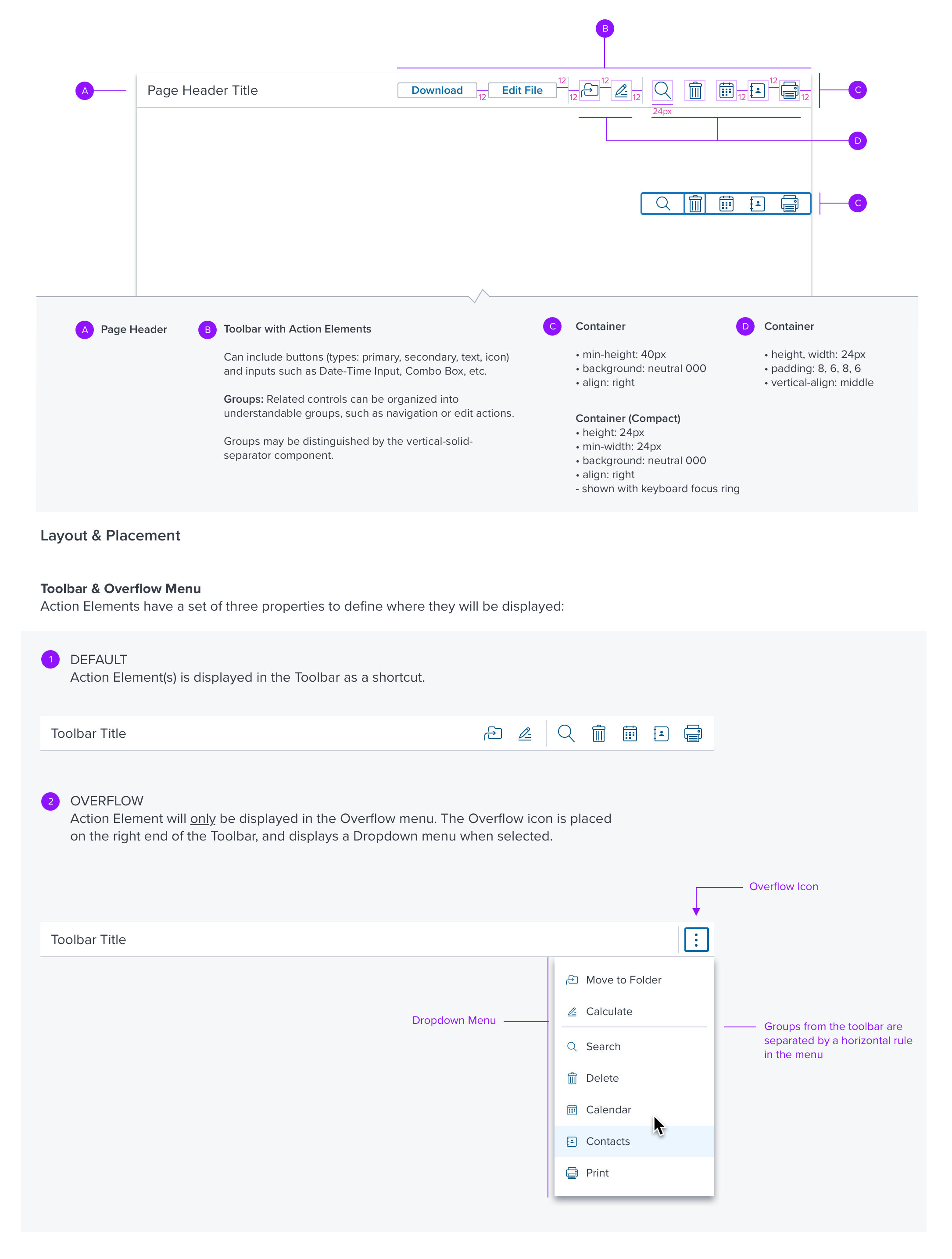
Layout & Placement
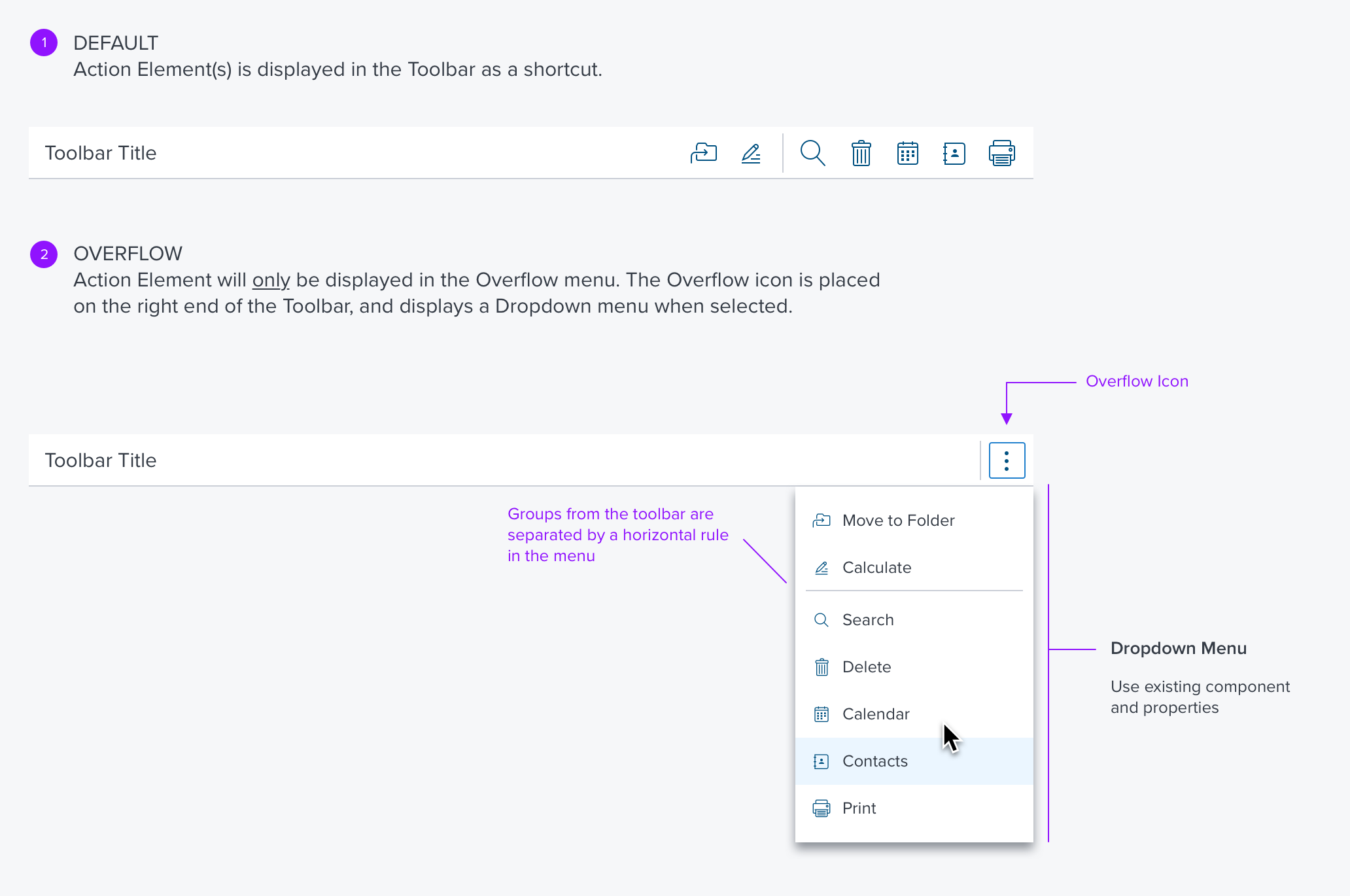
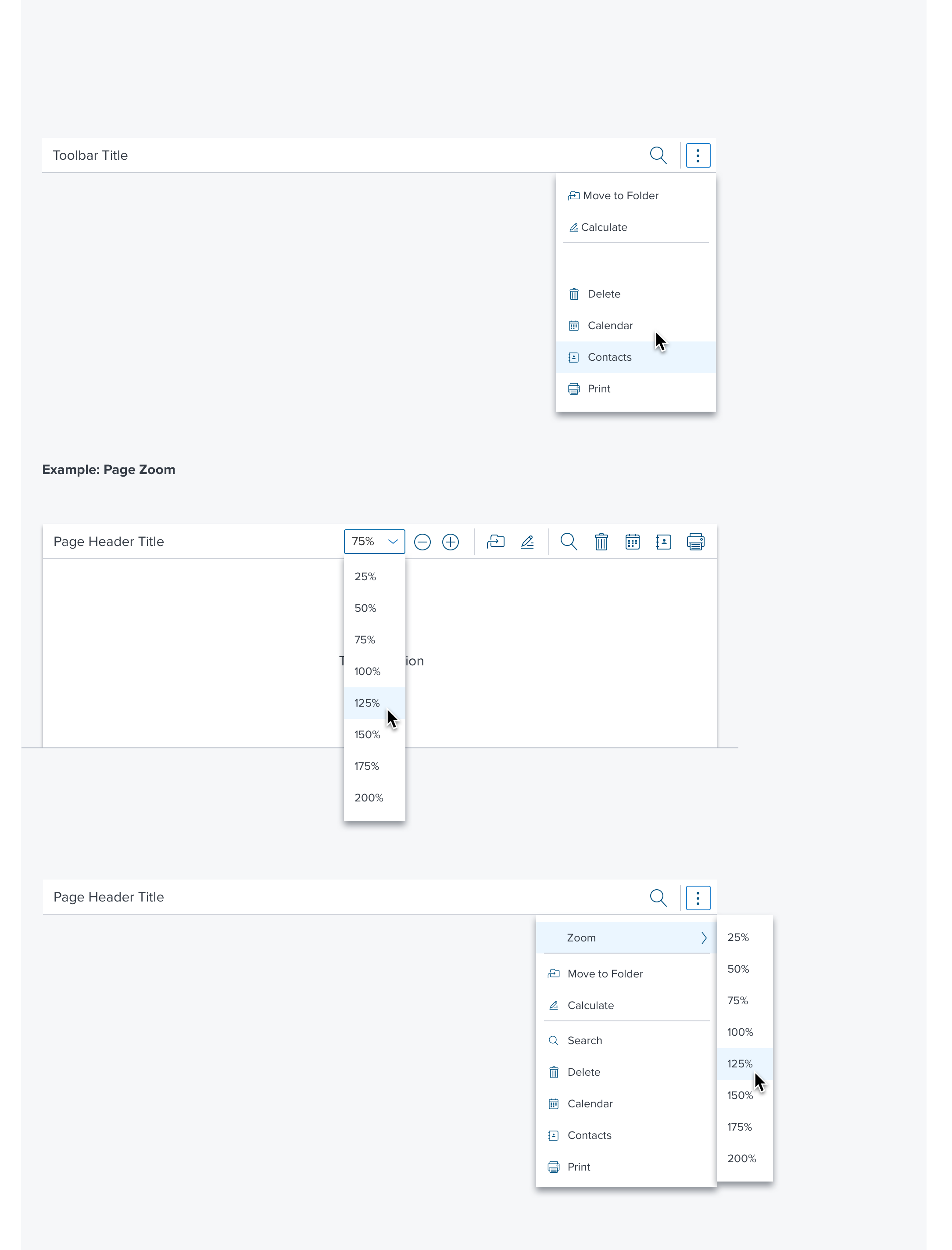
Toolbar & Overflow Menu
Action Elements have a set of three properties to define where they will be displayed:
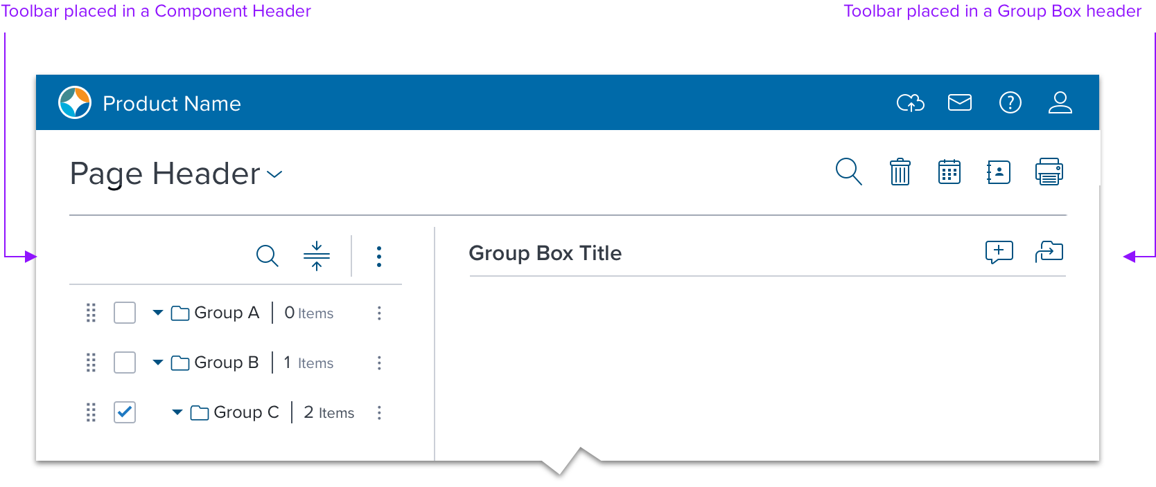
Contextual Region
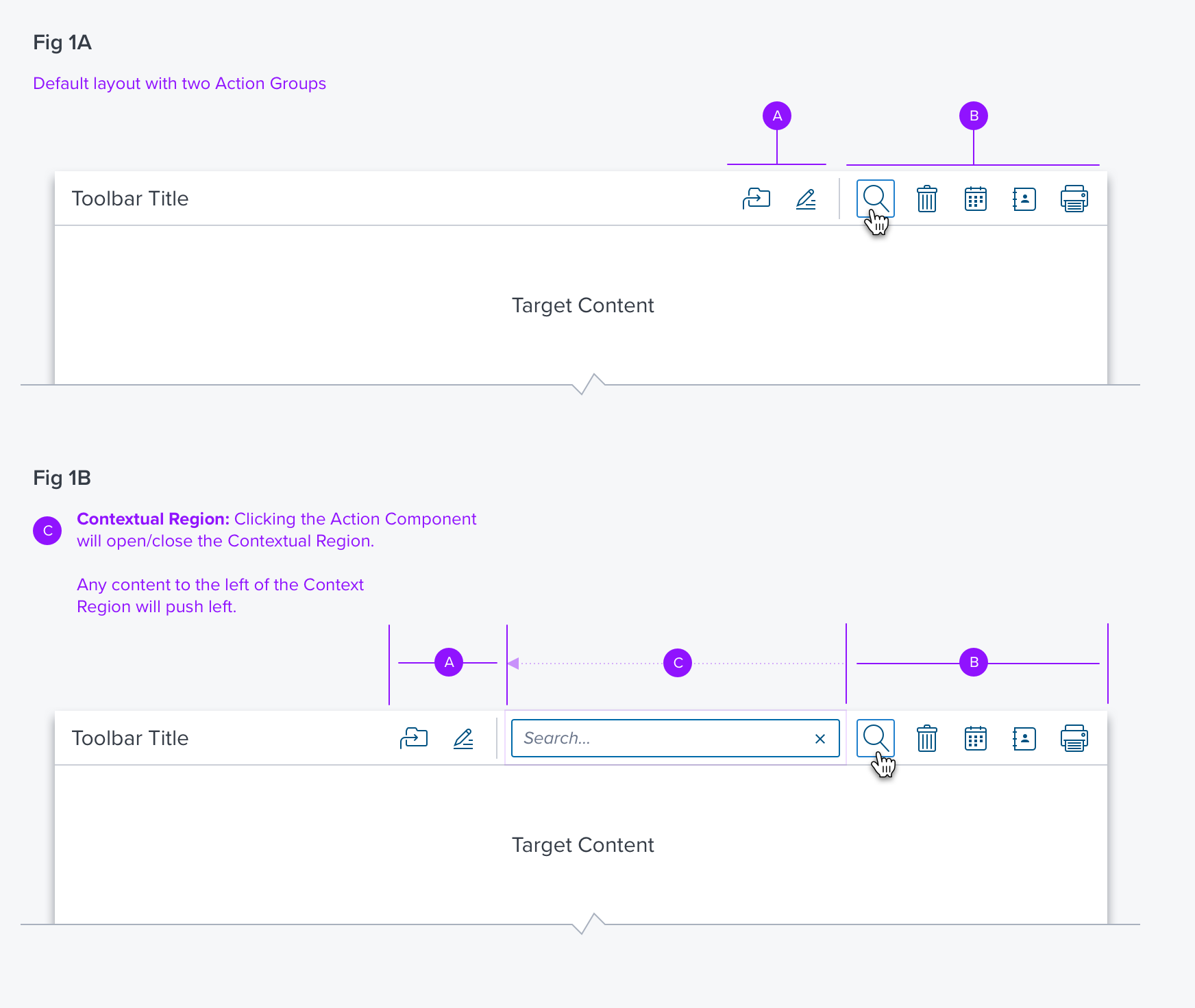
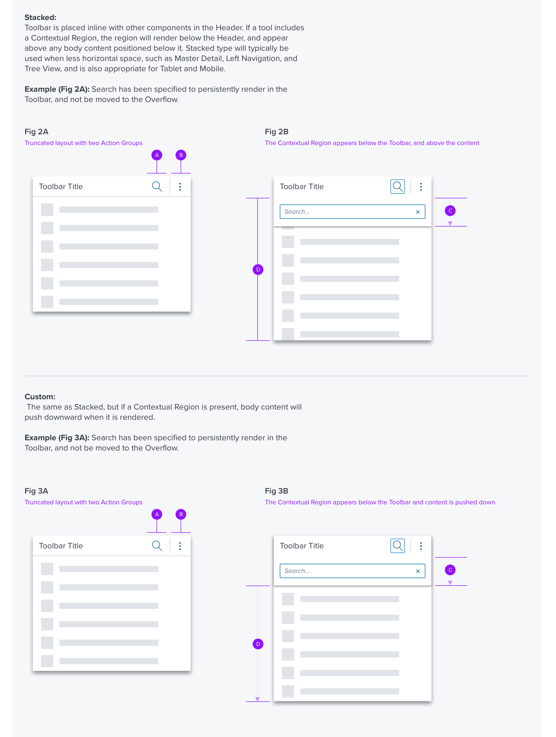
Inline: Toolbar is placed inline with other Header components. If a tool includes a Contextual Region, the region will render inline from left-to-right. Inline will typically be used on desktop-sizes that include more horizontal space than mobile or tablet.
Example (Fig 1A): Toolbar may include two Action Groups. Search icon includes a Search Box modifier, which will be placed in the Contextual Region (Fig 1B).
Available Controls
The following components are available for the toolbar. Some have been excluded due to usability concerns.
| COMPONENT | |
|---|---|
| 1 | FILLED BUTTON |
| 2 | OUTLINE BUTTON |
| 3 | ICON BUTTON |
| 4 | TEXT BUTTON |
| 5 | CHECKBOX |
| 6 | SEARCH BOX |
| 7 | COMBO BOX |
Usage Warnings
Using the Appropriate Size
Toolbar includes a compact size variant which allows it to fit specifically to a min-height of 24. As a result, controls with a height greater than 24 cannot be used in the compact variant. For example, Date Picker, Combo Box or Input text.
A typical use case for the compact variant is Data Table, which also includes a compact variant with row heights of 24 so it would be appropriate to use the compact variant of Toolbar.
Digital Accessibility
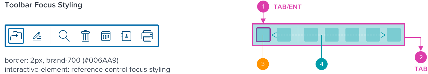
Keyboard Behavior
The Toolbar can group a set of interactive elements into a single tab stop. When the toolbar has focus, the container element border is highlighted simultaneously when the toolbar item highlight has focus, helping indicate that the container supports directional navigation with the arrow keys.
Navigation and focus details for embedded components can be found in their respective specs.
| KEY | FUNCTION |
|---|---|
  TAB / SHIFT + TAB TAB / SHIFT + TAB | Moves focus into and out of the toolbar (the left-most control is focused when receiving focus for the first time after page load. Otherwise, the most recently focused control receives focus). |
 ENT/RET or SPC ENT/RET or SPC | Makes a selection; submits a value (i.e. button, menu/list, overflow menu, search). Selects an interactive element after being navigated to by tab or arrow. Places focus on the trigger element (Data Table). Activates trigger element to display Toolbar and place focus on left-most control (Data Table). |
 Right Arrow Right Arrow | Moves focus to the next control on the right. If the last control has focus, focus moves to the first control. If an item in the popup menu has focus, does nothing. |
| Left Arrow | Moves focus to the previous control. If the first control has focus, focus moves to the last control. If an item in the popup menu has focus, does nothing. |
| HOME | Moves focus to the first control. |
| END | Moves focus to the last control. |
| ESC | Closes the Toolbar and returns focus to the trigger element |
| WAI-ARIA ROLES |
|---|
| The element that serves as the toolbar container has role toolbar. |