v 1.3.0
Overview
Slider provides a mechanism for selecting/displaying a value (one handler) or a range of values (two handlers). It is very clear and easy to use especially on mobile (touch) devices.
Usage
- Sliders are an ideal way to change a value when the results will be seen immediately (e.g. setting volume, adjusting zoom). Conversely, sliders should not be used to adjust a value when the result is not immediately apparent.
- Sliders are not the optimal choice when each position on the scale has a long and unique name.
- Sliders are best applied when the scale is linear and the values can be expressed minimally.
- The basic slider with no scale can be combined with a dynamic label that specifies exactly where the slider is set. This results in a very minimal and clean appearance while accurately displaying the current value.
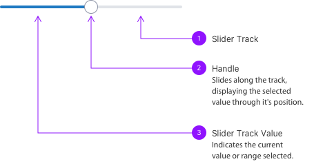
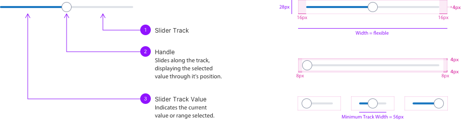
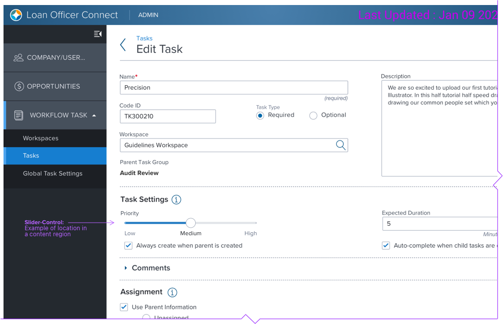
Anatomy
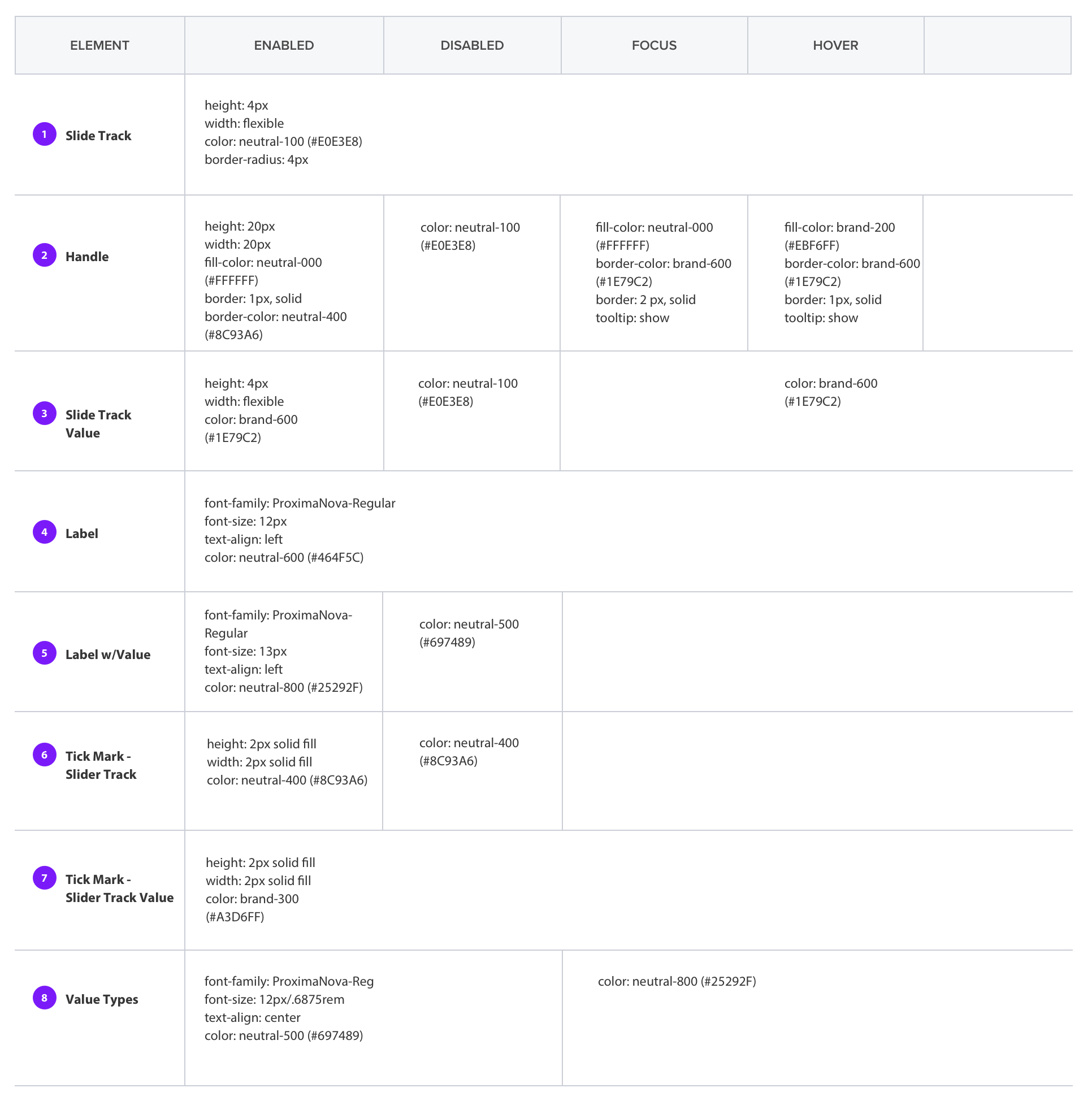
Visual Style
Spacing, Dimensions
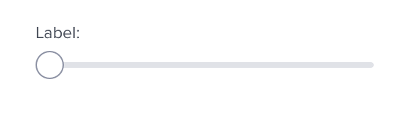
Basic- Horizontal Orientation
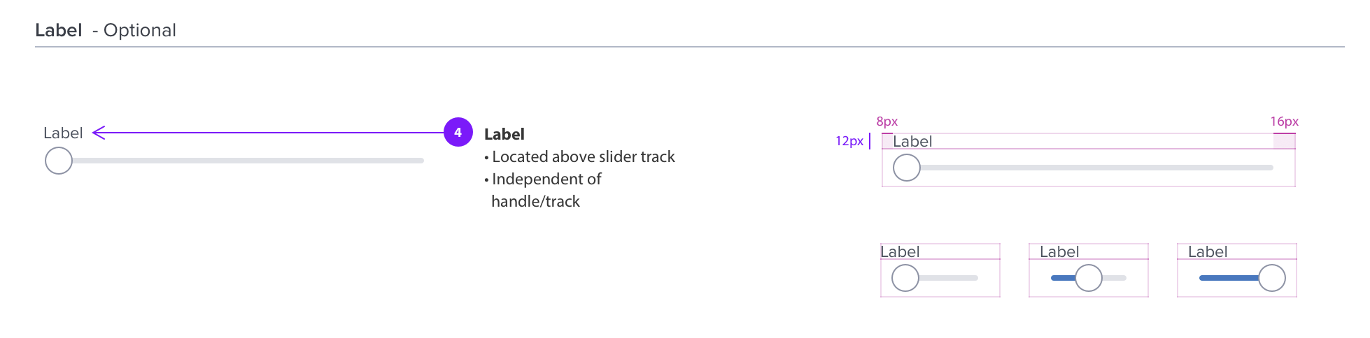
Label- Optional
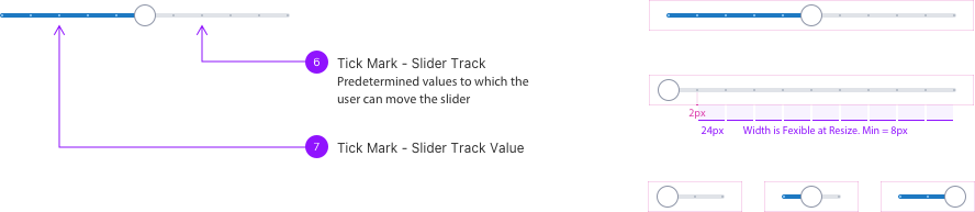
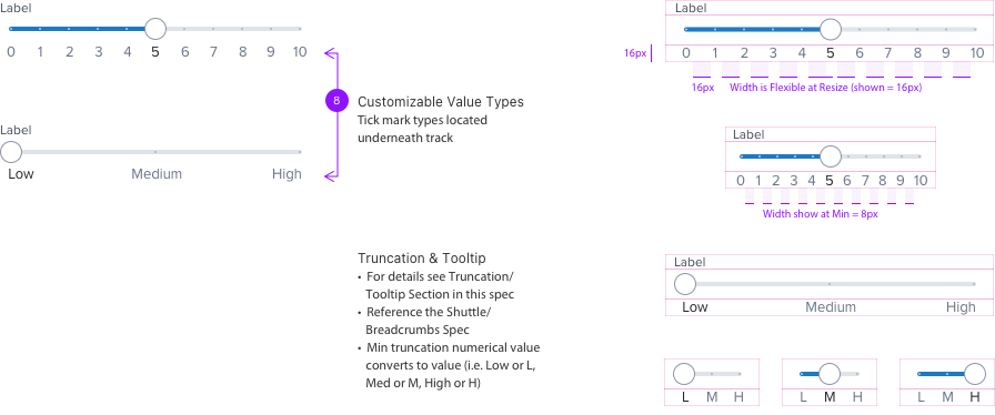
Tick Mark- Optional
• Tick marks are evenly spaced along the slider track, and the handle will snap to them.
• Each tick mark should change the setting in increments that are discernable to the user.
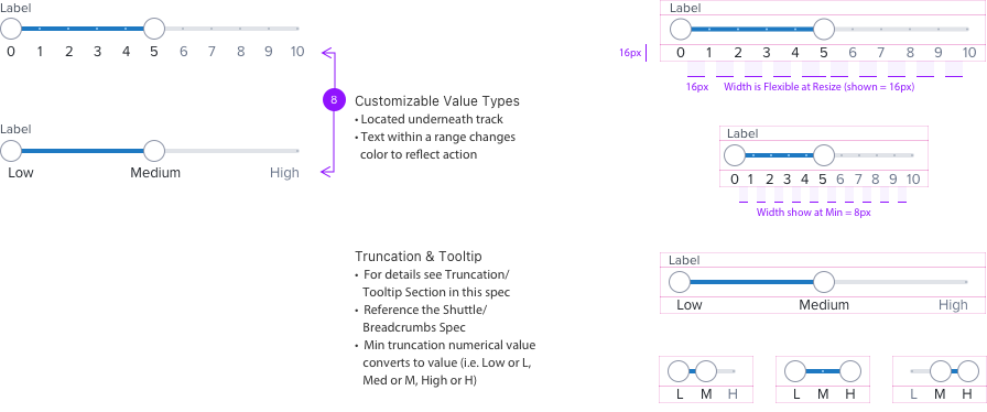
w/Tick Mark Value Types- Optional
w/Two Handles for a Range- Optional
Special Notes for Handle and Value Track
- By clicking and dragging the track value region, both of the handles will also be dragged along the track together maintaining the range that was set.
Text Wrapping
Standard Appearance
The Label and Value are located on the LEFT of the slider bar.
Text Wrapping
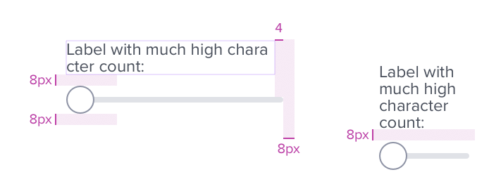
Labels and Values with high character count will wrap to multiple lines. Label and Value will stack when very minimal width is available.
Sample
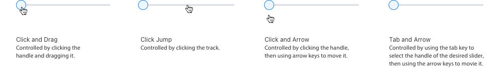
Behavior
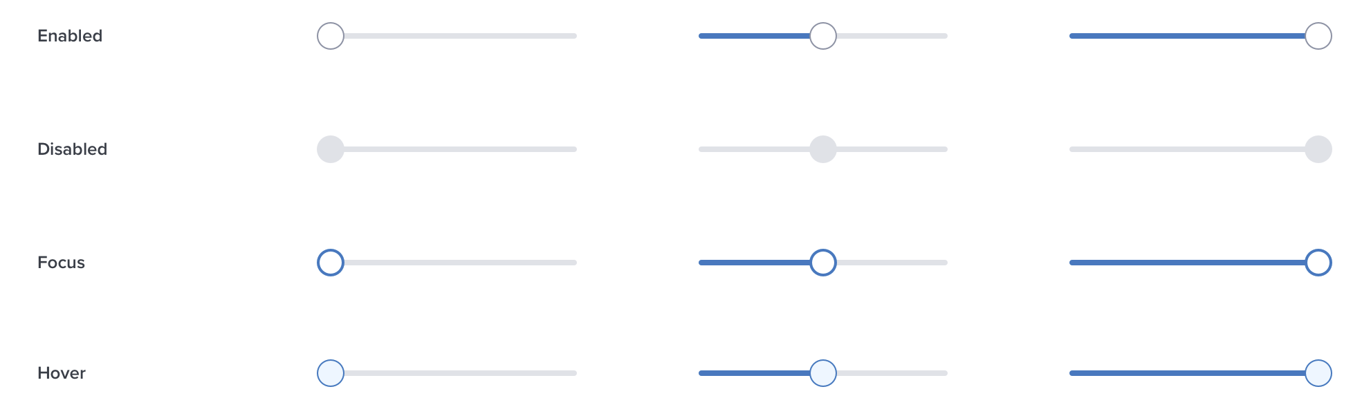
States
Digital Accessibility
Keyboard Behavior
| Key | Function |
|---|---|
| Right Arrow | Increases slider value one step. |
| Up Arrow | Increases slider value one step. |
| Left Arrow | Decreases slider value one step. |
| Down Arrow | Decreases slider value one step. |
| Page Up / Home | Increase slider value by 50% of the active node value |
| Page Down / End | Decreases slider value by 50% of the active node value |
Screen Reader
| Semantic HTML Role | Announced Content (Defined by app-side) | ARIA Attribute |
|---|---|---|
| SLIDER | Identifies the focusable element as SLIDER | |
| ARIA-VALUENOW | The current value | |
| ARIA-VALUEMIN | The minimum value allowed | |
| ARIA-VALUEMAX | The maximum value allowed | |
| ARIA-LABELLEDBY | The visible label for the Slider |