v 1.1
Overview
Use Badge as a graphic modifier to indicate status change from the system. Familiar use cases include placements on icons of messaging or email apps, and may indicate new or unread items have been added by the system, and even the quantity of items added.
Anatomy
Types & Usage
Number Badge
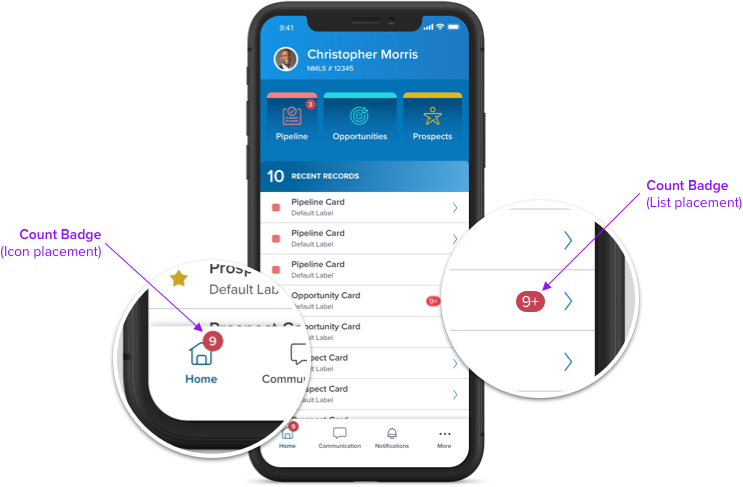
Used to display the number of items changed. Number Badge usually modifies an object such as Icon, Card and Tile.

Properties
• Background Color
• Font Color
• Size (Small, Large)
• Position (Left, Right)
See Visual Style for complete spec
Dot Badge
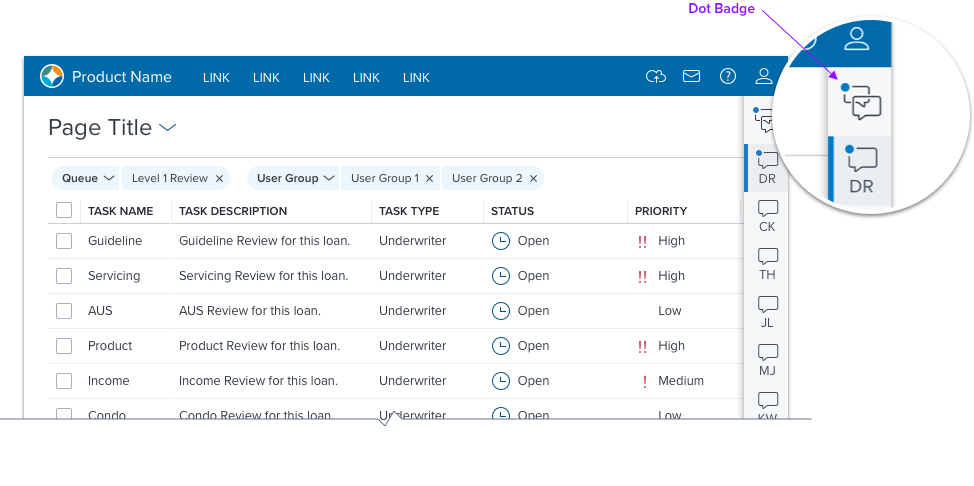
Used to display binary status changes of the system, such as if new items have been added to a list. Dot Badge is sized to work in small spaces.

Properties
• Background Color
• Position (Left, Right)
Overflow
If the number of items is greater than 9, the numeric count is truncated with the ‘ + ‘ character. To be configured by app teams.

Text Badge
Used as a ‘Tag’ to indicate status. Placed independent of other components, and primarily includes alpha characters.
Visual Style
Positioning
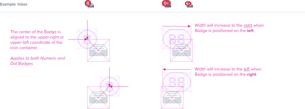
Both Number and Dot Badge can be positioned to the upper-left or the upper-right of the icon.
States (Numeric)
Default/Hover/Focus Active

SIZE: SMALL
font-family: Proxima-Nova
font-size: b3 (12px)
font-weight: 600; semibold
font-color: #FFFFFF; neutral 000
align: left, right
height: 15px
min-width: 15px
max-width: ~30px
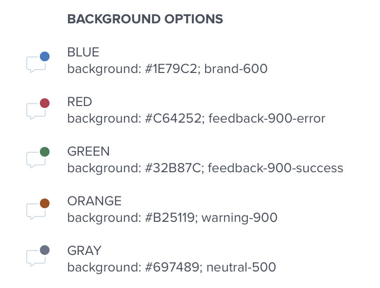
background: #C64252; feedback-900-error
border-radius: 7px
SIZE: LARGE
font-family: Proxima-Nova
font-size: h4 (16px)
font-weight: 400; regular
font-color: #FFFFFF; neutral 000
align: left, right
height: 21px
min-width: 21px
max-width: ~40px
background: #C64252; feedback-900-error
border-radius: 11px
Disabled

background: #697489; neutral 500
States (Dot)
Default / Hover / Focus / Active

SIZE: SMALL
height: 10px
width: 10px
border-radius: 100%
SIZE: LARGE
height: 15px
min-width: 15px
border-radius: 100%
Disabled

Digital Accessibility
Keyboard & Focus
Global standard keyboard interactions apply, and in order of operations from left to right, top to bottom.
| Key | Function |
|---|---|
| TAB | SHIFT+TAB | Moves focus indication to the next and previous interactive elements in the tab order. |
| SPC | ENT/RET | Activates and confirms action when an interactive element receives focus indication. |
Screen Reader
Steps from object to object or by jumping between components. Converts interactive elements into speech.
| HTML/Semantic Role | Announced Content (defined by app-side) | ARIA Attributes |
|---|---|---|
| Badge | Label, Status, Value | role="status" aria-label=“x number of items” or role=“alert” |
| ARIA Consideration |
|---|
| NA |
