v1.0.0
Overview
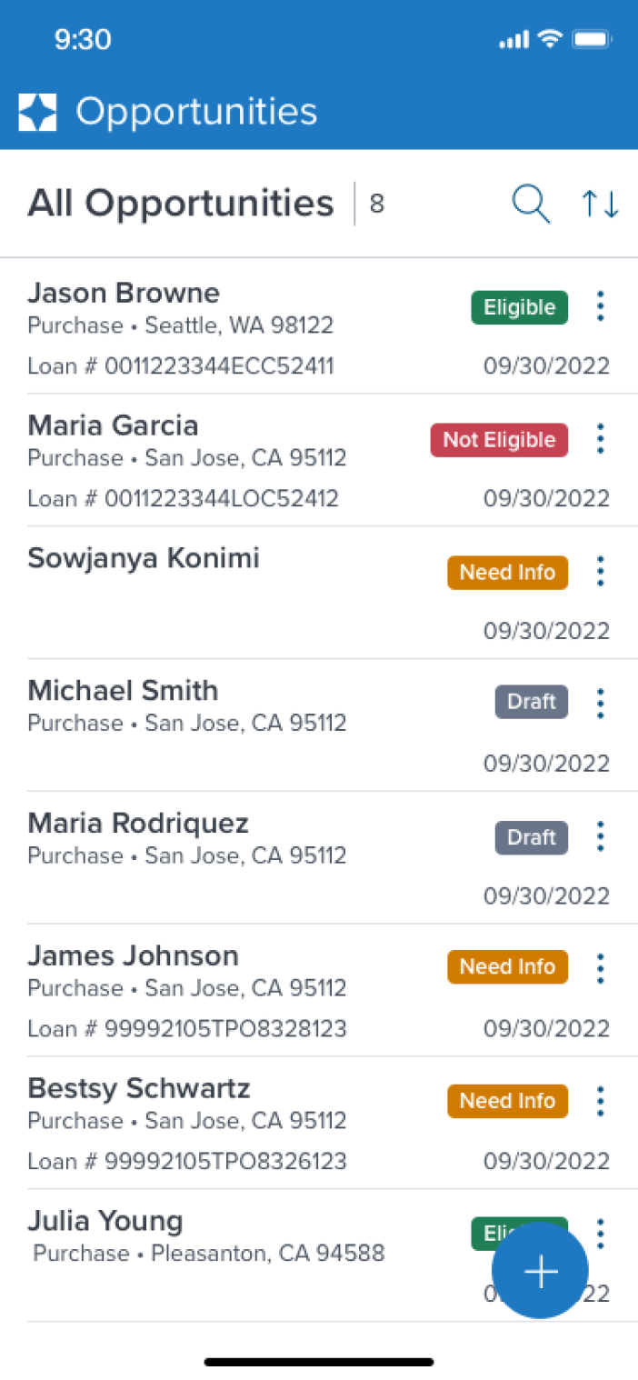
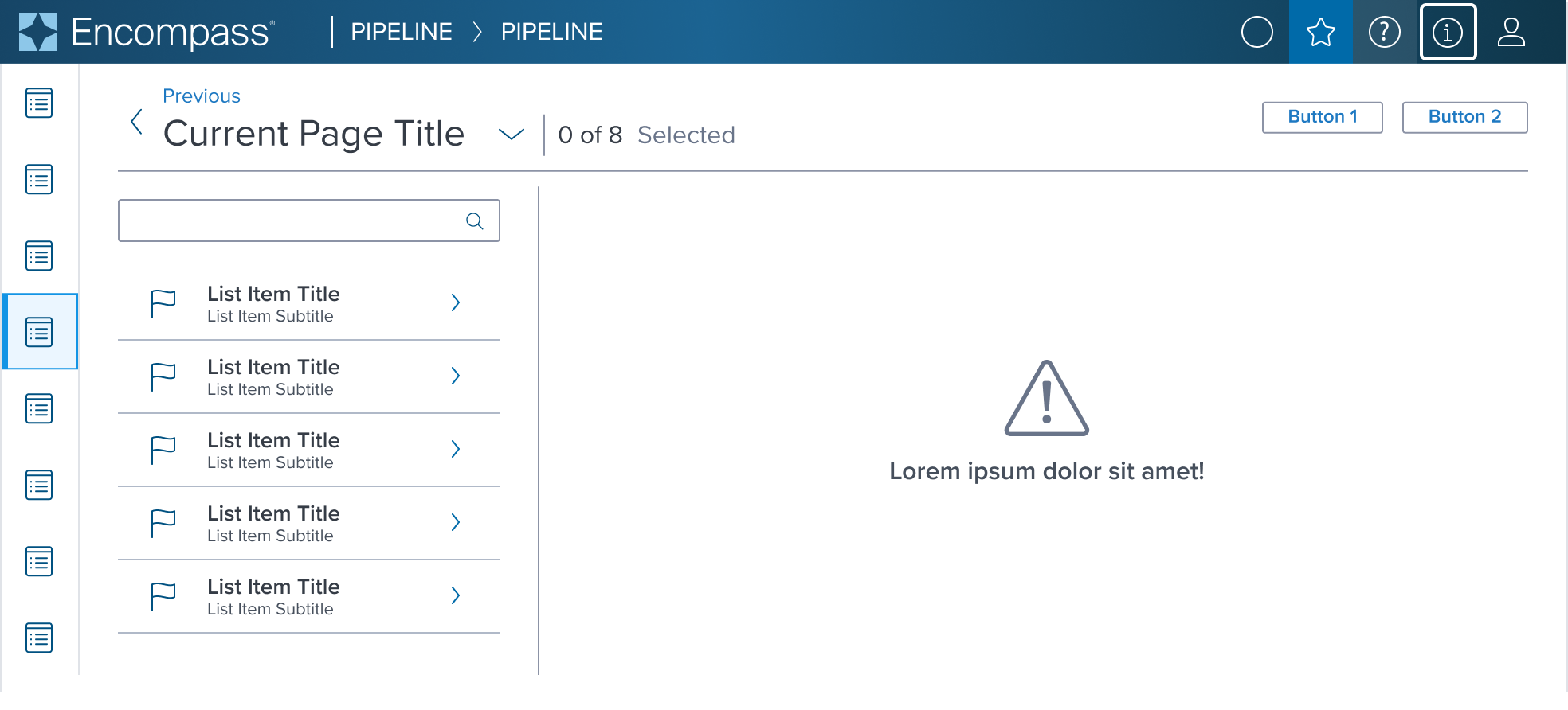
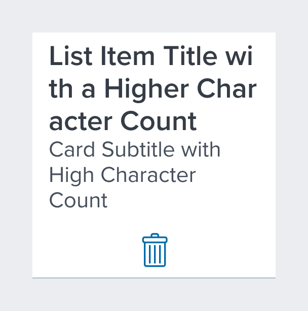
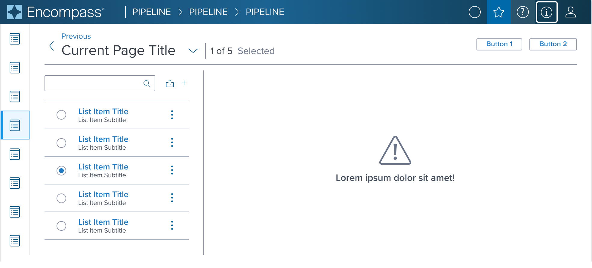
List Item is one of a group of elements in a vertical list. It must include a title and bottom border to separate it from other elements. It may include Interactive components to add functionality.
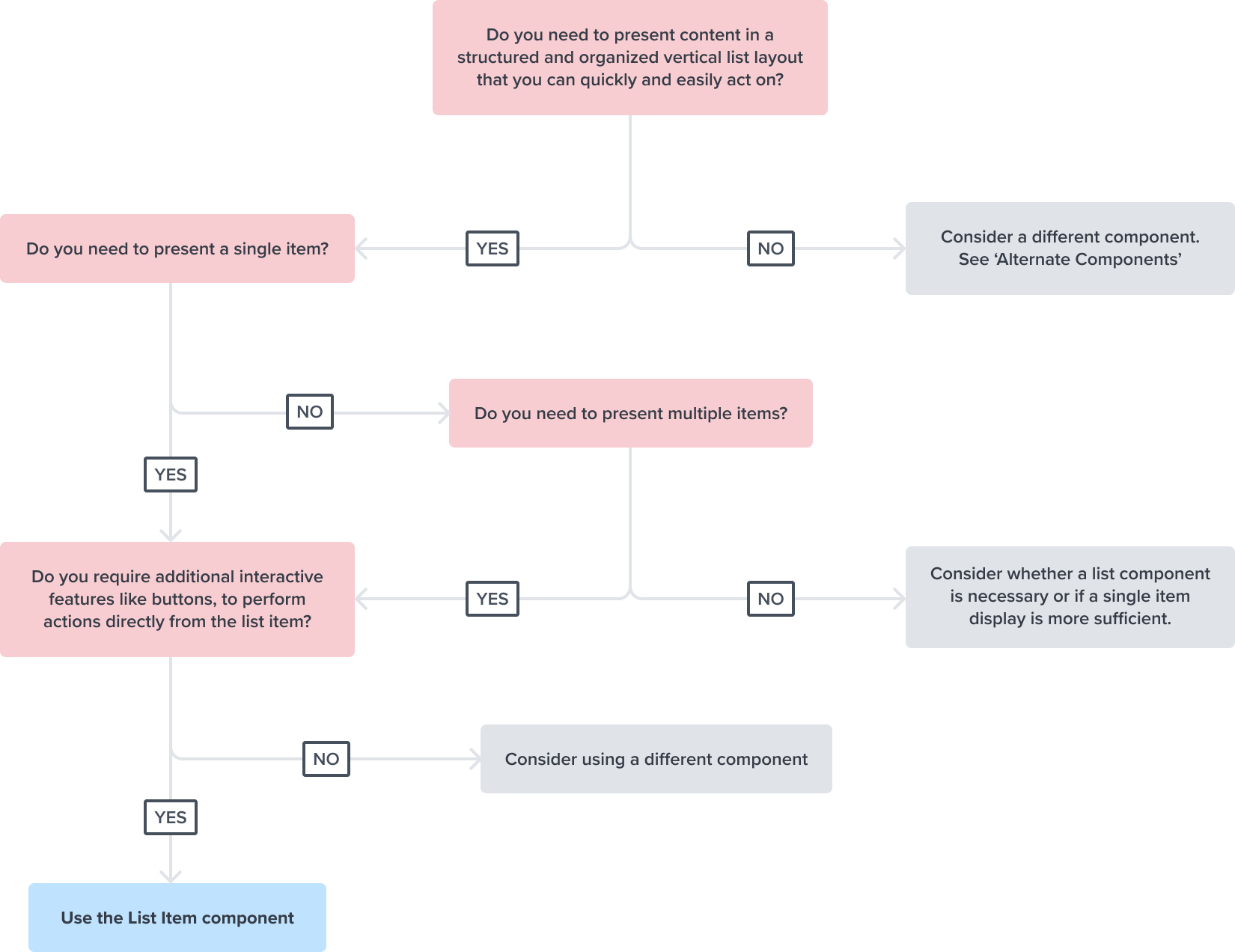
Decision Tree
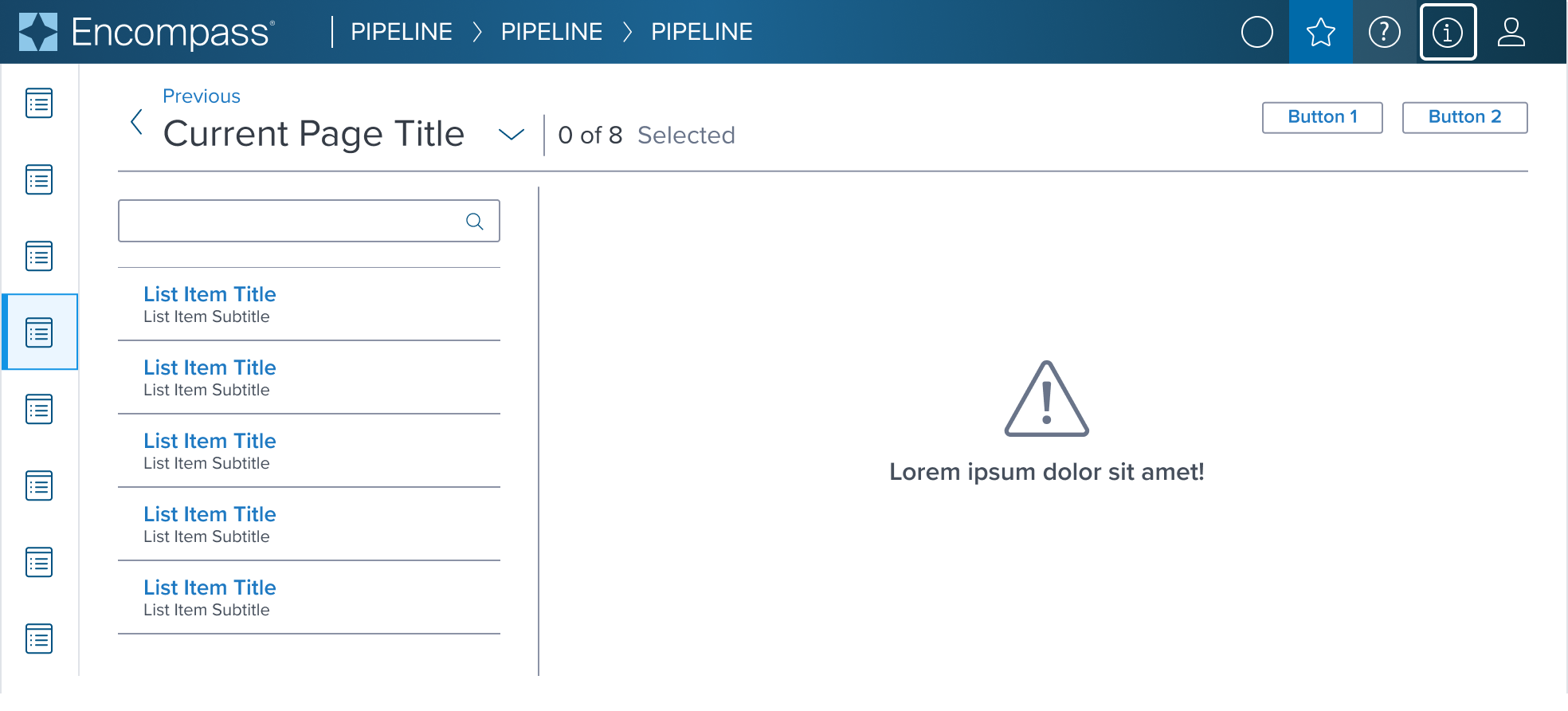
List Item can be used in dedicated single column vertical layouts when navigation is more important than comparison between objects or taking bulk action.
It's layout allows for easy integration into complex pages, providing a structured way to display important content that can be easily accessed for clear and efficient pathways to various features or sections of an application.
Design
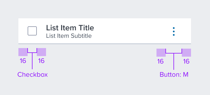
Box Model
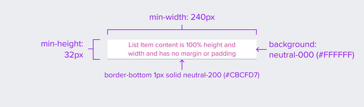
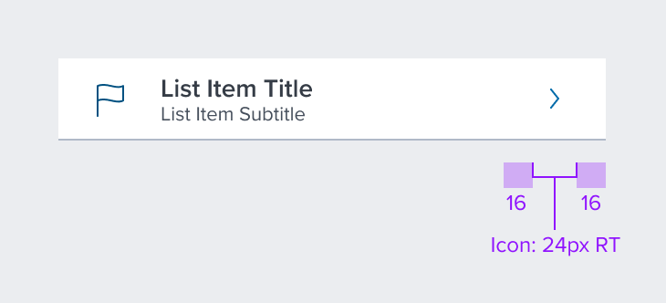
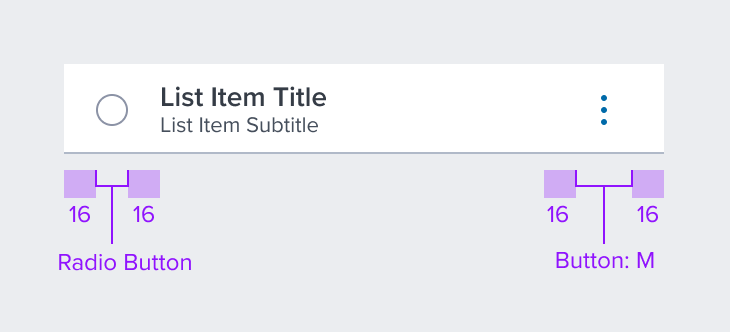
The List Item's box model is designed with specific features to ensure that it meets its core objectives as a container for structured, visually appealing content within a user interface.
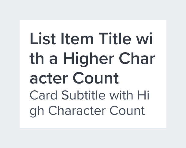
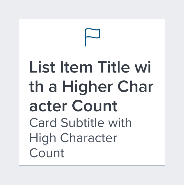
It has a compact design that has a shorter height to quickly scan different list sizes, and fine bottom border for clear separation between other items. This allows items to stack vertically together with no space in-between to maximize the number of items per viewport allowing users to scroll content more efficiently.
-
Border-bottom 1px solid neutral-200 (#CBCFD7)
The fine bottom border provides enough contrast to define the list item as a separate entity while keeping the design clean and unobtrusive. -
Background: neutral-000 (#FFFFFF)
The list item background has a neutral color fill to provide sufficient contrast with the foreground content for proper presentation. -
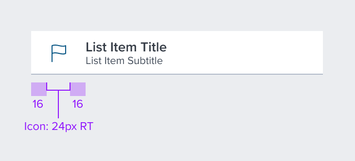
Margin/padding
List Item does not come with pre-set spacing values in order to optimize the flexibility of content layout.UX will provide exact guidance on a case-by-case basis to ensure consistent styling, which will follow standard Dim Sum spacing values.
-
Min-width 240px and Min-height 32px
These dimensions guarantee that the list item remains functional and aesthetically pleasing across different devices and screen sizes, adhering to the principles of responsive design. -
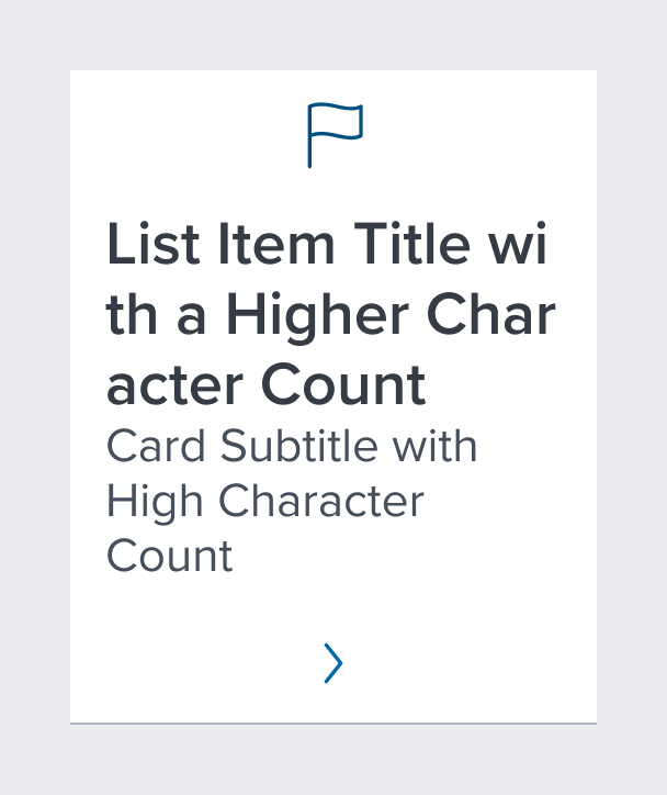
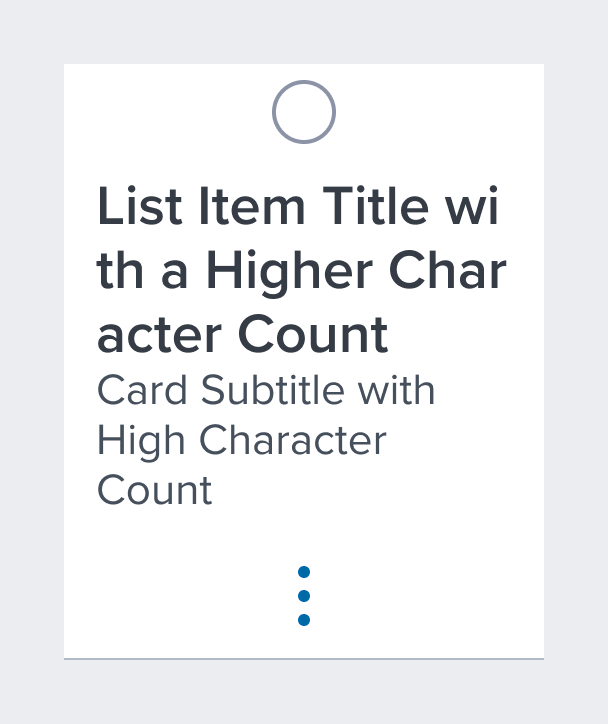
Stretches to fit content
The list item expands to fit the content, ensuring that the design adapts to content volume while maintaining the list item's visual integrity. It may also be confined to grid layout in order to maintain it's relationship and context in the user interface.
The List Item Component's box model is intricately tied to its purpose as a visual segregator in the design system.
Each aspect of the box model is deliberately chosen to uphold the clarity and distinctiveness of the list item as a content container.
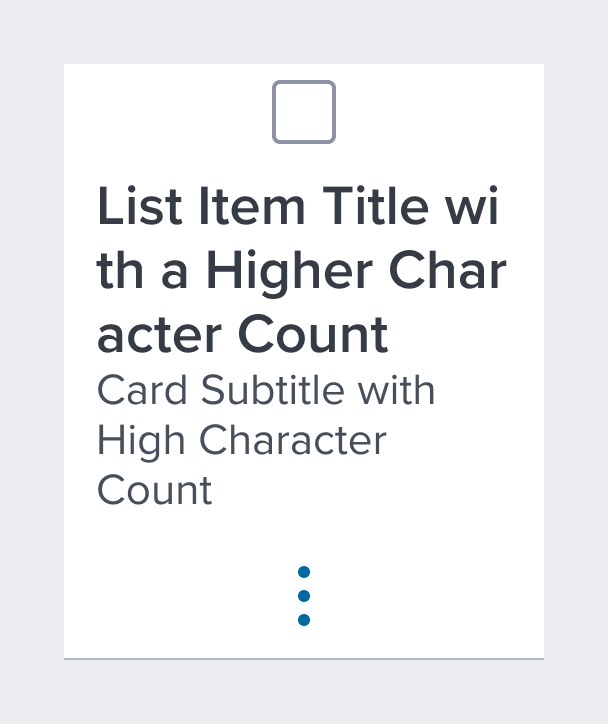
Responsive
By design, List Item supports responsive resize and reflow characteristics by defining minimum height and width in relative units. Relative measurements ensure that the list item maintains its structural integrity and visual appeal across different screen sizes and orientations, adapting gracefully as needed.
Dictating content-specific reflow behaviors goes beyond its scope and is managed by the individual content elements within the list item, which are designed to be responsive in their own right within the overarching design system.
This approach allows the list item to serve a wide array of content types and interaction contexts without imposing rigid layout constraints that could hinder the adaptability of the content it hosts.
States
| State | Graphic | Default Styling |
|---|---|---|
| Idle | 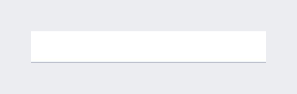 | min-width: 240 RT min-height: 32 RT background: neutral-000(#FFFFFF) border-bottom: 1px solid neutral-200 (#CBCFD7) |
| Focus | N/A (content needed to apply) | N/A |
| Disabled | 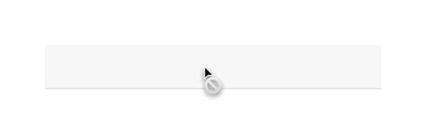 | [vs standard idle] cursor: disabled background: neutral-050 (#F6F7F9) border-bottom: 1px solid neutral-100 (#E0E3E8) |
| Read-only | N/A (contented needed to apply) | N/A |
| Hover |  | [vs standard idle] background: brand-200 (#EBF6FF) border-bottom 1px solid brand-500 (#1394E5) |
| Error | N/A (no required cases) | N/A |
Use Cases
Navigable and Actionable
| Original Scenario (Use Case) | Dim Sum Version (Proposed Solution with DS Components) |
|---|---|
 | 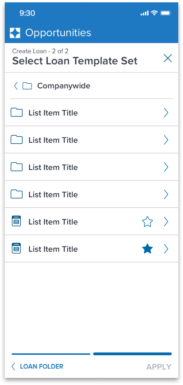 |
 | 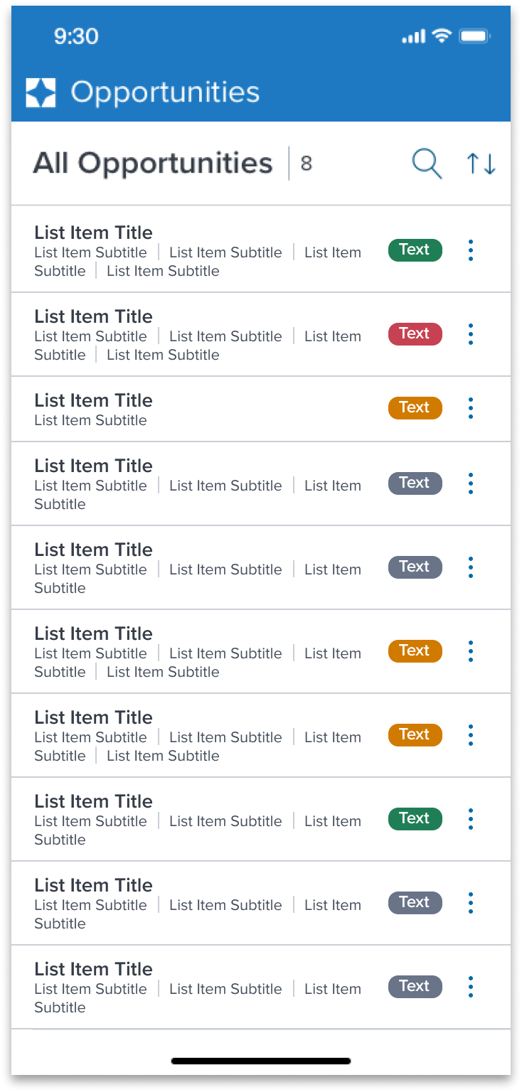 |
Activatable and Actionable
| Original Scenario (Use Case) | Dim Sum Version (Proposed Solution with DS Components) |
|---|---|
1. 2.  3. 3. | 1. Showing interactive element 2. Showing nested indented (parent uses the toolbar (vertical ellipsis icon) to edit or remove a nested option. 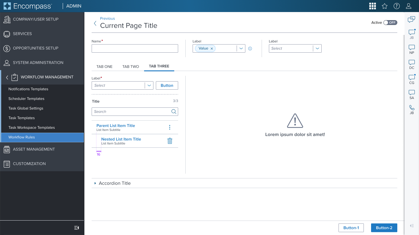 3. Showing multi nested with notification icon 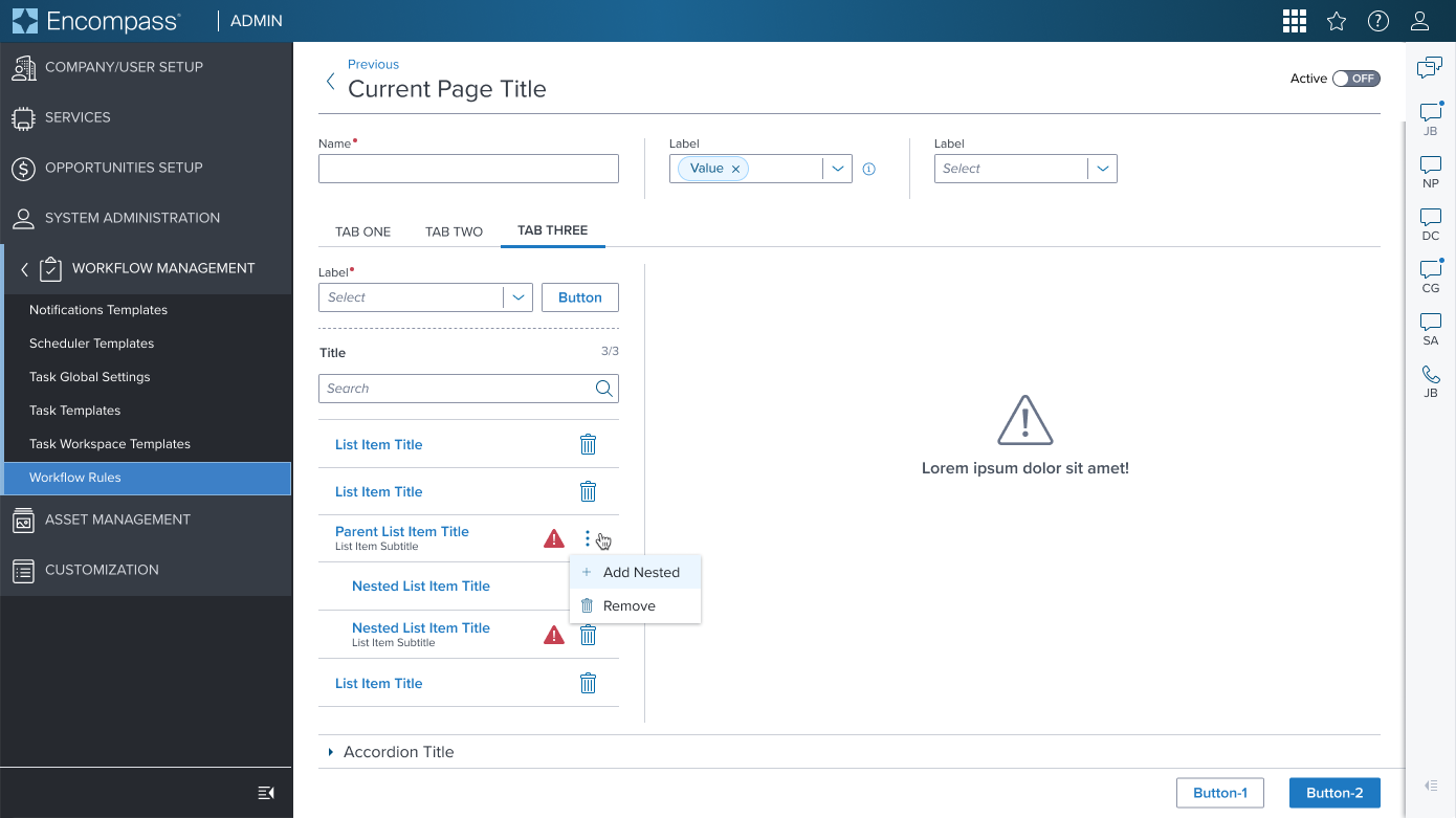 |
Examples
Given the List Item Component's role as a primarily container-centric element in the design system, its content is highly dependent on what scenario it's used in
The component's value lies in its ability to provide a structured, visually consistent container for diverse content types.
We have selected a curated list of scenarios that can be achieved through atomic composition with other components in the design system, allowing for a wide range of layout possibilities while maintaining a cohesive design language to serve as the baseline for application to expand on and integrate as is if the scenario is already covered.
| Scenario Graphic | Scenario Solution | Text Resize and Reflow (200%) | Scenario Description |
|---|---|---|---|
 |  |  | No Action Title and Subtitle text information for display purpose only. |
 |  |  | Primary Icon Leading decorative identifier located on the left side. |
 |  |  | Secondary Icon Trailing decorative identifier located on the right side. |
 |  |  | Action Information requires user action to be taken. |
 | 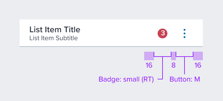 | 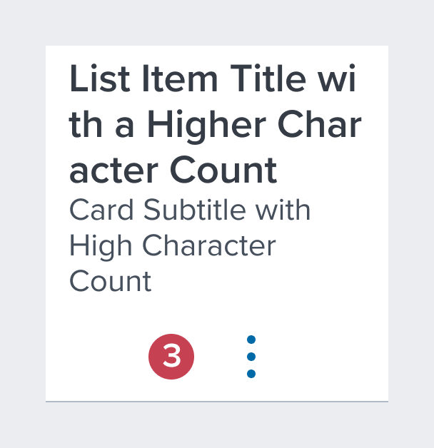 | Notification Badges When status change, new or unread items or quantity of items added needs to be indicated. Includes contextual action. |
 |  |  | Single Select Radio button control for selecting a single option within a multi select list. |
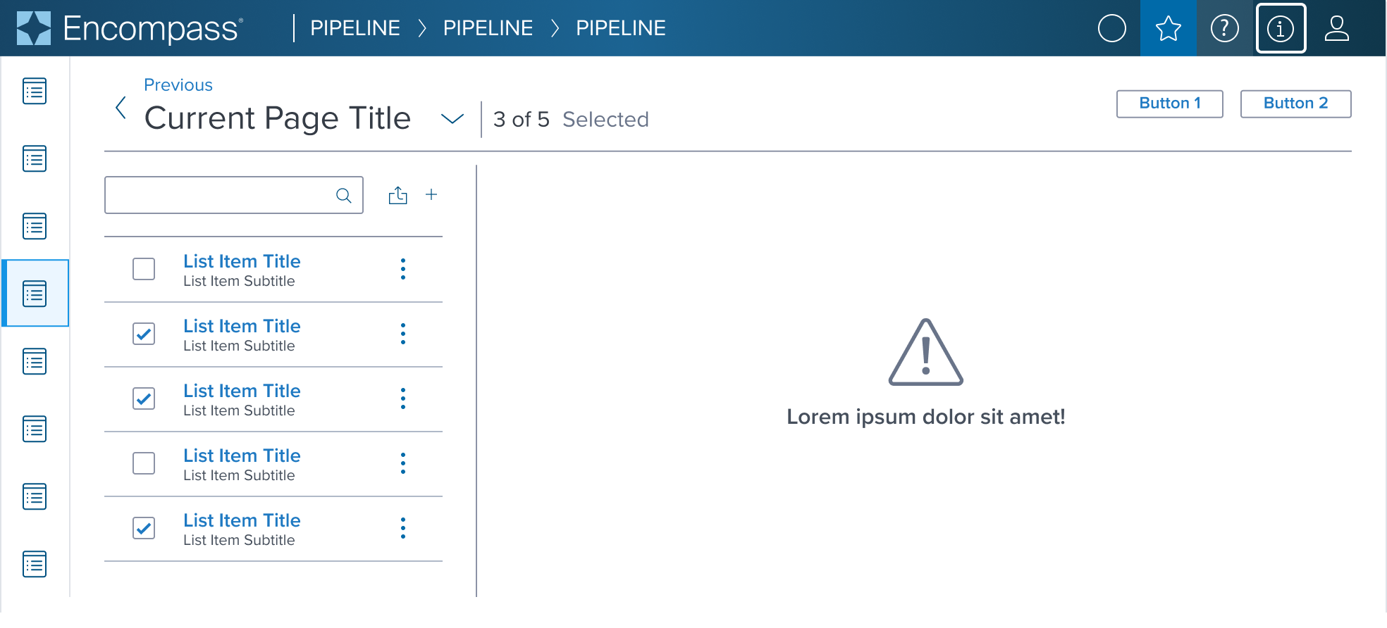 |  |  | Multi Select Checkbox control for selecting multiple options within a multi select list. |
Additional Examples
| Hypothetical Scenario Graphic | Hypothetical Scenario Solution | Text Resize and Reflow (200%) | Hypothetical Scenario Description |
|---|---|---|---|
| NA | NA | NA | NA |
Digital Accessibility
While the List Item Component itself primarily serves as a visual layout tool and does not introduce specific accessibility concerns, it is crucial to ensure that all content placed within the list item is accessible. The responsibility for accessibility lies with the content and interactive elements integrated within the list item.
Designers must adhere to accessibility guidelines for text, images, interactive controls, and other content types to ensure the overall accessibility of the list item's content.
List Item-y uses role='region', but ad-hoc considerations need to be evaluated and done on the app side.
Related Composition Components
The List Item Component's flexibility and adaptability are enhanced when used in conjunction with other atomic components within the Dim Sum Design System. These related components may include:
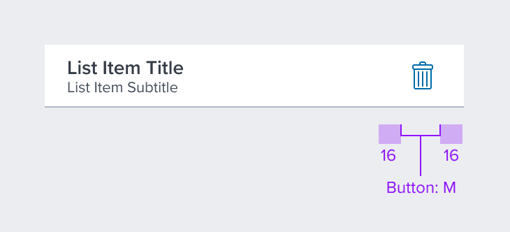
- Buttons: For actions within the list item.
- Icons: To add visual cues and enhance understanding.
- Notification Badging: To notify the user that there is new information that needs attention.
- Typography Components: For presenting textual content in a readable and aesthetically pleasing manner.
- Image Components: To incorporate visual media within the list item layout.
By leveraging these atomic components, designers can create highly customized card layouts that cater to specific content needs while ensuring a consistent and cohesive user experience across the interface.
Usage Warnings
Interaction within List Items
Pitfalls & Misconceptions
Implementation of interactive components within the list item should enhance user experience without compromising the list item’s core function as a structured and clear content container. Use interactive buttons, icons, toggles and images only when necessary in order to maintain a intuitive and easy-to-use experience.
- Do Not Use Nest Interactive Elements: Do not nest clickable elements within a List Item that is already interactive. Doing so creates a confusing for user experience for those that rely on assistive technologies and keyboard navigation.
- Semantic Roles for Interactive List Items: If interaction is applied to the list item container, such as making it behave as a button or link, it must be communicated with the correct semantic role for accessibility purposes.
- Manage Focus for Interactive List Items: When making a list item interactive, focus management becomes crucial to prevent user disorientation and to ensure a seamless navigational experience for all, including those using assistive devices.
Alternate Components
- Card v3: Use Card when a set of related pieces of content need to be easily assessed for individual or bulk action. Card typically summarizes key information from the full detail view of its corresponding content, such as an input form, service order results, or report. The summary helps the user compare each Card in the set and prioritize next actions, such as completing missing inputs or selections, or resolving errors.
- Grid: Use when quick and easy grid-based layouts are needed to ensure cross-browser support.
- Data Table: Use when multiple columns of information are needed for the user to select or act.
References
- link to storybook stories when they exist
- Global Practices - Keyboard Functions
- Resize and Reflow Guidance
- WCAG Role-Region
- WCAG Principles