Overview
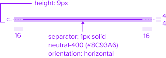
Separator is for presentational purpose only and has no action. It's delicate horizontal border offers sufficient contrast to delineate it as a distinct element, and is to be placed within the menu to distinguish section content.
1 - This indicator serves a presentational purpose and as has no related A11y concerns.
2 - (if color contrast applies) make sure is perceivable by low vision users.
3 - (if color contrast doesn't apply) this is purely presentational it can be treated as a "nice to have" and is correctly marked as "optional" html-wise, so by design we ignore color contrast concerns in favor of a leaner better looking final graphic
Design
Box Model
Resize/Reflow
[images]
Validity Criteria:
- Covers spacing and dimensions: Identifying spacing and dimensions to ensure pieces are A11Y compliant. Use min-width/min-height instead of height/width/max-height/max-width. Define padding/margins in PX, and min-width/min-height in relative measures.
- Covers responsive/adaptive layout: Given the box models, clearly identify how the layout adapts to breakpoints and responsiveness.
[Images]
States
| State | Default Graphic | Default Styling |
|---|---|---|
| Idle |  | background: neutral-000 (#FFFFFF) separator: 1px solid, neutral-400 (#8C93A6) orientation: horizontal |
| Focus | N/A (no required cases) | N/A (no required cases) |
| Disabled | N/A (no required cases) | N/A (no required cases) |
| Read-only | N/A (no required cases) | N/A (no required cases) |
| Hover | N/A (no required cases) | N/A (no required cases) |
| Error | N/A (no required cases) | N/A (no required cases) |
Configurations
Not applicable
Use Cases
| Original Scenario | Dimsum's version |
|---|---|
 |  |
Examples
| hypothetical scenario graphic | hypothetical scenario solution | hypothetical scenario description |
|---|---|---|
| [UX to add image of hypothetical use-case valuable proposed solution] | [UX to add an text based description/guidance of the scenario] |
Digital Accessibility
Not applicable
Variants
Not applicable
Usage Warnings
No known-of issues
Reference
Not applicable