v 1.3.0
Overview
The Page Header provides context for the users' understanding of what they are expected to do on a page. It is essential and as such, every page should include one with few exceptions such as the login page.
A title is placed on the left, with optional additional contextual information, while an optional Toolbar on the right allows contextual action to be taken on the page.
If there is only one Section/Box on the page - for example, if the page only contains a dGrid, Accordion or Card Array - the Page Header also serves as the Section Header, and no component level Section/Box header is required.
Anatomy
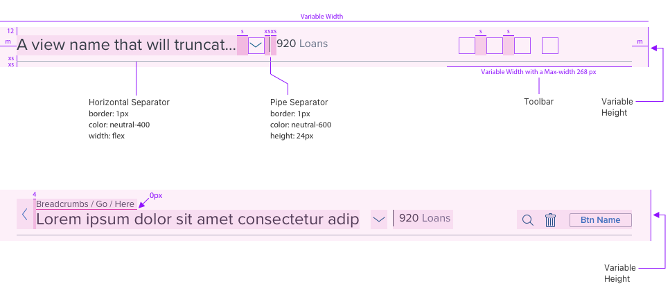
Visual Mockup of Page Header
Page Header with Label/Value Pair Page Title

Page Header with just Value

Page Header with Breadcrumb and Back Arrow

Page Header on smaller viewport with Overflow Menu

Page Header with only one item (no View Managment = no chevron)

Page Header with one view and View Management enabled

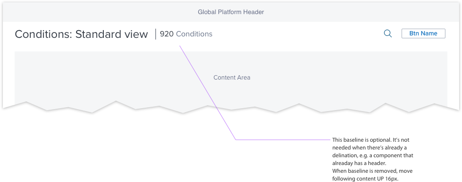
Optional baseline shown

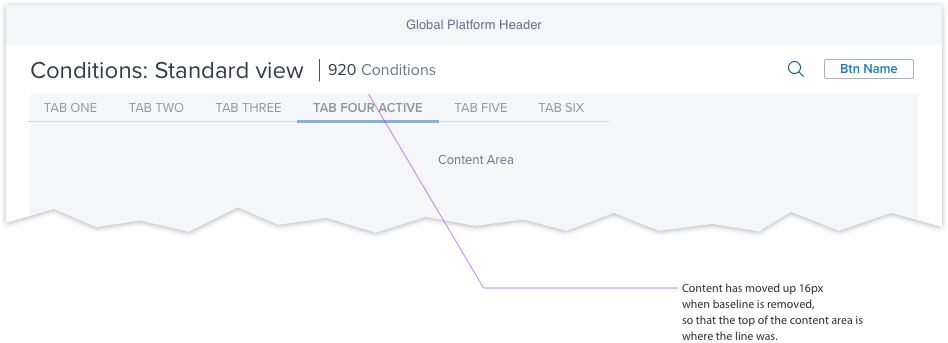
Optional baseline hidden, content moved up. E.g. tabs as shown

Visual Style


When there is only one title in the menu the chevron (#3) can be programmatically hidden.
Edit Interaction States
Default

Hover / Page Header Edit Field

Active + Focus / Page Header Edit Field

View Manager Interaction States
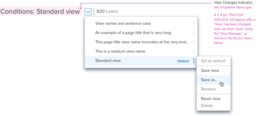
Page Header View Manager

Page Header Save View Changes

Toolbar Interaction States
Default Search

Active Search

Results for Search

Toolbar Overflow Menu

Page Header Scenarios
Edit Mode - Page Header with Breadcrumb and Truncation

Small Viewport Truncation with Back Arrow and Breadcrumb

Truncation Tooltip

Page Header with Number Only

Page Header with Breadcrumb and Chevron

Basic Page Header

Digital Accessibility
| Key | Function |
|---|---|
| Tab | ・Takes user to the next interactive element in the tab order. |
| Shift+Tab | ・Takes user to the previous interactive element in the tab order. |
| Enter/Return OR Spacebar | ・Selects and or opens an interactive element (i.e. button, menu/list, overflow menu, search. ・Used to select an interactive element post navigating by tab or arrow. |
| ESC | ・Exits control, collapses list, confirms user input. |
| Down Arrow | ・Moves focus down options (i.e. button, menu/list, overflow menu, search. ・When inside input field, moves cursor to the end of the text string. ・Opens drop menus (i.e. down chevron, pills) and overflow menu. |
| Up Arrow | ・Moves focus up options (i.e. drop menu/list, overflow menu, chevron) ・When inside input field, moves cursor to the front of the text string |
| Left Arrow | ・Moves focus left options (i.e. input field, pills) ・When inside drop menu, opens and closes overflow menu |
| Right Arrow | ・Moves focus right options (i.e. input field, pills) ・When inside drop menu, opens and closes overflow menu |
| Delete | ・Clears a value/character within the input field. ・Clears a pill when it has received focus. |
