v 2.0
Important Usage Note: Transition from Dropdown Menu v2 to Menu Button
The design system team is shifting focus from the Dropdown Menu v2 component to the newly created Menu Button widget.
This change aligns with the company's commitment to accessibility (a11y) compliance and aims to provide a more inclusive user experience across all products.
Going forward, any accessibility efforts on Dropdown Menu v2 will be paused until product teams provide feedback on specific scenarios where the new Menu Button widget may not meet their needs.
The design system team will address these cases with tailored solutions, rather than applying fixes to Dropdown-Menu v2.
The goal is to gradually reduce the use of Dropdown Menu v2 as products adopt the Menu Button or alternatives.
Overview
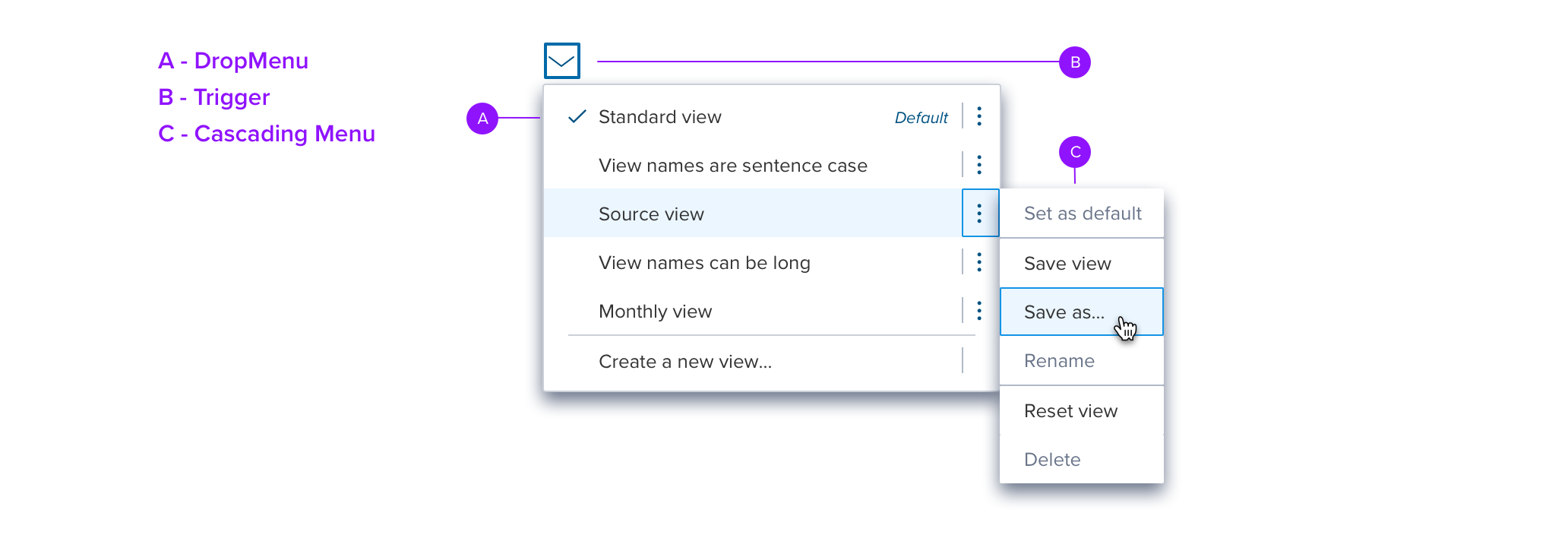
A Dropdown is a component that provides actions and/or selections. It consists of a trigger and a container that is rendered when the user interacts with the trigger.
Triggers may include Icon buttons, Menu Labels, or the icon that is part of another control, (eg. Combo Box icon, etc.).
The dropdown container can display any kind of content, with Menu content being the default.
Controls like the Date Picker have their own proscribed content.
Dropdowns can also have other content such as a color picker, or something like a light modal with combined actions.
The container is styled with a drop shadow and always appears in front of other content.
Usage
Use Dropdown to provide:
Selection with custom triggers or content different than those provided.
Selection in a smaller space than Shuttles, Lists, and DataGrids.
Additional actions to a page, section of a page, or components like DataGrid, List, Accordion, etc.

Anatomy
Visual Style

Focus Details

Cascading Menu

Special States

Positioning

Accessibility
Keyboard Navigation
| KEY | FUNCTION |
|---|---|
| Tab | When focus is on the trigger, move to next interactive element When focus is on a menu item, close the menu, initiate no menu action, move to the next interactive element NOTE: Ignore the tab stops for cascading menus (ellipsis or chevron) SELECTION RATIONALE: Tab is specifically used for keyboard navigation and not confirming selection or taking an action? For example, a button is selected by pressing ENT/RET/SPC, while Tab navigates to the next interactive element. The same pattern applies to input components such as menus and lists. |
| Shift+Tab | When focus is on the trigger, move to the previous interactive element When focus is on a menu item, close the menu, focus returns to the trigger |
| Enter/SpaceBar | When focus is on the trigger, open the menu, focus moves to the menu. When focus is on a action menu item, take the action and close the menu. When focus is on a selection menu item, (always mandatory) if the item is selected then nothing happens, if it is not selected then select it. Menu does not auto excuse. |
| ESC | Close the menu, initiate no action, focus returns to the trigger. |
| Down Arrow | When focus is on the trigger, open the menu, focus moves to the menu. When focus is on a menu item, move focus down. If focus is on last menu item then move focus to the first menu item (cycles) |
| Up Arrow | When focus is on the trigger, do nothing When focus is on a menu item, move focus up. If focus is on first menu item then move focus to the last menu item (cycles) |
| Left Arrow | If focus is on the right add on then move focus back to the entire item. If on cascading menu then close and return focus to the parent |
| Right Arrow | If on menu item with a right add on then move focus to the right add on. If focus is on the right add on then move focus back to the line item. |
| Home | If menu is open move focus to the first item in it. |
| End | If menu is open move focus to the last item in it. |
| Printable Characters | If menu is open move focus to the item that starts with the string typed. (If there is a pause in typing the focus resets). no space bar (as this could collide with the Space key functions). |
Screen Reader
Content Pending
