v 2.4
Overview
Modal Slide is:
- A generic container which may house varying types of content.
- Used to expose complimentary information and tools, such as loan details, calculators and decisional prompts (modals).
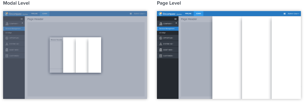
- Primarily used at modal and page levels.
- A non-grid influencer that displays atop the content.
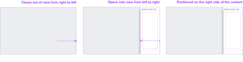
- Positioned on the right side of the content
Anatomy
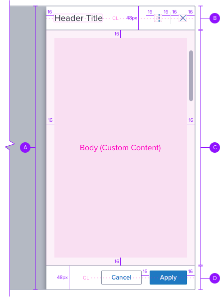
A-Container
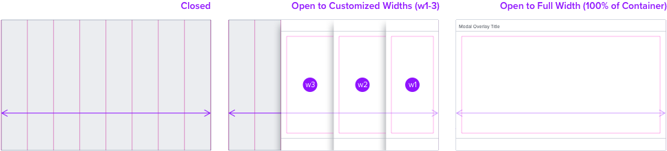
width: customized, full 100%
height: 100%
background-color: neutral-000 (#FFFFFF)
border-color: neutral-400 (#8C93A6)
border-color: neutral-400 (#8C93A6)
border-radius: 0px
box-shadow: -10px, 0px, 10px, -10px,
rgba 53,60,70,0.60
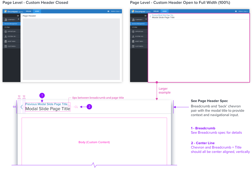
B-Header (Optional)
Optional property that may house components, such as page header, breadcrumb, button.
Background
color: neutral-000 (#FFFFFF)
border: 1px solid, neutral-400 (#8C93A6)
border-location: bottom
width: 100% of container
Font
size: 1.125 rem (18px), left align
line-height: 1
color: neutral-700 (#353C46)
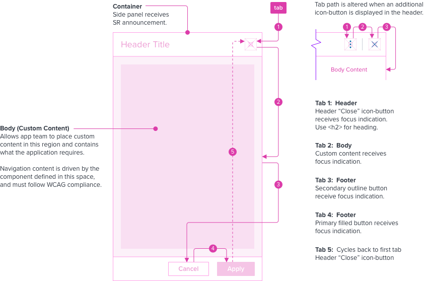
C - Body (Custom Content)
App team to place custom content in this region, contains what the application requires.
Body content will pin to the top of parent container and take component’s spacing rules.
Content will scroll within the panel if necessary.
A minimum padding of 16px should be implemented by the App Dev using an embedded grid component.
D - Footer (Optional)
Optional property that may house components, such as secondary and primary button.
Background
color: neutral-000 (#FFFFFF)
border: 1px solid, neutral-400 (#8C93A6)
border-location: top
width: 100% of container
Button (See button Spec)
type: outline, filled
Interaction and Layout
Motion
• Positioned on the right side of the content, Modal Overlay will:
- Open into view from left-to-right
- Close out of view from right-to-left
• Refer to existing implementation for exact motion details.
Grid Behavior
Non-Grid Influencer
• When the modal slide is displayed and opened, the content region does not resize.
• Modal slide includes a box-shadow to visually display atop the content.
Example
Digital Accessibility
Keyboard Interaction
- An interactive button is used to invoke the modal slide open.
- Tab and focus indication should remain in the modal slide until closed, cycling through.
- The modal slide should contain the tab sequence so Tab and Shift + Tab keys do not move focus outside of the modal slide. The windows underneath are not available for interaction.
- To close the modal slide, use the elements that are applicable, header use Close “X”, footer use “Cancel”, or Escape key when the focus is inside the modal slide, but not intercepted by other content.
- When modal slide closes, focus should retain the user’s point of regard and return to the element that invoked the modal slide open.
Keyboard and Focus
Global standard keyboard interactions apply, and in order of operations from left to right, top to bottom.
| Key | Function |
|---|---|
| TAB | SHIFT+TAB | Moves focus indication to the next and previous interactive elements in the tab order, cycling through (i.e. header, body, footer). |
| ESC | Closes panel, focus should retain the user’s point of regard and return to the element that invoked the panel open. modified content is not kept. |
Screen Reader
Steps from object to object or by jumping between components. Converts interactive elements into speech.
| Semantic HTML Role | Announced Content (app-side) | ARIA Attribute |
|---|---|---|
| BUTTON | aria-expanded=“true/flase”, aria-controls=“sidepanel-container-id” | |
| DIALOG | sidepanel | tabindex=“-1”, role=“dialog”, aria-labelledby=“sidepanel-header-id”/aria-label="dialog label", aria-modal=“true” |
| Considerations |
|---|
| Add the dynamic content of the modal slide above the button in the DOM. This allows the trigger button to receive focus indication after the modal slide closes. |