v1.0.0
Overview
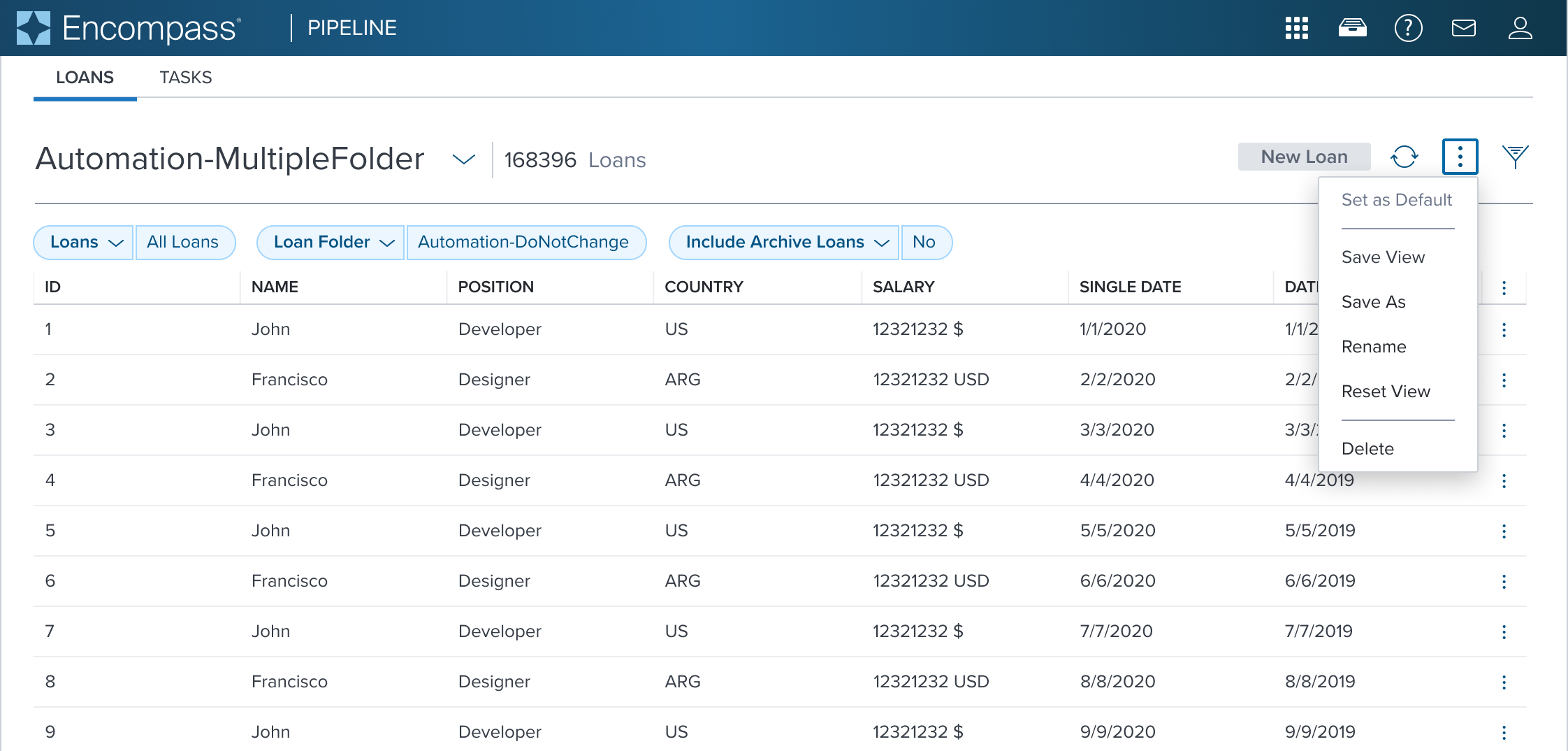
The Menu is a composable element meant to be used specifically and only in combination with the menu-button. Together with the menu-button it becomes a strict opinionated widget that provides Accessibility compliance with WCAG dictated enumerated patterns.
It's important to understand that the following document dos not describe "a generic fly-out", but is instead meant to describe the predetermined Accessibility compliant "menu and menu-button" widget. If a generic fly-out is required use an alternative component.
Design
Box Model
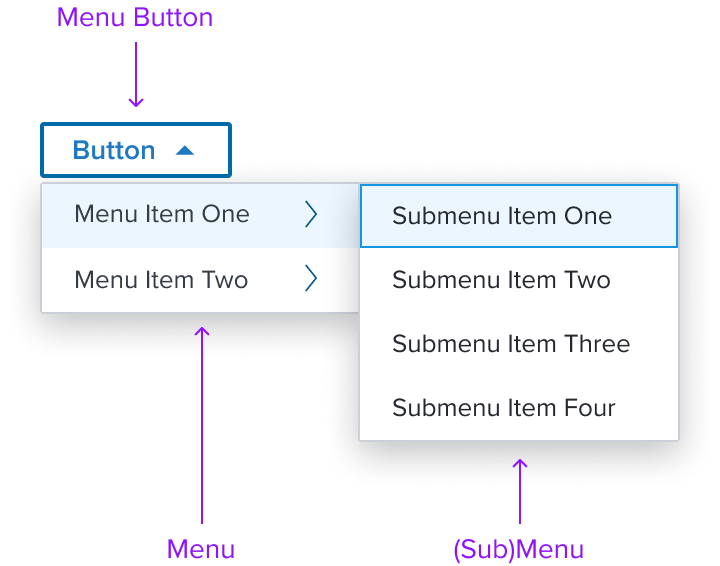
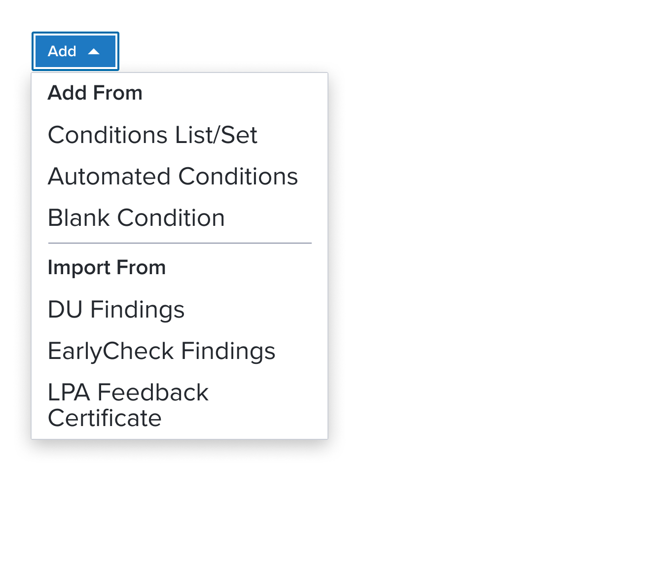
Menu Button
- Please refer to the Button Specification for complete details.
Menu
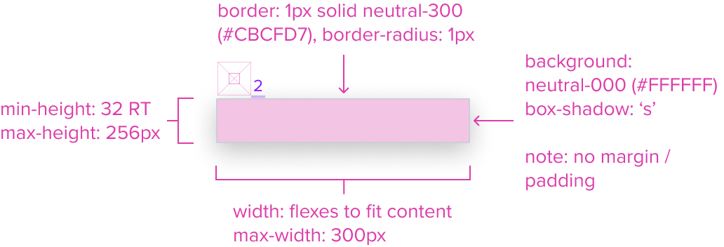
- Box-shadow "s"
The Menu's container is styled with a drop shadow and always appears in front of other content. - Border 1px solid neutral-300 (CBCFD7)
The fine border marks the Menu's perimeter, providing enough contrast to define the Dropdown Menu as a primary entity while keeping the design clean and unobtrusive. - Border radius 1px
The Menu's rounded edges make the interface appear softer and more inviting, providing an intuitive, user-friendly and accessible interface. - Background neutral-000 (#FFFFFF)
The Menu background has a neutral color fill to provide sufficient contrast with the foreground content for proper presentation. - Margin / Padding
The Menu does not come with pre-set spacing values in order to optimize the flexibility of content layout. Correct spacing is instead ensured through atomic composition of the out-of-the-box composed elements. In case authors hosts custom content, authors are in charge of ensuring consistent styling, which will follow standard Dim Sum spacing values. - Min-Height 32 RT
When a menu exists, it MUST have at least one item, and by design follow the minimum sizing for an interactive element action menu item. This ensures for accessibility compliant minimum region size requirements while maintaining a visually pleasing size. - Min-Width Stretches to fit content
The width stretches over the minimum size to fit the content as best possible. - Max-Height 256px
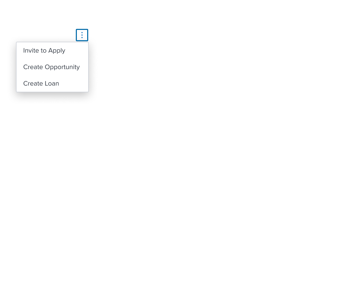
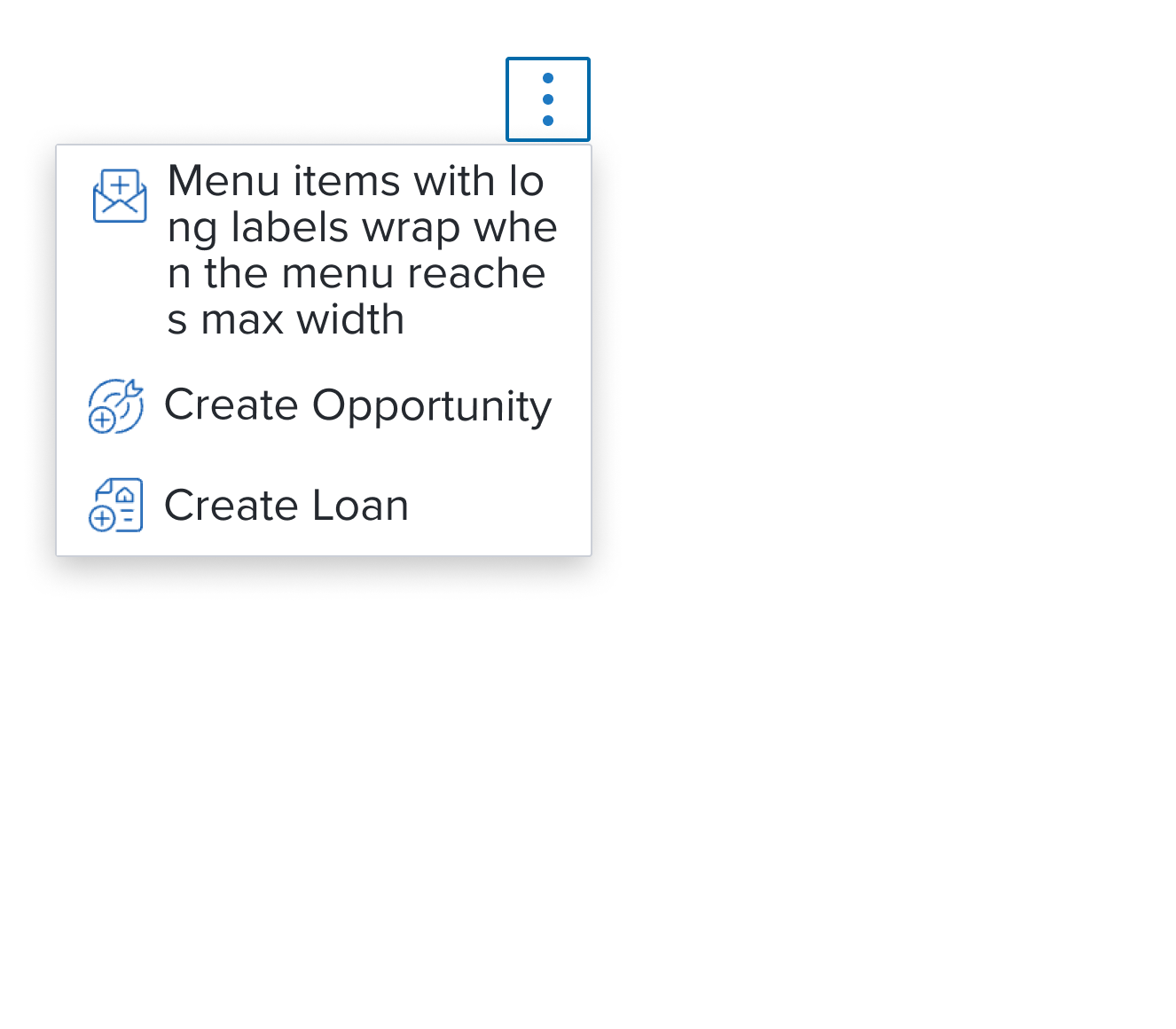
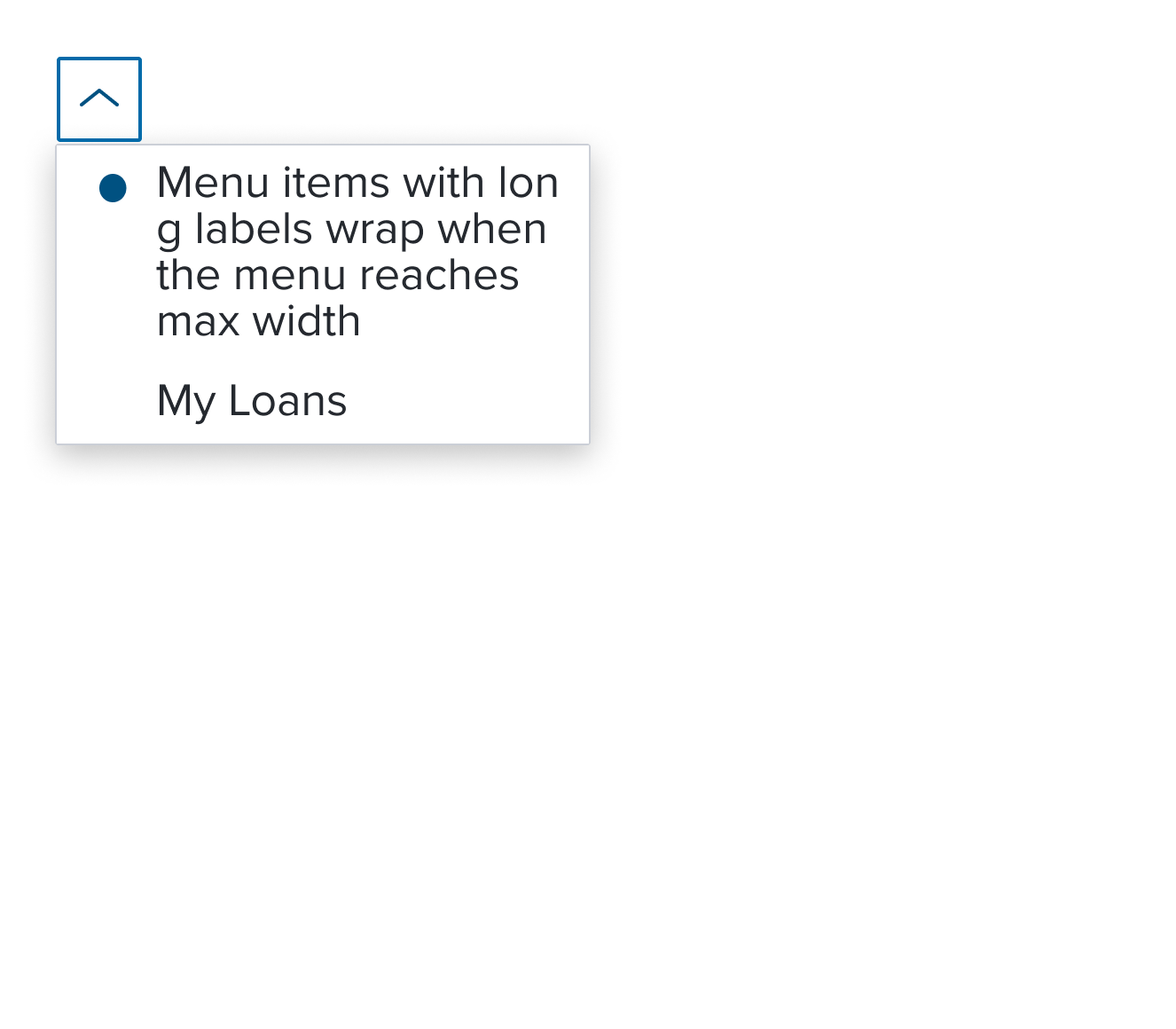
When the max-height is reached the menu component itself is designed to add it's own scrollbar out of the box. This can be altered by authors in specific scenarios. - Max-Width 300px
The max-width is designed to cover most use cases. This can be altered by authors in specific scenarios, but 200% resize and reflow MUST be considered. If the Menu with Submenu is used, a 'per screen size' MUST be used to ensure the fly-out is able to fit and labels can wrap when the max-width is reached.
Responsive
The Menu is designed with a responsive box model that by default has a defined max height and width to accommodate most use cases. This provides a baseline for content scalability accounting for resize and reflow to ensure a consistent and accessible user experience.
When the maximum height is reached the menu component is designed to incorporate a scrollbar to keep the menu content usable. Menu items should appear always in the same order and with the same wording and destination. When on smaller screens, and in long drop downs, to prevent them from overflowing off the screen.
For Resize and Reflow behaviors, see the Examples Section
States (Standard Menu Item)
| State | Graphic | Default Styling |
|---|---|---|
| Idle |  | background: neutral-000 (#FFFFFF) |
| Focus |  | [vs standard idle] background: brand-200 (#EBF6FF) border: 1px solid brand-500 (#1394E5) |
| Disabled |  | [vs standard idle] cursor: disabled |
| Hover |  | [vs standard idle] background: brand-200 (#EBF6FF) |
| Read-only | N/A (no required cases) | N/A |
| Error | N/A (no required cases) | N/A |
Use Cases
| Original Scenario (Use Case) | Dim Sum Version (Proposed Solution with DS Components) | Scenario Description |
|---|---|---|
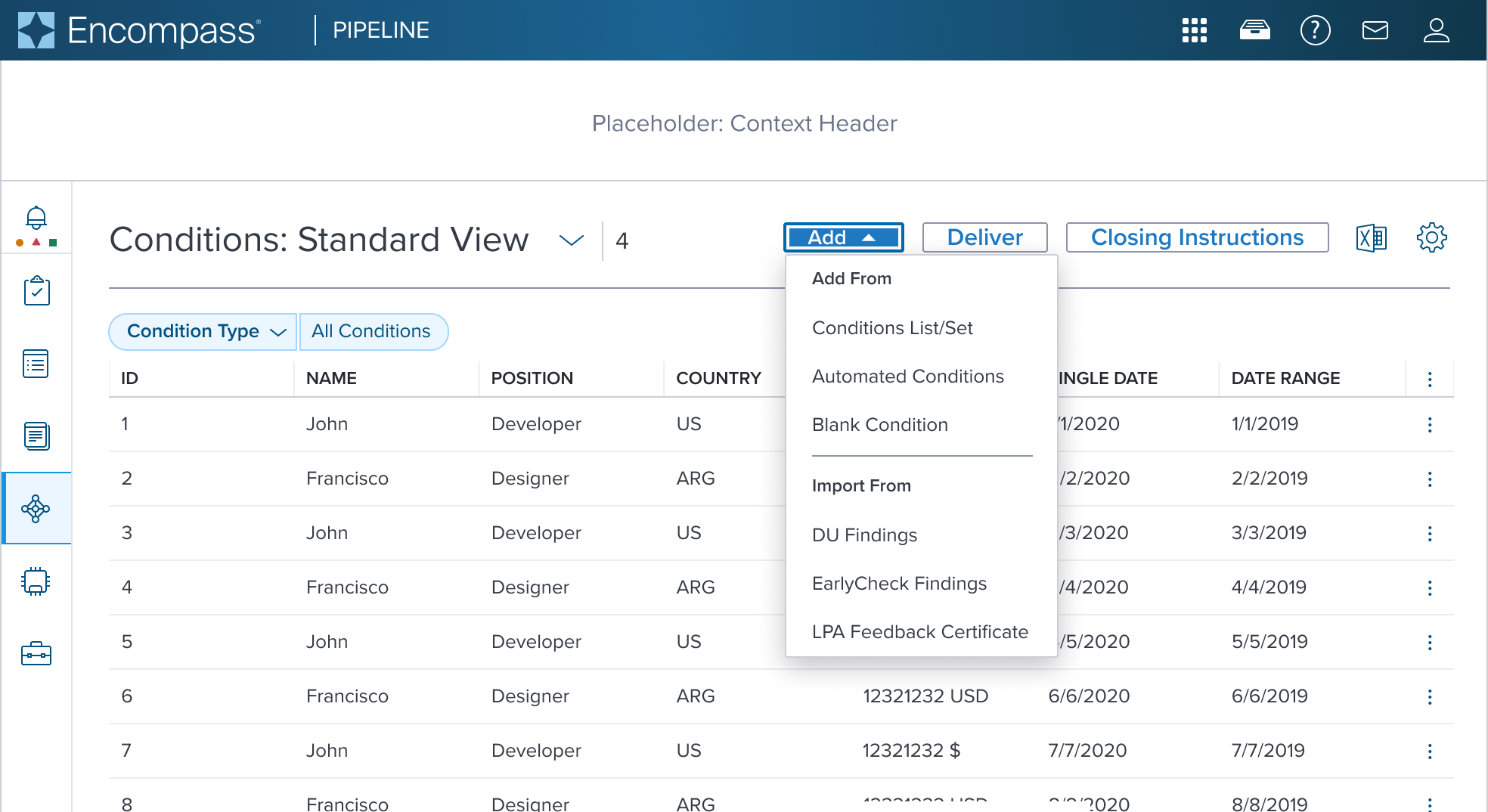
 |  | Activation Menu Shown in a Toolbar located above a Data Table (using an overflow icon-only button) |
 |  | Activation Menu with Left Decorator Shown in a Page Header Toolbar (triggered from an overflow icon-only button) |
 |  | Single Activation Menu This is showing the Pills v2 component used with Menu Button component. These two components MUST be configured together to achieve this result. See Pills v2 Specs |
 |  | Multi Activation Menu This is showing the Pills v2 component used with Menu Button component. These two components MUST be configured together to achieve this result. The original scenario (use case) shows a context header with a complex page header that is a custom implementation by the application side. This is not a pattern that Dim Sum currently supports and therefore is not promoted as a solution. A 'Placeholder: Context Header" region is shown in the 'Dim Sum Version' graphic until addressed. See Pills v2 Specs |
 |  | Activation Menu with Group Label and Separator Shown with Group Label and Separator used in a Page Header Toolbar (triggered from a filled toggle button) The original scenario (use case) shows a context header with a complex page header that is a custom implementation by the application side. This is not a pattern that Dim Sum currently supports and therefore is not promoted as a solution. A 'Placeholder: Context Header" region is shown in the 'Dim Sum Version' graphic until addressed. |
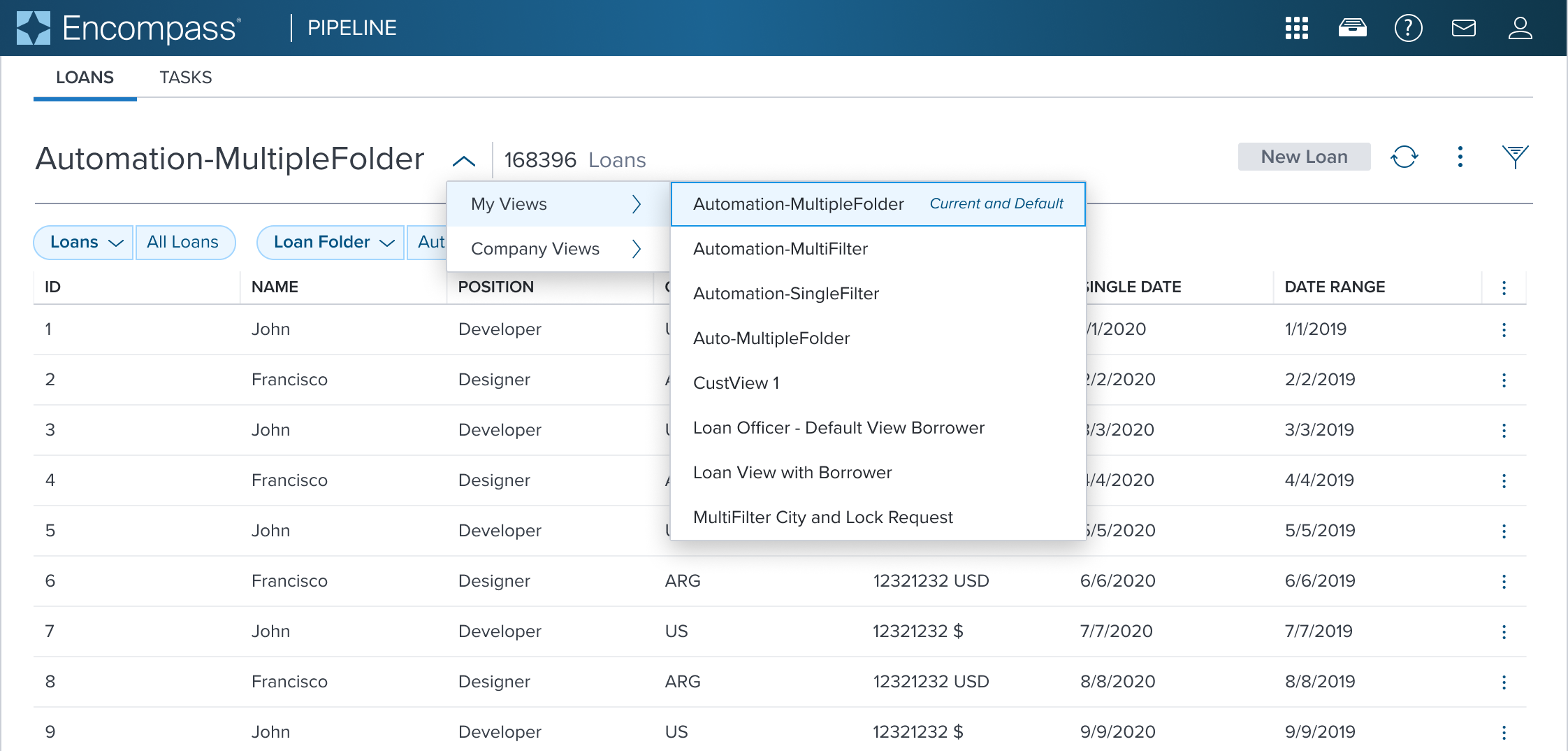
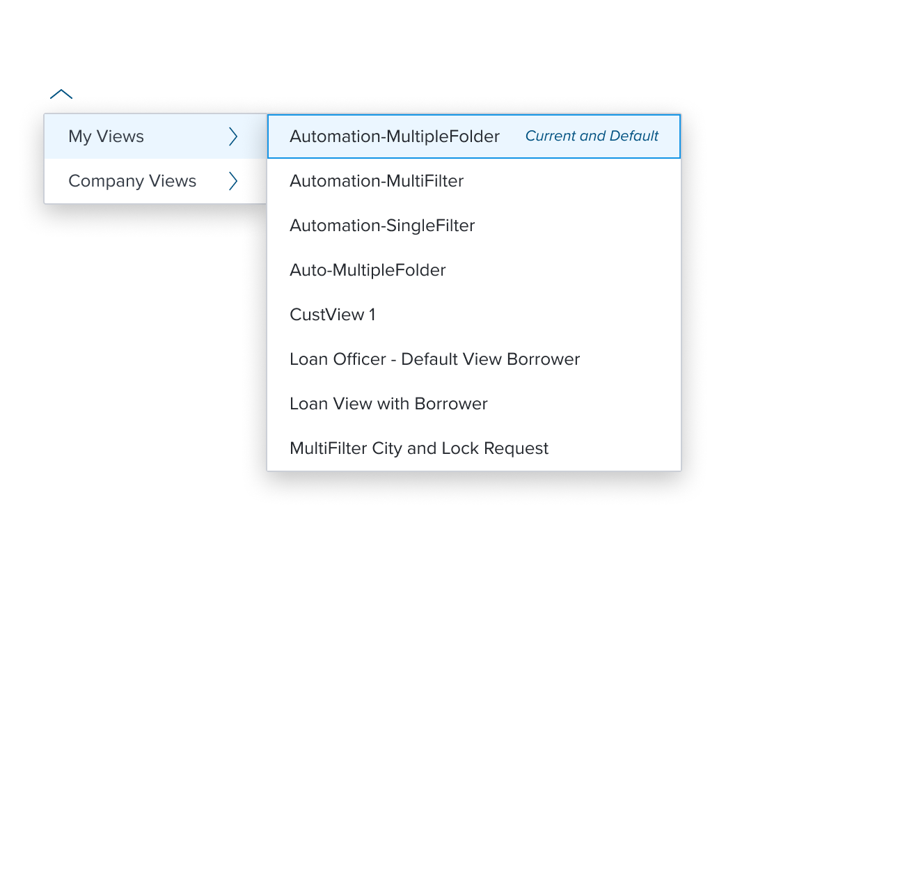
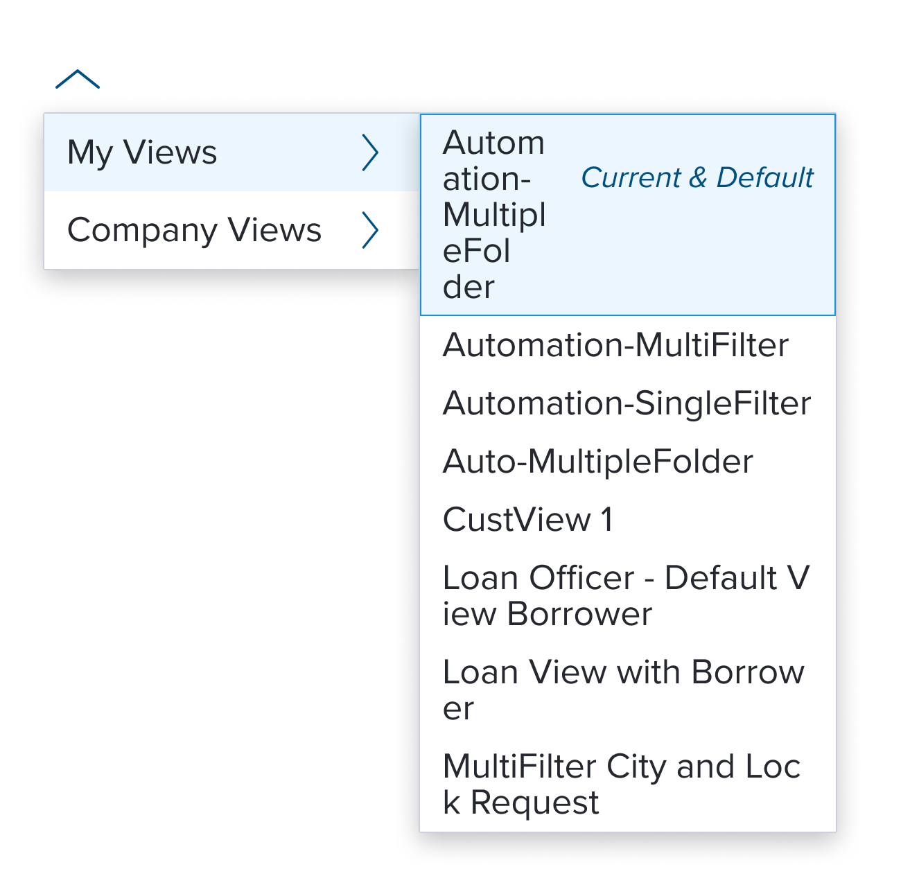
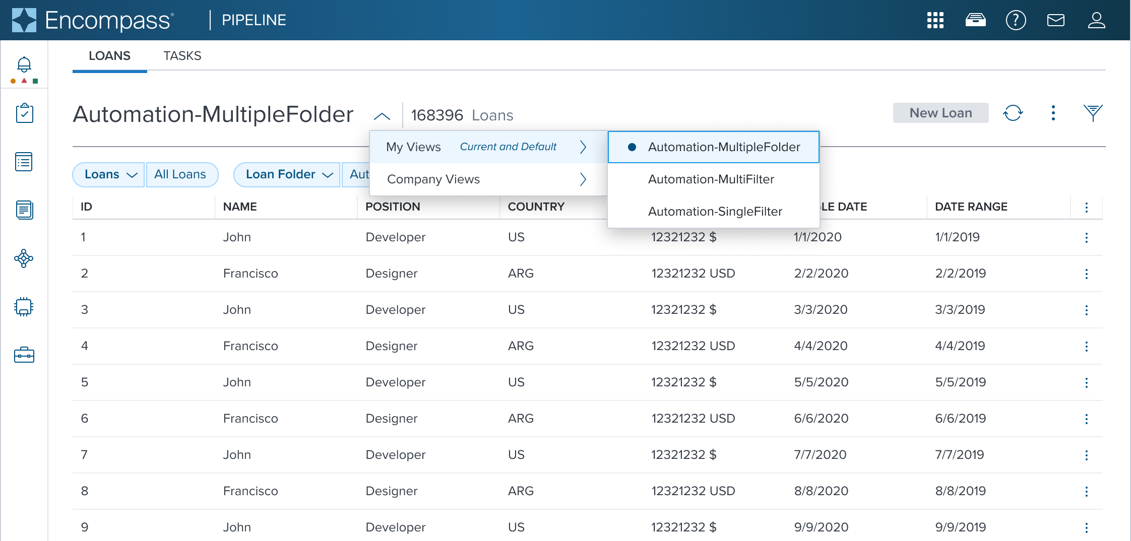
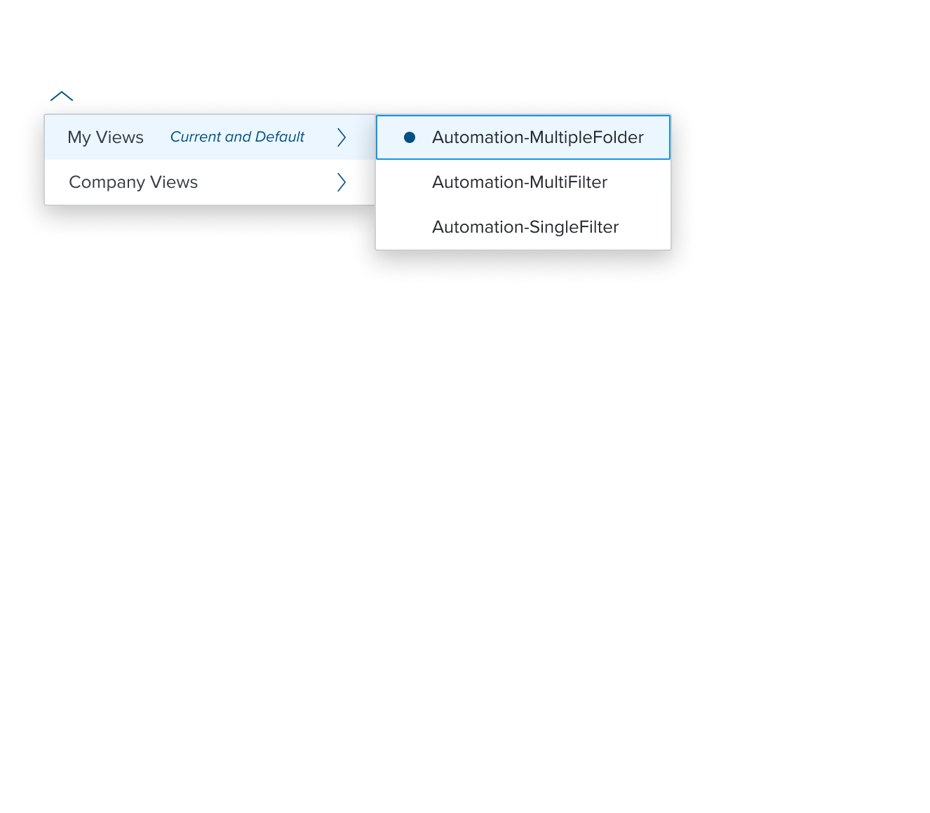
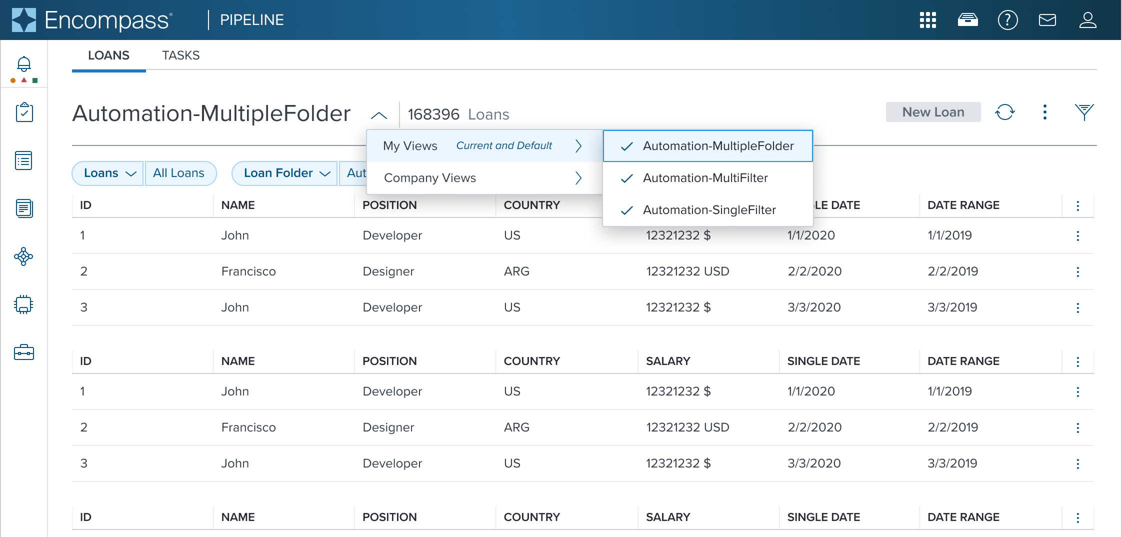
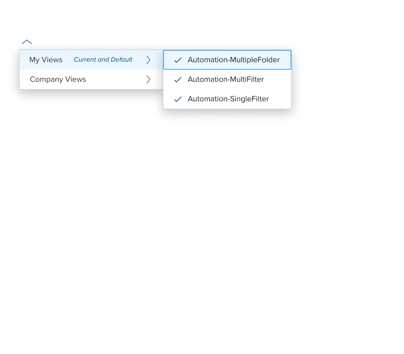
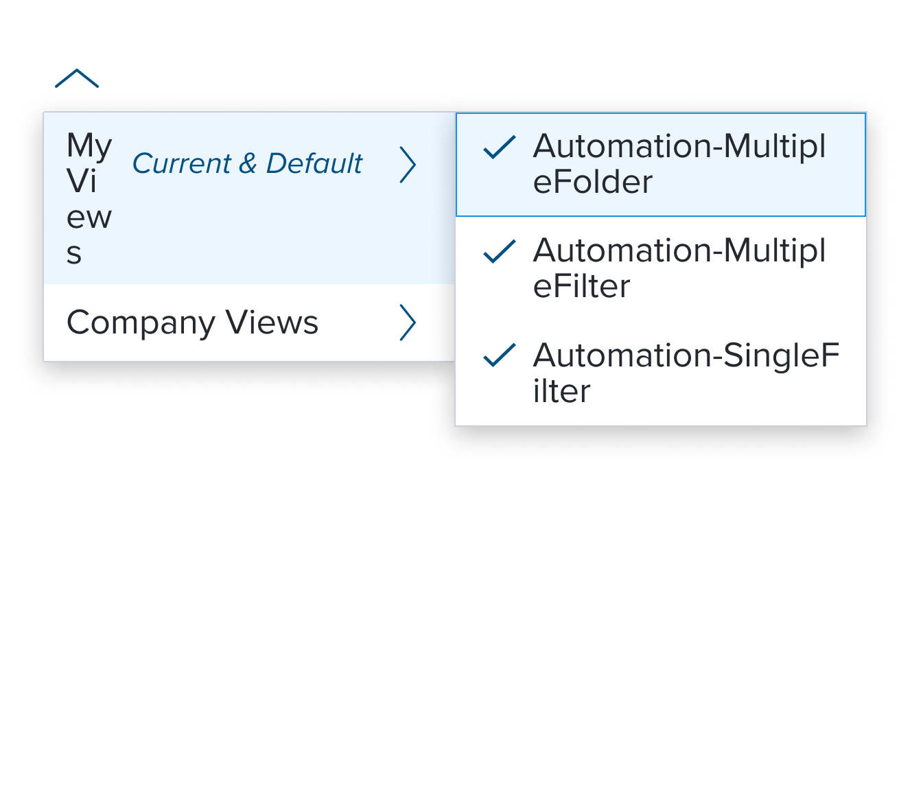
 |   | Top: Navigation Menu with (Sub)Menu Shown in a Page Header. The current selection and default menu items are marked with a Secondary Label 'Current and Default'. Bottom: Activation Menu Shown moved out of the Navigation Menu, relocated to the Toolbar. This separates the two different semantic roles from co-mingling different functionalities. |
Examples
| Scenario Graphic | Scenario Solution | Text Resize and Reflow (200%) | Scenario Description |
|---|---|---|---|
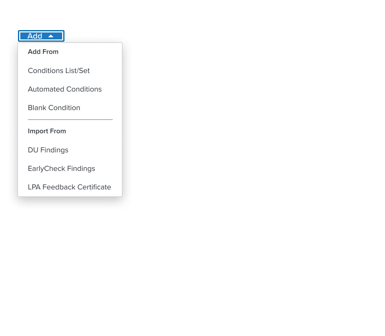
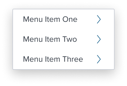
 |  |  | Activation Menu menu consisting of menu items (labels) for taking immediate action on one or more items. When standard action occurs and no visual representation is needed. |
 | 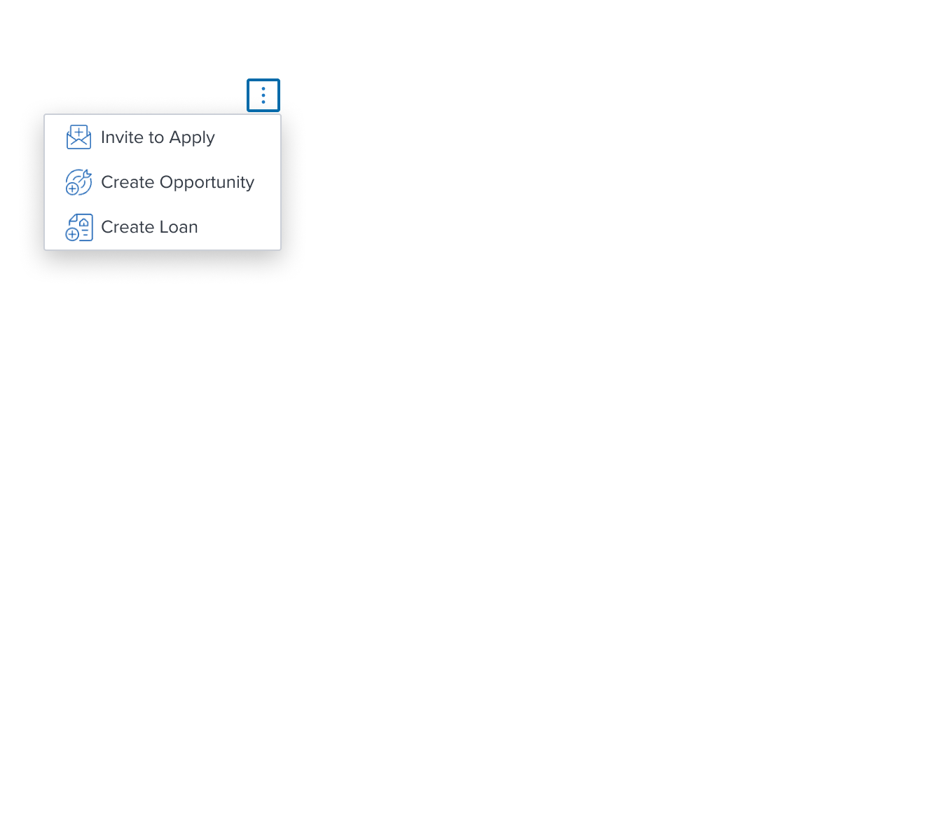 |  | Activation Menu with Left Decorator menu configured with a left decoration icon for better understanding of various actions to be taken. |
 | 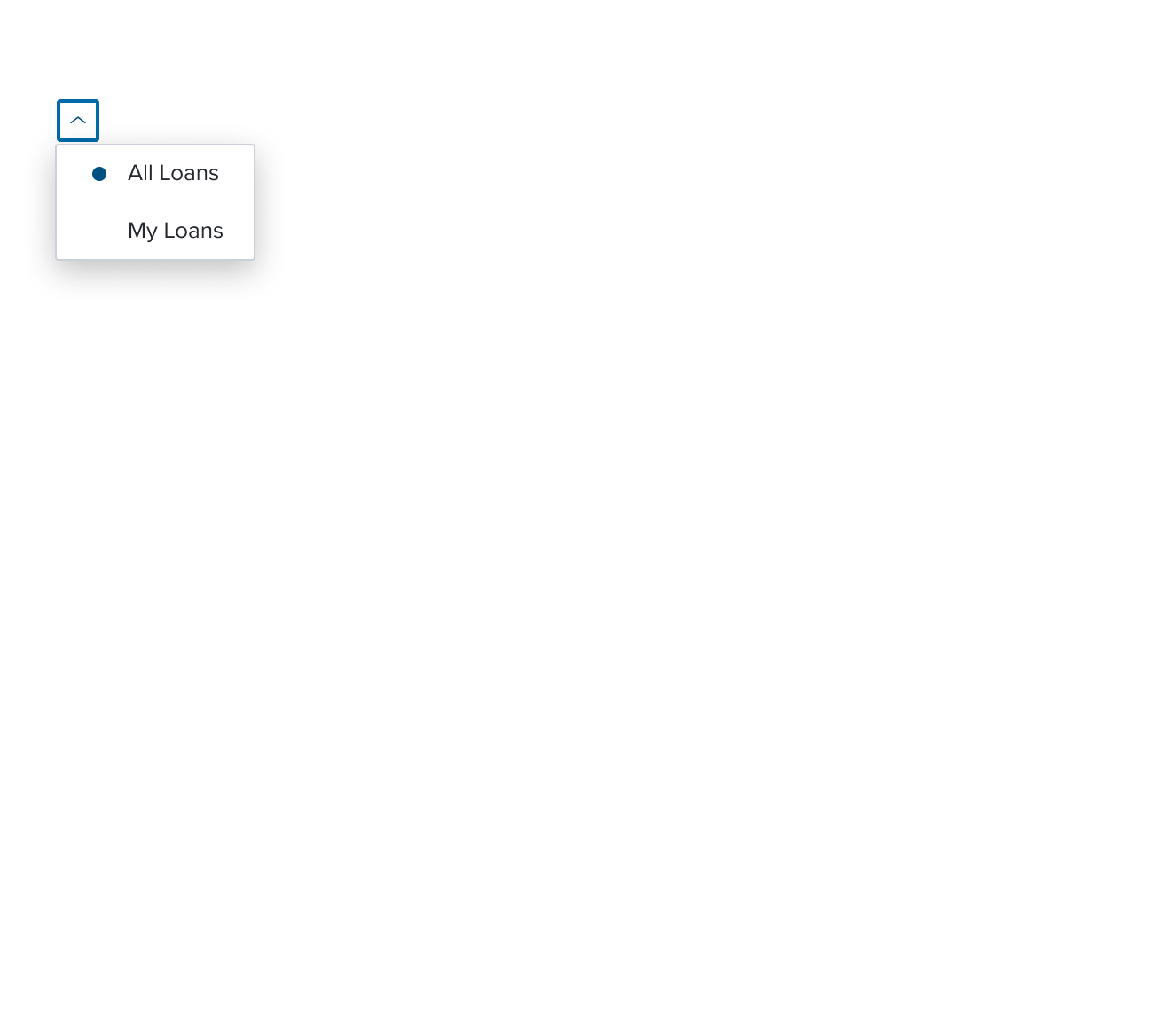 |  | Single Activation Menu menu item whose activation implies exclusive selection within the same selection group. The visual feedback to indicate the activation state is a circular dot. |
 | 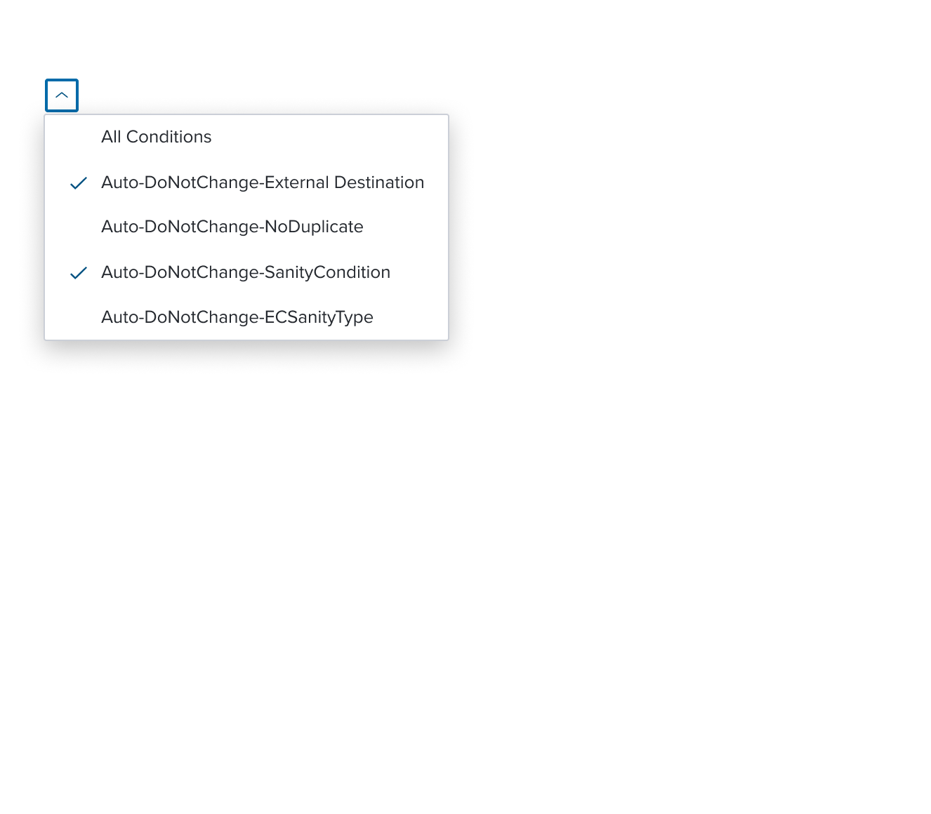 | 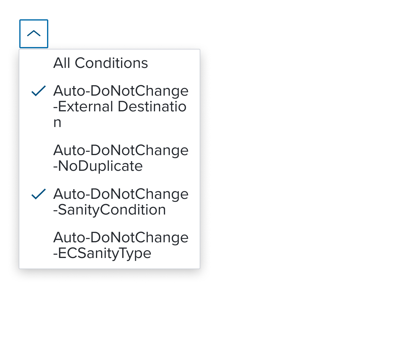 | Multi Activation Menu menu item whose activation implies non-exclusive selection within the same selection group. The visual feedback to indicate the activation state is a single check mark. The scenario graphic shows a context header with a complex page header that is a custom implementation by the application side. This is not a pattern that Dim Sum currently supports and therefore is not promoted as a solution. A 'Placeholder: Context Header" region is shown in the 'Scenario Graphic' until addressed. |
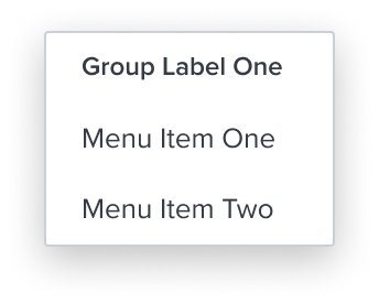
 |  |  | Menu with Group Label an element who's purpose is to delimit single selection within a group of items. It provides a label placed at the top of a group of menu items acting as a label for related items, helping to organize the menu structure. The scenario graphic shows a context header with a complex page header that is a custom implementation by the application side. This is not a pattern that Dim Sum currently supports and therefore is not promoted as a solution. A 'Placeholder: Context Header" region is shown in the 'Scenario Graphic' until addressed. |
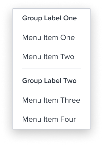
 |  |  | Menu with Separator an element who's purpose is to divide section content within a group of items. It's delicate horizontal border offers sufficient contrast to delineate it as a distinct element. It is purely presentational and has no action associated with it. The scenario graphic shows a context header with a complex page header that is a custom implementation by the application side. This is not a pattern that Dim Sum currently supports and therefore is not promoted as a solution. A 'Placeholder: Context Header" region is shown in the 'Scenario Graphic' until addressed. |
Discouraged Examples
These menu item's are highly discouraged from usage and only intended for retro-compatibility with Drop Down Menu V2.
| Scenario Graphic | Scenario Solution | Text Resize and Reflow (200%) | Scenario Description |
|---|---|---|---|
 |  |  | Activation Menu with (Sub)Menu menu with a right facing chevron serves the purpose of providing visual feedback about the presence of a (sub)menu spawning from the given "submenu" menu item. |
 |  |  | Single Activation Menu with (Sub)Menu menu pre-composed and orchestrated component that unifies the semantics and behaviors of "single selection" composable and "submenu" composable |
 |  |  | Multi Activation Menu with (Sub)Menu menu pre-composed and orchestrated component that unifies the semantics and behaviors of "multi selection" composable and "submenu" composable |
Composables
The menu-button widget simplifies interactions with predefined, accessible menu items, each serving a specific role.
| Composables | Link and Description |
|---|---|
 | Skeleton The Menu uses the Skeleton 'S1' loading pattern for rendering fidelity. |
 | Activation Item Simple, direct actions without hierarchy or selection behavior that triggers a change in the page content. |
Single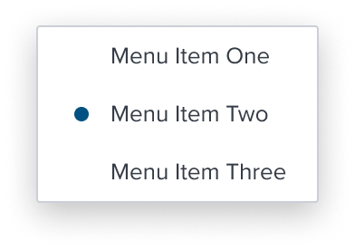 Multi Multi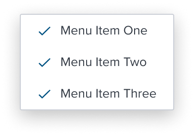 | Single Activation Multi Activation Handle altering page content dynamically while also tracking selections so far, when activating a specific menu item can't logically happen continuously. |
 | Group Ensures exclusive selection within a set of items and must wrap single select items and can also be used, sparingly, to provide a label for a group of menu items within the same menu or submenu level. |
 | Separator Divides section content within a group of items. It's delicate horizontal border offers sufficient contrast to delineate it as a distinct element. |
Discouraged Composables
These menu item's are highly discouraged from usage and only intended for retro-compatibility with Drop Down Menu V2.
| Composables | Link and Description |
|---|---|
 | Activation with Submenu Item The introduction of this hierarchy is a key characteristic, requiring logical and semantic parent-child relationships to avoid confusion and carries significant design implications. When using the with submenu item, designers must carefully consider the hierarchical relationships between the parent item and its submenu items.The parent-child relationship MUST be logical and semantically meaningful. Failing to establish clear relationships can lead to a confusing user experience, both for users with and without disabilities. Beyond the need for careful design to ensure logical hierarchy, the with submenu item functions similarly to other menu items, without additional pitfalls to consider. |
Single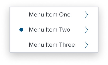 Multi Multi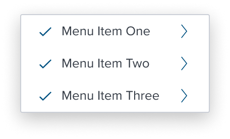 | Single Activation Item with Submenu Multi Activation Item with Submenu These MUST be used sparingly due to their potential to violate WCAG standards and include strict embedded limitations on behaviors to prevent such violations. Ensuring clear grouping, hierarchy, and appropriate use of items guarantees an accessible and user-friendly experience. When using the with submenu item, designers must carefully consider the hierarchical relationships between the parent item and its submenu items.The parent-child relationship MUST be logical and semantically meaningful. Failing to establish clear relationships can lead to a confusing user experience, both for users with and without disabilities. Beyond the need for careful design to ensure logical hierarchy, the with submenu item functions similarly to other menu items, without additional pitfalls to consider. |
Variants
Variants are not applicable to this component.
Digital Accessibility
The Menu by design is accessible out of the box by being opinionated and enforcing the standard HTML Patterns and Roles described below. Please refer to the documentation for complete details for Keyboard Interaction and ARIA roles and properties.
Restricted allowed ARIA roles and properties
HTML semantics are enforced by restricting the allowed ARIA roles and properties to ensure that the menu-widget is accessible and follows the WAI-ARIA Author. In particular, the menu-widget uses the role=menu, role=menuitem, role=menuitemcheckbox, role=menuitemradio, and role=group roles, which by current HTML specifications are the only roles allowed under a menu context.
Keyboard/Mouse interaction
The menu-widget is implemented following the WAI-ARIA Authoring Practices for Menubar and Menu keyboard, since the pattern includes "optional" keyboard interactions, and seems to be missing some details on specific interactions, the opinions of the menu-widget are further detailed in the Regarding WAI Pattern Optionals and Opinionated choices section.
References
Related Composition Components
This Component's flexibility and adaptability are enhanced when used in conjunction with other atomic components within the Dim Sum Design System. These related components may include:
Menu Button: Menu Button is an action component consisting of a button that opens a menu.
By leveraging these atomic components, designers can create highly customized card layouts that cater to specific content needs while ensuring a consistent and cohesive user experience across the interface.
Usage Warnings
The menu-button widget is purposefully designed to facilitate interactions that lead to a partial page reload, where only a specific section of the page content is updated without affecting the entire page. It is not intended for managing full-page navigations.
This widget is ideal for scenarios where the user's selection triggers changes within a defined area of the interface, ensuring a seamless and efficient user experience.
Implementing the menu-button widget in such cases would contradict its intended purpose and could lead to usability issues or confusion.
Additionally, this widget is not designed to function as a form field for user selections. Using it in this context would violate its scope and could result in non-compliant or suboptimal user experiences.
In summary, the menu-button widget should be utilized exclusively in contexts where it supports partial content updates within a page, ensuring both ease of use and compliance with accessibility standards.
These categories align with HTML semantics and are designed to ensure accessibility and consistency within the role='menu' structure.
Terminology
- Partial Navigation: Updates part of the page content without a full page reload. Includes altering filters, sorting, triggering a dialog, toggling the visibility of a section.
- Hierarchy: Describes parent-child relationships in menus with submenus, requiring logical design to avoid confusion.
Alternate Components
- Combo Box Use when there are many states or selectable items and one or more can be selected. This component is best used when space is at a premium and essential content requires progressive disclosure.
Reference
- Usage Guidelines
- WCAG Menu Pattern
- Resize and Reflow Guidance
- View code on Storybook
- Storybook documentation