HTML Select
Overview
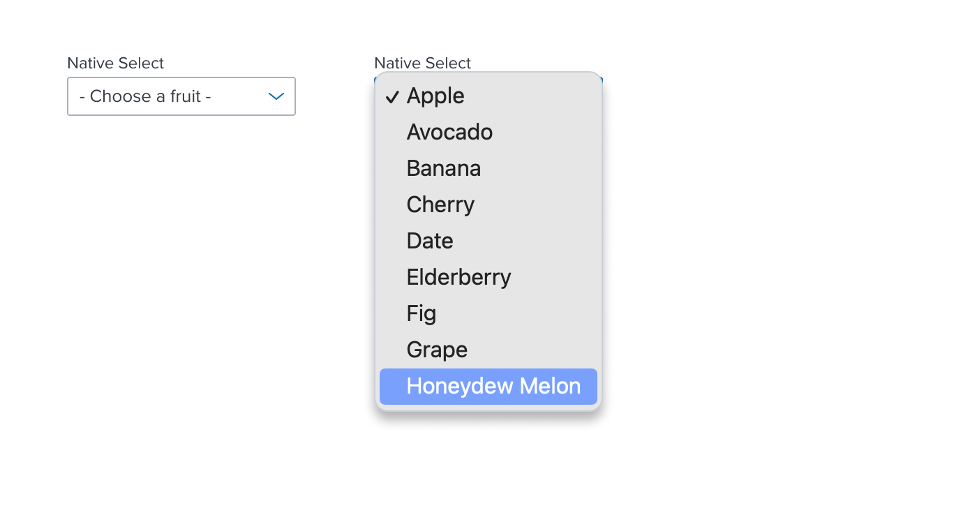
Provides the ability to select a single item from the native dropdown provided by the browser.

Usage: Use when a only single item may be selected from a non-hierarchical list of options. Native Select can be used in input forms or nested within other components to provide functionality. For example, Query Builder may use Native Select to set boolean values within a statement.
Implementation Note:Native Select uses a dropdown menu that is managed completely by the browser. Therefore, the design cannot be enhanced, restyled or otherwise modified. For example, a menu list cannot include sections, checkboxes, separators, flyouts, etc.
Anatomy

Native Select is made up of a background, prompt text and a right add-on. It is typically configured with FormLayoutBlock
Visual Style

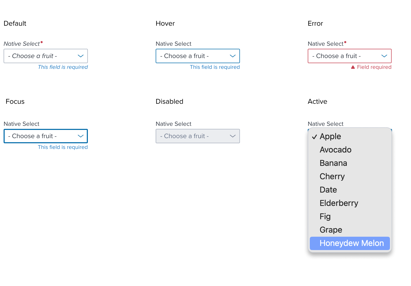
| Default | Hover | Error |
|---|---|---|
| background: N-000 (#FFF) border: solid, 1px, N-400 (#A9B1BE) height: 28px min-width: 64px Hint Text: B2; N-700 (#353C46) | border: solid, 1px, B-700 (#006AA9) | border: solid, 1px, Error-900 (#C64252) |
| Focus | Disabled | Active |
|---|---|---|
| border: solid, 2px, B-700 (#006AA9) | background: N-080 (#EBEDF0) Hint Text: B2; N-500 (#697489) | Native Dropdown Menu displayed |
Interactions

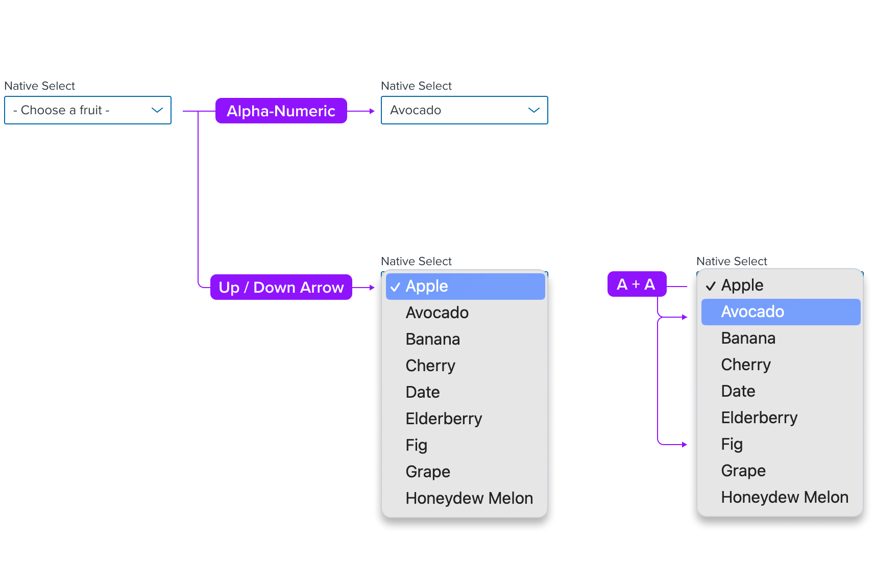
Selections are made when a list item is clicked with the mouse or focused with the keyboard with alpha-numeric inputs or the Up/Down Arrow.
If multiple items begin with the same character, focus will move sequentially through those items as the corresponding key continues to be inputted.
Configurations
While Native Select is typically configured with FormLayoutBlock, it may also be used on its own in rare case.

Examples
Content pending
Digital Accessibility
| Key | Function |
|---|---|
| Tab | If drop menu is closed the focus moves to the next focusable or interactive element. No action If drop menu is open. |
| Shift+Tab | Moves focus to previous interactive element. No action If drop menu is open. |
| Enter | Selects the menu item in focus and closes the drop menu. Focus automatically moves to the next interactive element. |
| SPC (SpaceBar) | Opens the drop menu if closed. Selects menu item if menu is open. |
| ESC | Closes the drop menu if open and selection is retained. |
| Up/Down Arrow | Opens the drop menu if closed. Moves focus to next/previous menu item. |
| Alpha-Numeric Keys | Moves focus to corresponding menu item. Quickly inputting the same character will move focus to the next menu item if it begins with the same character. |
