v3.0.1
Overview
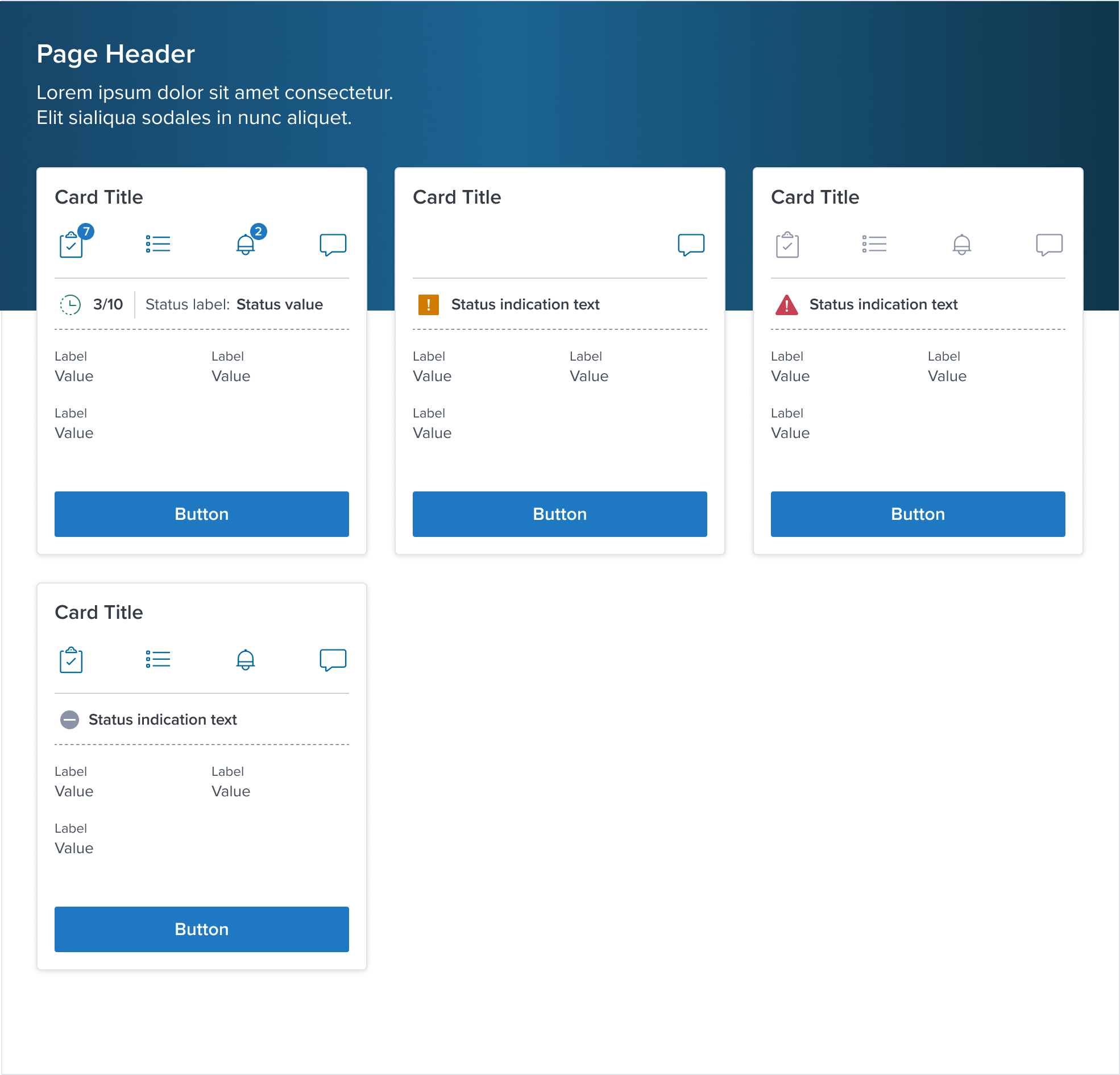
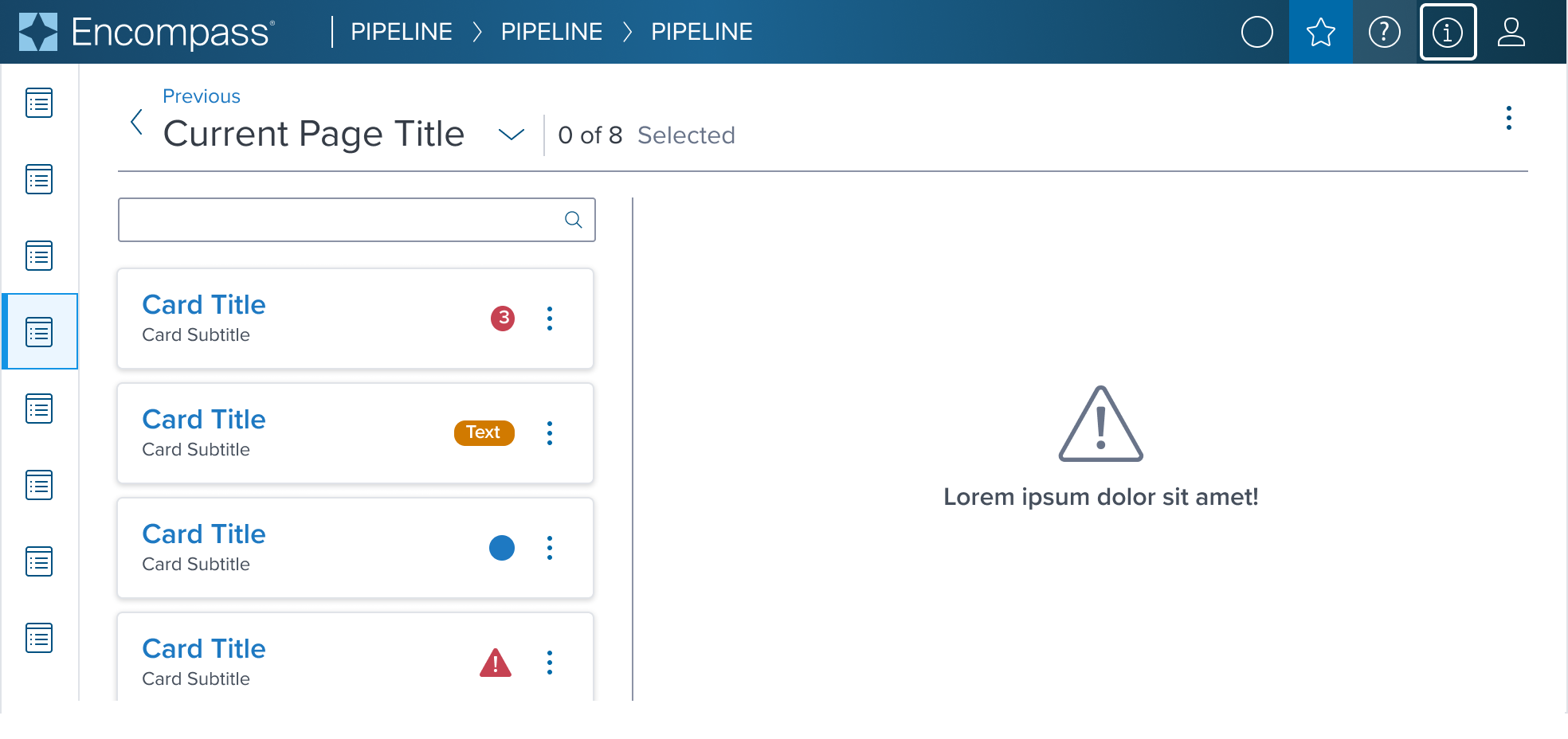
The Card component serves as a foundational element within the Dim Sum Design System, embodying the role of a versatile wrapper container.
It is designed to encapsulate a wide array of content types, offering a unified and coherent method for presenting distinct pieces of information.
The flexibility of the Card component ensures it can be seamlessly integrate across various contexts and applications within the user interface.
Design
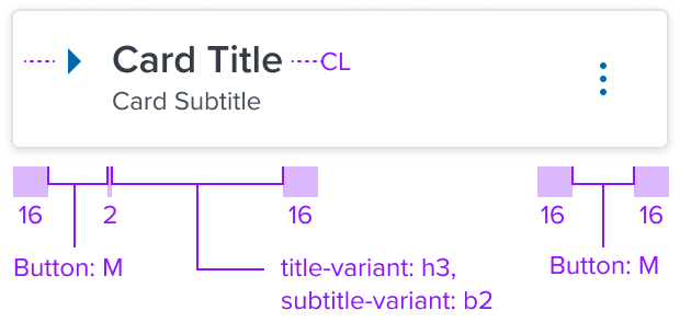
Box Model
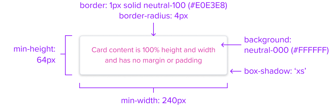
The Card Component's box model is designed with specific features to ensure that it meets its core objectives as a container for structured, visually appealing content within a user interface.
-
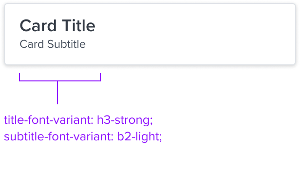
Box-shadow "xs"
The extra-small shadow signifies a subtle elevation, distinguishing the card from its background without overshadowing the content it contains. -
Border 1px solid neutral-100
The fine border marks the card's perimeter, providing enough contrast to define the card as a separate entity while keeping the design clean and unobtrusive. -
Border Radius 4px
The rounded edges make the interface appear softer and more inviting, providing an intuitive, user-friendly and accessible interface. -
Background: neutral-000 (#FFFFFF)
The card background has a neutral color fill to provide sufficient contrast with the foreground content for proper presentation. -
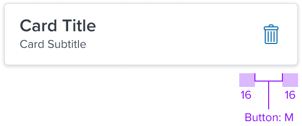
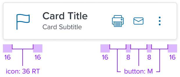
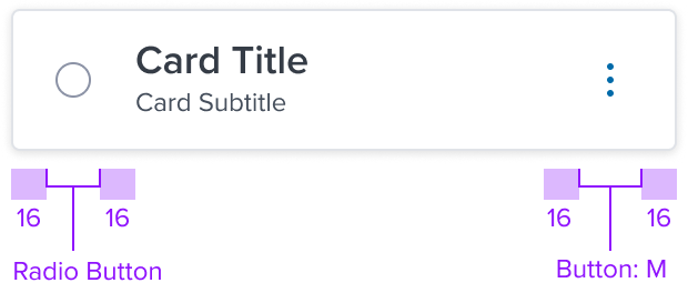
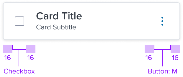
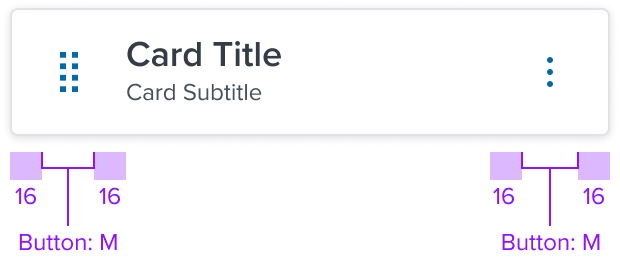
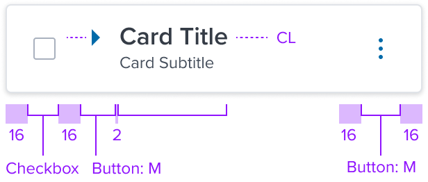
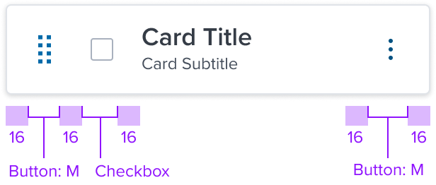
Margin/padding
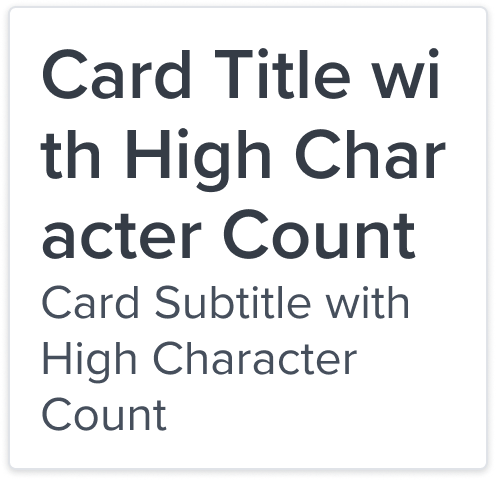
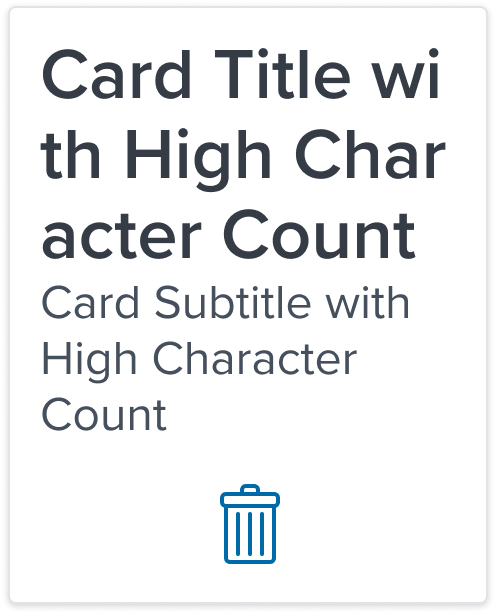
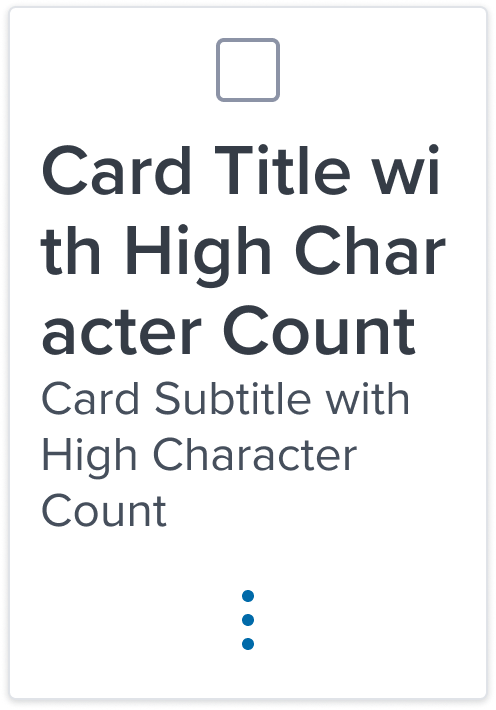
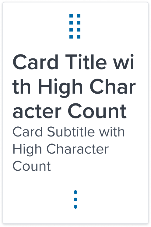
Card does not come with pre-set spacing values in order to optimize the flexibility of content layout.UX will provide exact guidance on a case-by-case basis to ensure consistent styling, which will follow standard Dim Sum spacing values.
-
Min-width 240px and Min-height 64px
These dimensions guarantee that the card remains functional and aesthetically pleasing across different devices and screen sizes, adhering to the principles of responsive design. -
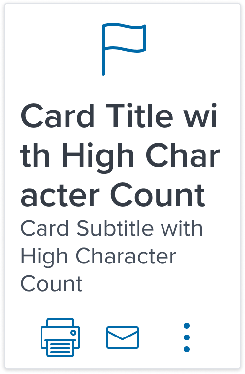
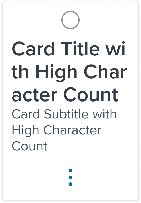
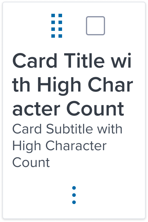
Stretches to fit content
The card expands to fit the content, ensuring that the design adapts to content volume while maintaining the card's visual integrity. It may also be confined to grid layout in order to maintain it's relationship and context in the user interface.
The Card Component's box model is intricately tied to its purpose as a visual segregator in the design system.
Each aspect of the box model is deliberately chosen to uphold the clarity and distinctiveness of the card as a content container.
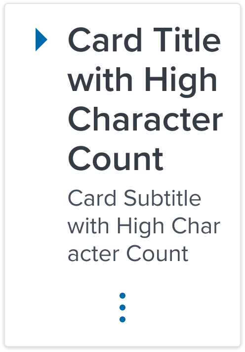
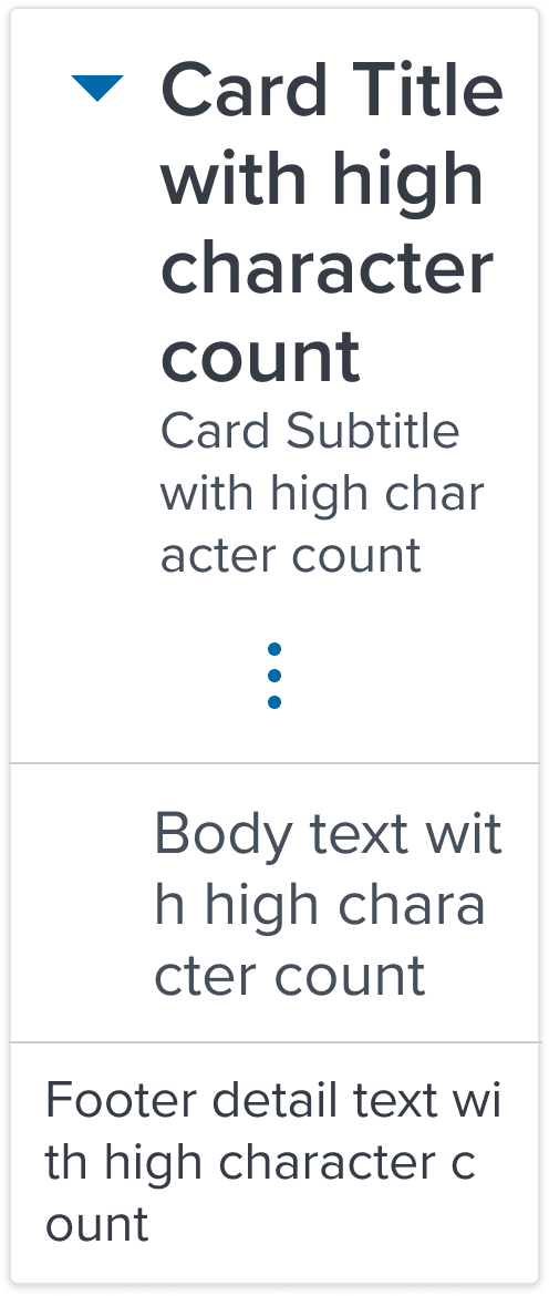
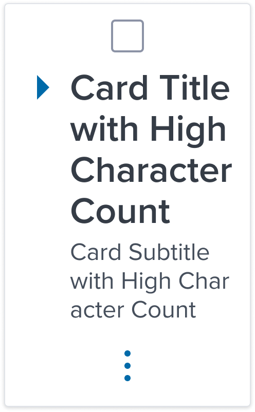
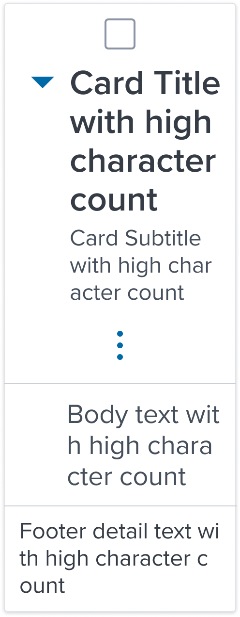
Responsive
By design, Card supports responsive resize and reflow characteristics by defining minimum height and width in relative units. Relative measurements ensure that the card maintains its structural integrity and visual appeal across different screen sizes and orientations, adapting gracefully as needed.
Dictating content-specific reflow behaviors goes beyond its scope and is managed by the individual content elements within the card, which are designed to be responsive in their own right within the overarching design system.
This approach allows the card to serve a wide array of content types and interaction contexts without imposing rigid layout constraints that could hinder the adaptability of the content it hosts.
States
| State | Graphic | Default Styling |
|---|---|---|
| Idle |  | box-shadow: 'xs' border: 1px solid neutral-100 border-radius: 4px min-width: 240 RT min-height: 64 RT background: neutral-000(#FFFFFF) |
| Focus | N/A (no IE, no focus received) | N/A |
| Disabled |  | [vs standard idle] cursor: disabled background: neutral-050 (#F6F7F9) box-shadow: none |
| Read-only | N/A (contents need to apply) | N/A |
| Hover |  | [vs standard idle] box-shadow: 'xs', 0 1px 5px 0 rgba(0,0,0,0.60) |
| Error | N/A (no required cases) | N/A |
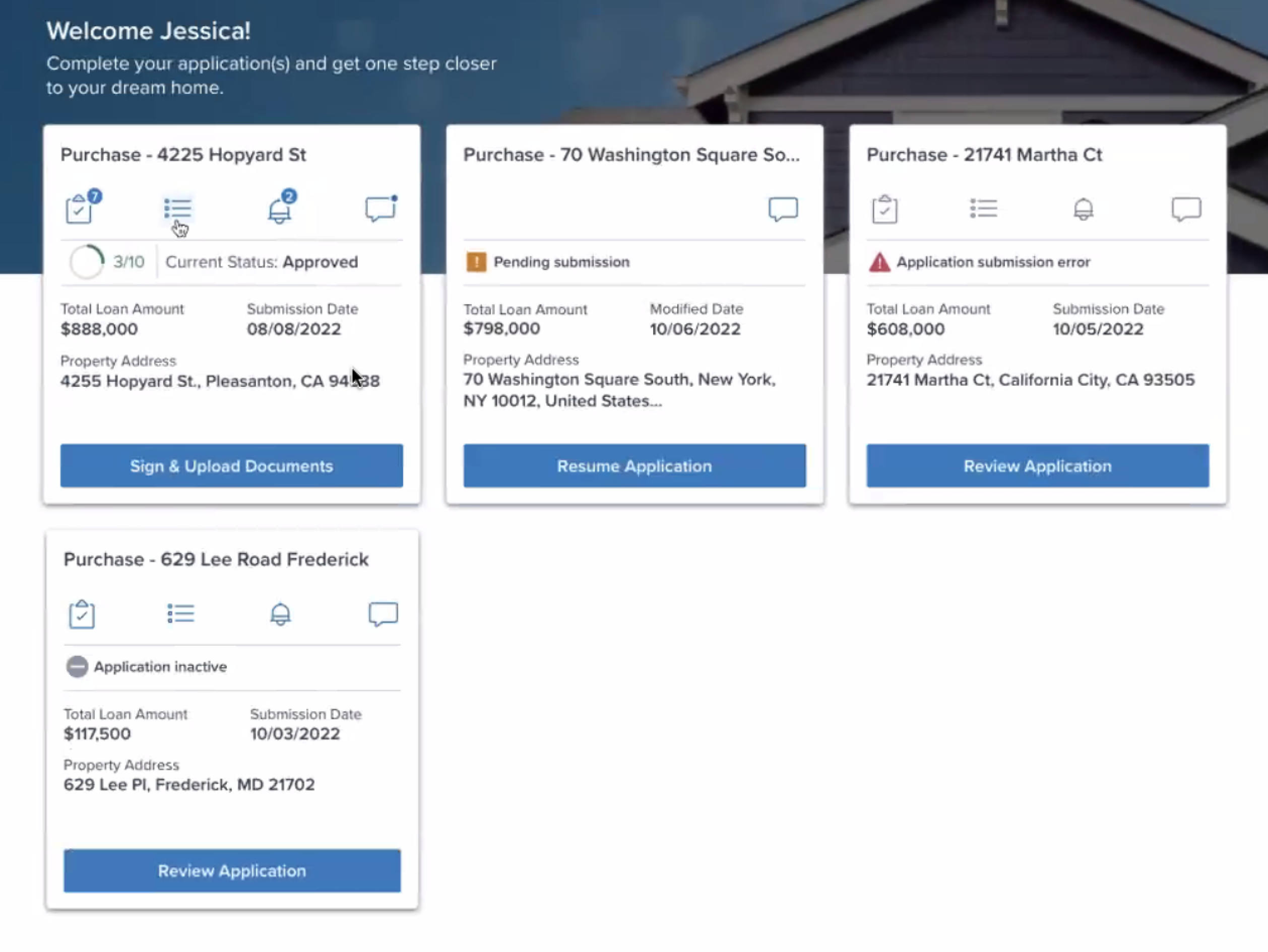
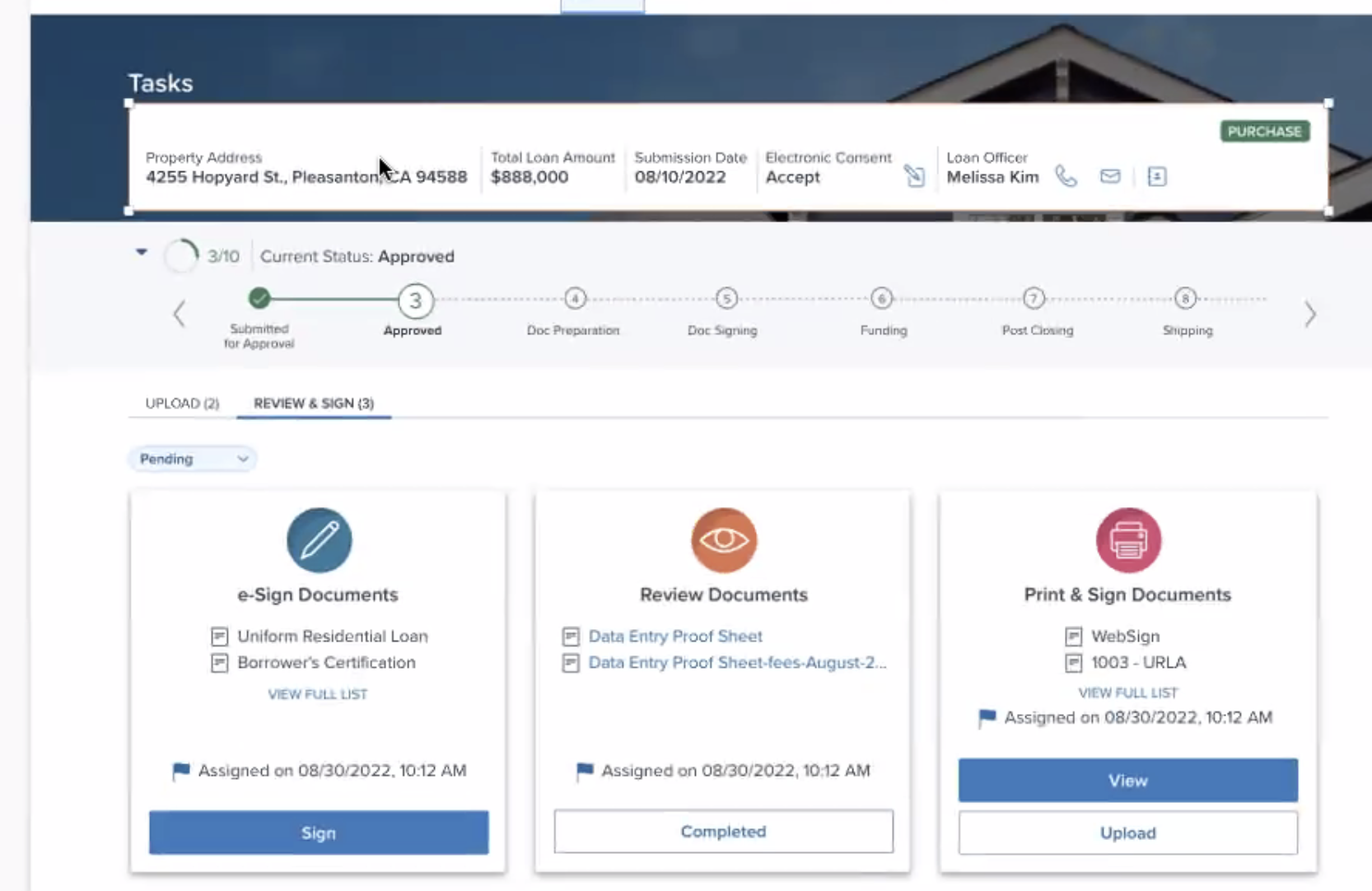
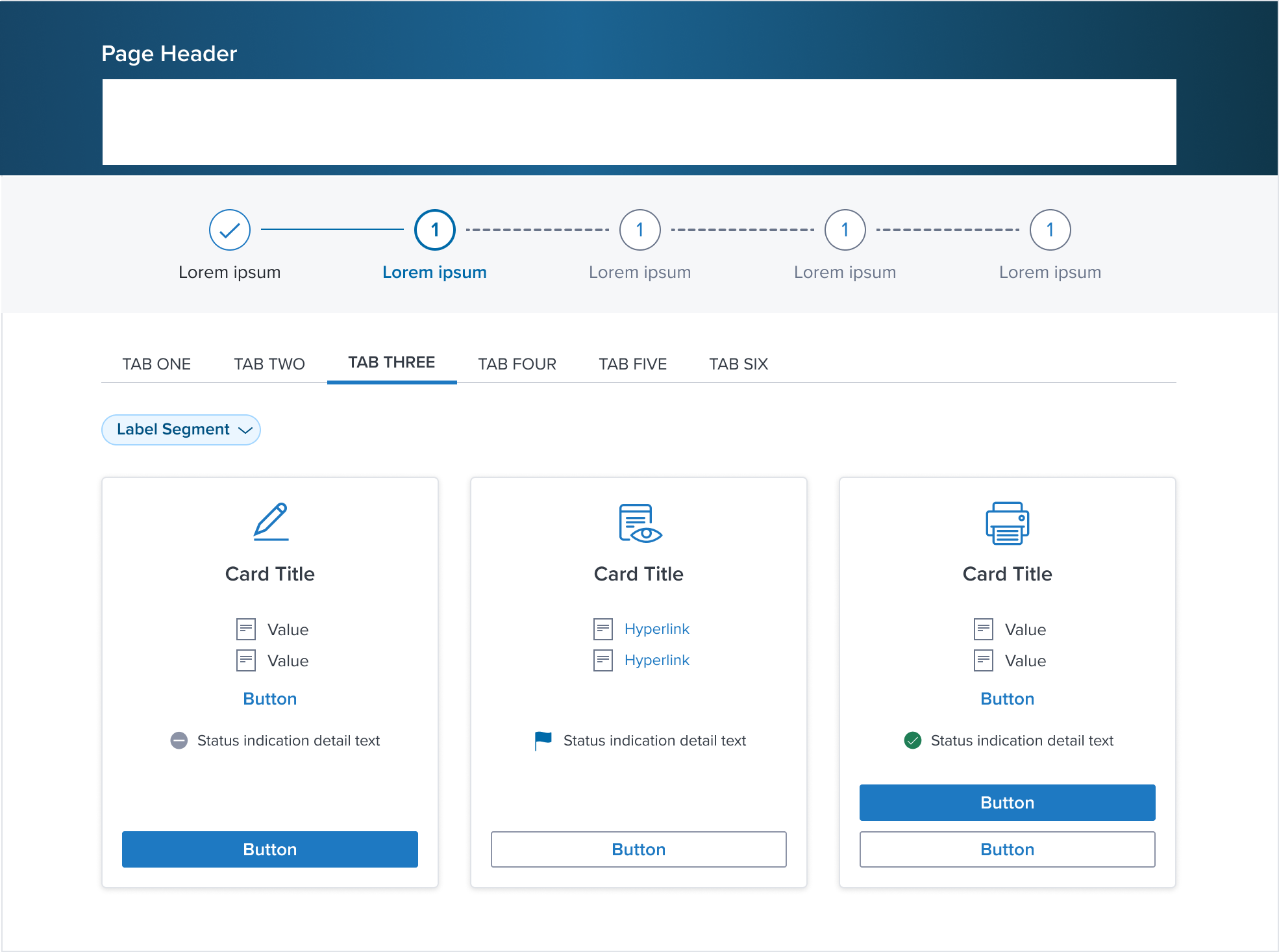
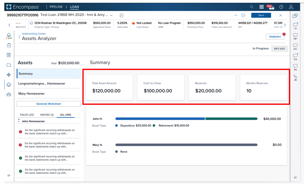
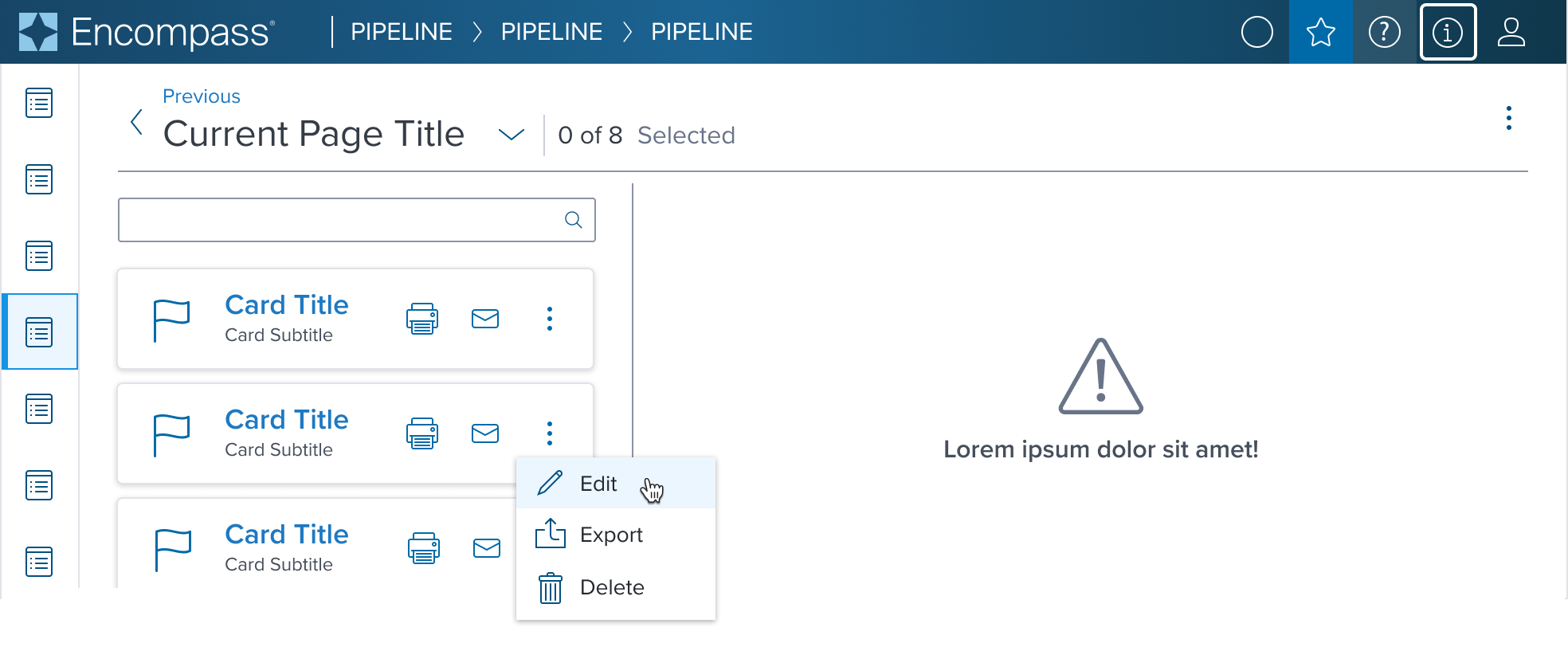
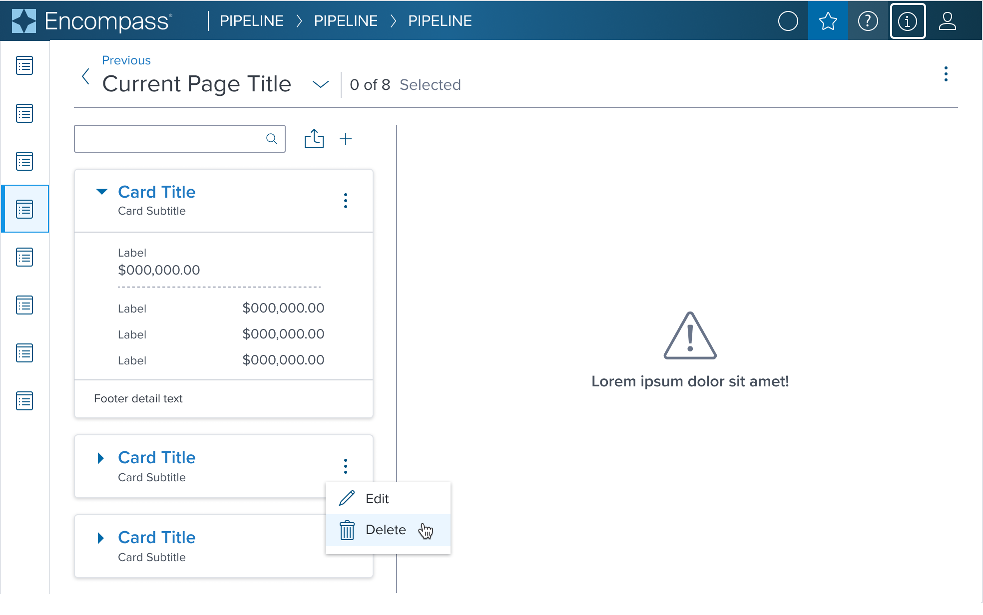
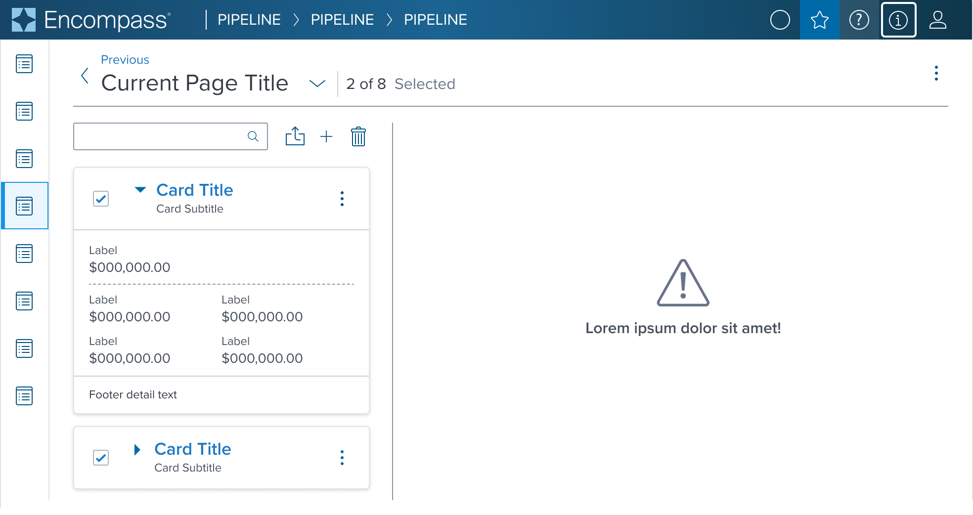
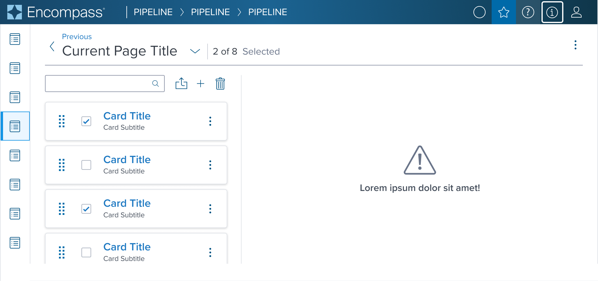
Use Cases
| Original Scenario (Use Case) | Dim Sum Version (Proposed Solution with DS Components) |
|---|---|
  |  |
 |  |
 |  |
 | 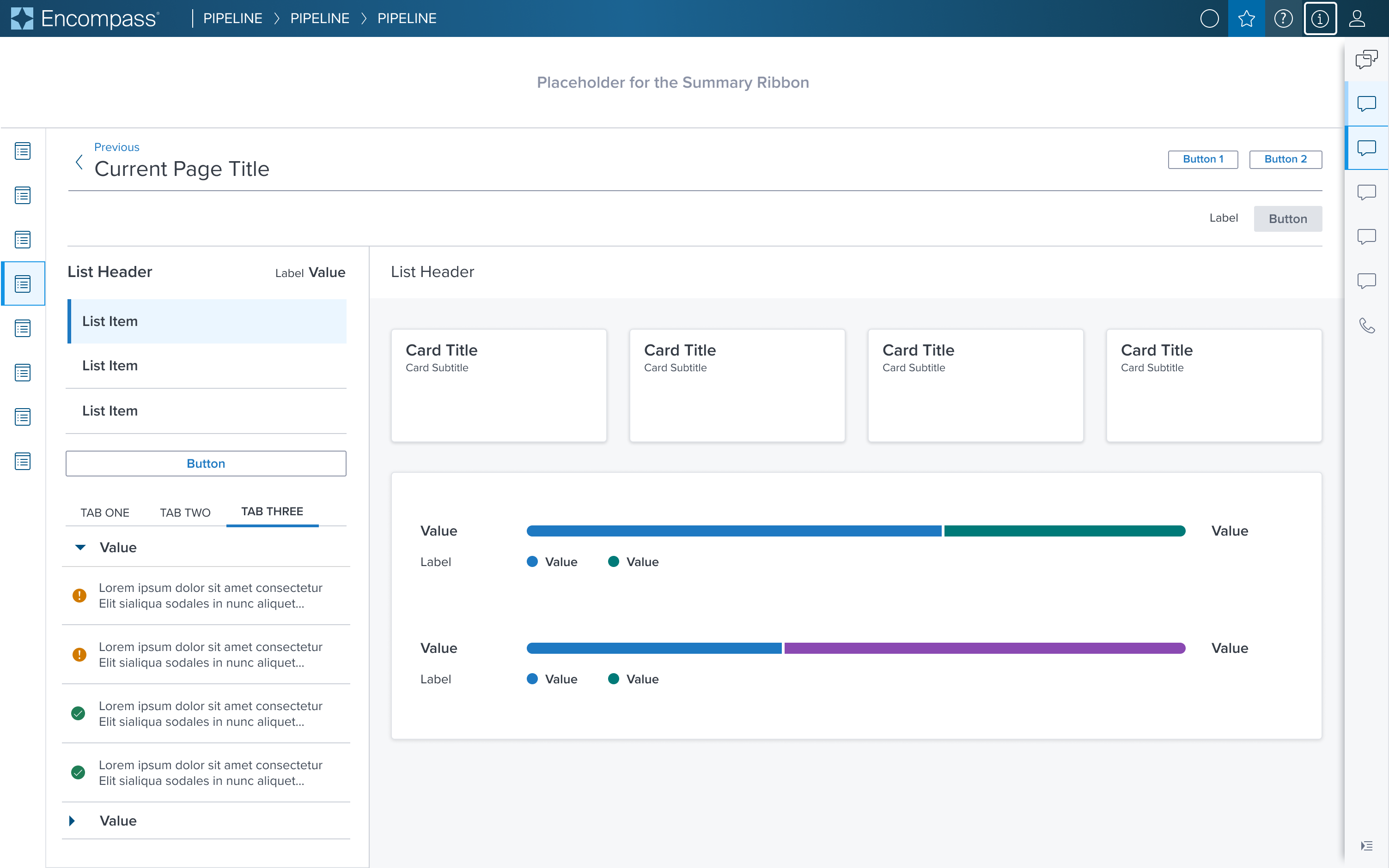 |
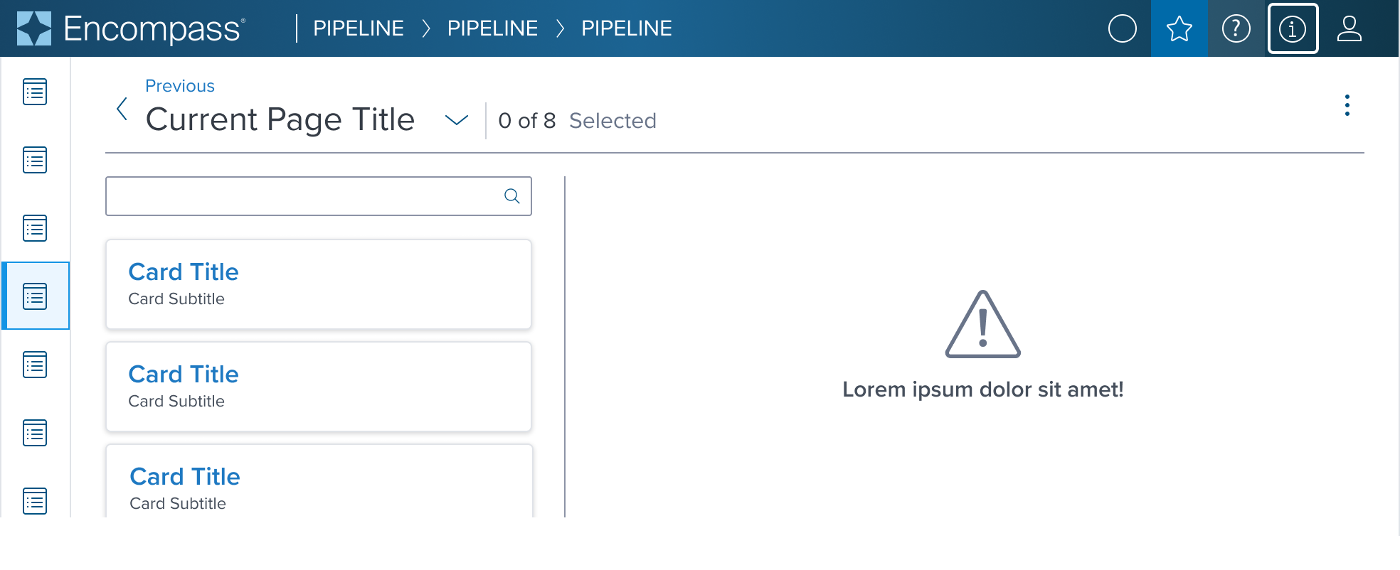
Examples
Given the Card Component's role as a primarily container-centric element in the design system, its content is highly dependent on what scenario it's used in
The component's value lies in its ability to provide a structured, visually consistent container for diverse content types.
We have selected a curated list of scenarios that can be achieved through atomic composition with other components in the design system, allowing for a wide range of layout possibilities while maintaining a cohesive design language to serve as the baseline for application to expand on and integrate as is if the scenario is already covered.
| Scenario Graphic | Scenario Solution | Text Resize and Reflow (200%) | Scenario Description |
|---|---|---|---|
 |  |  | No Action When information is for display purpose only. |
 |  |  | Action When information requires user action to be taken. |
 |  |  | Multiple Action When information requires user action to be taken on multiple items. |
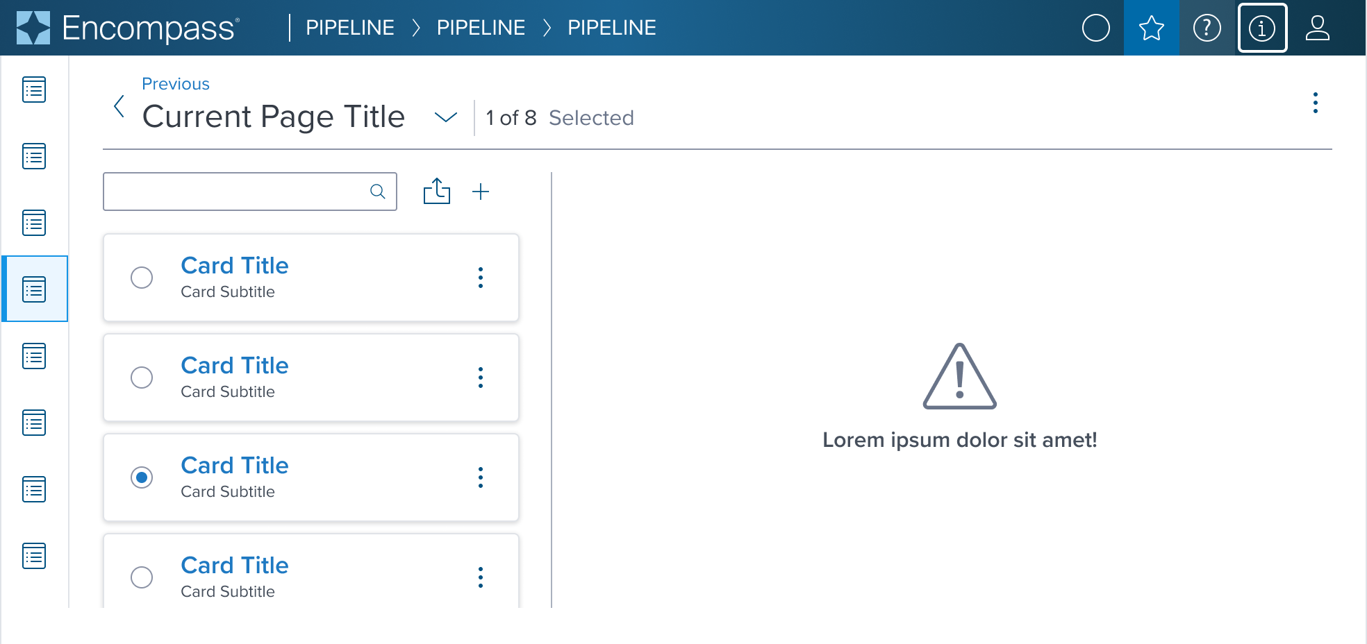 |  |  | Single Select For taking action on a card within the card group. Includes contextual action. |
 |  |  | Multi Select For taking bulk action on cards within a card group. Includes contextual action. |
 |  |  | Drag and Drop Allows for moving a card within a matrix or list to arrange in a desired order. Includes contextual action. |
 | 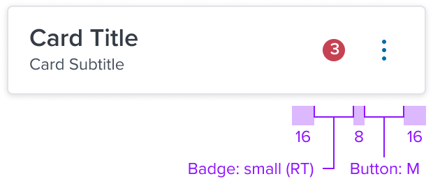 | 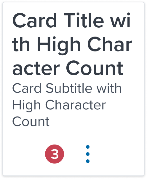 | Notification Badge When status change, new or unread items or quantity of items added needs to be indicated. Includes contextual action. |
 |  |   | Accordion Expand and collapse to hide or reveal additional content. Includes contextual action. |
Additional Examples
| Hypothetical Scenario Graphic | Hypothetical Scenario Solution | Text Resize and Reflow (200%) | Hypothetical Scenario Description |
|---|---|---|---|
 |  |   | Multiple Control Expand and collapse to hide or reveal additional content and take bulk action within a card region. Includes contextual action. |
 |  |  | Multiple Control-1 Allows for moving a card within a matrix or list to arrange in a desired order and to take bulk action within a card region. Includes contextual actio |
Digital Accessibility
While the Card Component itself primarily serves as a visual layout tool and does not introduce specific accessibility concerns, it is crucial to ensure that all content placed within the card is accessible. The responsibility for accessibility lies with the content and interactive elements integrated within the card.
Designers must adhere to accessibility guidelines for text, images, interactive controls, and other content types to ensure the overall accessibility of the card's content.
Given the card is meant to separate it's content from the rest of the page it's a good candidate to serve as a role='region' but ad-hoc consideration needs to be done on the app side.
Related Composition Components
The Card Component's flexibility and adaptability are enhanced when used in conjunction with other atomic components within the Dim Sum Design System. These related components may include:
- Buttons: For actions within the card.
- Icons: To add visual cues and enhance understanding.
- Notification Badging: To notify the user that there is new information that needs attention.
- Typography Components: For presenting textual content in a readable and aesthetically pleasing manner.
- Image Components: To incorporate visual media within the card layout.
By leveraging these atomic components, designers can create highly customized card layouts that cater to specific content needs while ensuring a consistent and cohesive user experience across the interface.
Usage Warnings
Interaction within Card Containers
Pitfalls & Misconceptions
Implementation of interactive components within the card should enhance user experience without compromising the card’s core function as a structured and clear content container. Use interactive buttons, icons, toggles and images only when necessary in order to maintain a intuitive and easy-to-use experience.
- Do Not Use Nest Interactive Elements: Do not nest clickable elements within a List Item that is already interactive. Doing so creates a confusing for user experience for those that rely on assistive technologies and keyboard navigation.
- Semantic Roles for Interactive Cards:If interaction is applied to the card container, such as making it behave as a button or link, it must be communicated with the correct semantic role for accessibility purposes.
- Manage Focus for Interactive Cards:When making a card interactive, focus management becomes crucial to prevent user disorientation and to ensure a seamless navigational experience for all, including those using assistive devices.
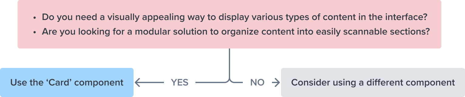
Alternate Components
-
List Item Component: Use when navigation is more important than comparison between objects or taking bulk action.
List Items provide users with clear and efficient pathways to various features or sections of an application.
In essence, use the Card Component when the goal is to feature content in a stand-out manner, and opt for List Items when the priority is to guide the user through different parts of the application with clarity and efficiency.
References
- Usage Guidelines
- Global Practices - Keyboard Functions
- Resize and Reflow Guidance
- WCAG Role-Region
- View code on Storybook