v 2.0.2
Overview
The Form Layout component allows you to easily structure and organize your forms in a responsive and accessible way. It includes features such as inline error messages, validation messages, and custom label placement options to help streamline the form-building process.
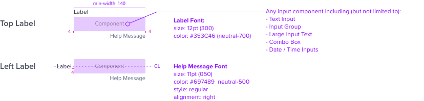
Anatomy
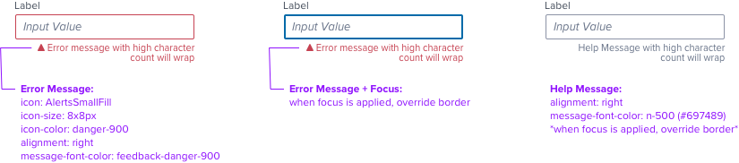
Visual Style
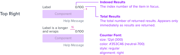
Label Position
Live Character Counter
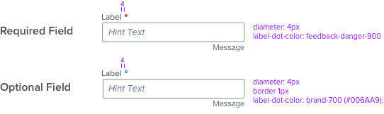
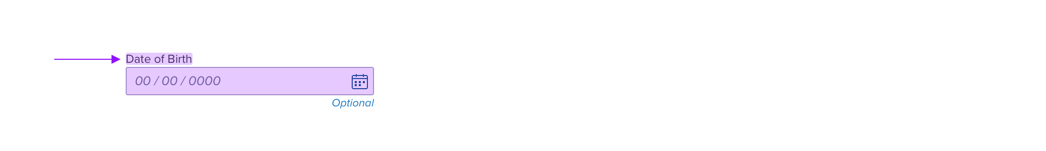
Modifiers: Required & Optional
Highlight
The highlight is used to direct attention to a control such as when navigating search results in a form.
Wrapping Rules
Primary Label Wraps responsively when container size changes
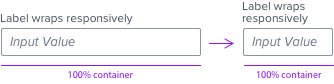
Help and Error text both wrap when there is not enough space to display the entire message.
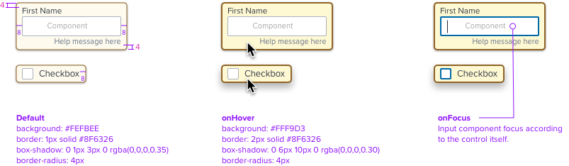
Interaction
The Label is included in the clickable region to operate the control, and behaves identically as the input or selectable region(s). See WCAG example here.
Digital Accessibility
Form Layout Block follows standard keyboard and screen reader patters. Below is an example of Input Text.
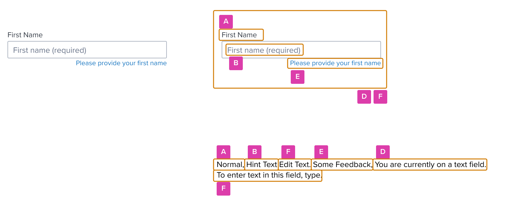
| A - Label |
| B - Hint |
| C - Value |
| D - Role |
| E - Message |
| F - Hint / Instructions |