Menu Button (WIP)

v1.0.0

Overview

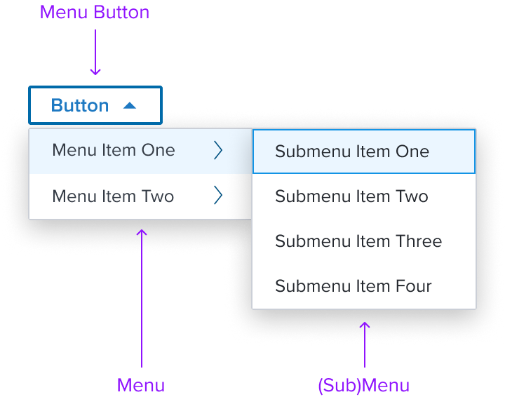
Menu Button is an action component consisting of a button that opens a menu.


Design

The Menu Button is a widget composed of a contextual menu that is opened by the Dim Sum 'Button' component. It is best served for applying a setting or property to an object or taking direct action on an object. It must never be used for comparison.


Box Model


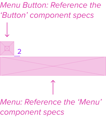
Menu Button

Menu

  • Box-shadow "s"
    The Menu's container is styled with a drop shadow and always appears in front of other content.
  • Border 1px solid neutral-300
    The fine border marks the Menu's perimeter, providing enough contrast to define the Dropdown Menu as a primary entity while keeping the design clean and unobtrusive.
  • Border radius: 1px
    The Menu's rounded edges make the interface appear softer and more inviting, providing an intuitive, user-friendly and accessible interface.
  • Background: neutral-000 (#FFFFFF)
    The Menu background has a neutral color fill to provide sufficient contrast with the foreground content for proper presentation.
  • Margin/padding
    The Menu does not come with pre-set spacing values in order to optimize the flexibility of content layout. UX will provide exact guidance on a case-by-case basis to ensure consistent styling, which will follow standard Dim Sum spacing values.
  • Min-width 32px and Min-height 32px
    These dimensions guarantee that the Menu remains functional and aesthetically pleasing across different devices and screen sizes, adhering to the principles of responsive design.
  • Stretches to fit content
    The Menu expands to fit the content, ensuring that the design adapts to content volume while maintaining the dropdown menu's visual integrity.
 

Responsive

The Menu Button component is designed with a responsive box model that adapts to varying screen sizes and contexts to ensure a consistent and accessible user experience. The minimum dimensions provide a baseline for content scalability, while the absence of margins and padding allows for flexible integration within different layout environments.

It is also important to provide scrolling to keep the menu usable on smaller screens, and in long drop downs, to prevent them from overflowing off the screen. Another important thing is defining breakpoints where the dropdown menu layout changes, ensuring optimal usability on devices ranging from mobile phones to desktops.

The Menu Button structure should be consistent across screen sizes. List items should appear always in the same order and with the same wording and destination.


States

StateGraphicDefault Styling
IdleN/A (see button spec)N/A
FocusN/A (see button spec)N/A
DisabledN/A (see button spec)N/A
Read-onlyN/A (see button spec)N/A
HoverN/A (see button spec)N/A
ErrorN/A (see button spec)N/A
 

Use Cases

Original Scenario (Use Case)Dim Sum Version (Proposed Solution with DS Components)
 

Examples

Scenario GraphicScenario SolutionText Resize and Reflow (200%)Scenario Description
Label Only
Single select menu consisting of list items (labels). When standard actions occur and no visual representation is needed.
Left Icon (decoration)
Single select menu consisting of list items and decorative icons, for better understanding of various actions to be taken.
Single Selection (dot)
Single select menu consisting of list items. Active list item is marked by a circular dot icon. When visible indication of current choice is needed.
Multiple Selection (checkmark)
Multi select menu consisting of list items. Active list items are marked by a checkmark icon. When visible indication of current choice's are needed.
Submenu
A right facing chevron icon provides affordance for a secondary menu that appears within a main menu. For more detailed and advanced actions with additional options related to a specific section or function.
Single Selection + Submenu Single select menu functionality paired with a secondary menu for detailed actions and functions.
Multiple Selection + Submenu Multi select menu functionality paired with a secondary menu for detailed actions and functions.
Left Icon (decoration) + Submenu Single select menu consisting of list items and decorative icons, for better understanding of various actions to be taken. Paired with a secondary menu for detailed actions and functions.
Separator A delicate horizontal border can be placed within the menu to distinguish section content, offering sufficient contrast to delineate it as a distinct element.
 

Digital Accessibility

Menu is a standard HTML component and therefore uses the familiar role=button Please refer to the documentation for complete details.


Variants

Objective: Provide an exhaustive list of the expected and available graphical variations that the component can take out-of-the-box, officially supported by the Dimsum team. Each variant's will then be created as a sub document but the this document should provide the quick-resume of each variants main points.

  • Variant Name 1 (Provide link)
  • Variant Name 2 (Provide link)
  • Variant Name 3 (Provide link)
 

Usage Warnings

Objective: Address common errors or misunderstandings related to the component's use or implementation.

A component may have obvious potential to be used incorrectly by UX or product. It is possible there are common implementation pitfalls for app devs as well. List these below with complete references and rationale.

🚧

Pitfalls & Misconceptions

Highlighted content may go here if necessary.


Alternate Components

  • Shuttle: Use a shuttle if the user selecting items and they are in a hierarchy or are heterogeneous.
  • Card v3: Use Card when a set of related pieces of content need to be easily assessed for individual or bulk action. Card typically summarizes key information from the full detail view of its corresponding content, such as an input form, service order results, or report. The summary helps the user compare each Card in the set and prioritize next actions, such as completing missing inputs or selections, or resolving errors.
  • Grid: Use when quick and easy grid-based layouts are needed to ensure cross-browser support.
  • Data Table: Use when multiple columns of information are needed for the user to select or act.

Reference