v 1.0.5A
Overview
Radio buttons are always used in a group, in sets of two or more to show and select a set of explicit choices.
- Radio Buttons are the preferred display of options when space allows. Their value over a drop menu is that user can see all of the options before having to click an element.
- Radio Buttons are typically aligned in a vertical list. Horizontal lists should be used only when vertical space must be prioritized.
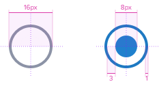
Anatomy
Diagram of the component
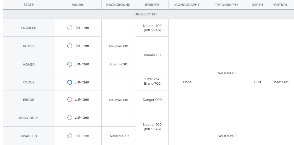
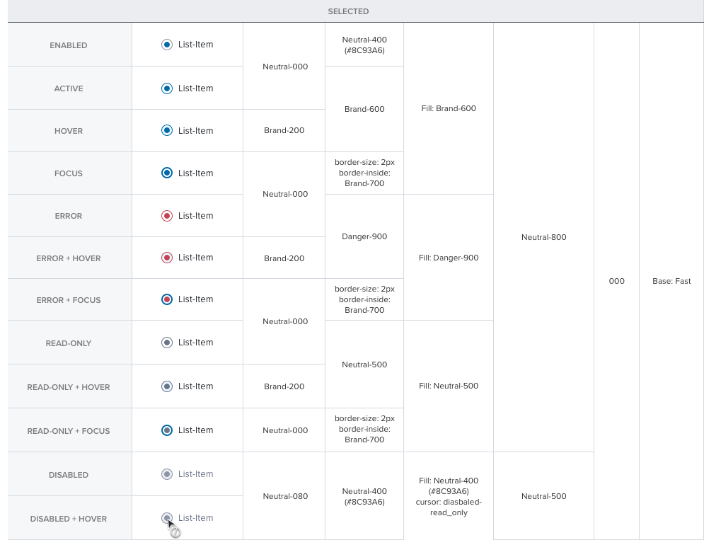
Visual Style
States: Visual of all potential states of the component:
Spacing
Radio Group Section Header
font-family: ProximaNova-Semibold;
font-size: 13px;
color: #464F5C;
letter-spacing: 0;
Radio Group Label
font-family: ProximaNova-Regular;
font-size: 12px;
color: #464F5C;
letter-spacing: 0;
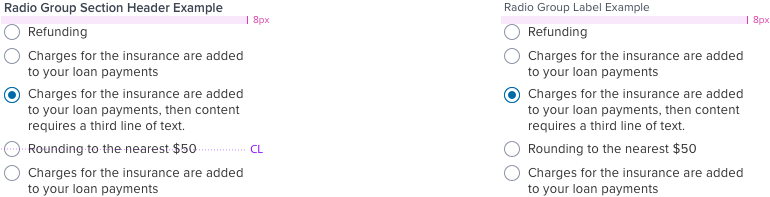
Radio Group Section Header w/ Checkbox
font-family: ProximaNova-Semibold;
font-size: 13px;
color: #464F5C;
letter-spacing: 0.2px;
Radio Group Label w/ checkbox
font-family: ProximaNova-Regular;
font-size: 13px;
color: #25292F;
letter-spacing: 0.2px;
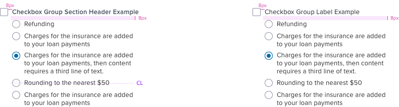
Checkbox Group Section Header w/ Radio
font-family: ProximaNova-Semibold;
font-size: 13px;
color: #464F5C;
letter-spacing: 0.2px;
Radio Group Label w/ checkbox
font-family: ProximaNova-Semibold;
font-size: 13px;
color: #464F5C;
letter-spacing: 0.2px;
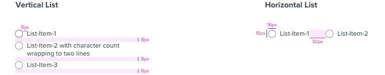
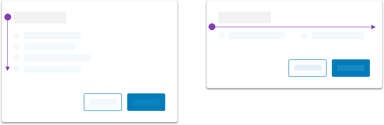
Layout
There are two layout patterns:
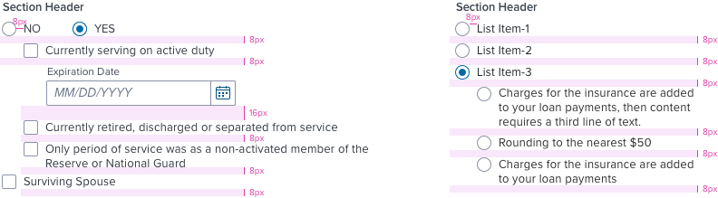
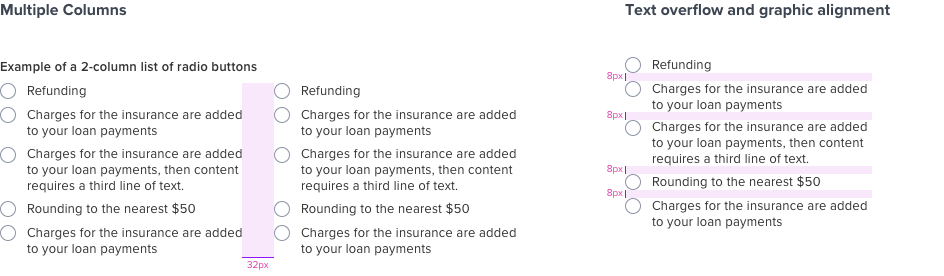
- Vertical - two or more selections as a vertical list. This format is the most-preferred layout for Radio Button.
- In-Line Horizontal - use this when a user flow can be improved by placing a binary selection side-by-side, or if the layout provides ample horizontal space for the list items. This pattern should be avoided for cases that include more than two selections.
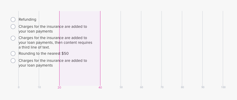
Width & Line Length
Character Count - width is governed by limiting character count between 20 and 40 per line.
Digital Accessibility
Keyboard
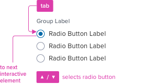
A radio button group is a single tab stop and radio buttons are selected using arrow keys.
Labeling and States
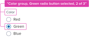
Screen reader announcement.
Keyboard Focus
Global standard keyboard interactions apply, and in order of operations from left to right, top to bottom.
Two / Dual-State
| Key | Function |
|---|---|
| TAB | SHIFT+TAB | Moves focus indication to the next and previous interactive elements in the tab order (radio button receives a single tab stop and focus). |
| ▲ / ▼ | Moves up and down, cycles through, and selects radio options on a vertical list. |
| ◀︎ / ▶︎ | Moves left and right, cycles through, and selects radio options on a horizontal list. |
| SPC | When the radio group has no selection, is a single tab stop with focus indication, activates and confirms selection. |
Screen Reader
Steps from object to object or by jumping between components. Converts interactive elements into speech.
| Semantic HTML Role | Announced Content (defined by app-side) | ARIA Attributes |
|---|---|---|
| RADIO BUTTON | group, label, state, number of items selected | NA |
| ARIA Considerations (source: www.w3.org) |
|---|
| Radiogroup - The radiogroup role defines a container for a set of ARIA radio buttons. - The radio button that is currently checked is identified using aria-checked=“true”. - Only one radio button can be selected at a time, all other radio buttons should define aria-checked as “false". - The label for the radio group is defined using aria-labelledby attribute. - The labels for the radio buttons are defined by the text nodes of each radio button. Accessibility Feature - div element with role radio has onkeydown event to support keyboard activation of the radio. - div element with role radio has tabindex="0" to become part of the tab order of the page. - Each radio has tabindex="-1" except one. - CSS Generated Content is used to visually indicate the state of radio (e.g. checked, unchecked). To ensure the visual state will be visible when browsers or operating system use “High Contrast” settings by people with visual impairments; the visuals are created in CSS rather than via the use of a background image. (Note: CSS background image techniques result in visual state disappearing when browsers or operating systems are configured to display high contrast themes.) - setRadioButton function uses aria-checked attribute to make sure the information communicated to asssitive tecnology is the same as the visual state. (e.g. img element) - onfocus and onblur event handlers on radio support visual focus styling for keyboard only users. |