v2.0.0
Overview
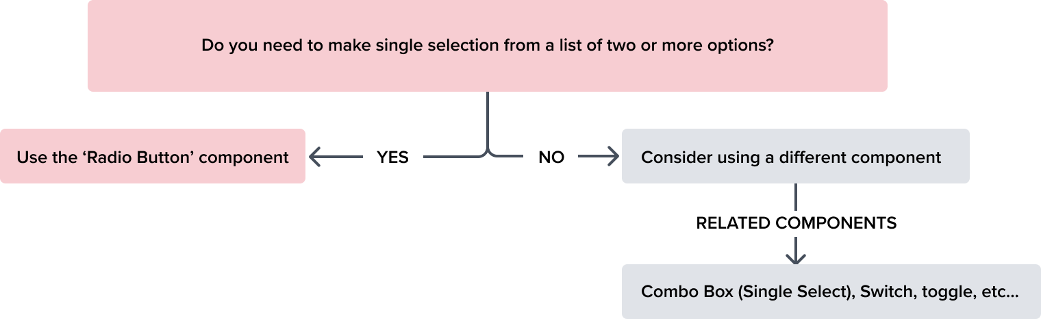
Radio button is used to make a single selection from a list of two or more options. It is activated by selecting the indicator, or both the indicator and label when arranged together.
Design
The visual styling of the control follows the standard and familiar pattern that is easy to understand and interact with.
The border is set to 1px and N-400 to make it easy to see. The node for the selected state is 8px with a background of N-600 for a bold and accessible visual indication that is easily distinguished between the various states of the component. Please see States for complete detail.
| Element | Default Styling |
|---|---|
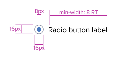
| Label | font-size: 13 RT font-line-height: 17 RT font-weight: 400 (regular) font-color: neutral-700 (#353C46) text-align: left |
| Control (Circle) | border: 1px solid neutral-400 (#8C93A6) border-radius: 50% background: neutral-000 (#FFFFFF) height/width: 16px |
| Control (Node) | border: 2px solid brand-600 (#1E79C2) height/width: 8px |
Box Model
The Radio Button's box model is intricately tied to its purpose as a visual segregator in the design system.
Each aspect of the box model is deliberately chosen to uphold the clarity and distinctiveness of Radio Button as a content container.
Responsive
By design, Radio Button supports resize and reflow characteristics by defining minimum height and width in relative units. Relative measurements ensure that Radio Button maintains its structural integrity and visual appeal across different screen sizes and orientations, adapting gracefully as needed.
This approach allows the Radio Button to serve a wide array of content types and interaction contexts without imposing rigid layout constraints that could hinder the adaptability of the content it hosts.
-
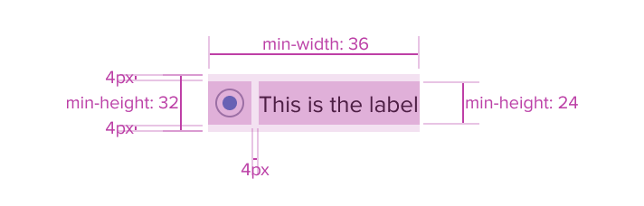
Border 1px solid neutral-400
The border creates ample visual recognition, and meets color contrast requirements. -
16 x 16px Circle
The circular visual is familiar and easy to understand, and differentiates it from other elements in the design while keeping the design clean and uncluttered. Its fixed size ensure it will retain usability when text is resized. -
Background: neutral-000 (#FFFFFF)
The background has a neutral color fill to provide sufficient contrast with the other states of the component, such as selected. (refer to the State table details) -
Margin/padding
Radio Button includes 4px of top and bottom margin to ensure accessible spacing when scaled up or down, and to accommodate text resize and reflow.UX will provide exact guidance on a case-by-case basis to ensure consistent styling, which will follow standard Dim Sum spacing values.
-
Min-width 36 and Min-height 32
These dimensions guarantee Radio Button remains functional, usable and aesthetically consistent across different devices and screen sizes, adhering to the principles of responsive design. -
Stretches to fit content
Radio Button will expand or contract to fit the content, ensuring that the design adapts to different amounts of content while maintaining the its visual integrity and readability. It may also be confined to grid layout in order to maintain it's relationship and context in the user interface.
States
| State | Type | Visual Graphic | Styling |
|---|---|---|---|
| Enabled | Not Selected |  | Background: Neutral-000 (#FFFFFF) Border: 1px Neutral-400 (#8C93A6) |
| Selected |  | Background: Neutral-000 (#FFFFFF) Border: 1px Neutral-400 (#8C93A6) Selection Fill: Brand-600 (#1E79C2) | |
| Active | Not Selected |  | Background: Neutral-000 (#FFFFFF) Border: 1px Brand-600 (#1E79C2) |
| Selected |  | Background: Neutral-000 (#FFFFFF) Border: 1px Brand-600 (#1E79C2) Selection Fill: Brand-600 (#1E79C2) | |
| Hover | Not Selected |  | Background: Brand-200 (#CBCFD7) Border: 1px Brand-600 (#1E79C2) |
| Selected |  | Background: Brand-200 (#CBCFD7) Border: 1px Brand-600 (#1E79C2) Selection Fill: Brand-600 (#1E79C2) | |
| Focus | Not Selected |  | Background: Neutral-000 (#FFFFFF) Border: 2px Brand-700 (#006AA9) |
| Selected |  | Background: Neutral-000 (#FFFFFF) Border: 2px Brand-700 (#006AA9) Selection Fill: Brand-700 (#006AA9) | |
| Error | Not Selected |  | Background: Neutral-000 (#FFFFFF) Border: 1px Error-900 (#C64252) |
| Selected |  | Background: Neutral-000 (#FFFFFF) Border: 1px Error-900 (#C64252) Selection Fill: Error-900 (#C64252) | |
| Error + Hover | Selected |  | Background: Brand-200 (#EBF6FF) Border: 1px Error-900 (#C64252) Selection Fill: Error-900 (#C64252) |
| Error + Focus | Selected |  | Background: Neutral-000 (#FFFFFF) Border: 2px Brand-700 (#006AA9) Selection Fill: Error-900 (#C64252) |
| Read-Only | Not Selected |  | Background: Neutral-000 (#FFFFFF) Border: 1px Neutral-400 (#8C93A6) |
| Selected |  | Background: Neutral-000 (#FFFFFF) Border: 1px Neutral-500 (#697489) Selection Fill: Neutral-500 (#697489) | |
| Read Only + Hover | Selected |  | Background: Brand-200 (#CBCFD7) Border: 1px Neutral-500 (#697489) Selection Fill: Neutral-500 (#697489) |
| Read Only + Focus | Selected |  | Background: Neutral-000 (#FFFFFF) Border: 2px Brand-200 (#CBCFD7) Selection Fill: Neutral-500 (#697489) |
| Disabled | Not Selected |  | Background: Neutral-020 (#EBEDF0) Border: 1px Neutral-400 (#8C93A6) Typography: Neutral-500 (#697489) |
| Selected |  | Background: Neutral-020 (#EBEDF0) Border: 1px Neutral-400 (#8C93A6) Selection Fill: Neutral-400 (#8C93A6) Typography: Neutral-500 (#697489) | |
| Disabled + Hover | Selected |  | Background: Neutral-020 (#EBEDF0) Border: 1px Neutral-400 (#8C93A6) Selection Fill: Neutral-400 (#8C93A6) |
| Aria-Read-Only / Aria-Disabled | Not Selected |  | Background: Neutral-050 (#F6F7F9) Border: 1 px Solid Neutral-400 (#8C93A6) Typography: Neutral-800 (#25292F) |
| Selected |  | Background: Neutral-050 (#F6F7F9) Border: 1 px Solid Neutral-400 (#8C93A6) Selection Fill: Neutral-800 (#25292F) Typography: Neutral-800 (#25292F) |
Use Cases
| Callouts | Original | Dim Sum Solution |
|---|---|---|
| Standalone Radio Button (e.g. Data Table) | 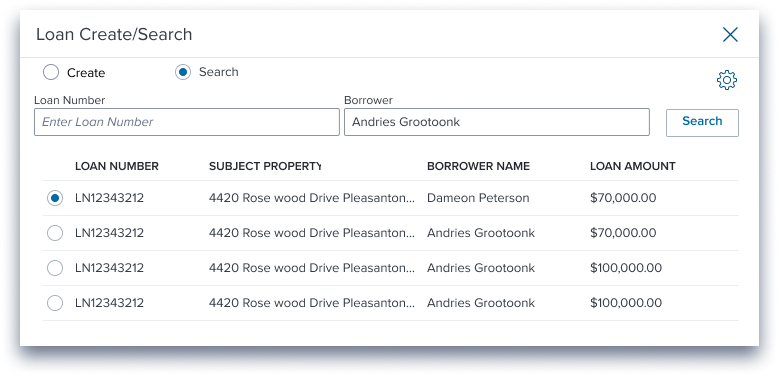 | 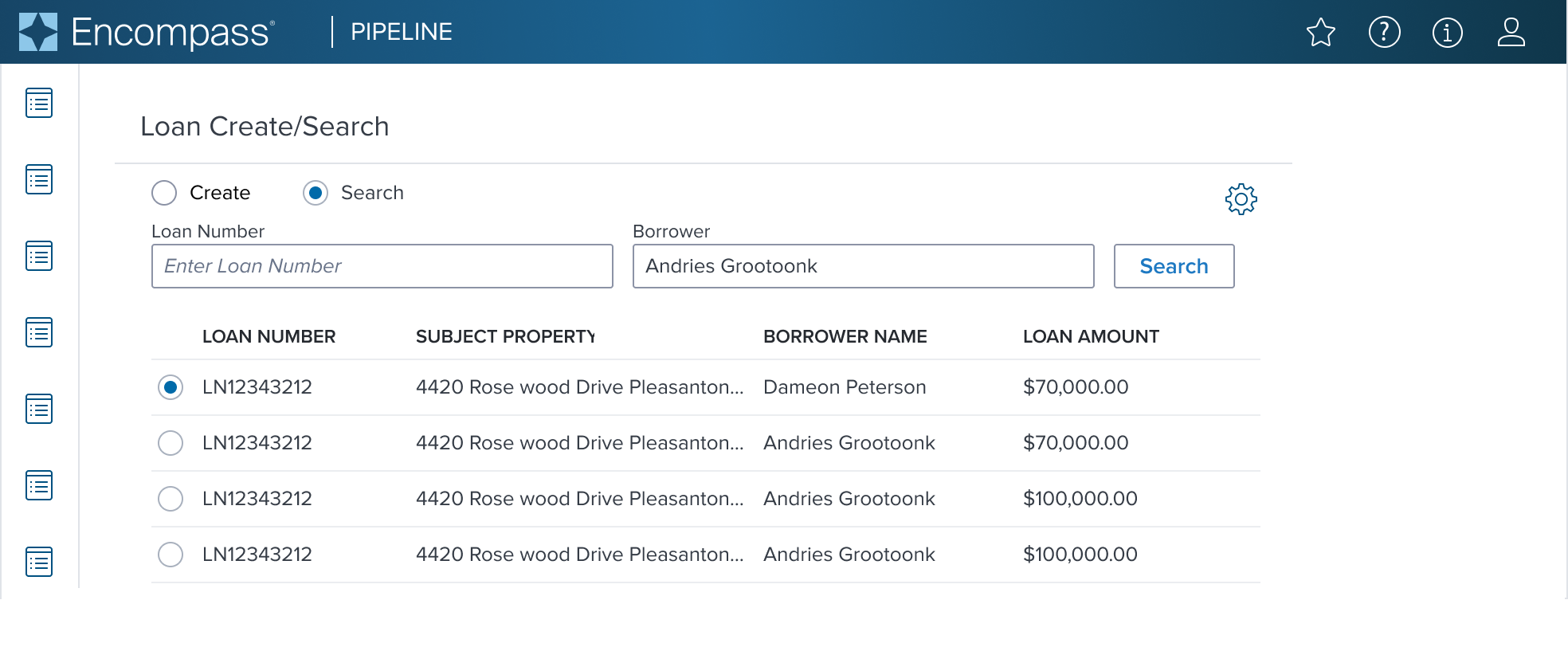 |
| Vertical Radio Group | 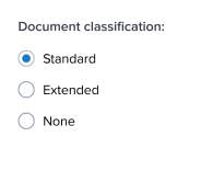 |  |
| Horizontal Radio Group |  | 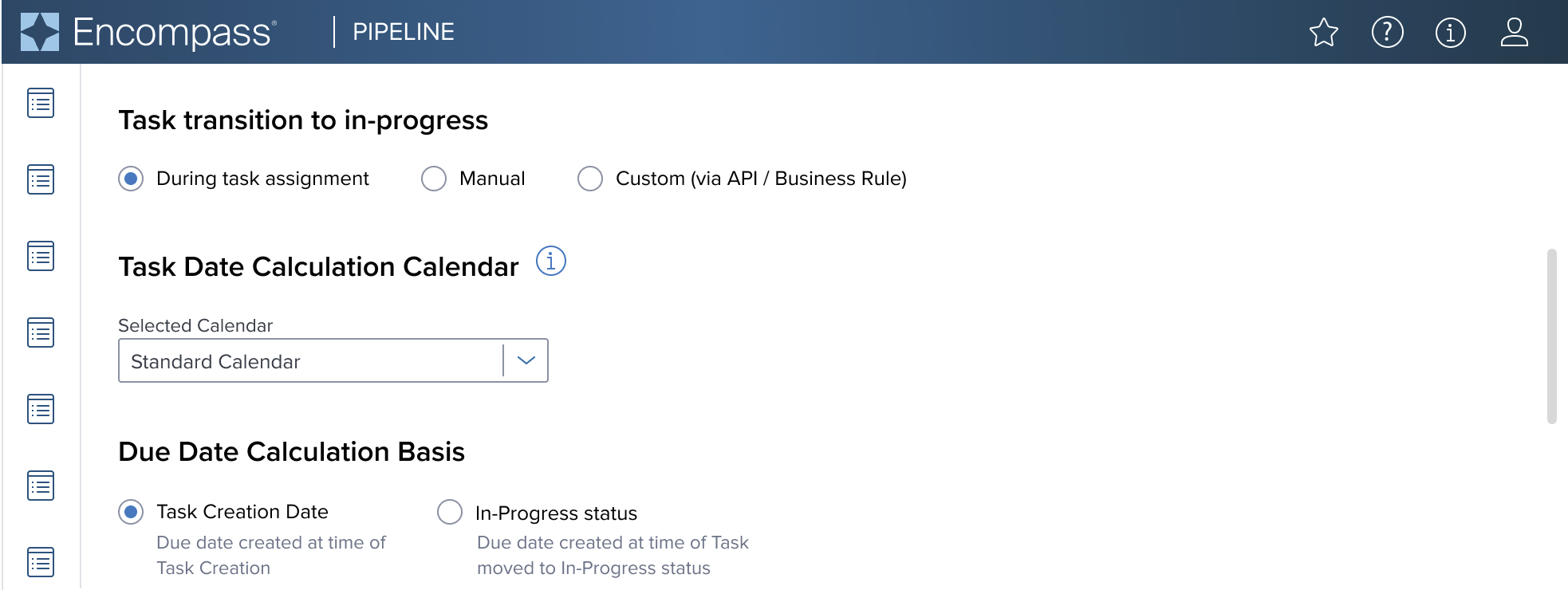 |
Examples
| Scenario | Text Resize and Reflow (200%) | |
|---|---|---|
 |  | need max-width detail here |
Digital Accessibility
Radio Button is a standard HTML component and therefore uses the familiarrole=radioand role=radiogroup Please refer to the documentation for complete details.
Usage Warnings
Objective: Address common errors or misunderstandings related to the component's use or implementation.
A component may have obvious potential to be used incorrectly by UX or product. It is possible there are common implementation pitfalls for app devs as well. List these below with complete references and rationale.
Pitfalls & Misconceptions
Highlighted content may go here if necessary.
Alternate Components
Toggle: Use when ideal for settings or actions that can be toggled between only two states, such as on/off.
Reference
- Usage Guidelines
- Global Practices - Keyboard Functions
- Resize and Reflow Guidance
- WCAG Role-Radio
- WCAG Role-RadioGroup
- View code on Storybook